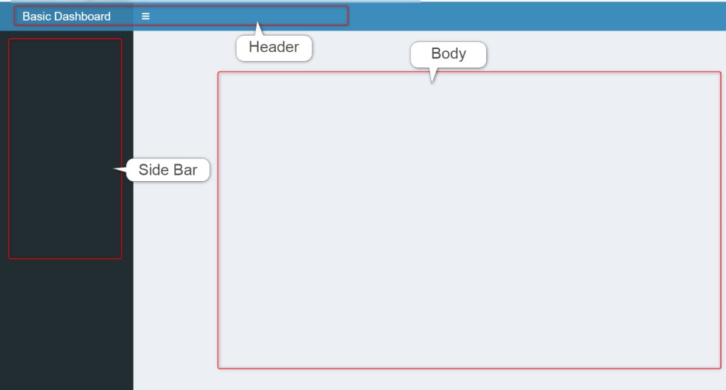
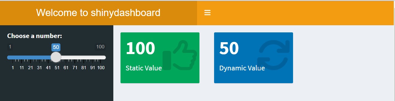
How to create a Shiny Dashboard
An empty shinydashboard
Code
sidebar <- dashboardSidebar(width = 300,
                   sidebarMenu(
    menuItem("Main Dashboard", tabName = "dashboard", icon = icon("dashboard")),
    menuItem("Widgets", tabName = "widgets", icon = icon("th"),
                     badgeLabel = "Newly added", badgeColor = "green"),
    menuItem("Charts", tabName = "charts", icon = icon("chart")),
    menuItem("Tables", tabName = "tables", icon = icon("table")),
    menuItem("my website Link", href = "https://yebelay.rbind.io",
icon = icon("external-link"))) ) 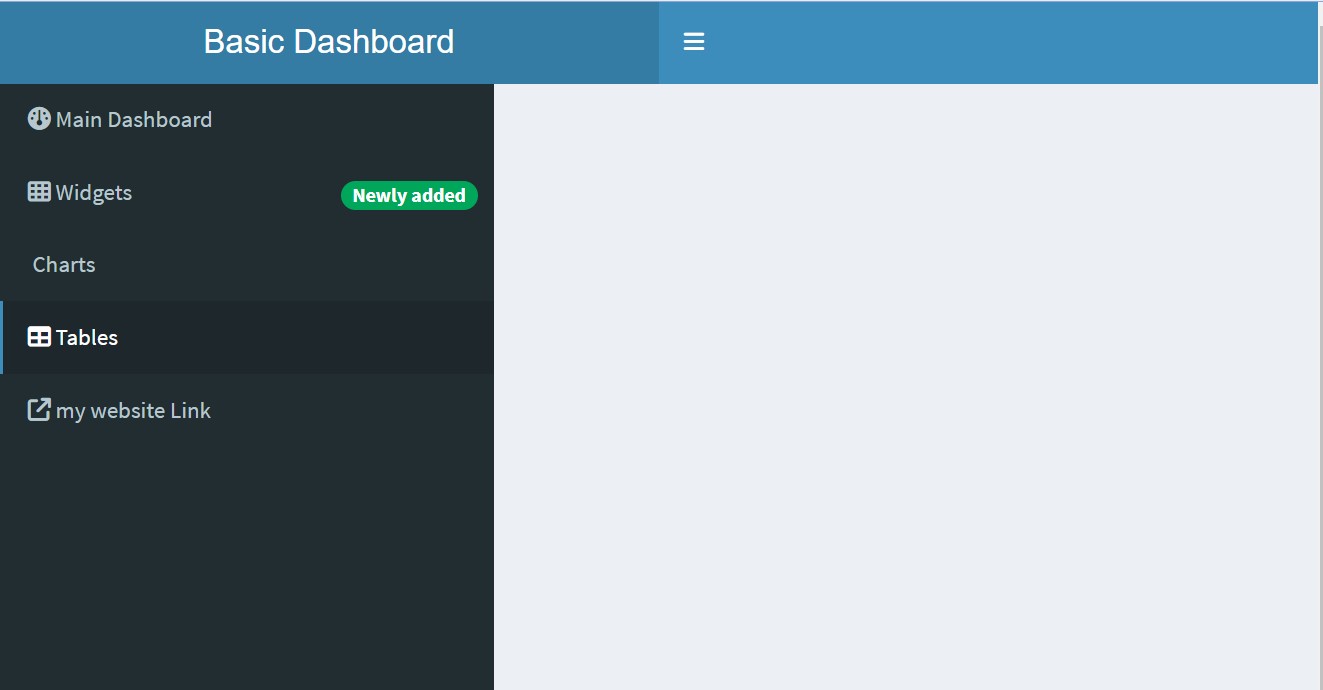
Dashboard Body dashboardBody()
The main part of the app goes inside
dashboardBody().It’s the area to displays outputs and accommodate user inputs.
The
tabNamehas to match the name you used in the sidebarmenuItem(), so that tab shows when the user clicks on the corresponding menu item.
Body Structure
- Tab items can be structured in several ways. At the simplest, you can just list each element after the
tabName.
Boxes
Most shinydashboard apps organise the parts inside boxes.
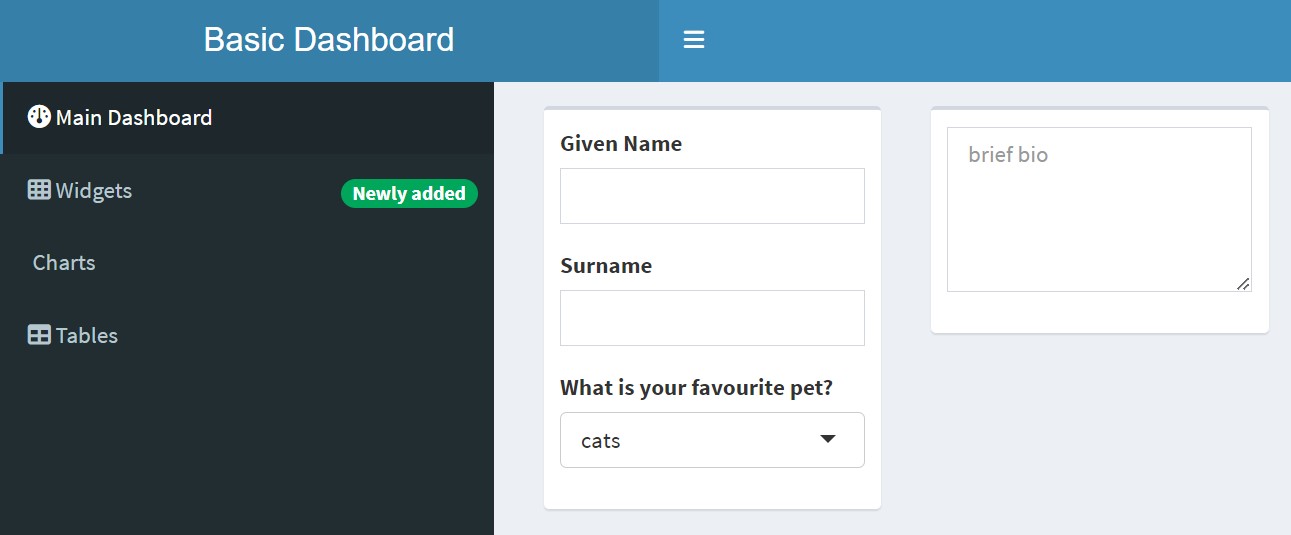
- You can add titles to the boxes, make them collapsible and/or give them solid headers.
Code
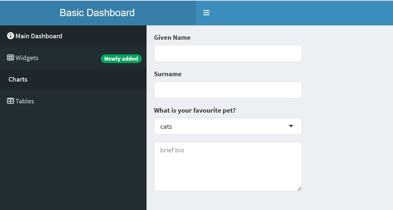
tabItem(tabName = "dashboard",
                box(title = "Personal Info", collapsible = TRUE,
                        textInput("given", "Given Name"),
                        textInput("surname", "Surname"),
                        selectInput("pet", "What is your favourite pet?",
                                                c("cats", "dogs", "ferrets"))),
                box(title = "Biography", solidHeader = TRUE,
                        textAreaInput("bio", NULL, height = "100px",
                                                    placeholder = "brief bio")))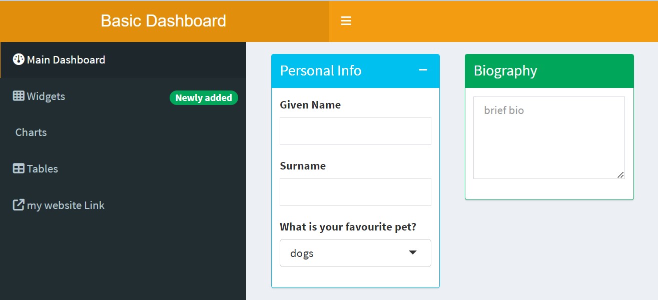
Tab Boxes
Create a box with multiple tabs using tabBox(), which contains tabPanel().
Code
tabItem(tabName = "dashboard",
                tabBox(title = "Test Yourself 1",
                             tabPanel("Question", "What function creates tabBox contents?"),
                             tabPanel("Answer", "tabPanel()") ),
                tabBox(title = "Test Yourself 2",
                             side = "right", selected = "Question",
                             tabPanel("Answer", "selected"),
                             tabPanel("Question", "What attribute changes the default tab?")) )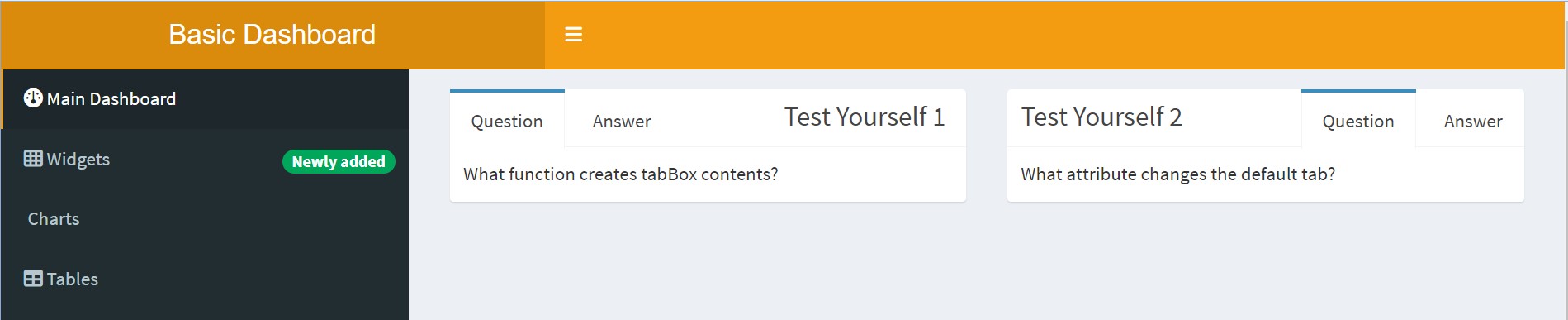
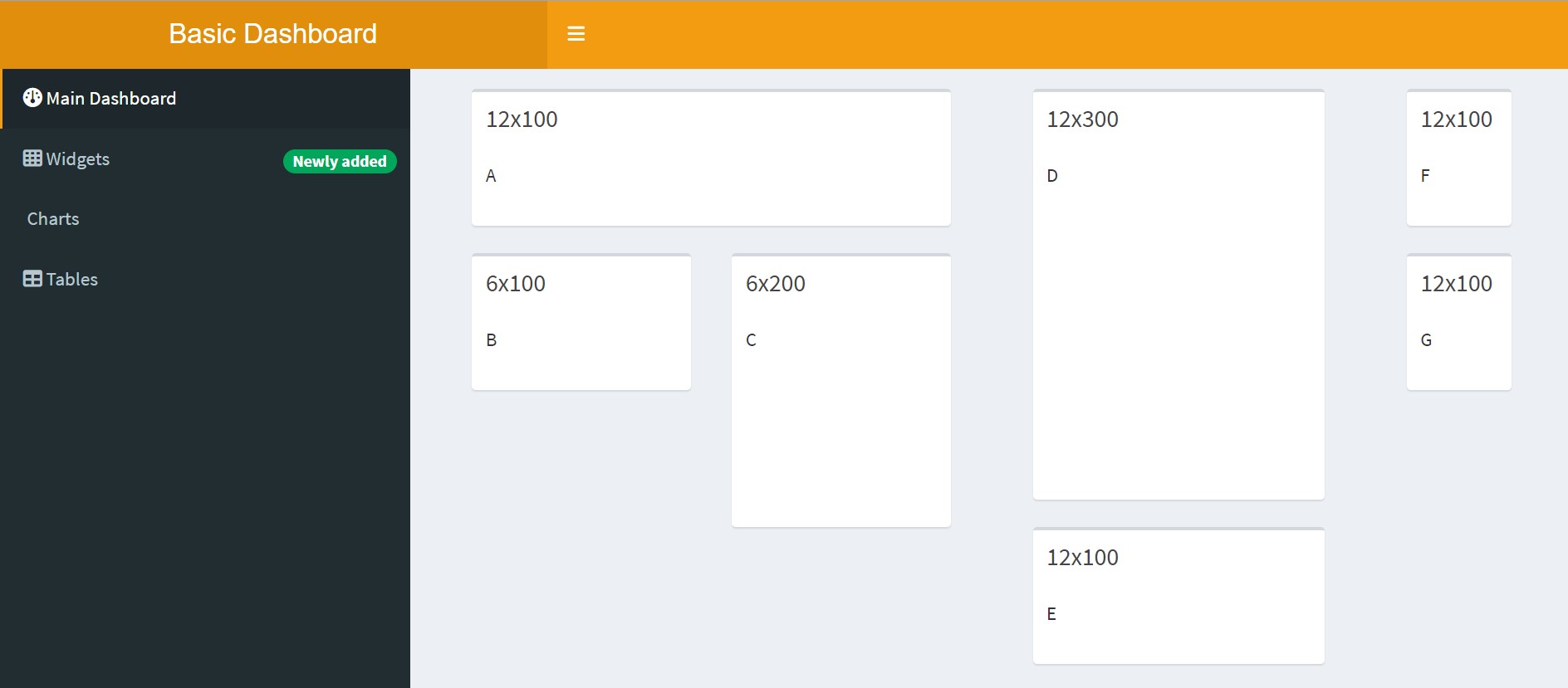
Row Layout
- You can arrange the boxes inside a
fluidRow(). - Set the box height in pixels. If the window gets too narrow, the boxes will move to stack instead of be in rows.
Code
tabItem(tabName = "dashboard",
                fluidRow(box("A", title = "2x100", width = 2, height = 100),
                            box("B", title = "1x100", width = 1, height = 100),
                            box("C", title = "2x200", width = 2, height = 200),
                            box("D", title = "3x300", width = 3, height = 300),
                            box("E", title = "4x100", width = 4, height = 100),
                            box("F", title = "5x100", width = 5, height = 100),
                            box("G", title = "7x100", width = 7, height = 100)))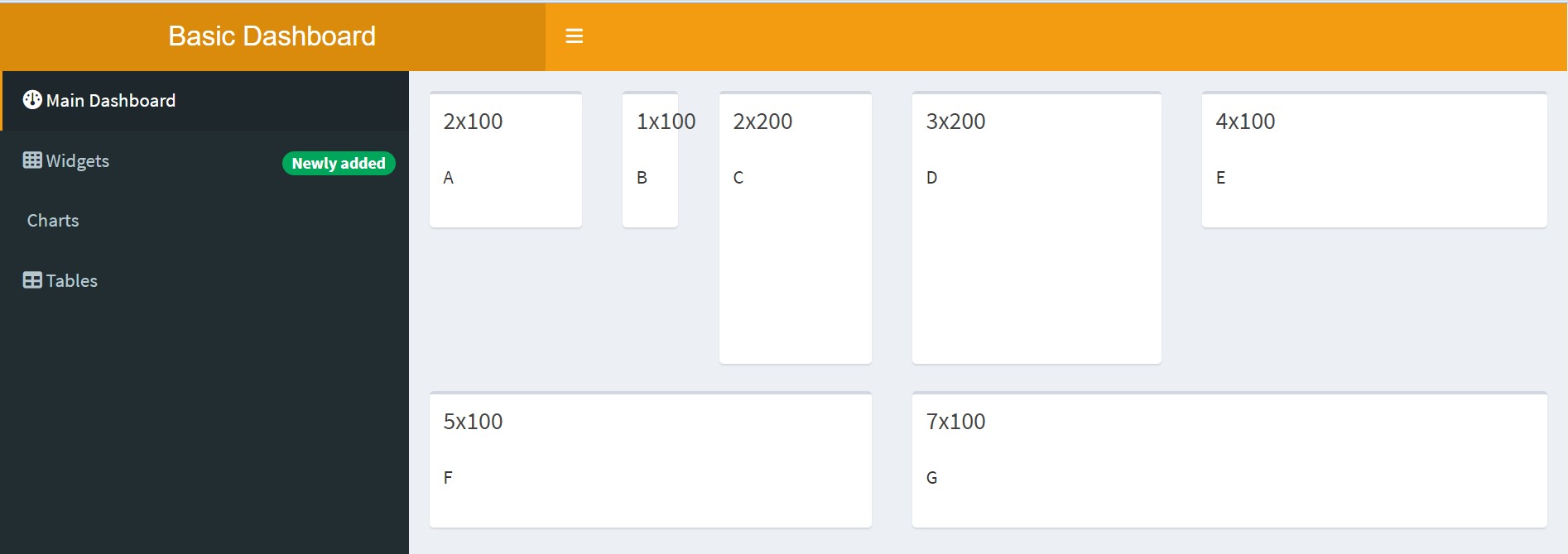
Code
# Sample dashboardBody with various box customisations
body = dashboardBody(fluidRow(
    box(title = "Box 1", status = "primary", "Content", solidHeader = TRUE),
    box(title = "Box 2", plotOutput("plot1", height = 250), solidHeader = TRUE),
    box(title = "Box 3", status = "warning", "Content", solidHeader = TRUE,
            collapsible = TRUE),
box(title = "Box 4", background = "black", "Content"))) 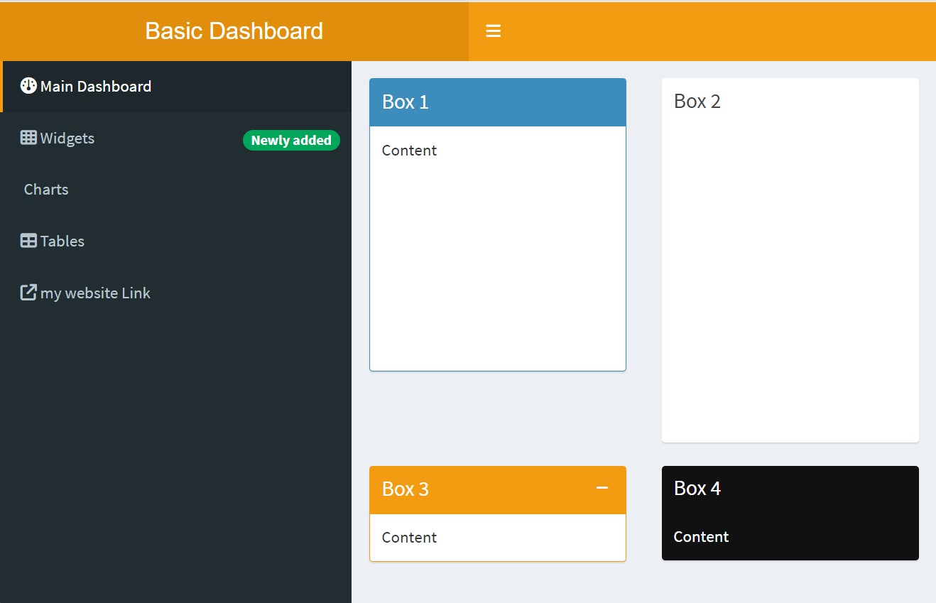
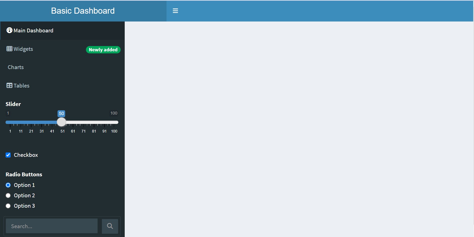
Types of Inputs in shinydashboard
- Inputs are ways that users can communicate information to the Shiny app.
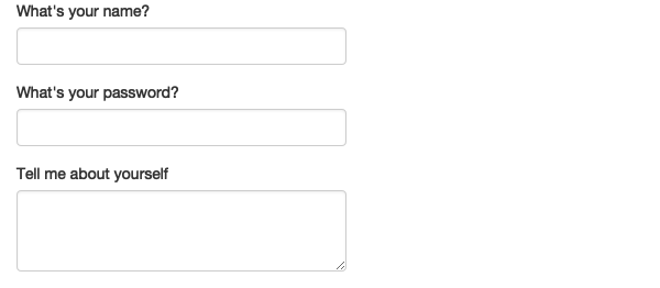
1.Free text
Collect small amounts of text with textInput(), passwords with passwordInput(), and paragraphs of text with textAreaInput().
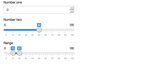
Numeric inputs
To collect numeric values, create a constrained text box with numericInput() or a slider with sliderInput(). If you supply a length-2 numeric vector for the default value of sliderInput(), you get a “range” slider with two ends.
7. dateInput
- Collect a single day with
dateInput()or a range of two days withdateRangeInput(). These provide a convenient calendar picker, and additional arguments likedatesdisabledanddaysofweekdisabledallow you to restrict the set of valid inputs.
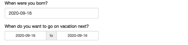
- IMHO, the default of
"yyyy-mm-dd"is the best because it sorts into chronological order. Don’t let me catch you storing dates like"m/d/yyyy".
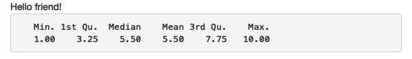
Text
- Output regular text with
textOutput()and fixed code and console output withverbatimTextOutput().
![]()
-
The two render functions which behave slightly differently:
renderText()combines the result into a single string, and is usually paired withtextOutput()renderPrint()prints the result, as if you were in an R console, and is usually paired withverbatimTextOutput().