Data Visualization
Part 2: Advanced Charts and Visual Storytelling

Yebelay Berehan

Center for Evaluation and Development (C4ED)


2026-06-11

Roadmap for Part 2

Part 1 covered the grammar of graphics and how to customize every element of a plot. Part 2 is the chart gallery: which advanced chart to use for which question, and how to turn a correct chart into a convincing one.

  1. Setup: packages used in this part
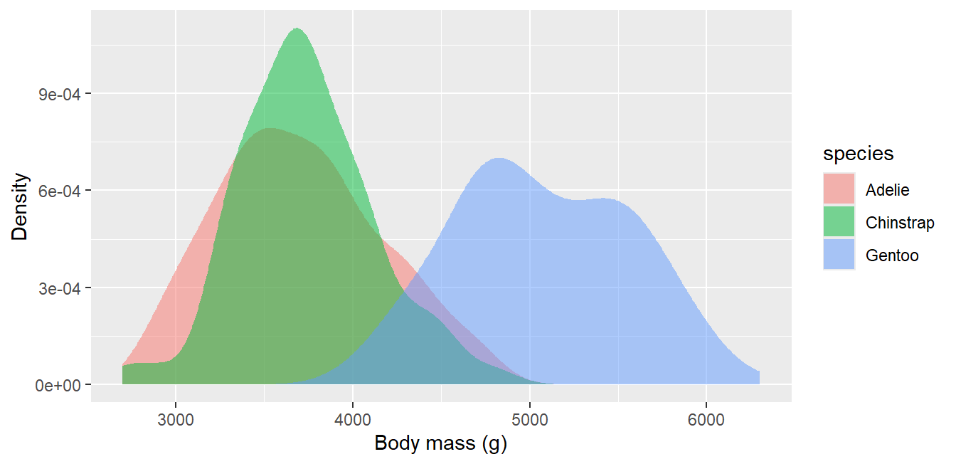
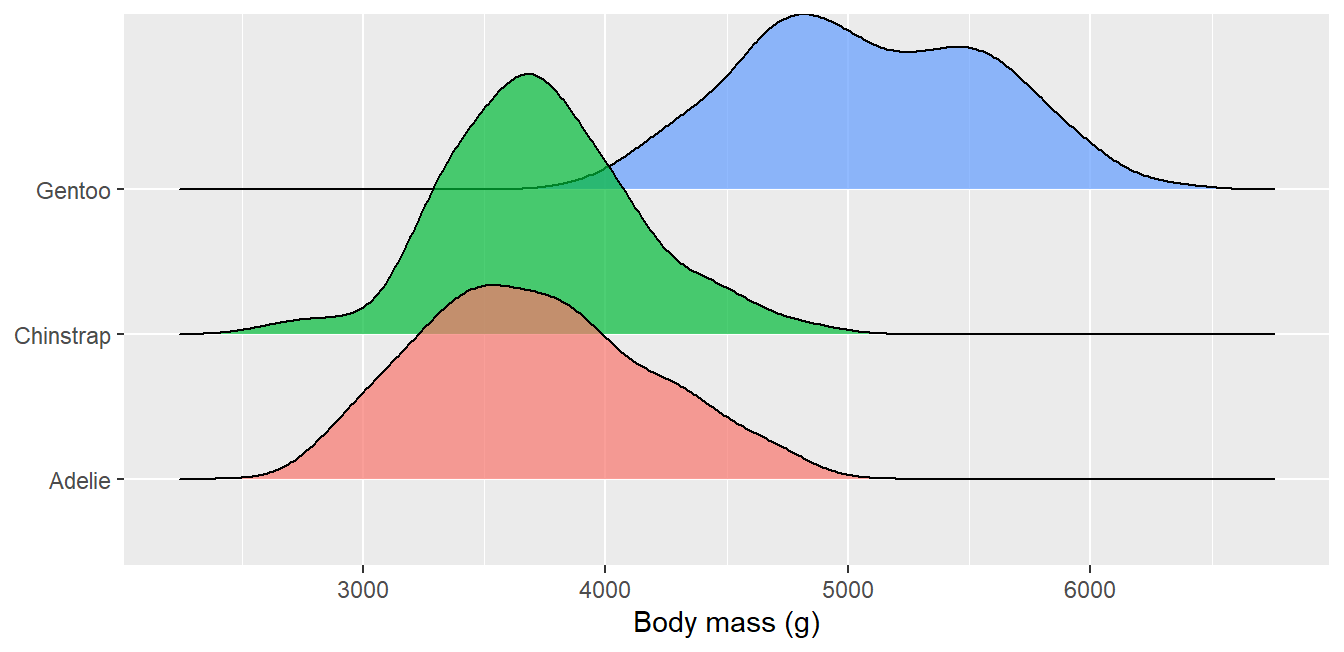
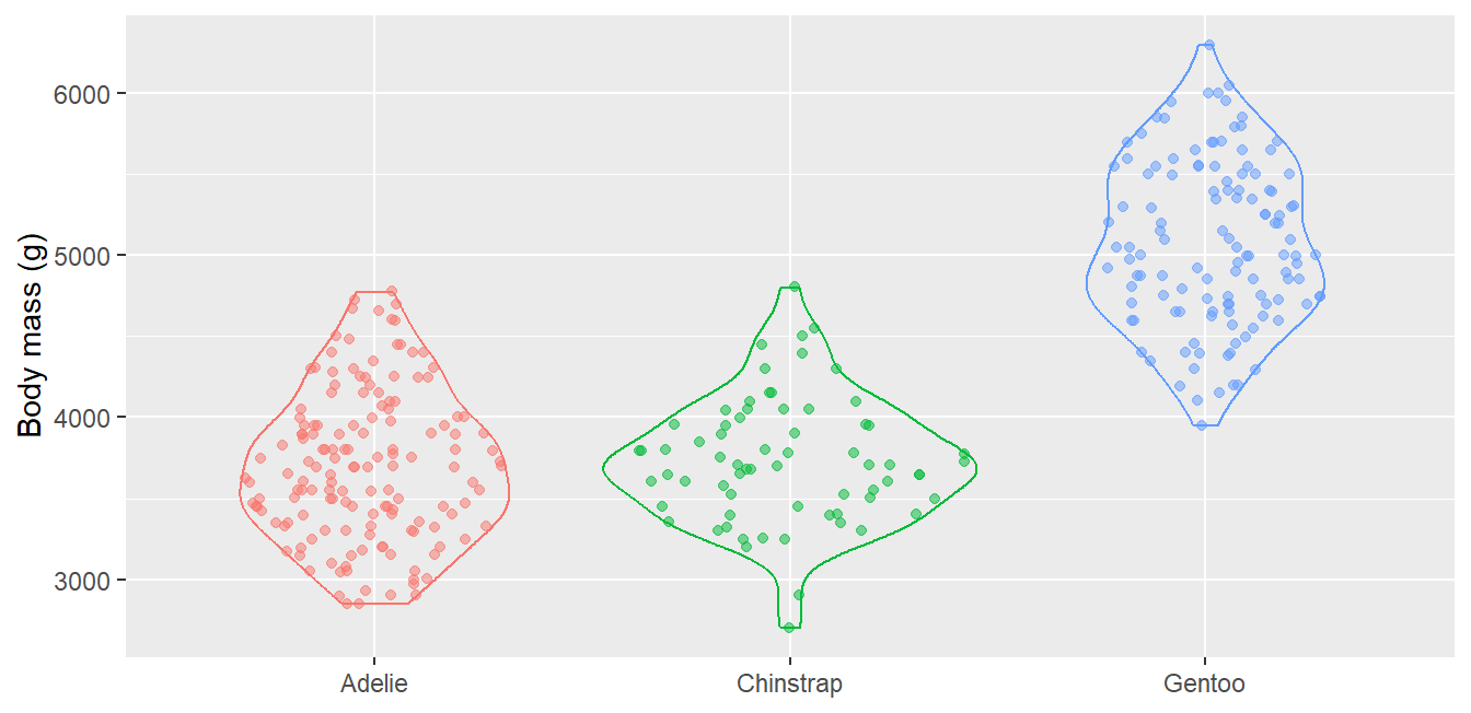
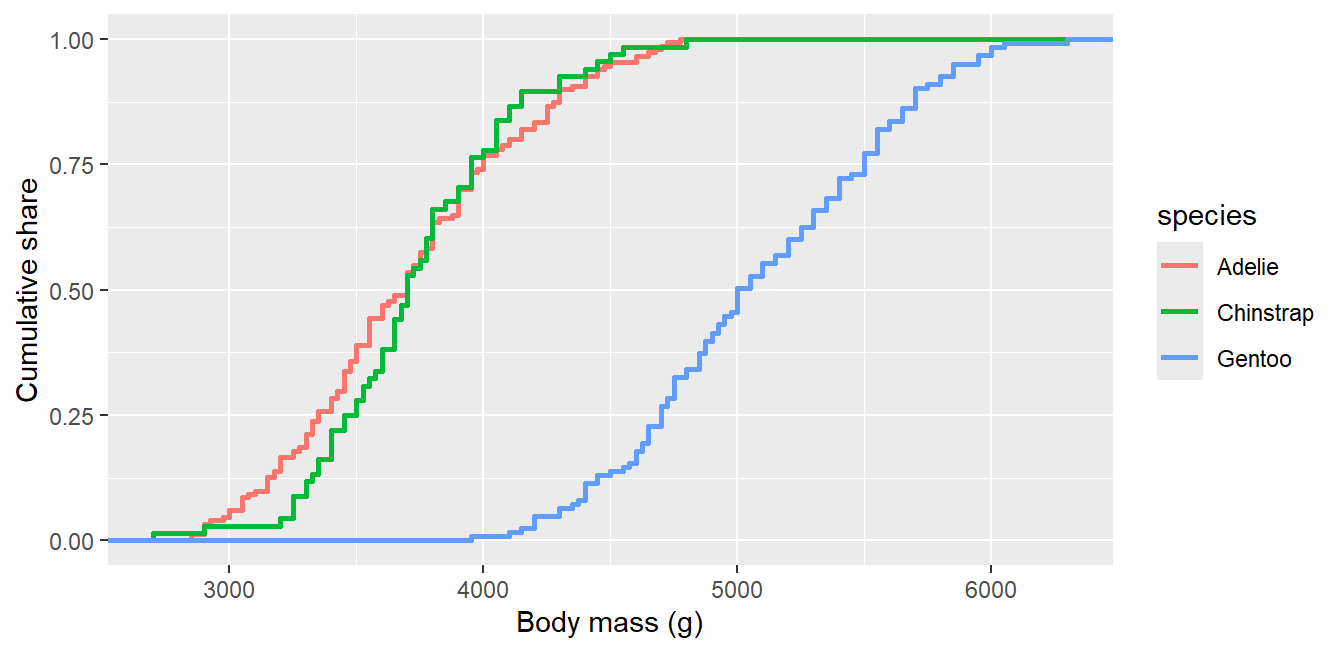
  2. Distributions in depth: density, ridgeline, sina, ECDF
  3. Comparisons: ordered bars, lollipop, dumbbell, diverging bars
  4. Relationships: bubble, density surfaces, correlation heatmap
  5. Composition: percent-stacked bars, donut, treemap
  6. Change over time: area, slope chart, calendar heatmap
  7. Showing uncertainty: error bars, pointrange, ribbons
  8. Highlighting and storytelling: focus the reader on the finding
  9. Branding: a reusable C4ED theme and palette
  10. Going further: maps, animation, dashboards

Setup

Most charts in this part use packages already installed for Part 1. A few extras are marked on their slides and can be installed once:

Code
# already used in Part 1
install.packages(c("ggplot2", "dplyr", "tidyr", "tibble", "palmerpenguins",
                   "ggridges", "ggforce", "ggrepel", "ggtext", "patchwork"))
# optional extras demonstrated in this part (marked on the slides)
install.packages(c("treemapify", "waffle", "gganimate", "gifski",
                   "sf", "rnaturalearth", "rnaturalearthdata"))
Code
library(ggplot2); library(dplyr); library(tidyr); library(tibble)
library(palmerpenguins)
data(penguins)

1. Distributions in depth

Beyond the histogram

Densities compare the shape of distributions across groups better than histograms:

Code
ggplot(penguins, aes(x = body_mass_g, fill = species)) +
  geom_density(alpha = .5, color = NA) +
  labs(x = "Body mass (g)", y = "Density")

A ridgeline plot (ggridges) stacks one density per group, ideal for many groups:

Code
library(ggridges)
ggplot(penguins, aes(x = body_mass_g, y = species, fill = species)) +
  geom_density_ridges(alpha = .7) +
  labs(x = "Body mass (g)", y = NULL) + theme(legend.position = "none")

geom_sina() (ggforce) shows every observation arranged by local density, combining the honesty of points with the shape of a violin:

Code
library(ggforce)
ggplot(penguins, aes(x = species, y = body_mass_g, color = species)) +
  geom_violin(fill = NA) + geom_sina(alpha = .5) +
  labs(x = NULL, y = "Body mass (g)") + theme(legend.position = "none")

The empirical cumulative distribution answers “what share of penguins weigh less than X?” directly:

Code
ggplot(penguins, aes(x = body_mass_g, color = species)) +
  stat_ecdf(linewidth = 1) +
  labs(x = "Body mass (g)", y = "Cumulative share")

2. Comparisons

Comparing groups clearly

Always order bars by value, not alphabetically; the ranking is the message:

Code
penguins %>% count(species) %>%
  ggplot(aes(x = reorder(species, n), y = n)) +
  geom_col(fill = "#1A9490", width = .6) + coord_flip() +
  labs(x = NULL, y = "Number of penguins")

A lollipop chart is a lighter bar chart, useful when many categories would create heavy ink:

Code
peng_mean <- penguins %>% group_by(species) %>%
  summarize(mass = mean(body_mass_g, na.rm = TRUE))
ggplot(peng_mean, aes(x = reorder(species, mass), y = mass)) +
  geom_segment(aes(xend = species, y = 0, yend = mass), color = "grey60") +
  geom_point(color = "#047B77", size = 5) + coord_flip() +
  labs(x = NULL, y = "Mean body mass (g)")

A dumbbell chart compares two values per category, for example female versus male:

Code
peng_db <- penguins %>% filter(!is.na(sex)) %>%
  group_by(species, sex) %>%
  summarize(mass = mean(body_mass_g, na.rm = TRUE), .groups = "drop") %>%
  pivot_wider(names_from = sex, values_from = mass)
ggplot(peng_db) +
  geom_segment(aes(x = female, xend = male, y = species, yend = species),
               color = "grey60", linewidth = 2) +
  geom_point(aes(x = female, y = species), color = "#E8740C", size = 4) +
  geom_point(aes(x = male, y = species), color = "#047B77", size = 4) +
  labs(x = "Mean body mass (g): female (orange) vs male (teal)", y = NULL)

Diverging bars show deviation from a reference (here: standardized fuel economy of car models):

Code
mt <- mtcars %>% rownames_to_column("car") %>%
  mutate(mpg_z = (mpg - mean(mpg)) / sd(mpg),
         type = ifelse(mpg_z < 0, "below average", "above average")) %>%
  arrange(mpg_z) %>% mutate(car = factor(car, levels = car))
ggplot(mt, aes(x = car, y = mpg_z, fill = type)) +
  geom_col(width = .6) + coord_flip() +
  scale_fill_manual(values = c("above average" = "#047B77",
                               "below average" = "#C0392B")) +
  labs(x = NULL, y = "Fuel economy (z-score)", fill = NULL)

3. Relationships

Beyond the simple scatter plot

A bubble chart maps a third variable to point size (always use scale_size_area() so area, not radius, encodes the value):

Code
ggplot(penguins, aes(x = bill_length_mm, y = bill_depth_mm,
                     size = body_mass_g, color = species)) +
  geom_point(alpha = .5) + scale_size_area(max_size = 8) +
  labs(x = "Bill length (mm)", y = "Bill depth (mm)", size = "Body mass (g)")

When points overlap heavily, plot the density of points instead of the points:

Code
ggplot(penguins, aes(x = bill_length_mm, y = bill_depth_mm)) +
  geom_density_2d_filled(alpha = .8) +
  labs(x = "Bill length (mm)", y = "Bill depth (mm)") +
  theme(legend.position = "none")

A tile heatmap summarizes all pairwise correlations at a glance:

Code
corr_df <- penguins %>%
  select(where(is.numeric), -year) %>%
  cor(use = "pairwise.complete.obs") %>%
  as.data.frame() %>% rownames_to_column("var1") %>%
  pivot_longer(-var1, names_to = "var2", values_to = "corr")
ggplot(corr_df, aes(x = var1, y = var2, fill = corr)) +
  geom_tile(color = "white") +
  geom_text(aes(label = round(corr, 2)), size = 3) +
  scale_fill_gradient2(low = "#C0392B", mid = "white", high = "#047B77",
                       limits = c(-1, 1)) +
  theme(axis.text.x = element_text(angle = 30, hjust = 1)) +
  labs(x = NULL, y = NULL, fill = "r")

4. Composition

Parts of a whole

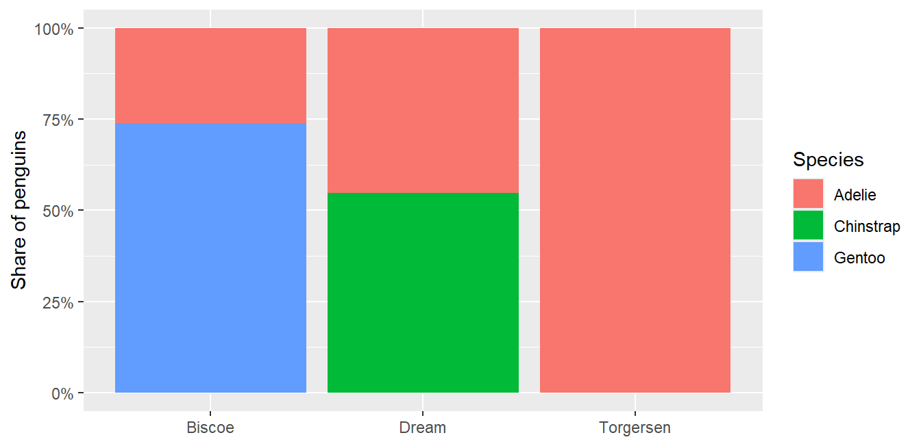
position = "fill" turns counts into shares, the most reliable composition chart:

Code
ggplot(penguins, aes(x = island, fill = species)) +
  geom_bar(position = "fill") +
  scale_y_continuous(labels = scales::percent) +
  labs(x = NULL, y = "Share of penguins", fill = "Species")

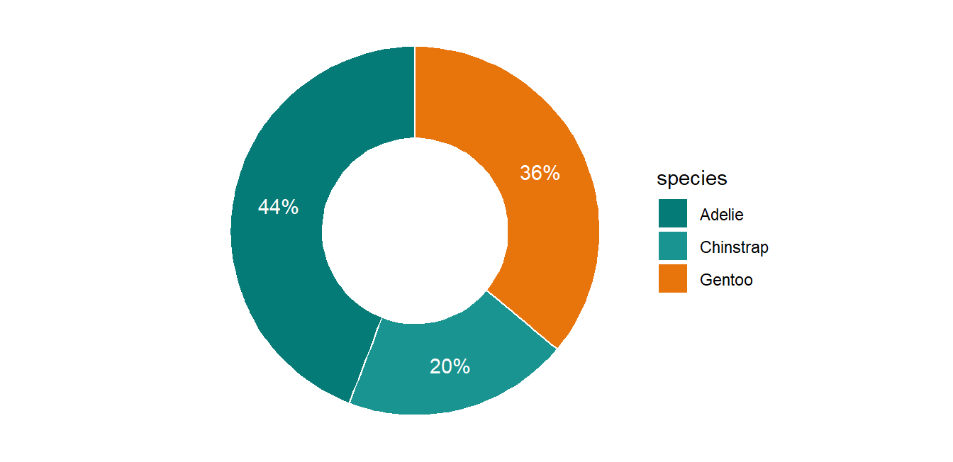
A donut is a pie with a hole; use it only for 2 to 4 categories and label the shares directly:

Code
peng_share <- penguins %>% count(species) %>% mutate(share = n / sum(n))
ggplot(peng_share, aes(x = 2, y = share, fill = species)) +
  geom_col(width = 1, color = "white") +
  geom_text(aes(label = scales::percent(share, accuracy = 1)),
            position = position_stack(vjust = .5), color = "white") +
  coord_polar(theta = "y") + xlim(0.5, 2.5) + theme_void() +
  scale_fill_manual(values = c("#047B77", "#1A9490", "#E8740C"))

A treemap (treemapify, optional extra) shows nested composition when there are many categories:

Code
# install.packages("treemapify")
library(treemapify)
penguins %>% count(island, species) %>%
  ggplot(aes(area = n, fill = species, label = species,
             subgroup = island)) +
  geom_treemap() + geom_treemap_subgroup_border(color = "white") +
  geom_treemap_text(color = "white", place = "centre") +
  geom_treemap_subgroup_text(color = "grey90", alpha = .5, place = "bottomleft")

A waffle chart ({waffle}, optional extra) shows shares as counted squares, intuitive for non-technical audiences:
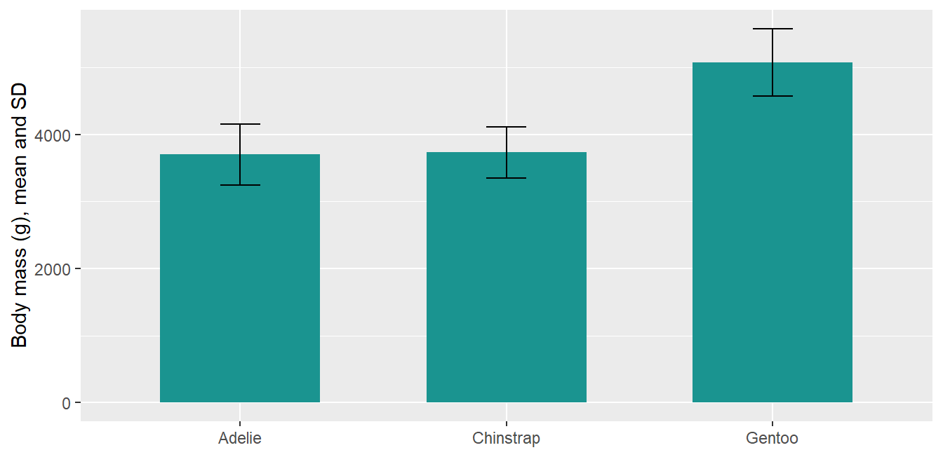
Code
# install.packages("waffle")
library(waffle)
penguins %>% count(species) %>%
  ggplot(aes(fill = species, values = n)) +
  geom_waffle(n_rows = 10, color = "white", make_proportional = TRUE) +
  coord_equal() + theme_void()

5. Change over time

Time series patterns

The examples use economics (US monthly economic data, built into ggplot2):

Code
ggplot(economics, aes(x = date, y = unemploy / 1000)) +
  geom_area(fill = "#CDEAE8", color = "#047B77") +
  labs(x = NULL, y = "Unemployed (millions)")

A slope chart compares two time points across groups; the slopes are the story:

Code
slope <- penguins %>% filter(year %in% c(2007, 2009)) %>%
  group_by(species, year) %>%
  summarize(flipper = mean(flipper_length_mm, na.rm = TRUE), .groups = "drop")
ggplot(slope, aes(x = factor(year), y = flipper,
                  group = species, color = species)) +
  geom_line(linewidth = 1.2) + geom_point(size = 3) +
  geom_text(data = filter(slope, year == 2009),
            aes(label = species), hjust = -.2) +
  scale_x_discrete(expand = expansion(mult = c(.1, .3))) +
  theme(legend.position = "none") +
  labs(x = NULL, y = "Mean flipper length (mm)")

Tiles over two time dimensions reveal seasonality (here: air passengers by month and year):

Code
data(AirPassengers)
ap <- data.frame(passengers = as.numeric(AirPassengers),
                 year = trunc(time(AirPassengers)),
                 month = factor(month.abb[cycle(AirPassengers)],
                                levels = month.abb))
ggplot(ap, aes(x = factor(year), y = month, fill = passengers)) +
  geom_tile(color = "white") +
  scale_fill_gradient(low = "#CDEAE8", high = "#047B77") +
  labs(x = NULL, y = NULL, fill = "Passengers")

6. Showing uncertainty

Means are not enough

Donor-grade figures show how certain an estimate is, not only its value:

Code
peng_sum <- penguins %>% filter(!is.na(body_mass_g)) %>%
  group_by(species) %>%
  summarize(mean = mean(body_mass_g), sd = sd(body_mass_g))
ggplot(peng_sum, aes(x = species, y = mean)) +
  geom_col(fill = "#1A9490", width = .6) +
  geom_errorbar(aes(ymin = mean - sd, ymax = mean + sd), width = .15) +
  labs(x = NULL, y = "Body mass (g), mean and SD")

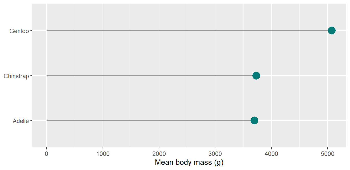
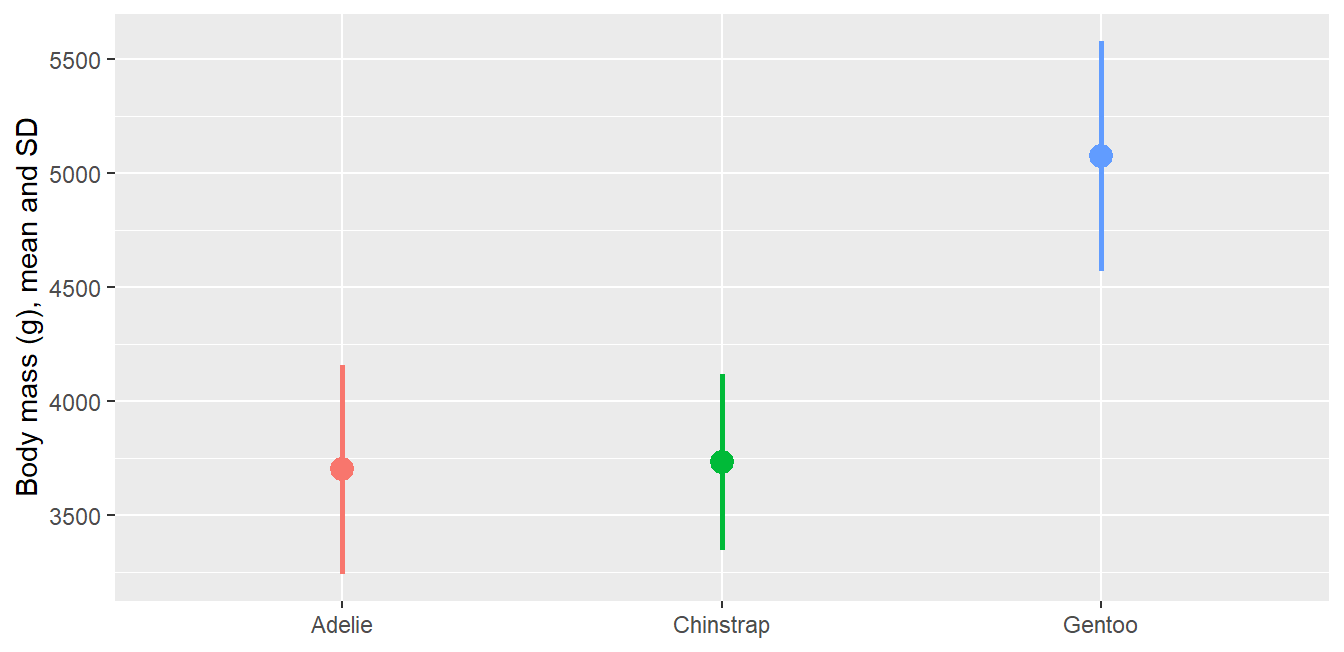
A pointrange is often clearer than bars with error bars, because the bar length itself carries no meaning for a mean:

Code
ggplot(peng_sum, aes(x = species, y = mean, color = species)) +
  geom_pointrange(aes(ymin = mean - sd, ymax = mean + sd),
                  linewidth = 1, size = .8) +
  theme(legend.position = "none") +
  labs(x = NULL, y = "Body mass (g), mean and SD")

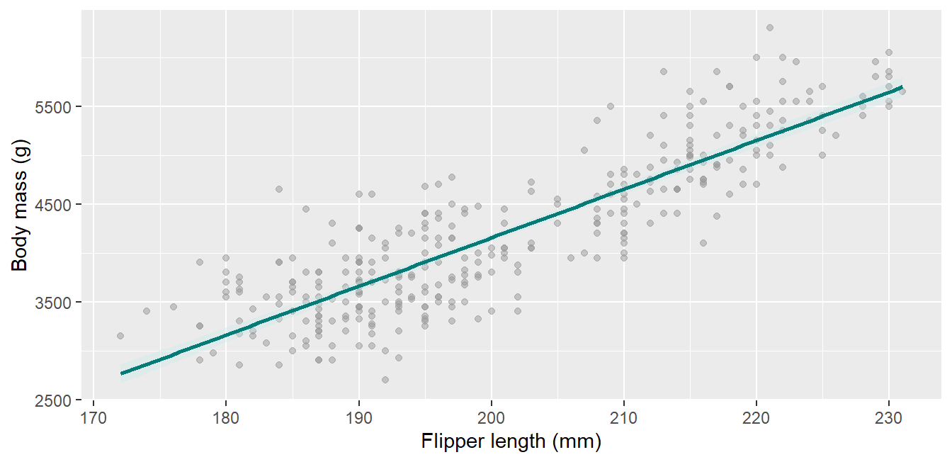
geom_smooth() draws the confidence ribbon around a fit by default; keep it visible:

Code
ggplot(penguins, aes(x = flipper_length_mm, y = body_mass_g)) +
  geom_point(color = "grey60", alpha = .5) +
  geom_smooth(method = "lm", color = "#047B77", fill = "#CDEAE8") +
  labs(x = "Flipper length (mm)", y = "Body mass (g)")

7. Highlighting and storytelling

Focus the reader on the finding

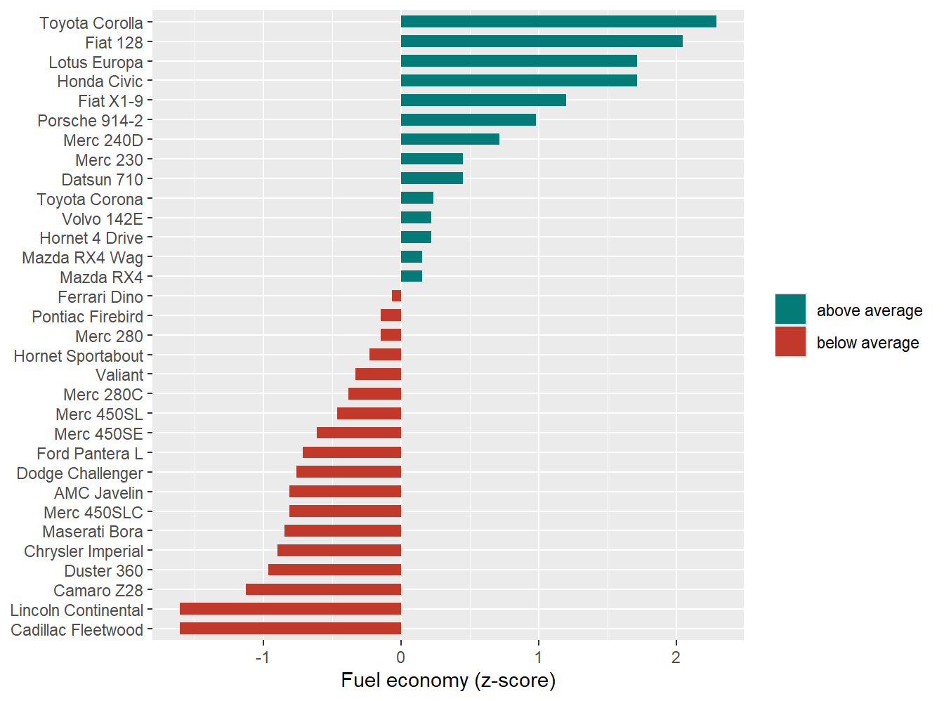
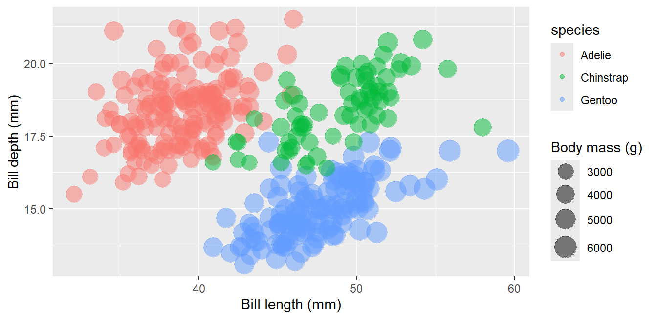
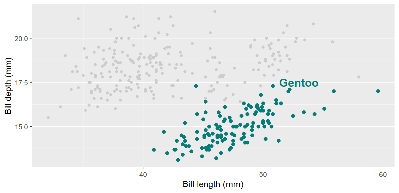
The single most effective trick in data storytelling: plot everything in grey, then add the group of interest in the accent color:

Code
ggplot(penguins, aes(x = bill_length_mm, y = bill_depth_mm)) +
  geom_point(color = "grey80") +
  geom_point(data = filter(penguins, species == "Gentoo"),
             color = "#047B77", size = 2) +
  annotate("text", x = 53, y = 17.5, label = "Gentoo",
           color = "#047B77", fontface = "bold", size = 5) +
  labs(x = "Bill length (mm)", y = "Bill depth (mm)")

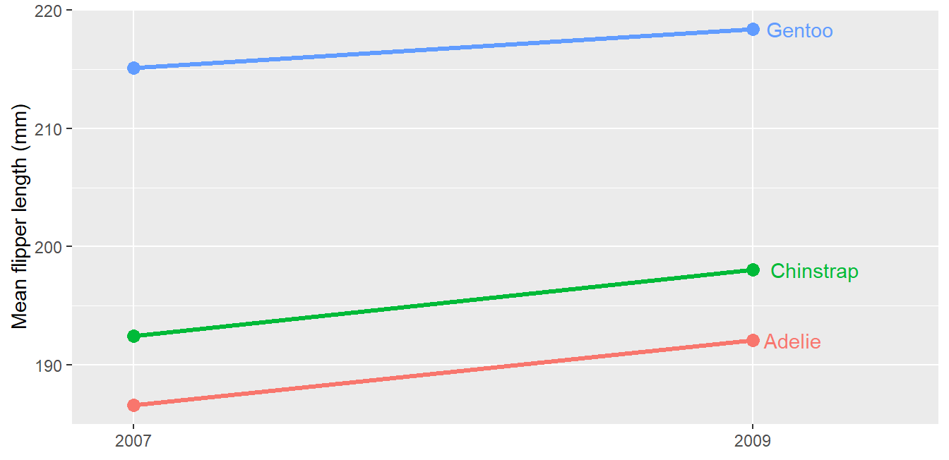
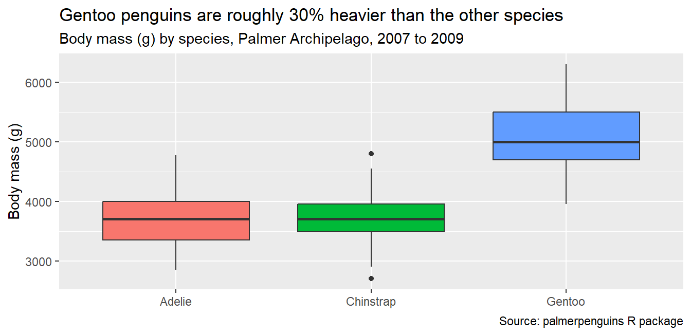
Write the takeaway in the title and keep the methodological description in the subtitle and caption:

Code
ggplot(penguins, aes(x = species, y = body_mass_g, fill = species)) +
  geom_boxplot() + theme(legend.position = "none") +
  labs(title = "Gentoo penguins are roughly 30% heavier than the other species",
       subtitle = "Body mass (g) by species, Palmer Archipelago, 2007 to 2009",
       caption = "Source: palmerpenguins R package",
       x = NULL, y = "Body mass (g)")

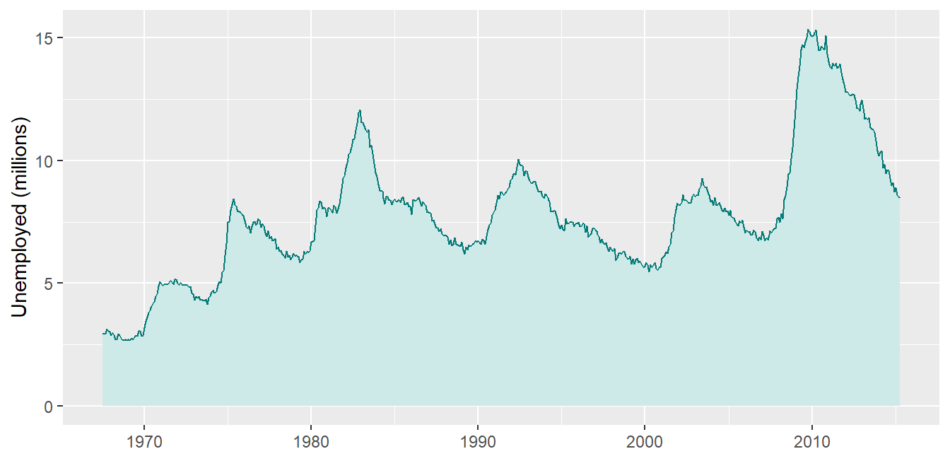
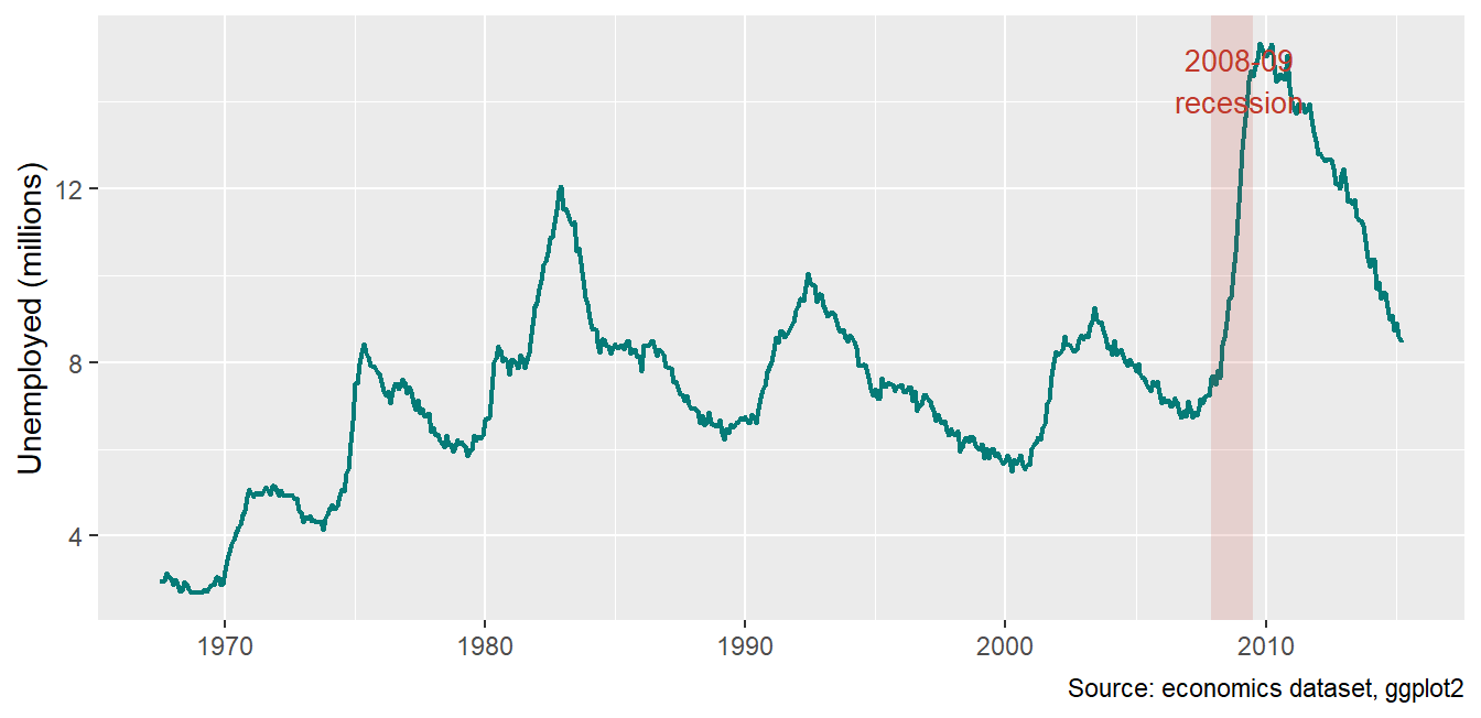
Use annotations to explain what the reader sees, right where they see it:

Code
ggplot(economics, aes(x = date, y = unemploy / 1000)) +
  geom_line(color = "#047B77", linewidth = .8) +
  annotate("rect", xmin = as.Date("2007-12-01"), xmax = as.Date("2009-06-30"),
           ymin = -Inf, ymax = Inf, alpha = .15, fill = "#C0392B") +
  annotate("text", x = as.Date("2009-01-01"), y = 14.5,
           label = "2008-09\nrecession", color = "#C0392B", size = 3.5) +
  labs(x = NULL, y = "Unemployed (millions)",
       caption = "Source: economics dataset, ggplot2")

8. Branding: a reusable C4ED theme

Build the theme once, use it everywhere

Code
c4ed_colors <- c("#047B77", "#E8740C", "#1A9490", "#C0392B", "#CDEAE8")

theme_c4ed <- function(base_size = 13) {
  theme_minimal(base_size = base_size) +
    theme(
      plot.title = element_text(face = "bold", color = "#047B77",
                                size = base_size * 1.25),
      plot.subtitle = element_text(color = "grey30"),
      plot.caption = element_text(color = "grey50", size = base_size * .7),
      plot.title.position = "plot",
      panel.grid.minor = element_blank(),
      axis.title = element_text(color = "grey30"),
      legend.position = "top"
    )
}

Save this in one .R file, source() it at the top of every script, and every figure in a report is branded and consistent by default.
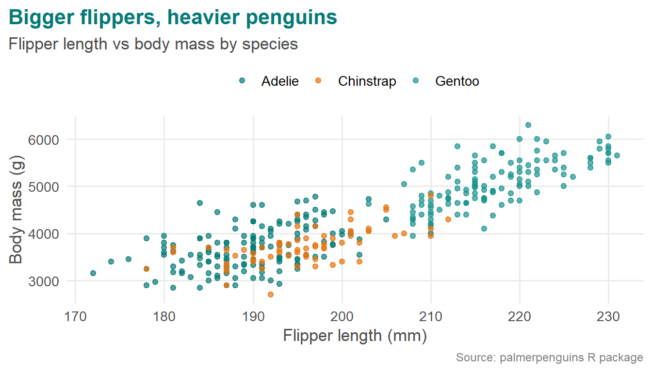
The theme in action

Code
ggplot(penguins, aes(x = flipper_length_mm, y = body_mass_g, color = species)) +
  geom_point(alpha = .7) +
  scale_color_manual(values = c4ed_colors) +
  theme_c4ed() +
  labs(title = "Bigger flippers, heavier penguins",
       subtitle = "Flipper length vs body mass by species",
       caption = "Source: palmerpenguins R package",
       x = "Flipper length (mm)", y = "Body mass (g)", color = NULL)

9. Going further

Maps

Choropleth and administrative-boundary maps use sf with geom_sf() (optional extras; boundary data downloads on first use):

Code
# install.packages(c("sf", "rnaturalearth", "rnaturalearthdata"))
library(sf)
library(rnaturalearth)
eth <- ne_states(country = "Ethiopia", returnclass = "sf")
ggplot(eth) +
  geom_sf(fill = "#CDEAE8", color = "#047B77", linewidth = .3) +
  theme_void() +
  labs(title = "Administrative regions of Ethiopia",
       caption = "Boundaries: Natural Earth")
  • Join your indicator to the boundary data by region name, then map it to fill for a choropleth.
  • Never map household-level GPS coordinates in outputs; aggregate to region or woreda level first.

Animation

gganimate (optional extra) turns any ggplot into an animation by adding a transition; useful for presentations, not for print:

Code
# install.packages(c("gganimate", "gifski"))
library(gganimate)
ggplot(economics, aes(x = date, y = unemploy / 1000)) +
  geom_line(color = "#047B77") +
  labs(x = NULL, y = "Unemployed (millions)") +
  transition_reveal(date)

From charts to products

  • Quarto reports and dashboards: the same ggplot2 code embeds in .qmd reports, slides (like this deck), and format: dashboard outputs.
  • Shiny: wrap plots in an interactive app when users need to filter and explore themselves.
  • Interactive charts (Part 1, Section 10): ggplotly(), ggiraph, highcharter, echarts4r for HTML outputs.
  • Combining figures: patchwork for multi-panel donor-report figures with shared legends (plot_layout(guides = "collect")).

Wrap-up: the expert’s checklist

Before any figure leaves your desk:

  1. Does the title state the finding, and does the caption cite the data source?
  2. Is this the right chart for the question (distribution, comparison, relationship, composition, time)?
  3. Is anything on the chart not earning its place (grid lines, legend, decimals, colors)?
  4. Are the colors meaningful, consistent with the brand, and colorblind-safe?
  5. Is uncertainty shown where the audience could otherwise over-read precision?
  6. Are axes honest (sensible ranges, no truncation that exaggerates)?
  7. Would the intended audience get the message in five seconds?

Thank you. The reference library and learning path are in Part 1, Section 12.