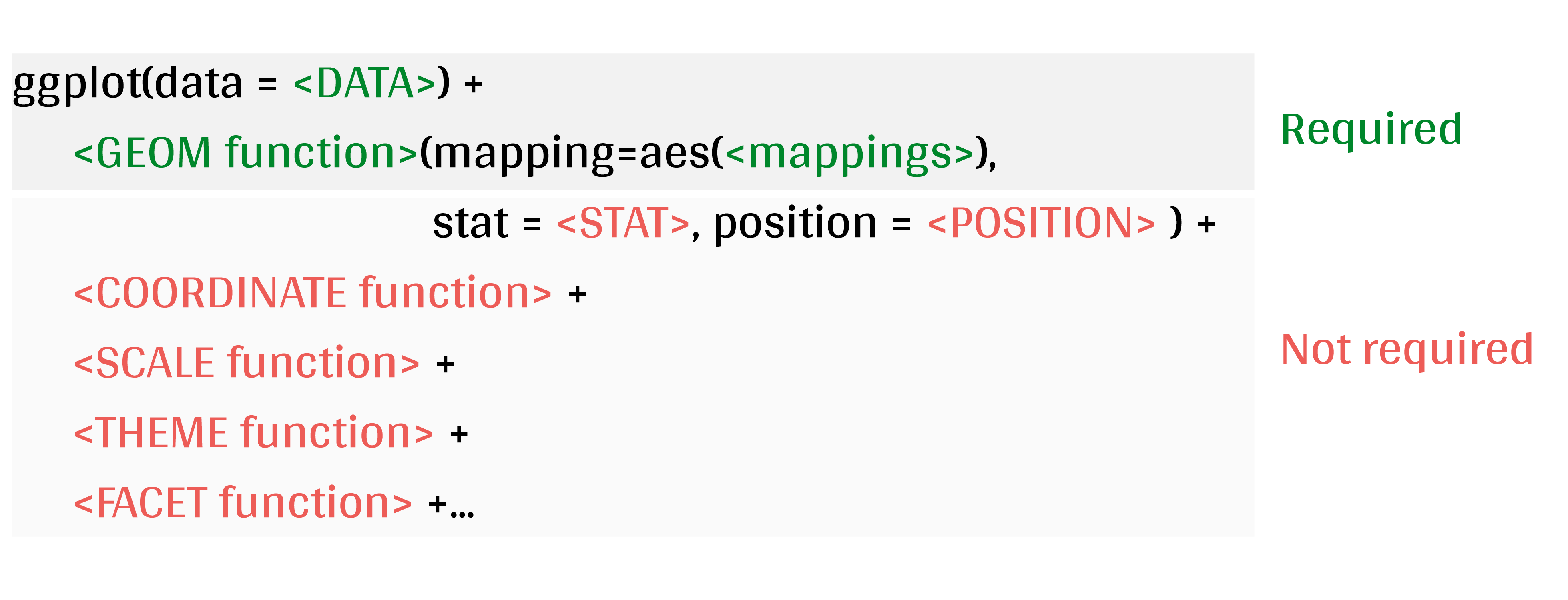
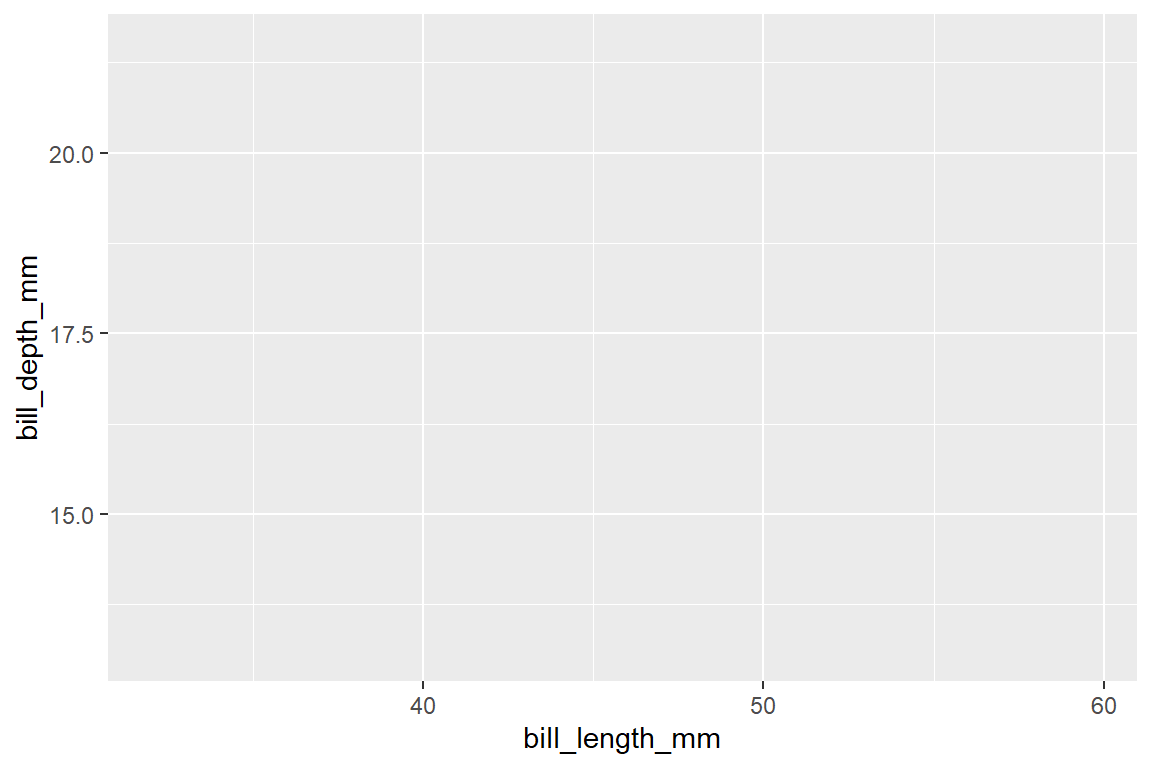
ggplot(data = penguins, aes(x = bill_length_mm, y = bill_depth_mm))
Code
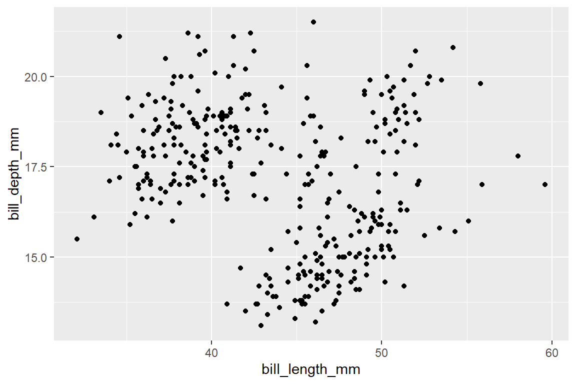
ggplot(data = penguins,aes(x = bill_length_mm, y = bill_depth_mm)) +geom_point()
Code
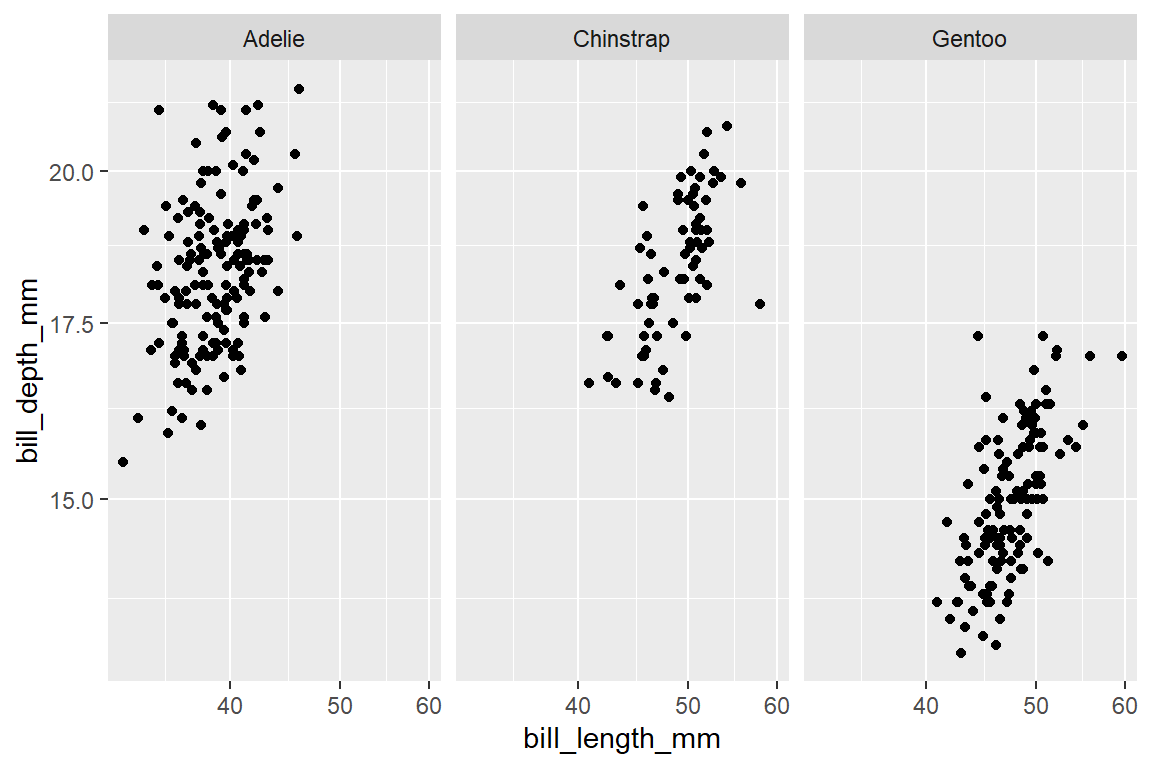
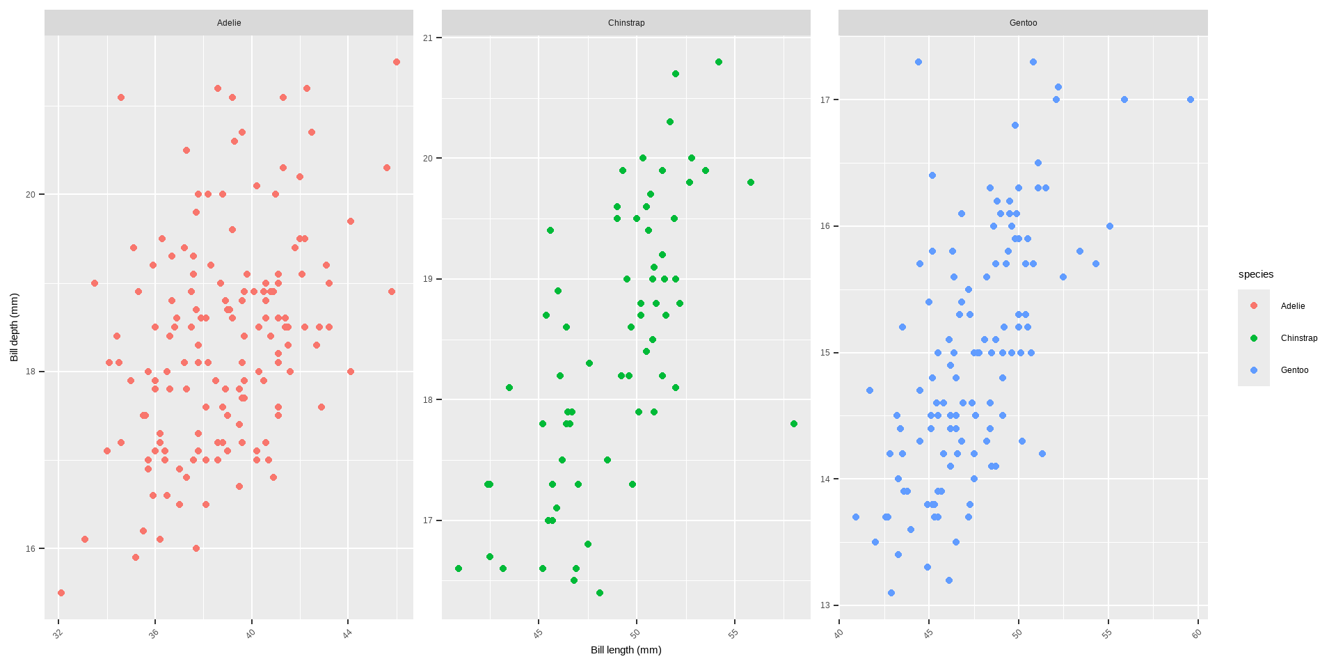
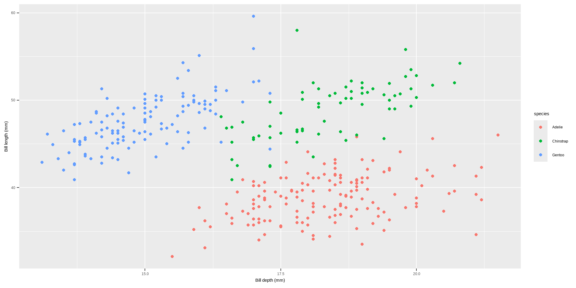
ggplot(data = penguins,aes(x = bill_length_mm, y = bill_depth_mm)) +geom_point() +facet_wrap(~species) +coord_trans(x ="log10", y ="log10")
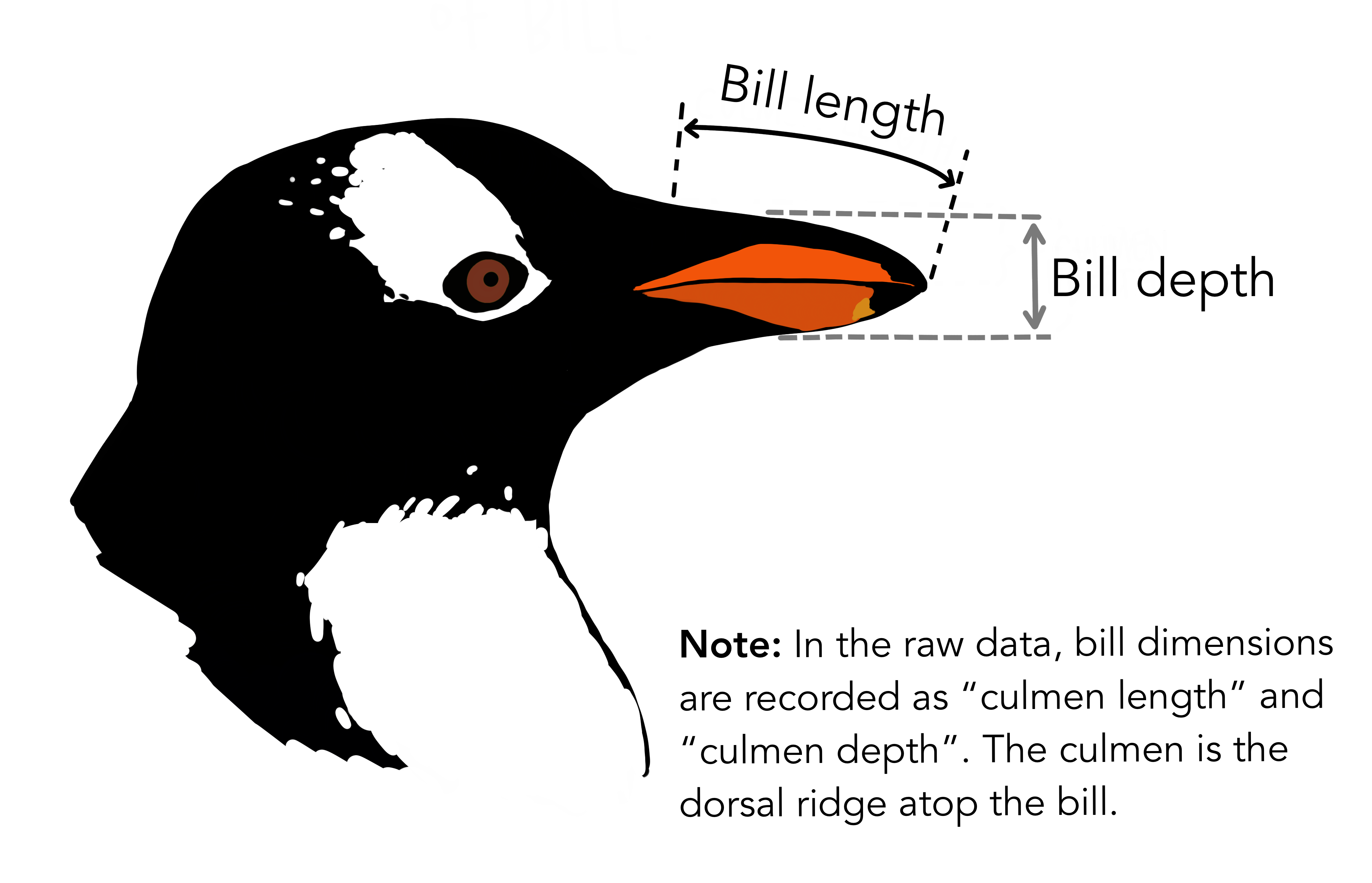
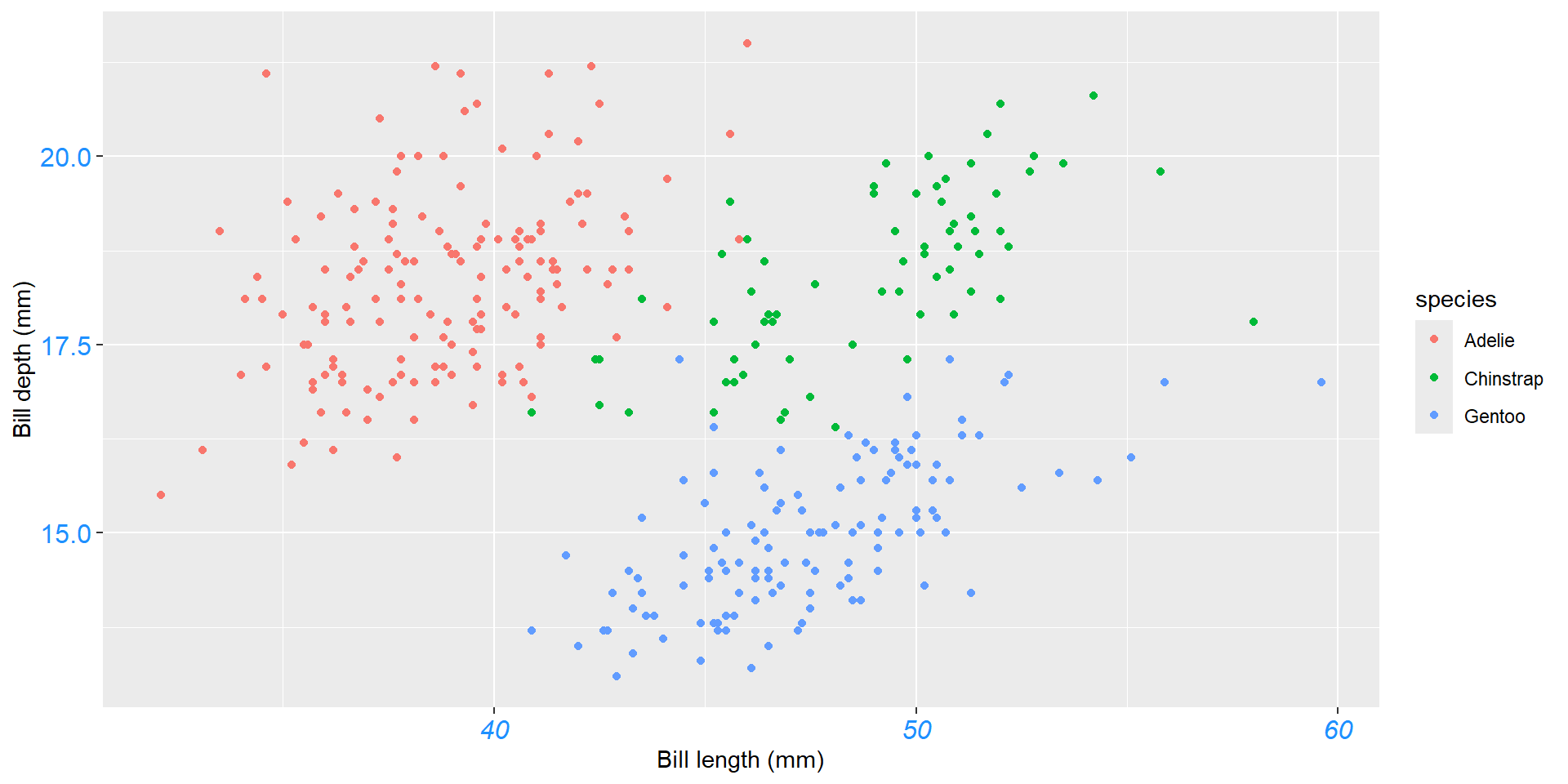
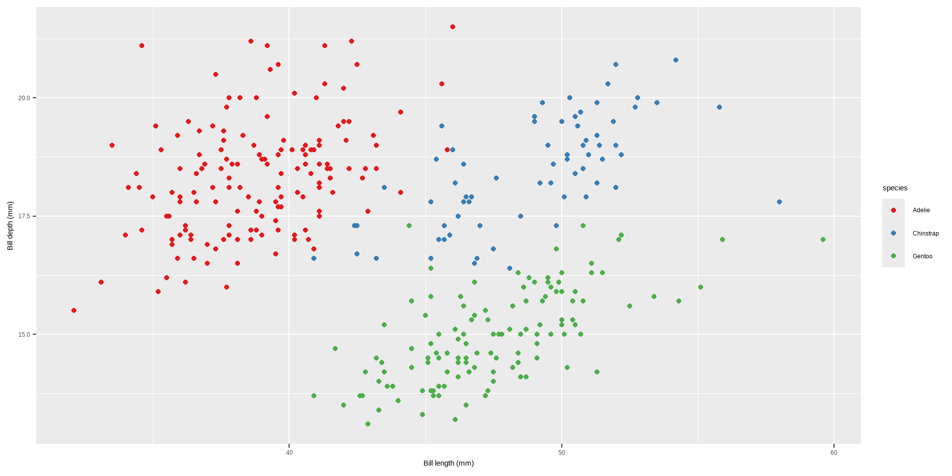
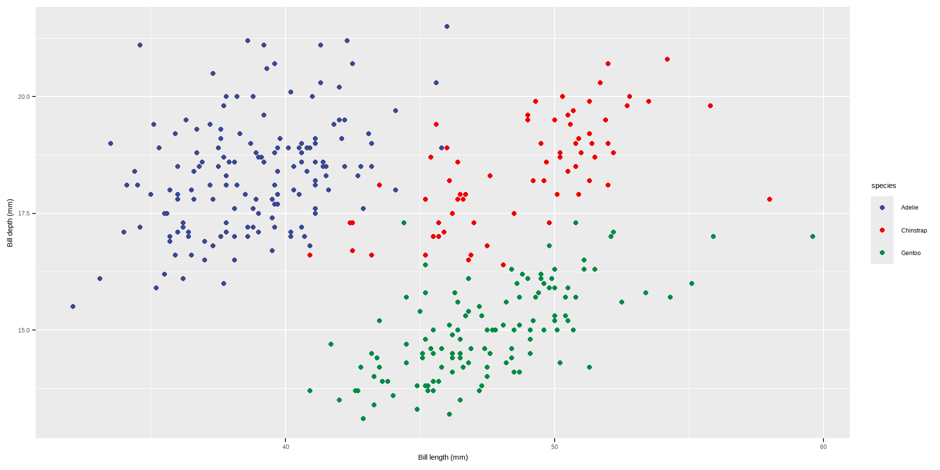
Let us explore how some of this data is structured by species:
Code
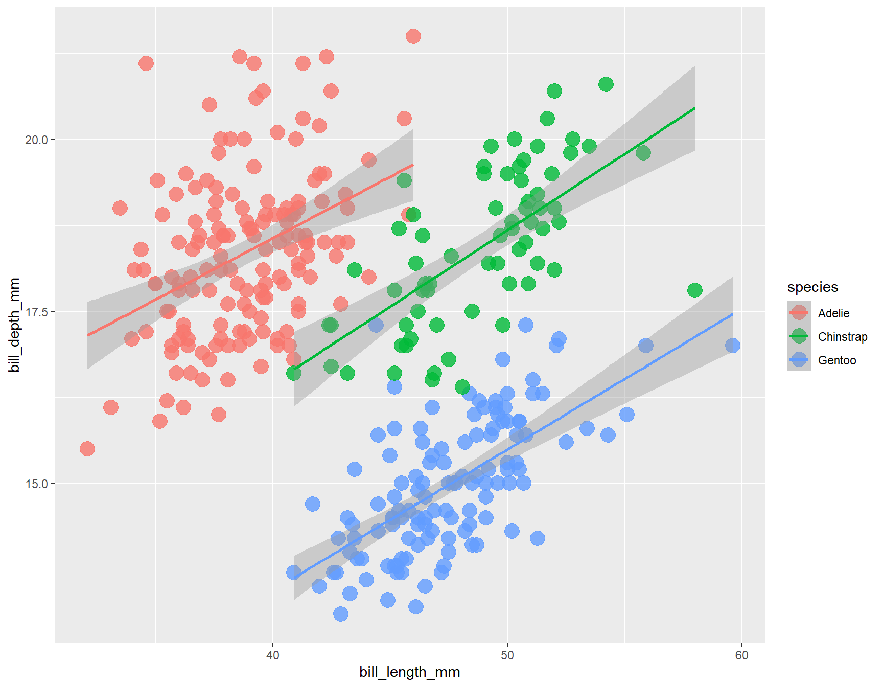
ggplot(data = penguins, # Dataaes(x = bill_length_mm, # Your X-valuey = bill_depth_mm, # Your Y-valuecol = species)) +# Aestheticsgeom_point(size =5, alpha =0.8) +# Pointgeom_smooth(method ="lm") # Linear regression
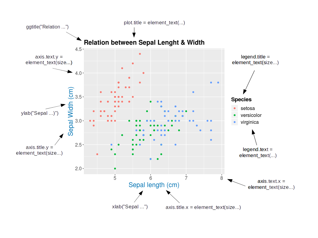
Customize Our Plot
Customizing plots involves adjusting various elements to enhance their readability, presentation, and informativeness.
Here are some key aspects you can customize:
Axes, Titles and Legends
Title and axes components: changing size, colour and face
Change Axis Titles
Axes, Titles and Legends
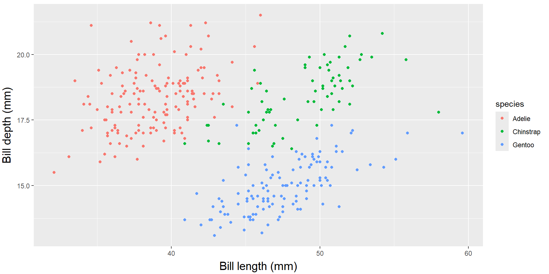
Customizing Axis Labels with labs()
labs(): This function is used to modify plot labels, including x-axis, y-axis, and plot title.
Code
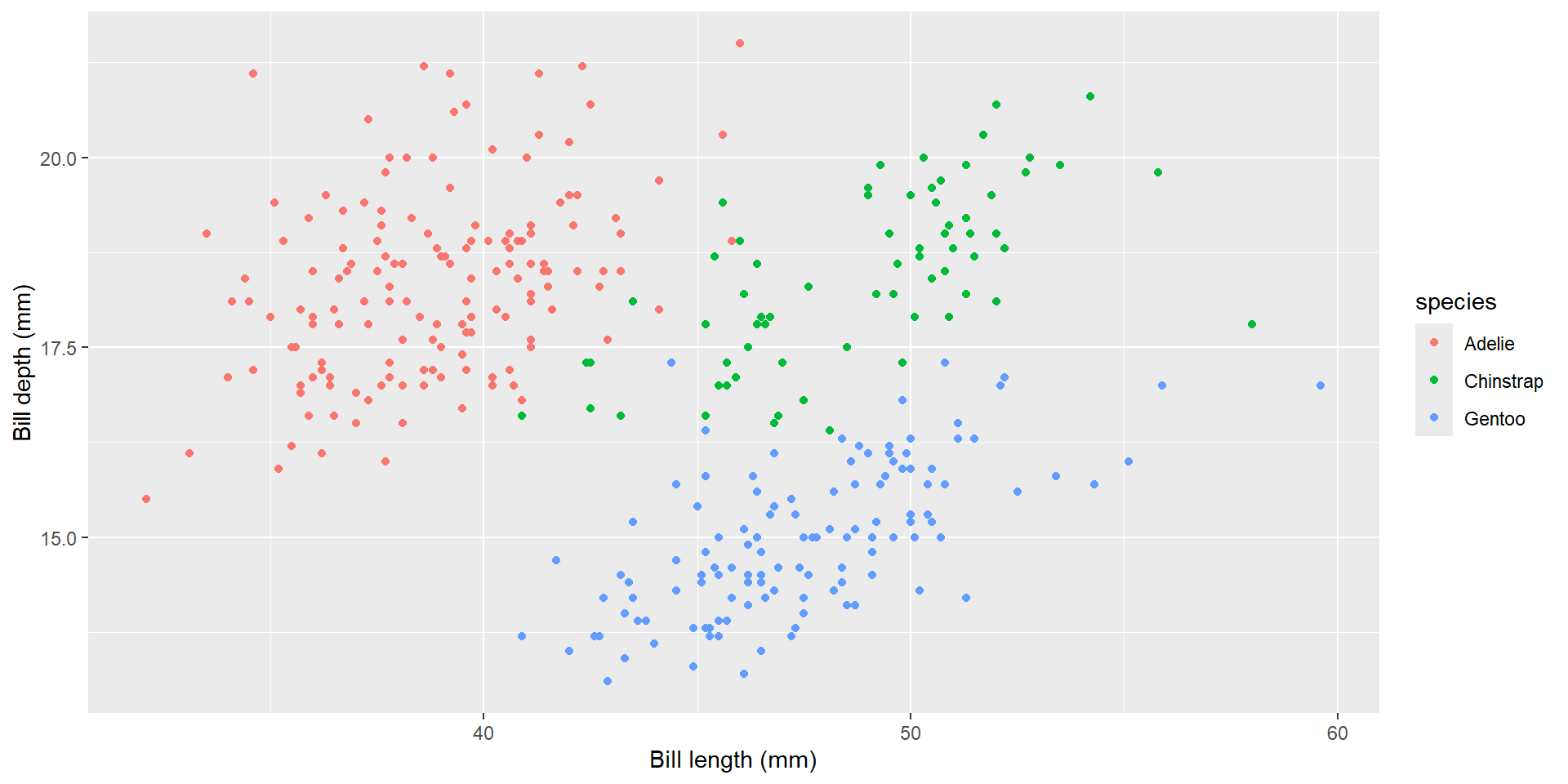
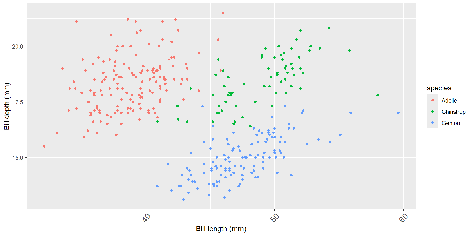
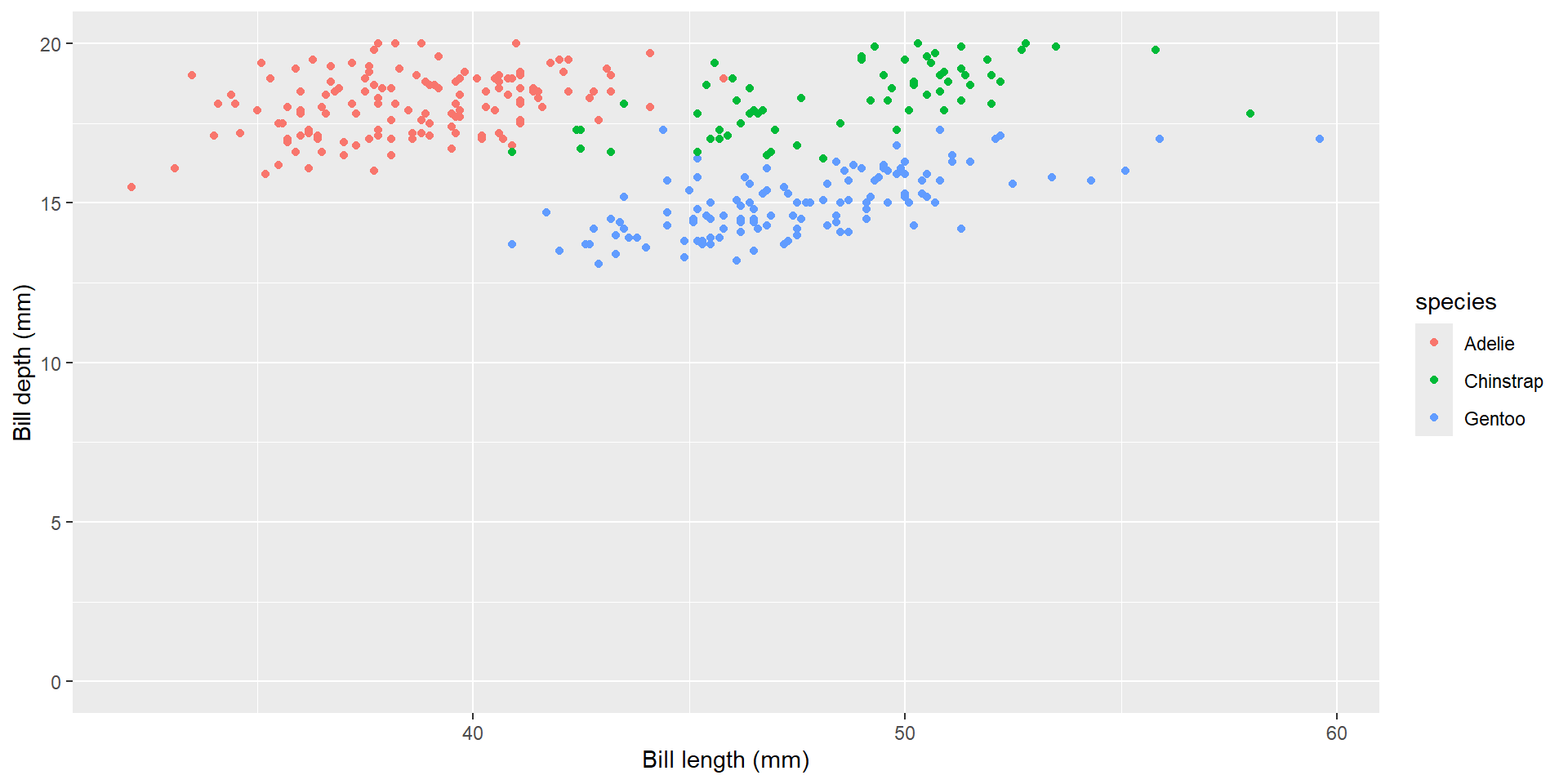
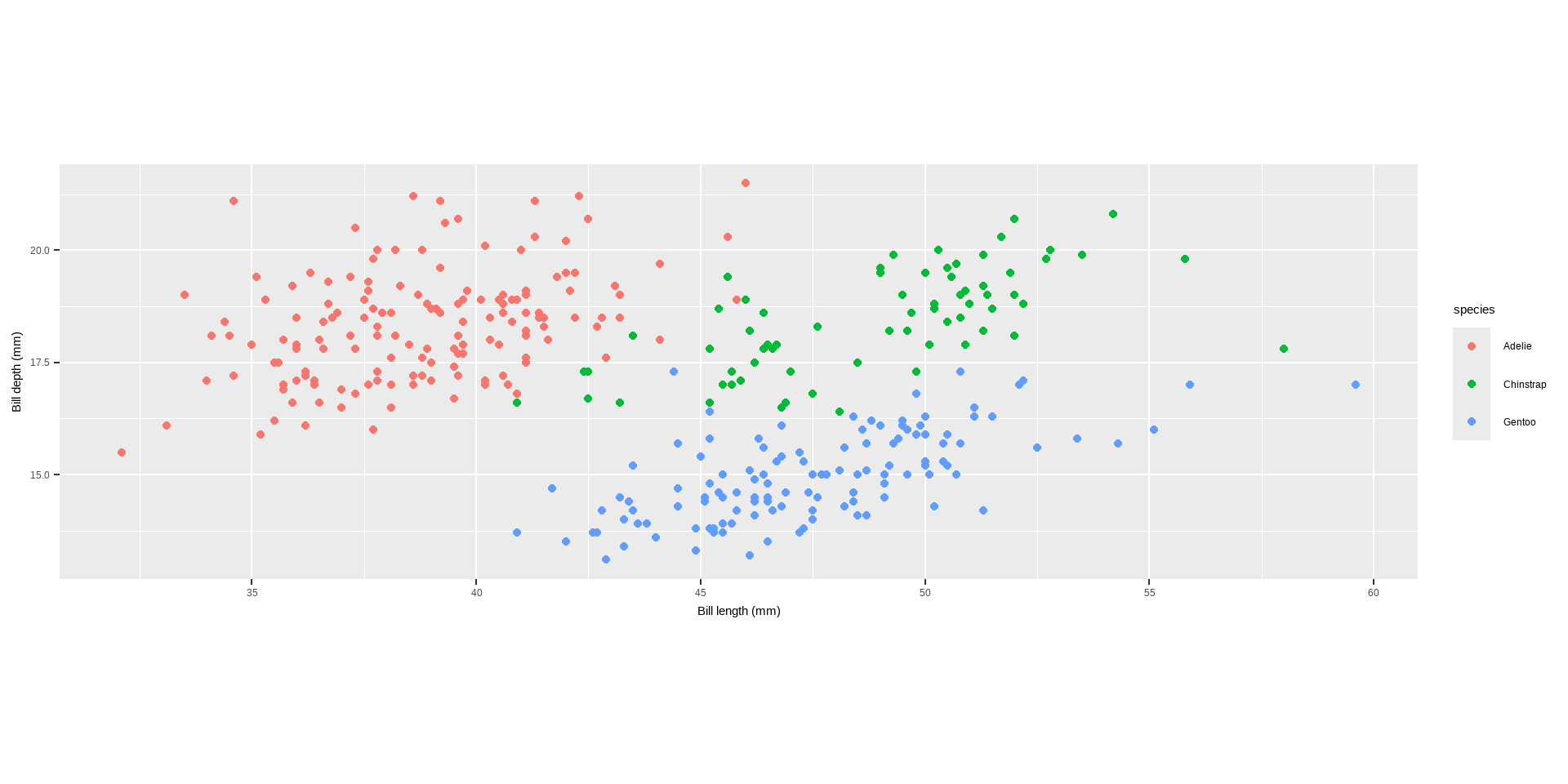
ggplot(data = penguins) +geom_point(aes( x = bill_length_mm, y = bill_depth_mm, color = species)) +labs(x ="Bill length (mm)", y ="Bill depth (mm)")
Axes, Titles and Legends
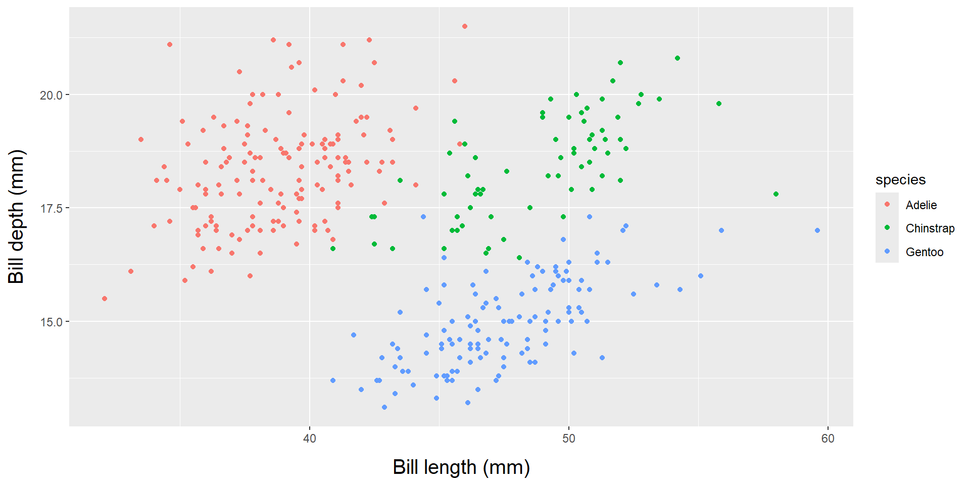
xlab() and ylab(): These functions specifically set the x-axis and y-axis labels, respectively.
Code
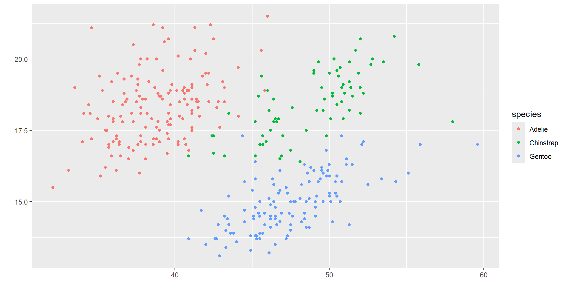
ggplot(data = penguins) +geom_point(aes( x = bill_length_mm, y = bill_depth_mm, color = species)) +xlab("Bill length (mm)")+ylab("Bill depth (mm)")
Axes, Titles and Legends
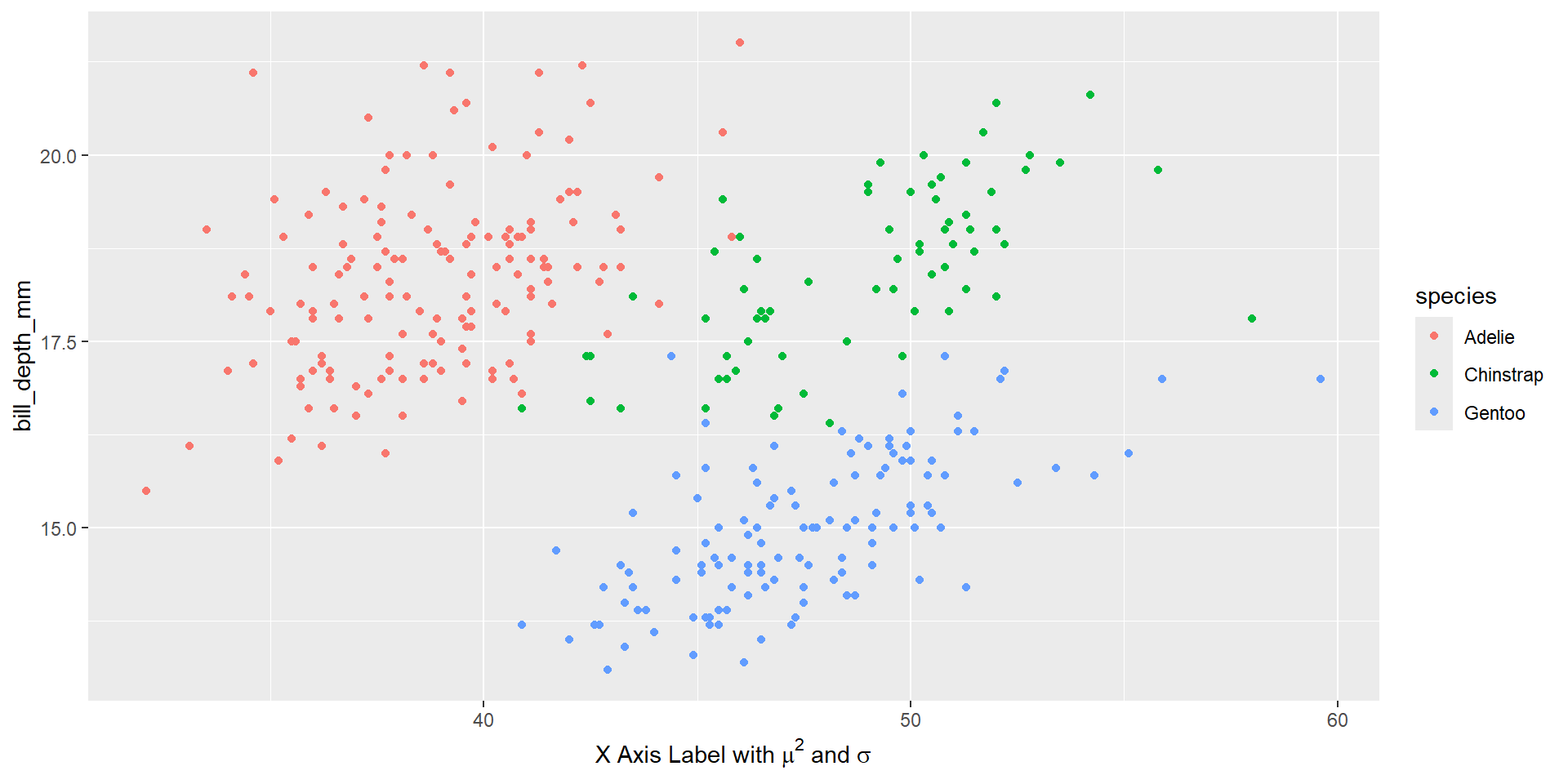
expression(): This function allows you to include mathematical expressions, special characters, and symbols in axis labels, such as Greek letters, superscripts, and subscripts.
Code
ggplot(data = penguins) +geom_point(aes( x = bill_length_mm, y = bill_depth_mm, color = species)) +labs(x =expression(paste("X Axis Label with ", mu^2, " and ", sigma)))
Axes, Titles and Legends
Increasing Space Between Axis and Axis Titles
element_text(): While primarily used in theme() for overall theme customization, element_text() can be used to specify text properties such as size, color, and font face for axis labels.
Code
ggplot(data = penguins) +geom_point(aes( x = bill_length_mm, y = bill_depth_mm, color = species)) +labs(x ="Bill length (mm)", y ="Bill depth (mm)")+theme(axis.title =element_text(size =15, face ="italic"))
Axes, Titles and Legends
To change vertical alignment using vjust which controls the vertical alignment, typically ranging between 0 and 1, but can extend beyond this range.
Code
ggplot(data = penguins) +geom_point(aes( x = bill_length_mm, y = bill_depth_mm, color = species)) +labs(x ="Bill length (mm)", y ="Bill depth (mm)")+theme(axis.title.x =element_text(vjust =0, size =15),axis.title.y =element_text(vjust =2, size =15))
Axes, Titles and Legends
To change the distance, you can specify the margin() function’s with parameters t and r which refer to top and right, respectively.
Code
ggplot(data = penguins) +geom_point(aes( x = bill_length_mm, y = bill_depth_mm, color = species)) +labs(x ="Bill length (mm)", y ="Bill depth (mm)")+theme(axis.title.x =element_text(margin =margin(t =10), size =15),axis.title.y =element_text(margin =margin(r =10), size =15))
Axes, Titles and Legends
To adjust the space on the y-axis, change the right margin, not the bottom margin.
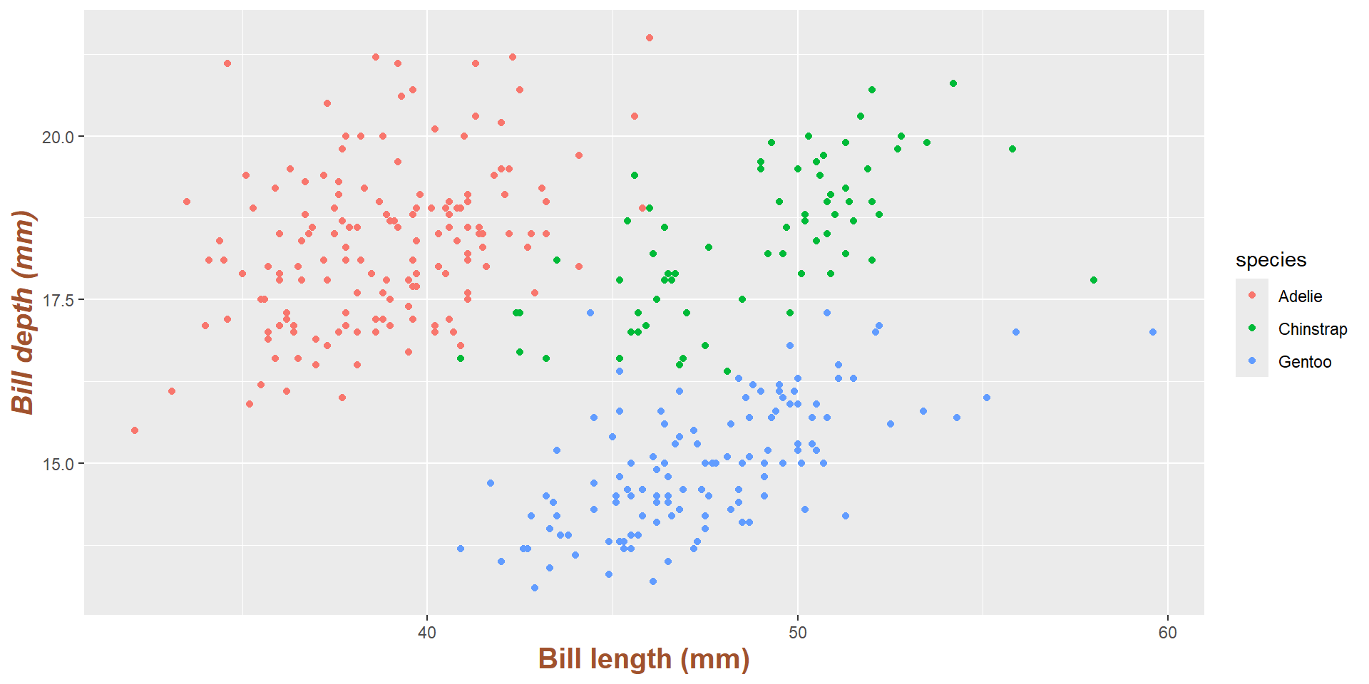
The face argument can be set to bold, italic, or bold.italic:
Code
ggplot(data = penguins) +geom_point(aes( x = bill_length_mm, y = bill_depth_mm, color = species)) +labs(x ="Bill length (mm)", y ="Bill depth (mm)")+theme(axis.title =element_text(color ="sienna", size =15, face ="bold"),axis.title.y =element_text(face ="bold.italic"))
Axes, Titles and Legends
axis.text can modify the appearance of axis text (numbers) and its sub-elements axis.text.x and axis.text.y:
Code
ggplot(data = penguins) +geom_point(aes( x = bill_length_mm, y = bill_depth_mm, color = species)) +labs(x ="Bill length (mm)", y ="Bill depth (mm)")+theme(axis.text =element_text(color ="dodgerblue", size =12),axis.text.x =element_text(face ="italic"))
Axes, Titles and Legends
angle, hjust and vjust can rotate any text element. hjust and vjust used to adjust the position horizontally (0 = left, 1 = right) and vertically (0 = top, 1 = bottom):
Code
ggplot(data = penguins) +geom_point(aes( x = bill_length_mm, y = bill_depth_mm, color = species)) +labs(x ="Bill length (mm)", y ="Bill depth (mm)")+theme(axis.text.x =element_text(angle =50, vjust =1, hjust =1, size =12))
Axes, Titles and Legends
element_blank() used to remove axis text and ticks,
Code
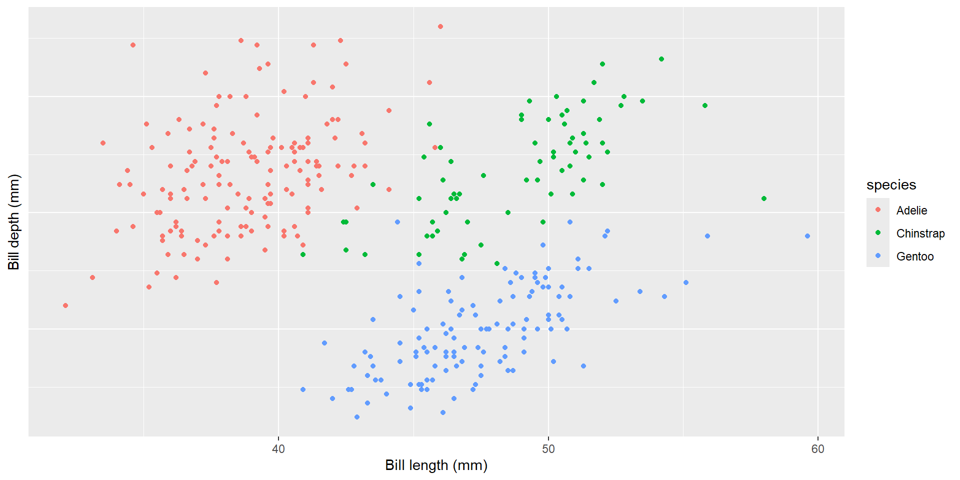
ggplot(data = penguins) +geom_point(aes( x = bill_length_mm, y = bill_depth_mm, color = species)) +labs(x ="Bill length (mm)", y ="Bill depth (mm)")+theme(axis.ticks.y =element_blank(), axis.text.y =element_blank())
Axes, Titles and Legends
The element_blank() function is used to remove an element entirely but to remove axis titles by setting them to NULL or empty quotes " " in the labs() function:
Code
ggplot(data = penguins) +geom_point(aes( x = bill_length_mm, y = bill_depth_mm, color = species)) +labs(x ="Bill length (mm)", y ="Bill depth (mm)")+labs(x =NULL, y ="")
💡 Using NULL removes the element, while empty quotes ” ” keep the space for the axis title but print nothing.
Axes, Titles and Legends
ylim() and xlim() functions are used to limiting axis range
Code
ggplot(data = penguins) +geom_point(aes( x = bill_length_mm, y = bill_depth_mm, color = species)) +labs(x ="Bill length (mm)", y ="Bill depth (mm)")+ylim(c(0, 20))
Alternatively, use scale_y_continuous(limits = c(0, 20)) or coord_cartesian(ylim = c(0, 20)). The former removes data points outside the range, while the latter adjusts the visible area without removing data points.
Axes, Titles and Legends
scale_x_continuous() and scale_y_continuous(): While primarily for scaling continuous axes, these functions can also adjust axis labels using name.
Code
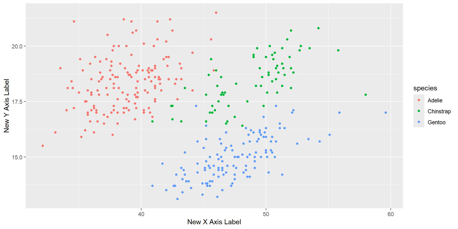
ggplot(data = penguins) +geom_point(aes( x = bill_length_mm, y = bill_depth_mm, color = species)) +scale_x_continuous(name ="New X Axis Label") +scale_y_continuous(name ="New Y Axis Label")
Adding Title
To customize titles in ggplot2, you can use a combination of ggtitle(), labs(), and theme() functions. Below is a list of the main functions and their key arguments for title customization:
Main Functions and Arguments
ggtitle(): used to label the text for the main title.
element_text(face, size, family, hjust, vjust, margin, lineheight): Control the font face, size, family, alignment, margin, and line height.
Adding Title
Code
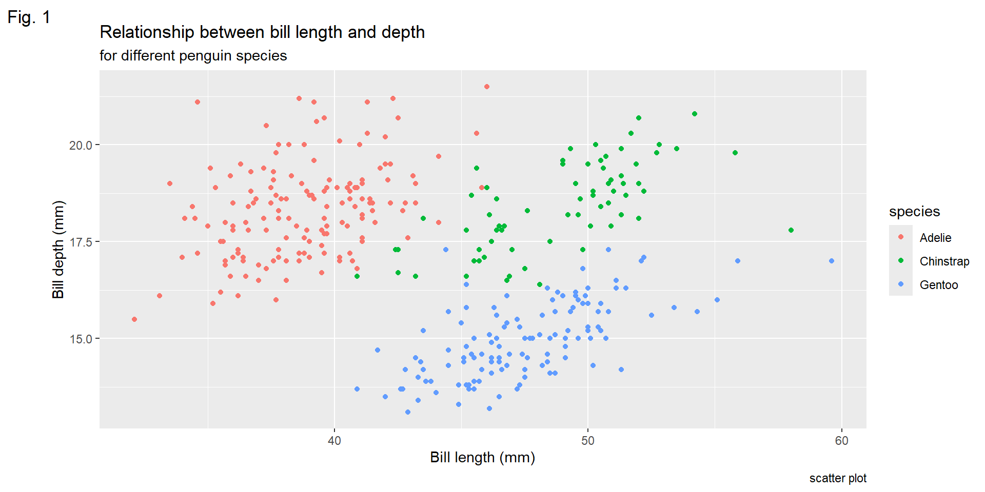
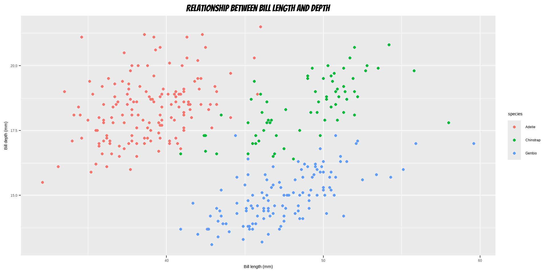
ggplot(data = penguins) +geom_point(aes( x = bill_length_mm, y = bill_depth_mm, color = species)) +labs(x ="Bill length (mm)", y ="Bill depth (mm)", title ="Relationship between bill length and depth", subtitle ="for different penguin species", caption ="scatter plot", tag ="Fig. 1")
Bold Title and Margin
Code
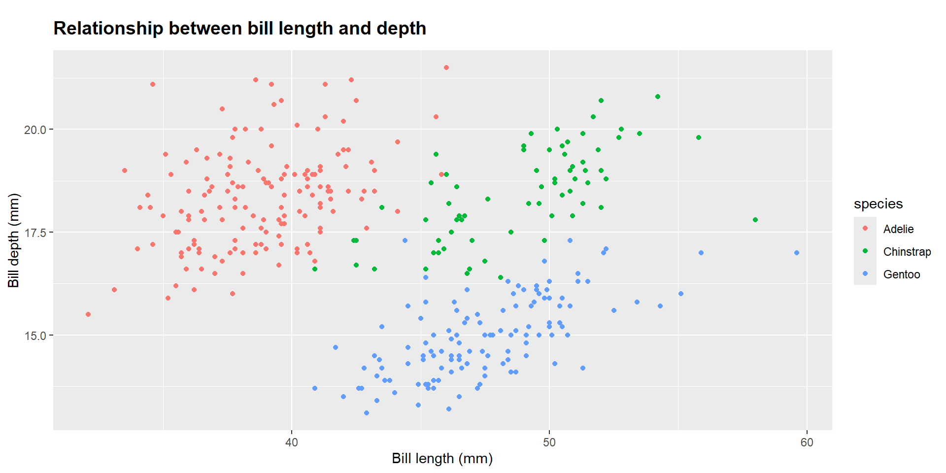
ggplot(data = penguins) +geom_point(aes( x = bill_length_mm, y = bill_depth_mm, color = species)) +labs(x ="Bill length (mm)", y ="Bill depth (mm)", title ="Relationship between bill length and depth")+theme(plot.title =element_text(face ="bold", margin =margin(10, 0, 10, 0), size =14))
Using Non-Traditional Fonts
Code
library(showtext) font_add_google("Playfair Display", "Playfair") font_add_google("Bangers", "Bangers") showtext_auto()ggplot(data = penguins) +geom_point(aes( x = bill_length_mm, y = bill_depth_mm, color = species)) +labs(x ="Bill length (mm)", y ="Bill depth (mm)", title ="Relationship between bill length and depth") +theme(plot.title =element_text(family ="Bangers", hjust =0.5, size =25),plot.subtitle =element_text(family ="Playfair", hjust =0.5, size =15))
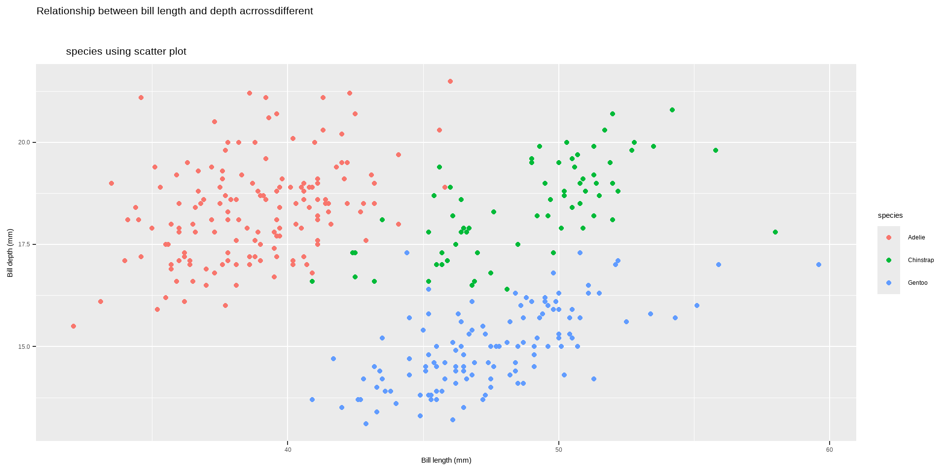
Changing Line Height in Multi-Line Text
Code
ggplot(data = penguins) +geom_point(aes( x = bill_length_mm, y = bill_depth_mm, color = species)) +labs(x ="Bill length (mm)", y ="Bill depth (mm)")+ggtitle("Relationship between bill length and depth acrrossdifferent \n species using scatter plot") +theme(plot.title =element_text(lineheight =0.8, size =16))
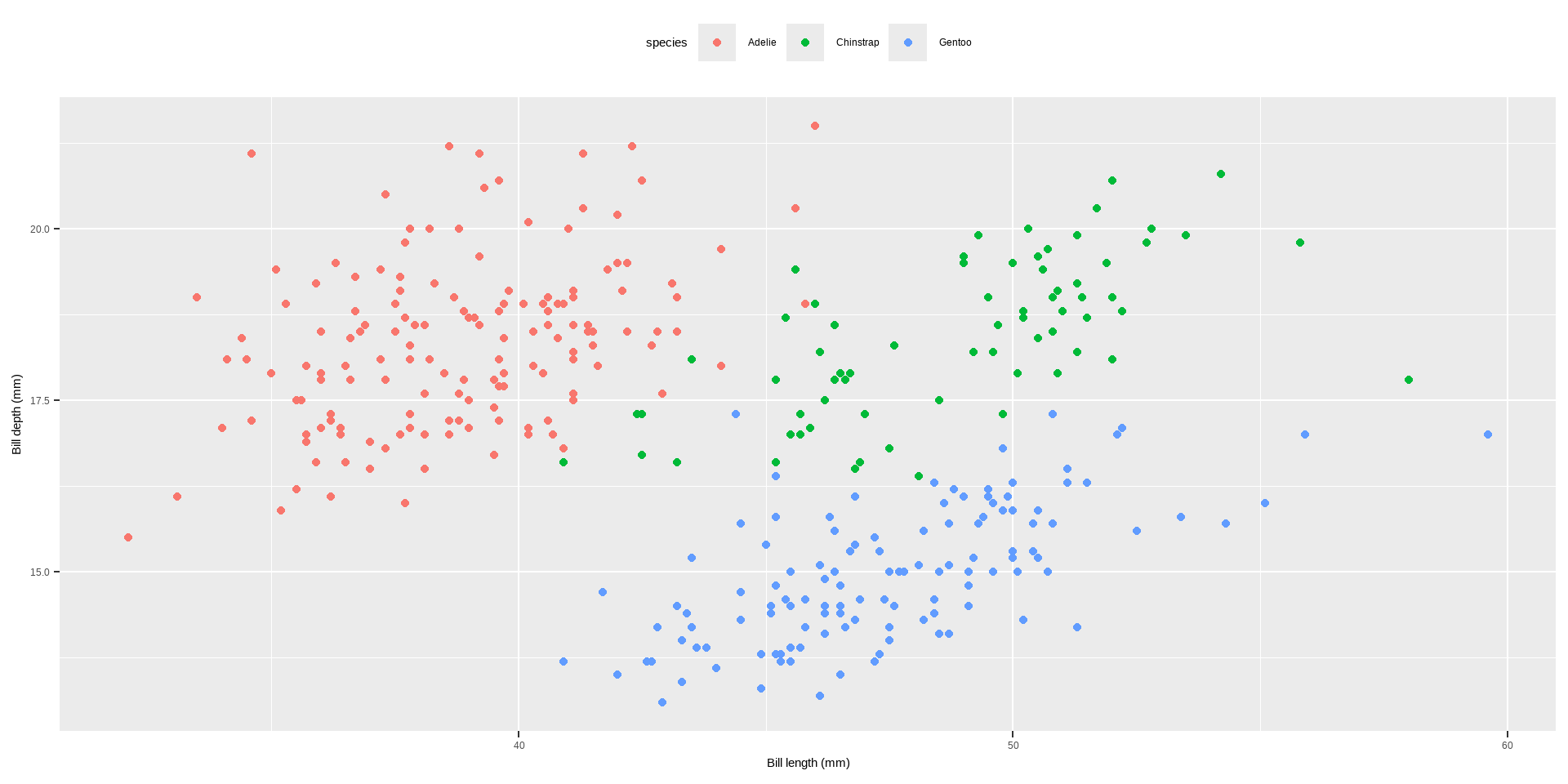
Legends
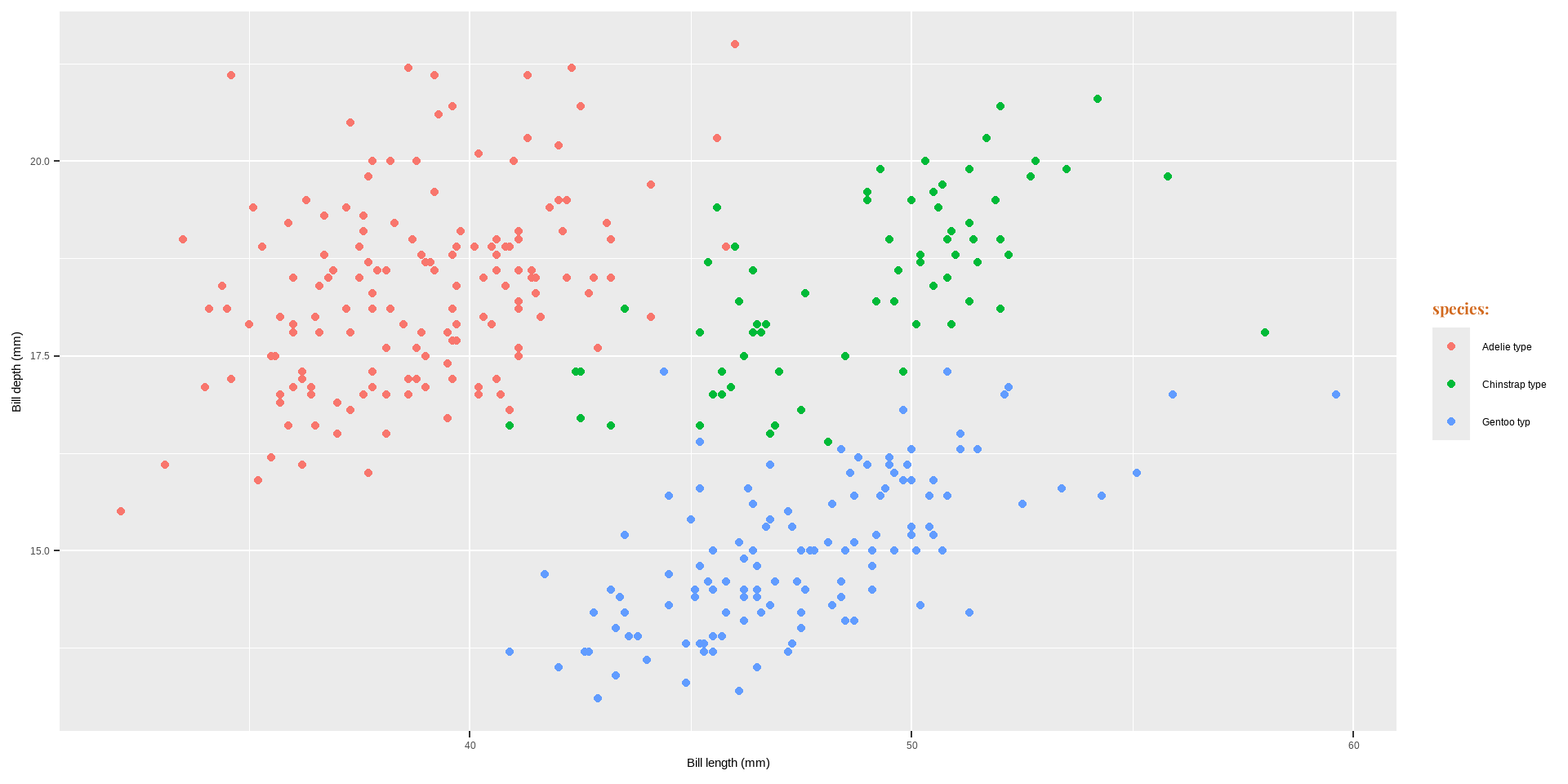
One nice thing about ggplot2 is that it adds a legend by default when mapping a variable to an aesthetic. You can see that by default the legend title is what we specified in the color argument:
Code
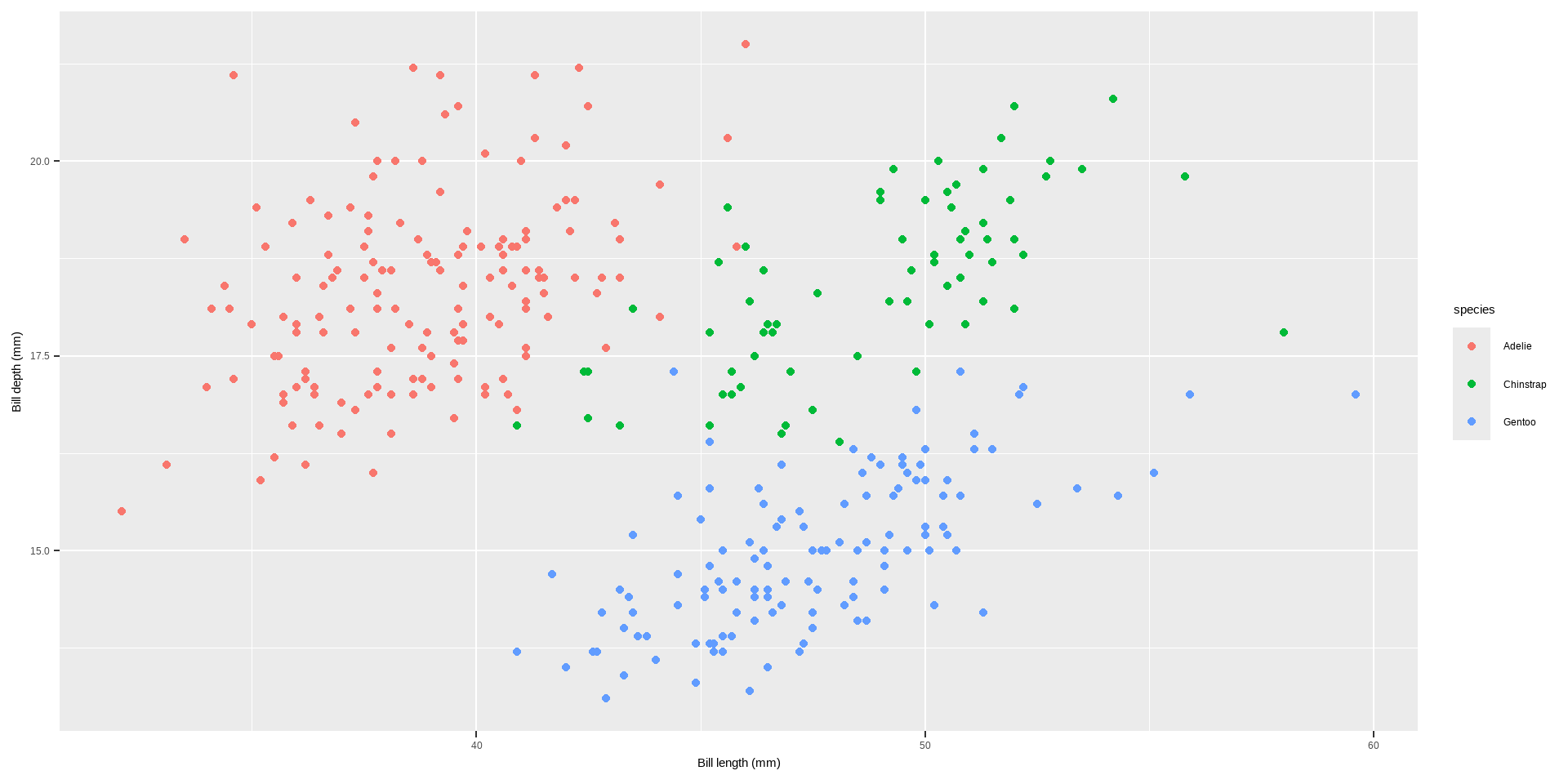
ggplot(data = penguins) +geom_point(aes( x = bill_length_mm, y = bill_depth_mm, color = species)) +labs(x ="Bill length (mm)", y ="Bill depth (mm)")
Legends
The main functions and methods to customize legends in ggplot2:
To Turn Off the Legend: we can use the following code
theme(legend.position = "none")
guides(color = "none")
scale_color_discrete(guide = "none")
Code
ggplot(data = penguins) +geom_point(aes( x = bill_length_mm, y = bill_depth_mm, color = species)) +labs(x ="Bill length (mm)", y ="Bill depth (mm)")+theme(legend.position ="none")
Legends
Code
ggplot(data = penguins) +geom_point(aes( x = bill_length_mm, y = bill_depth_mm, color = species)) +labs(x ="Bill length (mm)", y ="Bill depth (mm)")+guides(color ="none")
To Remove Legend Titles
theme(legend.title = element_blank())
scale_color_discrete(name = NULL)
labs(color = NULL
Code
ggplot(data = penguins) +geom_point(aes( x = bill_length_mm, y = bill_depth_mm, color = species)) +labs(x ="Bill length (mm)", y ="Bill depth (mm)")+theme(legend.title =element_blank())
To Remove Legend Titles
💁You can achieve the same by setting the legend name to NULL, either via scale_color_discrete(name = NULL) or labs(color = NULL). Expand to see examples.
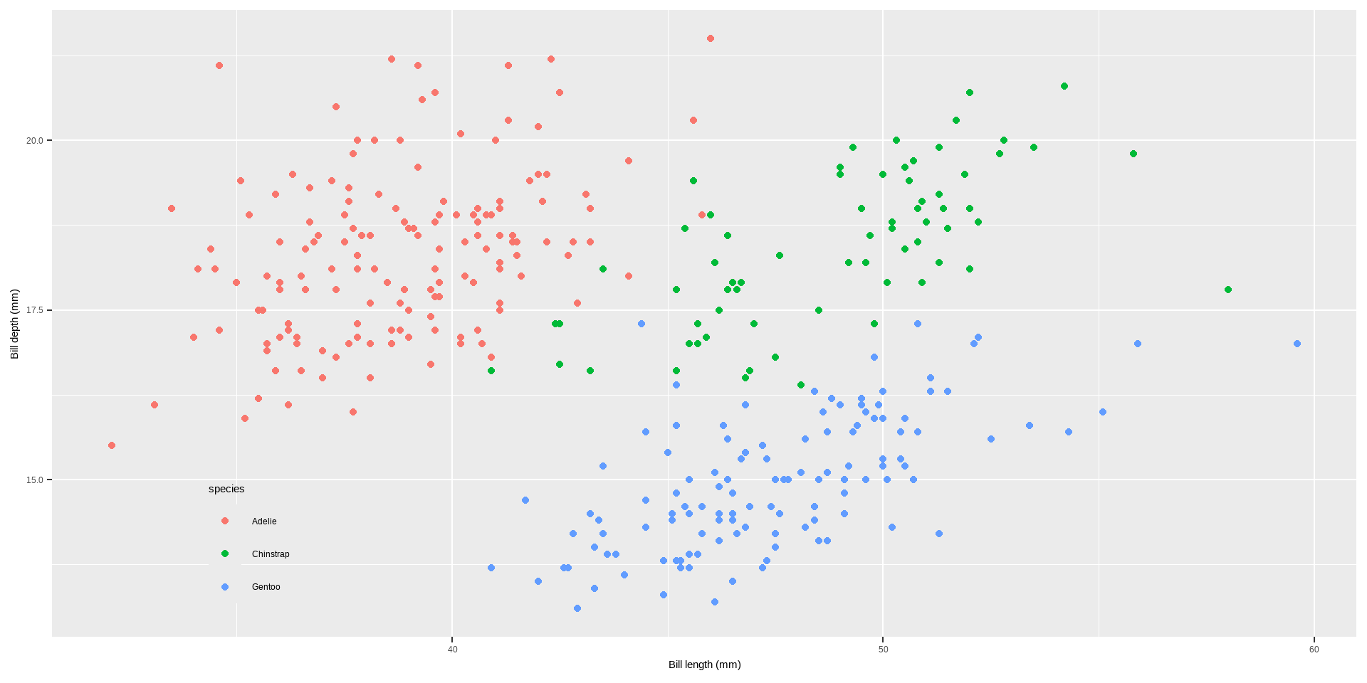
Change Legend Position
theme(legend.position = "top")
theme(legend.position = c(x, y), legend.background = element_rect(fill = "transparent")) to add legend inside the plot
Code
ggplot(data = penguins) +geom_point(aes( x = bill_length_mm, y = bill_depth_mm, color = species)) +labs(x ="Bill length (mm)", y ="Bill depth (mm)")+theme(legend.position ="top")
To Remove Legend Titles
Code
ggplot(data = penguins) +geom_point(aes( x = bill_length_mm, y = bill_depth_mm, color = species)) +labs(x ="Bill length (mm)", y ="Bill depth (mm)")+theme(legend.position =c(.15, .15), legend.background =element_rect(fill ="transparent"))
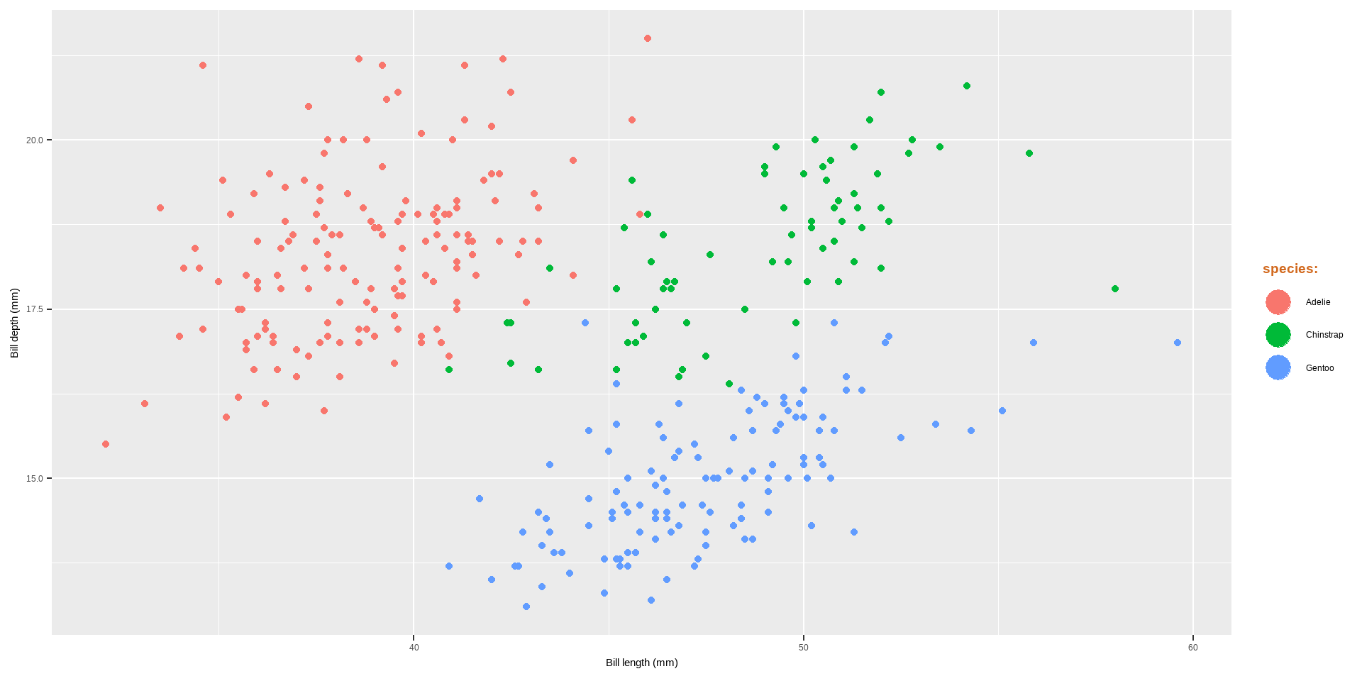
ggplot(data = penguins) +geom_point(aes( x = bill_length_mm, y = bill_depth_mm, color = species)) +labs(x ="Bill length (mm)", y ="Bill depth (mm)")+theme(legend.title =element_text(family ="Playfair", color ="chocolate", size =14, face ="bold"))
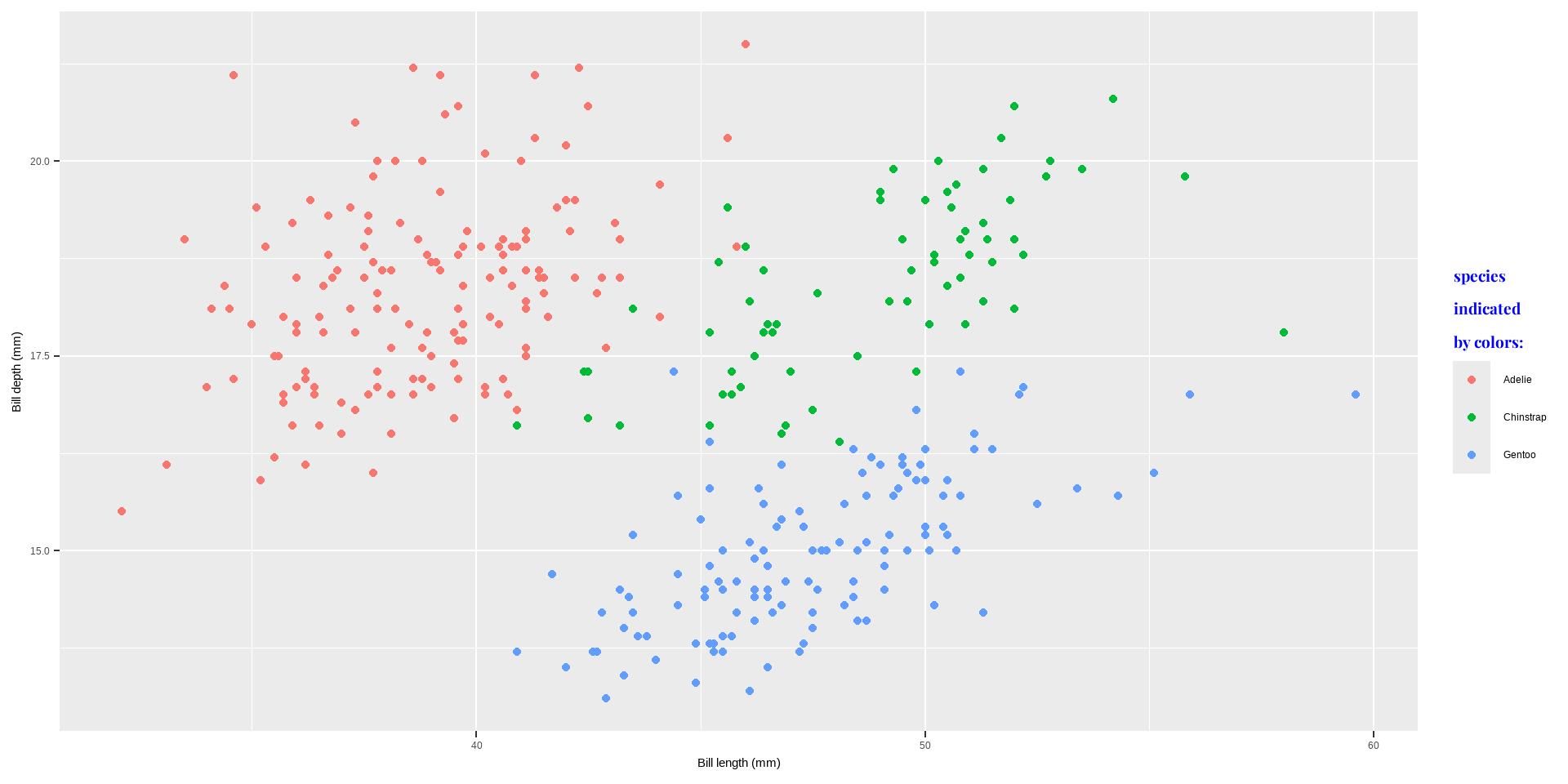
Change Legend Title
labs(color = "new title")
scale_color_discrete(name = "new title")
guides(color = guide_legend("new title"))
Code
ggplot(data = penguins) +geom_point(aes( x = bill_length_mm, y = bill_depth_mm, color = species)) +labs(x ="Bill length (mm)", y ="Bill depth (mm)", color ="species\nindicated\nby colors:") +theme(legend.title =element_text(family ="Playfair", color ="blue", size =14, face ="bold"))
The predefined theme takes two arguments for the base font size (base_size) and font family (base_family).
base_size input is a number, and base_family is a string (e.g. “serif”, “sans”, “mono”).
In addition, ggthemes pacakge offers additional predefined themes.
We will start with 8 predefined themes provided by ggplot2:
plot+theme_gray()
plot+theme_bw()
plot+theme_linedraw()
plot+theme_light()
plot + theme_dark()
plot + theme_minimal()
plot + theme_classic()
plot + theme_void()
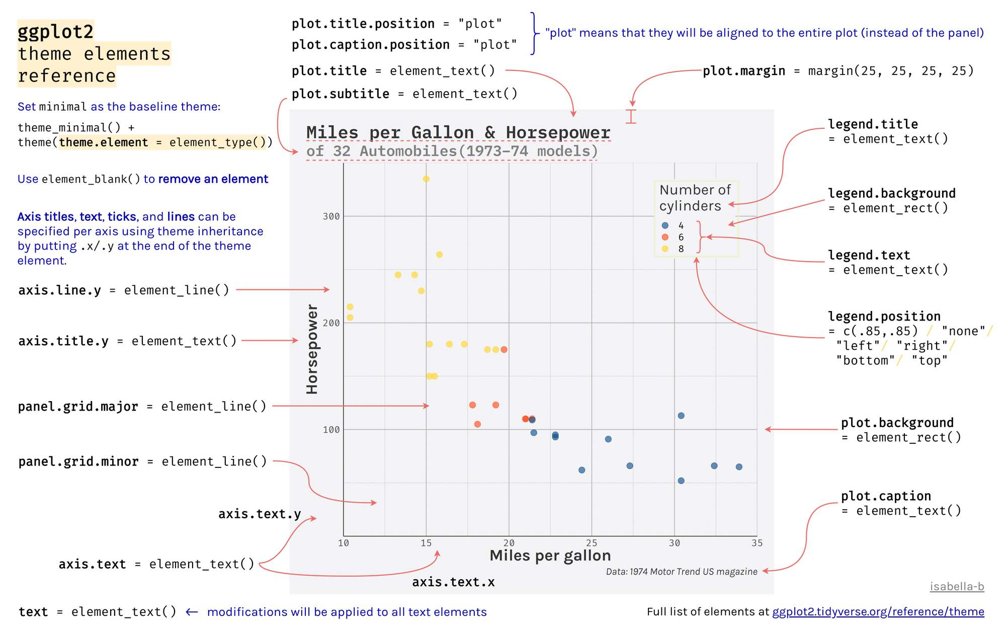
theme
theme() has many arguments to control and modify individual components of a plot theme, including:
all line, rectangular, text and title elements
aspect ratio of the panel
axis title, text, ticks, and lines
legend background, margin, text, title, position, and more
panel aspect ratio, border, and grid lines
Backgrounds & Grid Lines
The main functions to customize the background of the plot in the provided code and explanation involve modifying elements of the theme function in ggplot2. Here are the key functions and elements used:
Changing the Panel Background Color
The panel background refers to the area where the data is plotted.
panel.background: Adjusts the background color and outline of the panel area.
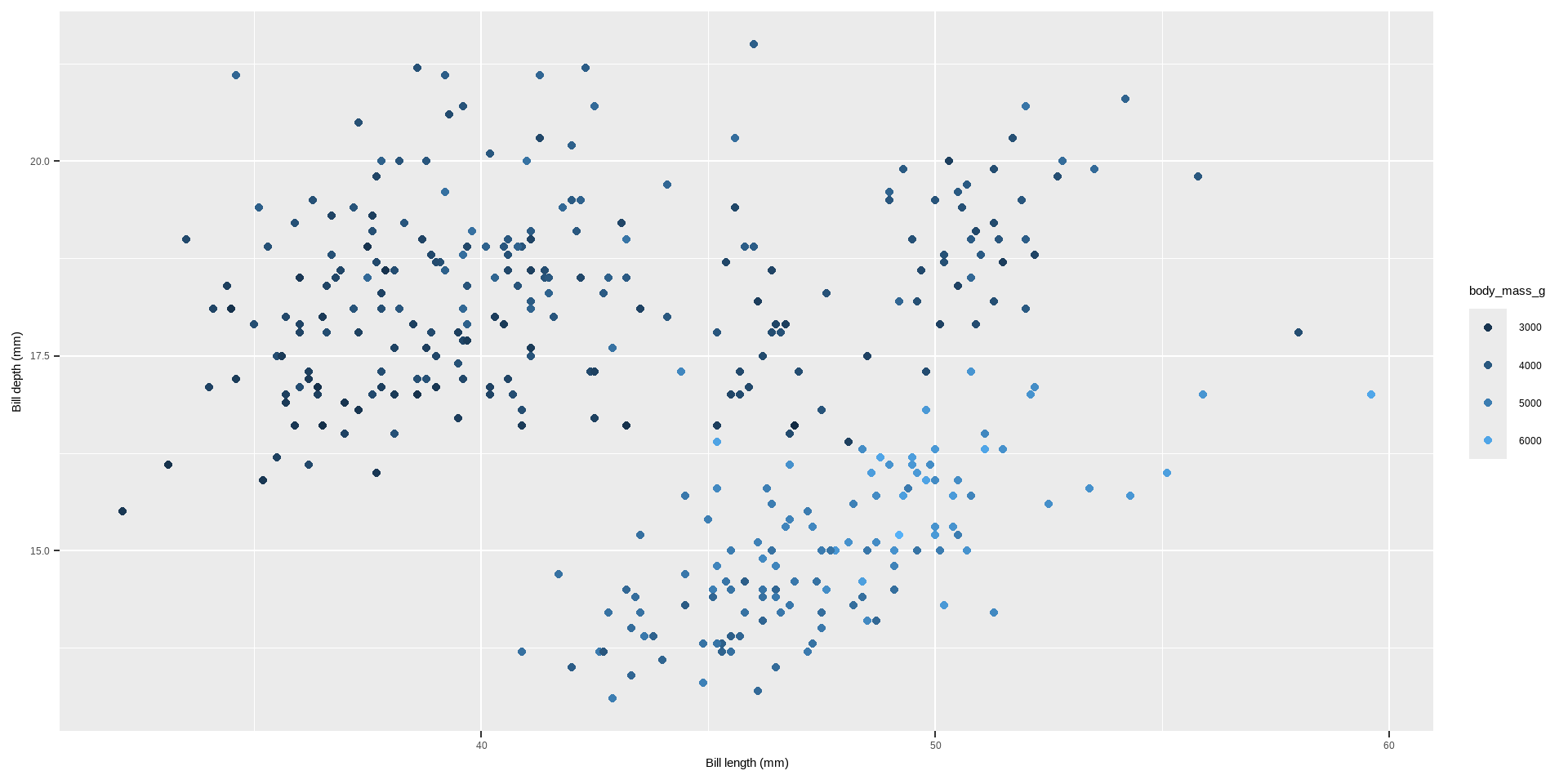
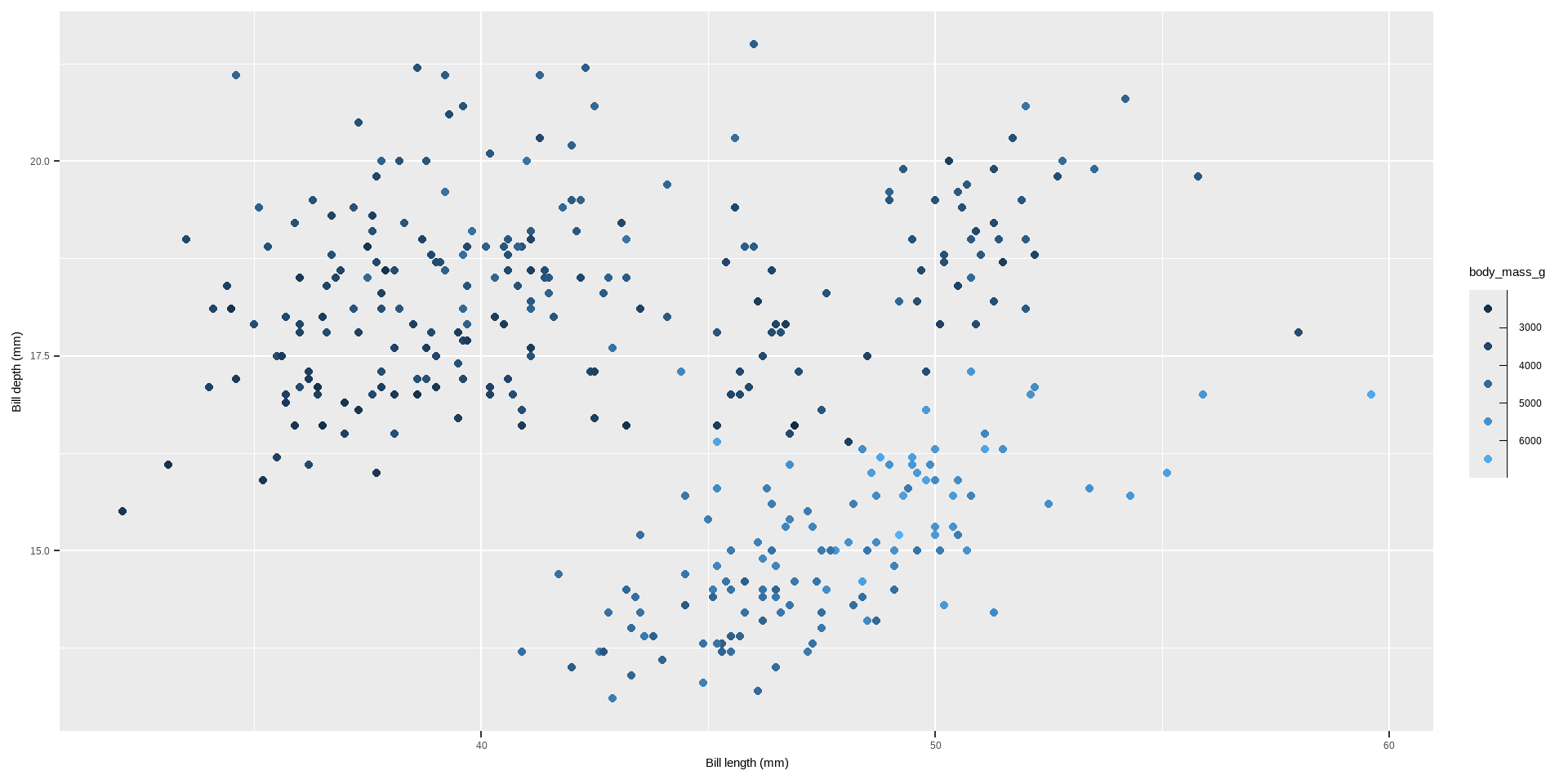
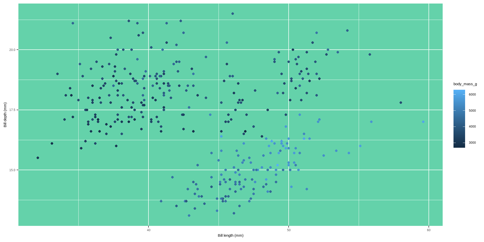
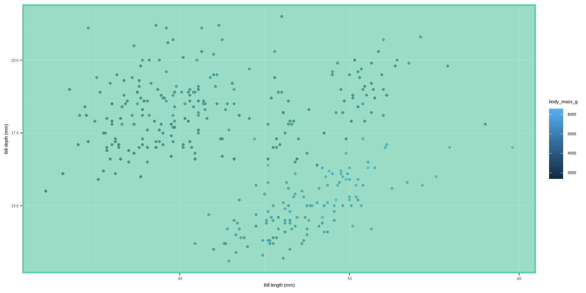
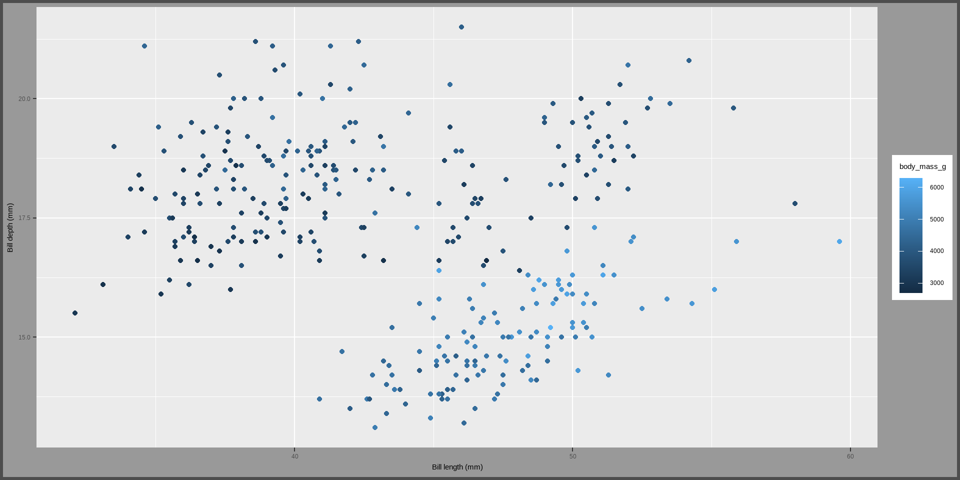
ggplot(data = penguins) +geom_point(aes( x = bill_length_mm, y = bill_depth_mm, color = body_mass_g)) +labs(x ="Bill length (mm)", y ="Bill depth (mm)")+theme(plot.background =element_rect(fill ="gray60", color ="gray30", linewidth =2))
Customizing multi-panel plots
When creating multi-panel plots in ggplot2, there are several functions and themes available to customize their appearance. Here’s a breakdown of the main functions and customization options based on the provided code:
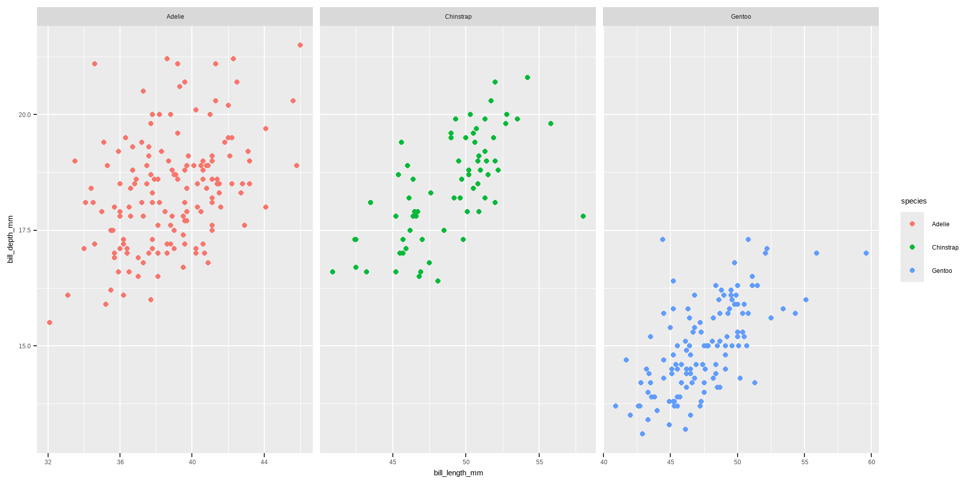
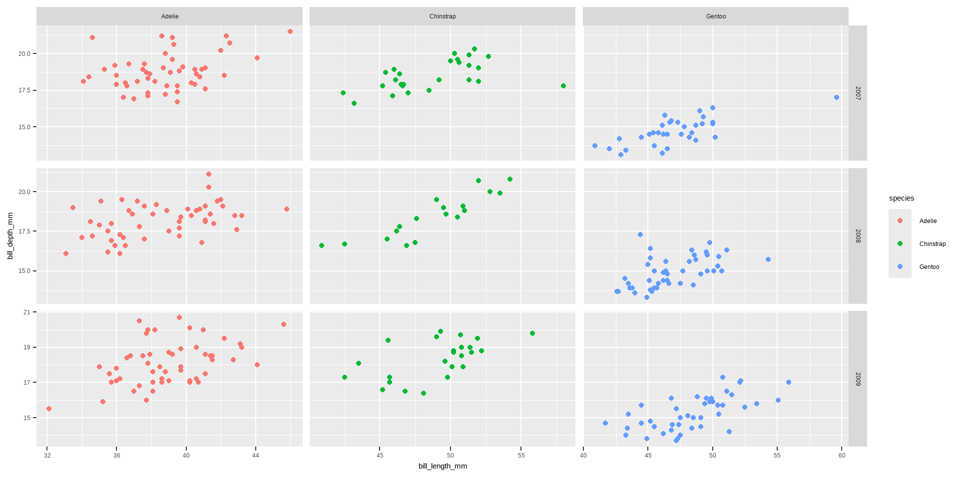
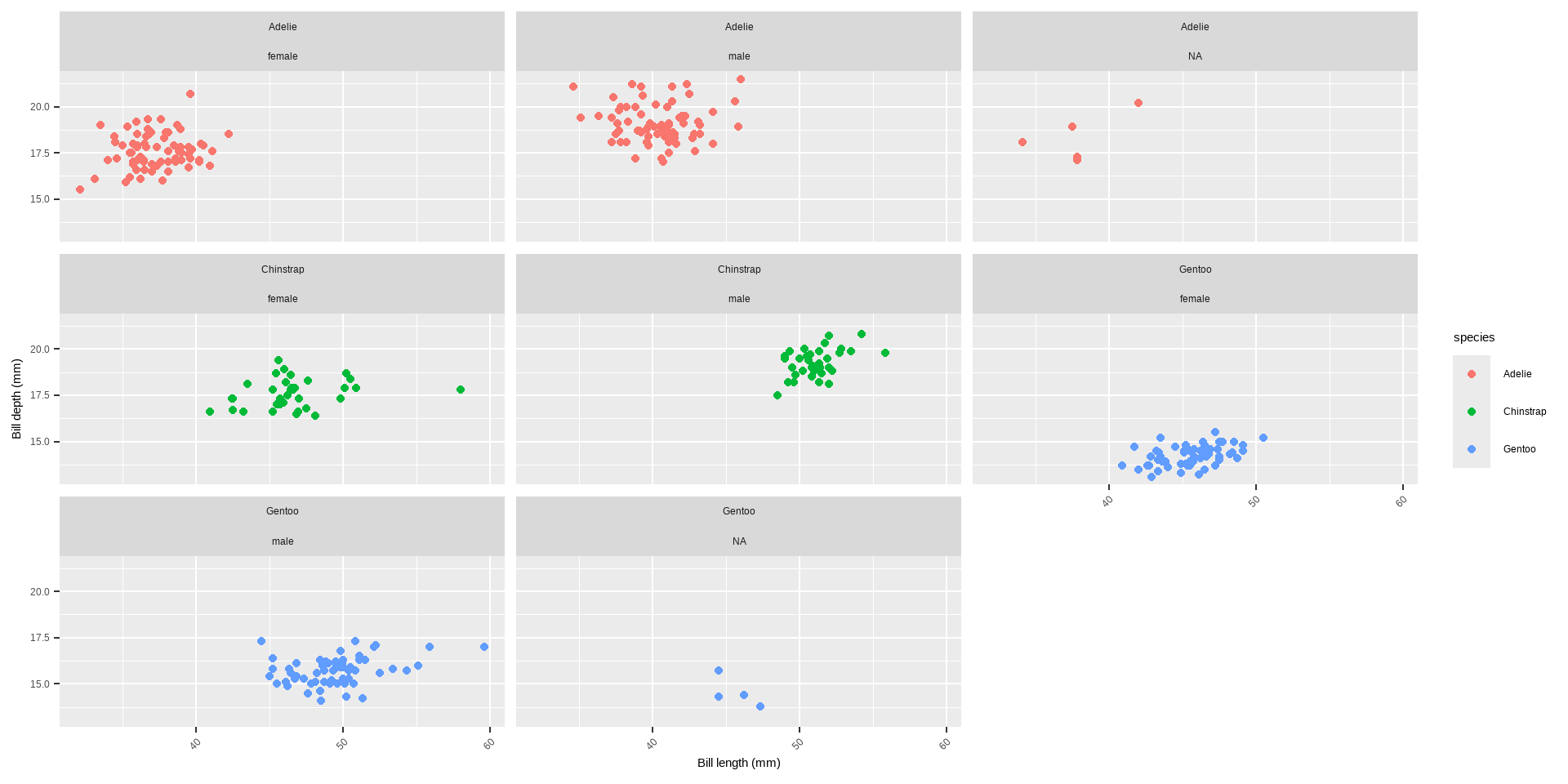
Creating Facets with facet_grid and facet_wrap
facet_wrap(variable ~ .):
Creates a ribbon of panels based on a single variable.
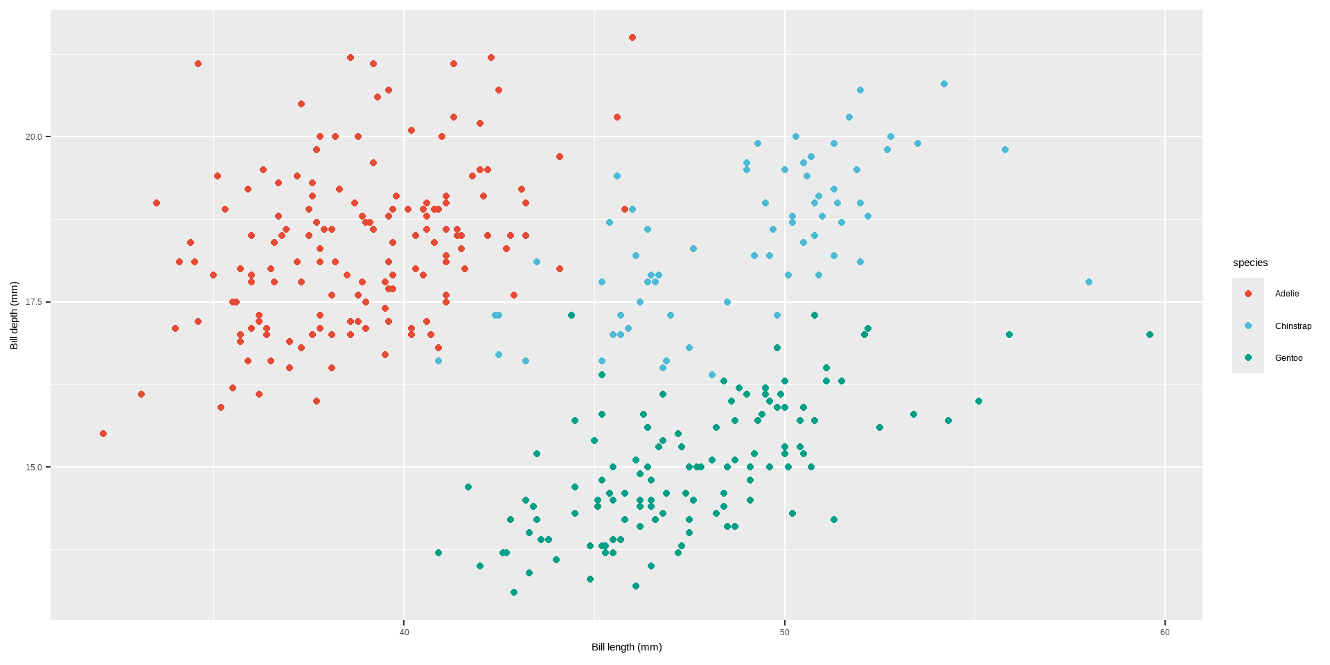
Several functions and techniques are highlighted for customizing colors in ggplot2 plots.
color and fill Arguments: Define the outline color (color) and the filling color (fill) of plot elements.
geom_point(color = "steelblue", size = 2)
geom_point(shape = 21, size = 2, stroke = 1, color = "#3cc08f", fill = "#c08f3c")
Code
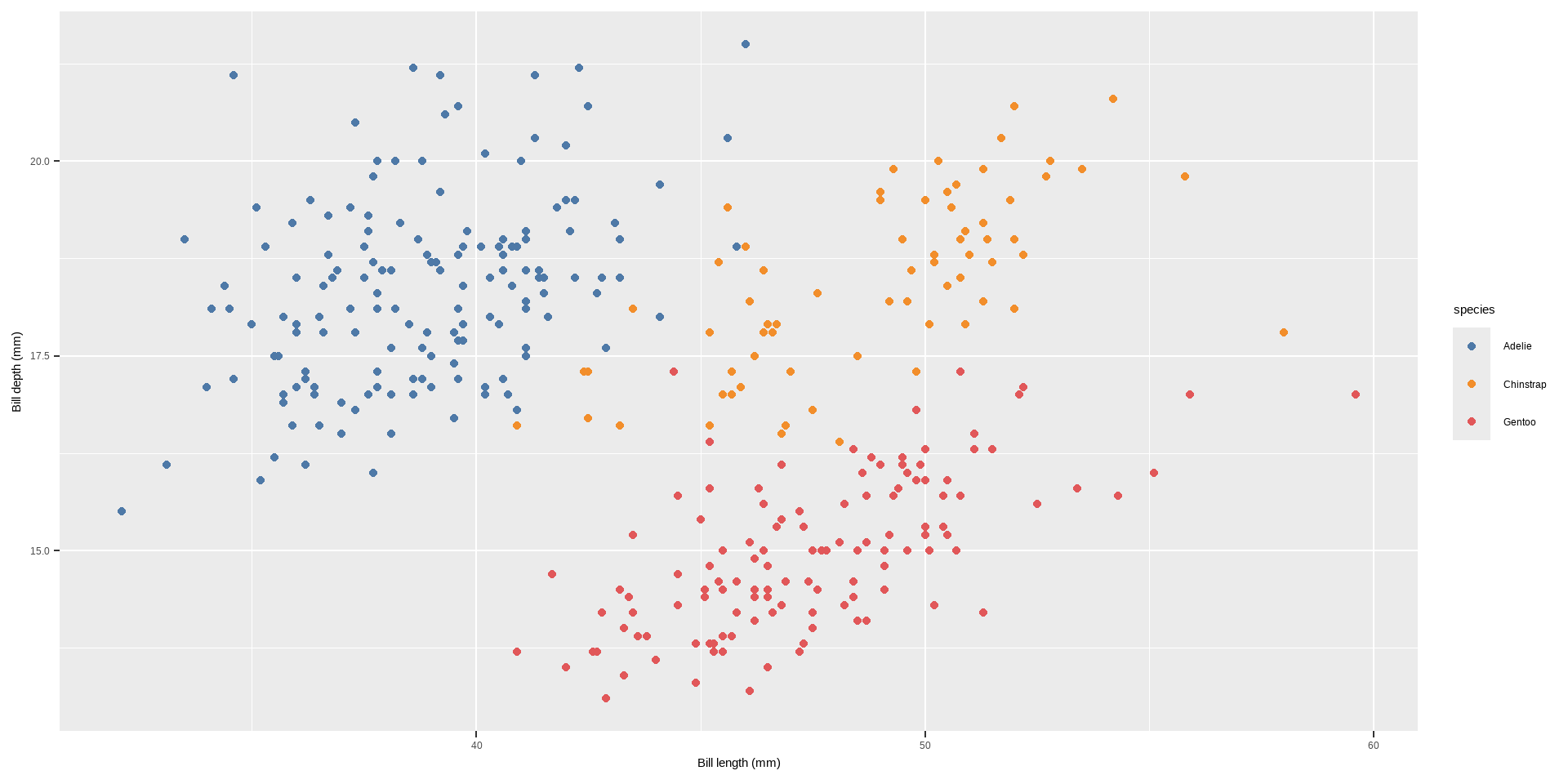
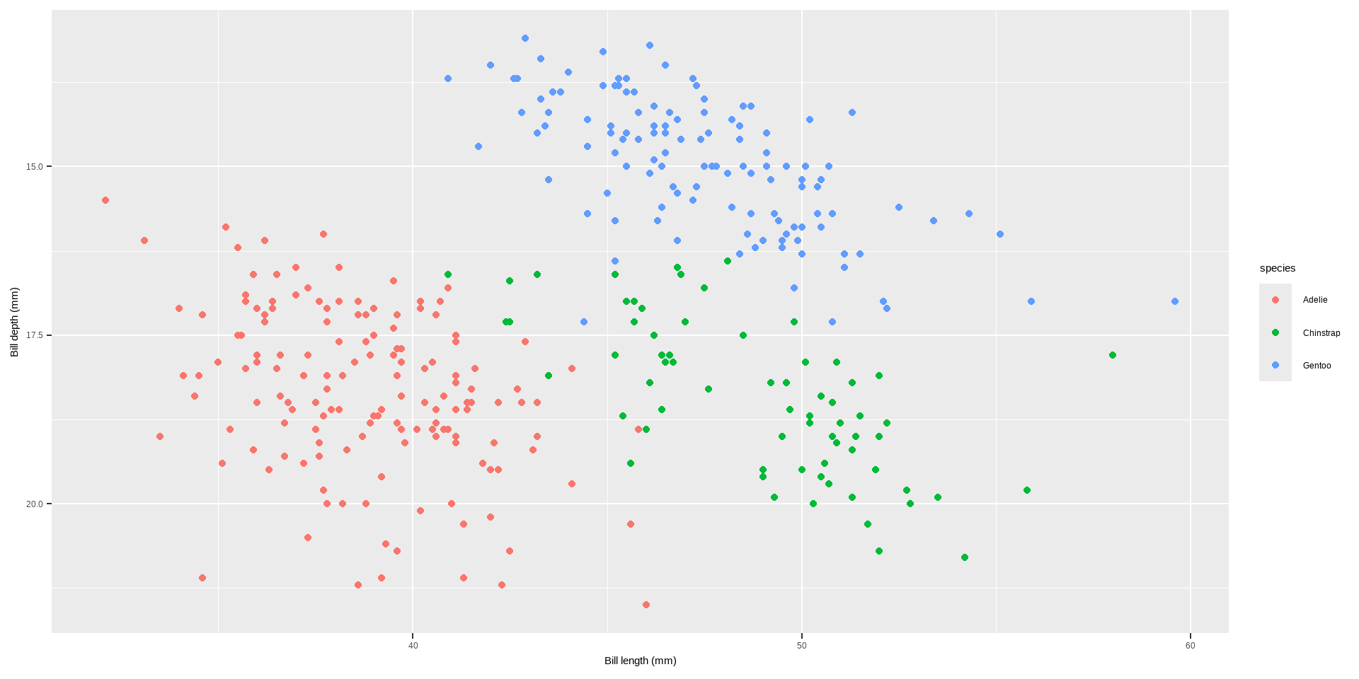
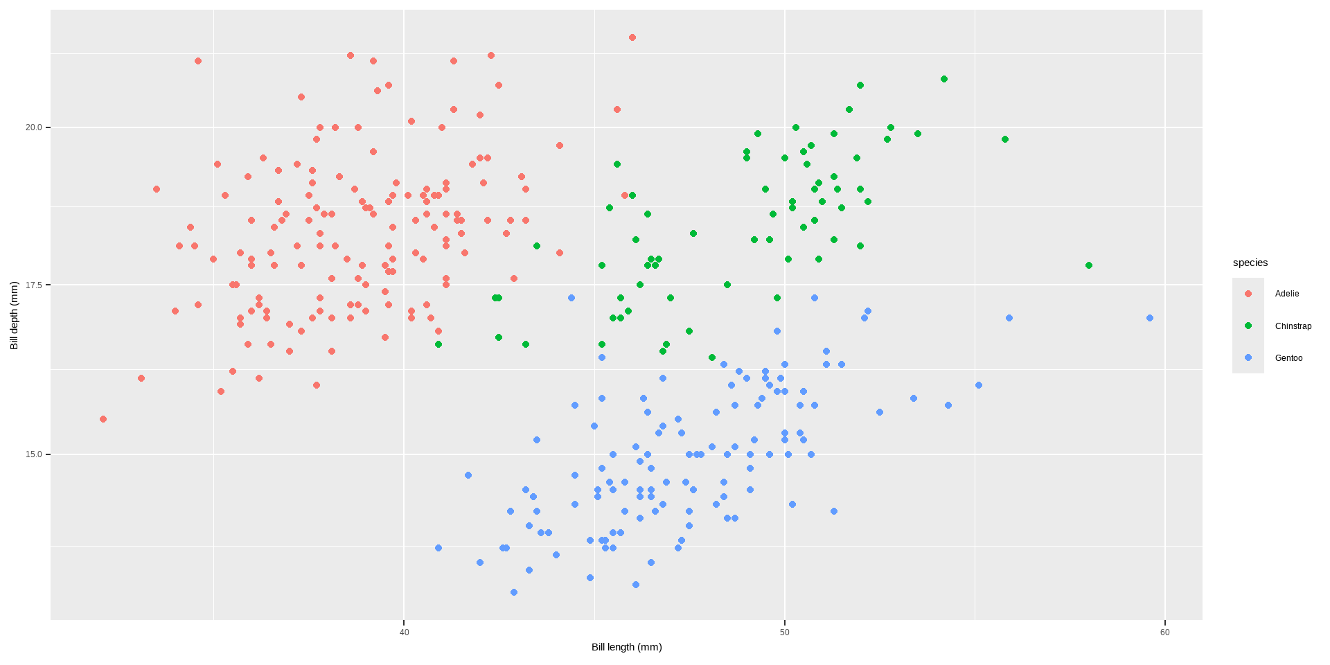
# defaultp <-ggplot(penguins, aes( x = bill_length_mm, y = bill_depth_mm, colour= species)) +geom_point() +labs(x ="Bill length (mm)", y ="Bill depth (mm)")
Colors
Code
p +geom_point(shape=21, size=2, stroke=1, color="#3cc08f", fill ="#c08f3c")
scale_color_* and scale_fill_* Functions: Modify colors when they are mapped to variables. - These functions differ based on whether the variable is categorical (qualitative) or continuous (quantitative).
Qualitative Variables:
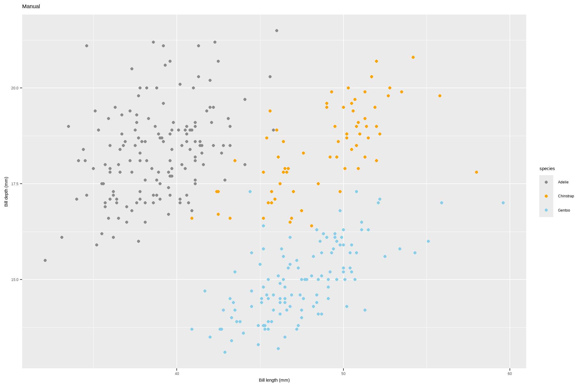
**`scale_color_manual` and `scale_fill_manual`**: Manually specify colors for categorical variables. `scale_color_manual(values = c("dodgerblue4", "darkolivegreen4", "darkorchid3", "goldenrod1"))`
Code
p +scale_color_manual(values =c("dodgerblue4", "darkorchid3", "goldenrod1"))
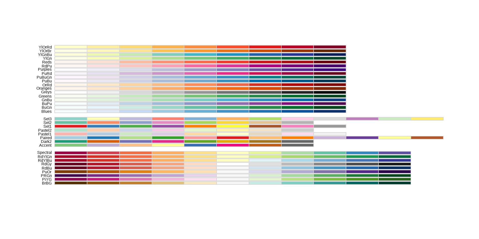
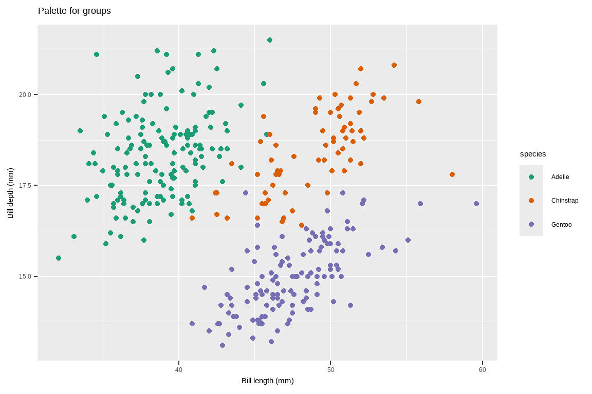
scale_color_brewer and scale_fill_brewer: Use predefined color palettes from ColorBrewer.
scale_color_brewer(palette = “Set1”)
Code
p+scale_color_brewer(palette ="Set1")
Quantitative Variables:
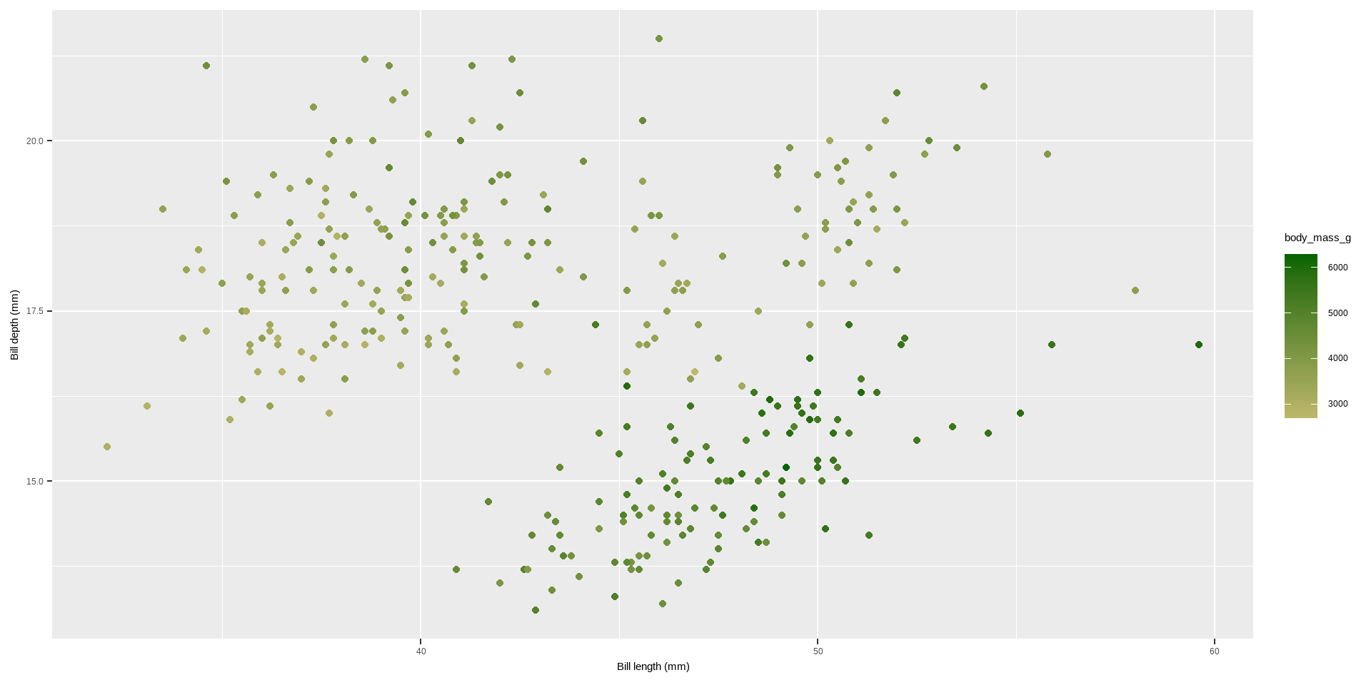
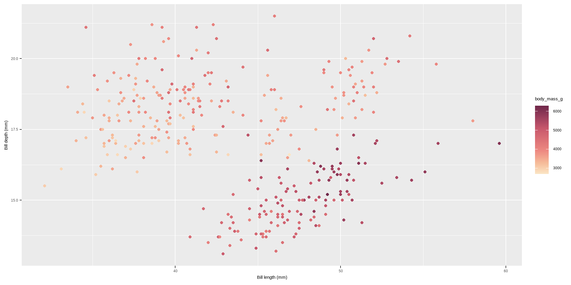
scale_color_gradient and scale_fill_gradient: Apply a sequential gradient color scheme for continuous variables.
scale_color_gradient(low = "darkkhaki", high = "darkgreen")
Code
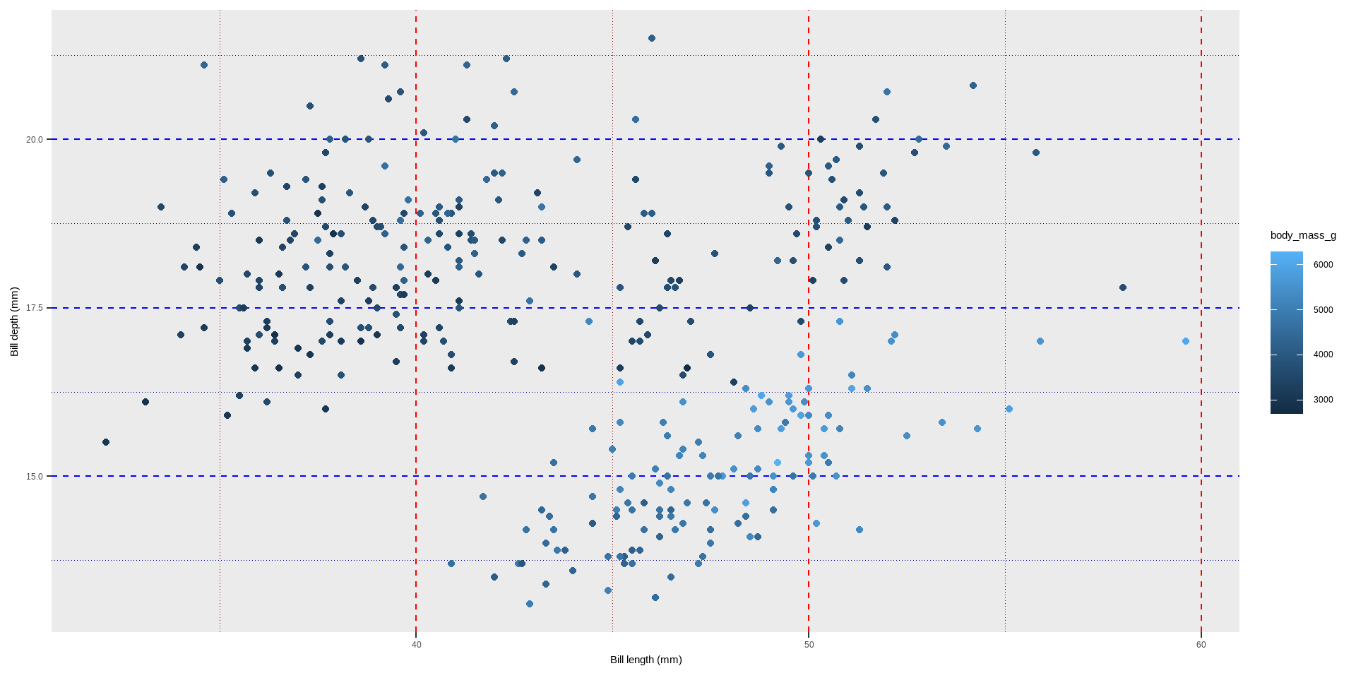
p2 <-ggplot(penguins, aes( x = bill_length_mm, y = bill_depth_mm, colour = body_mass_g)) +geom_point()+labs(x ="Bill length (mm)", y ="Bill depth (mm)") p2 +scale_color_gradient(low ="darkkhaki", high ="darkgreen")
Quantitative Variables:
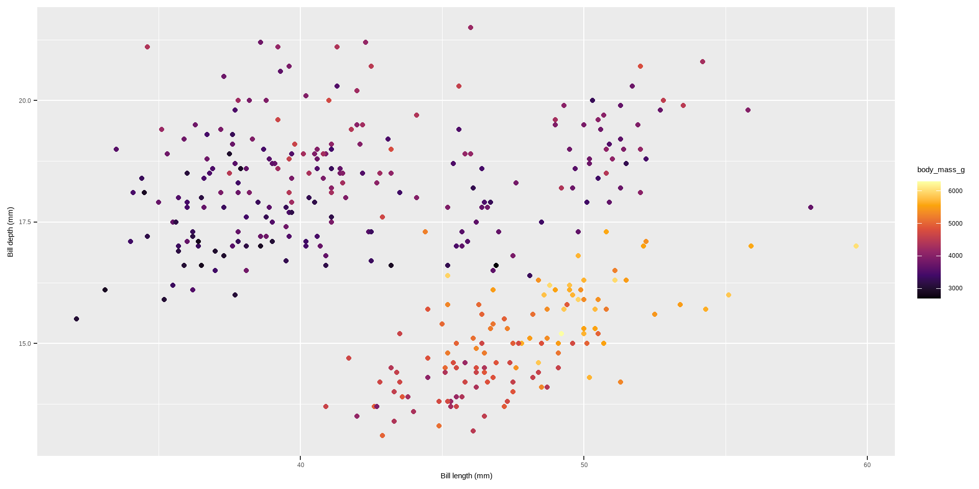
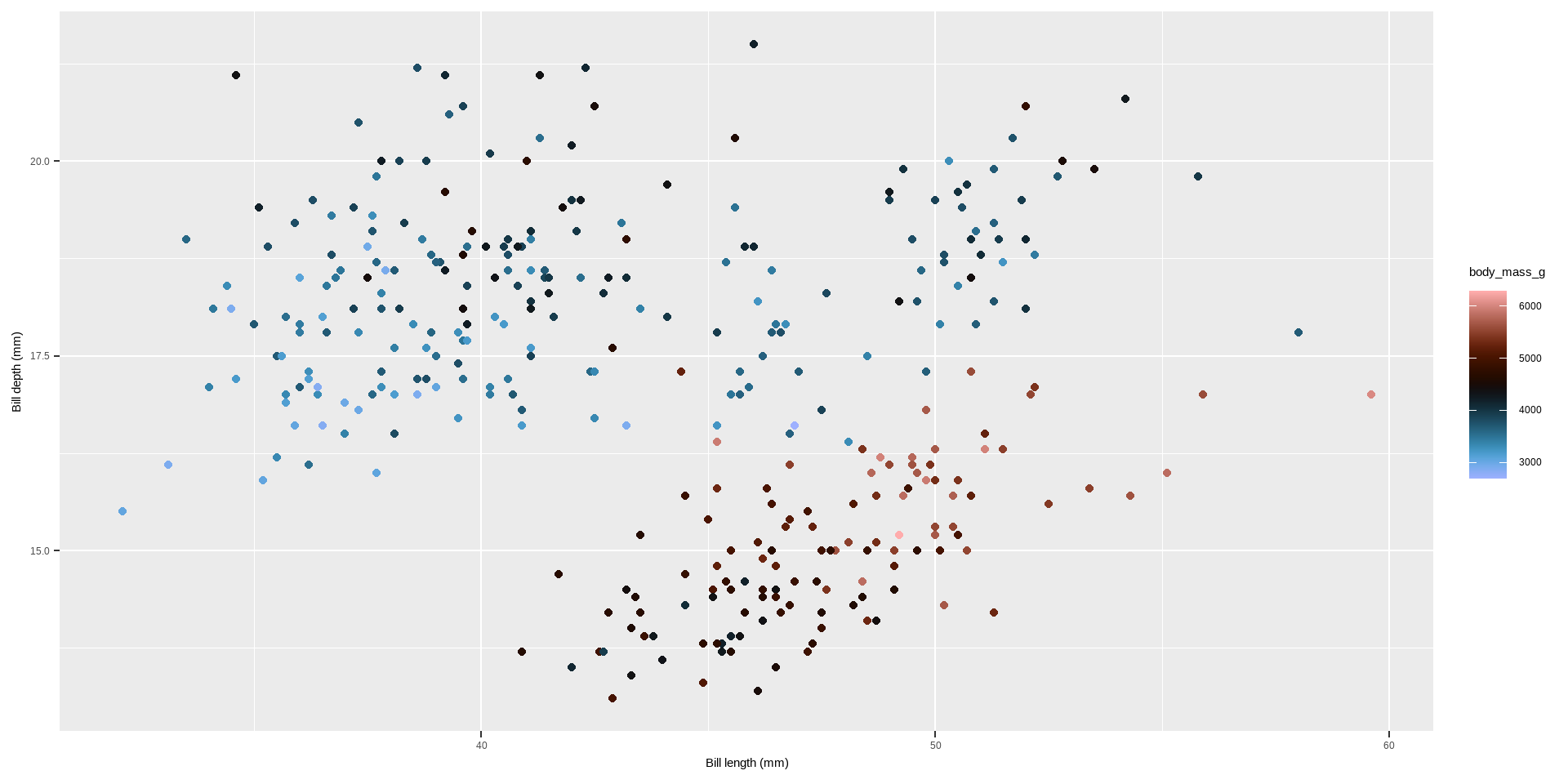
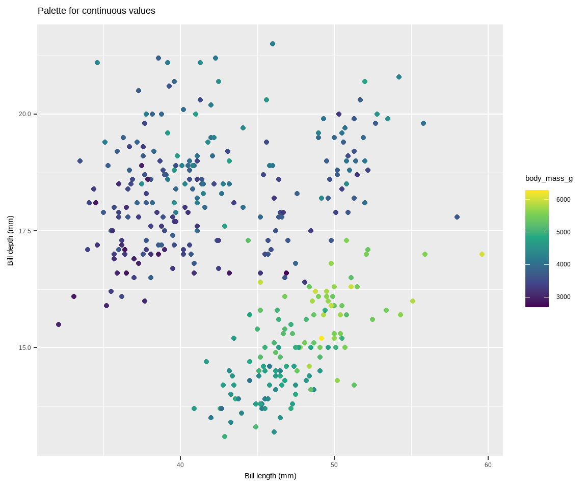
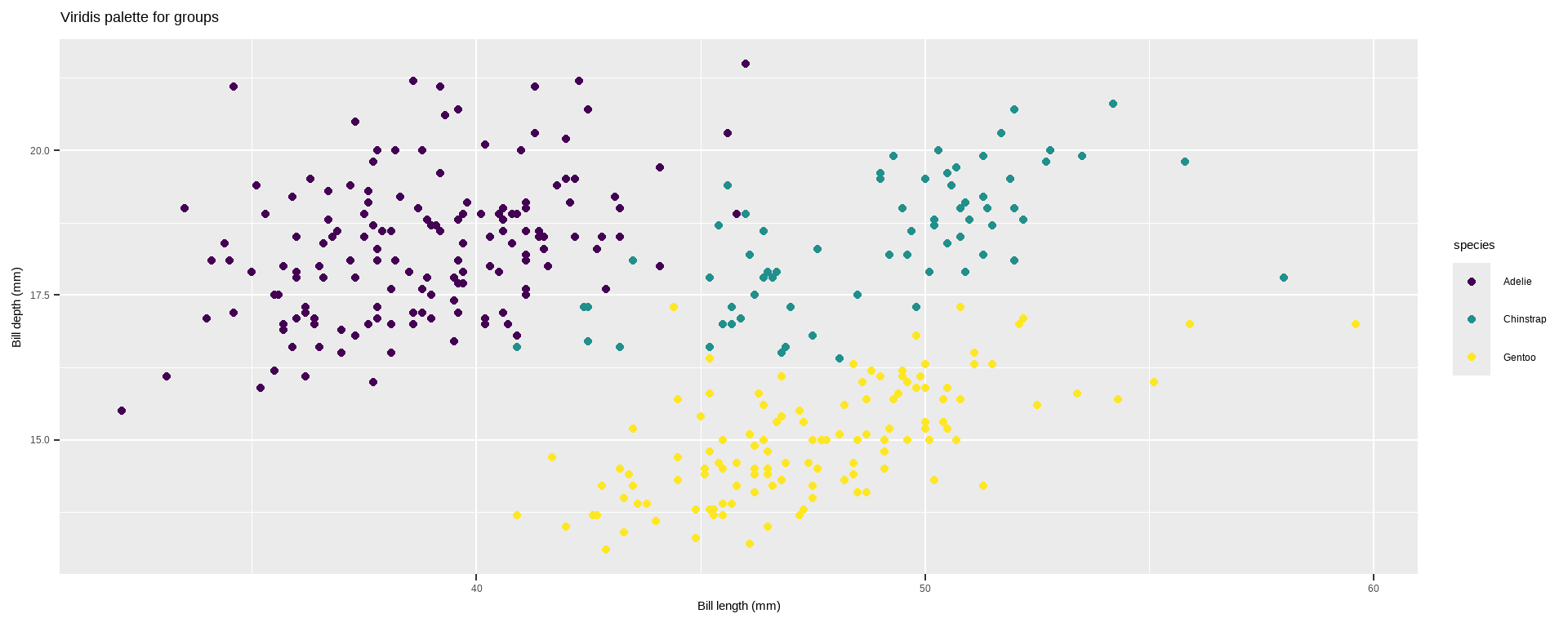
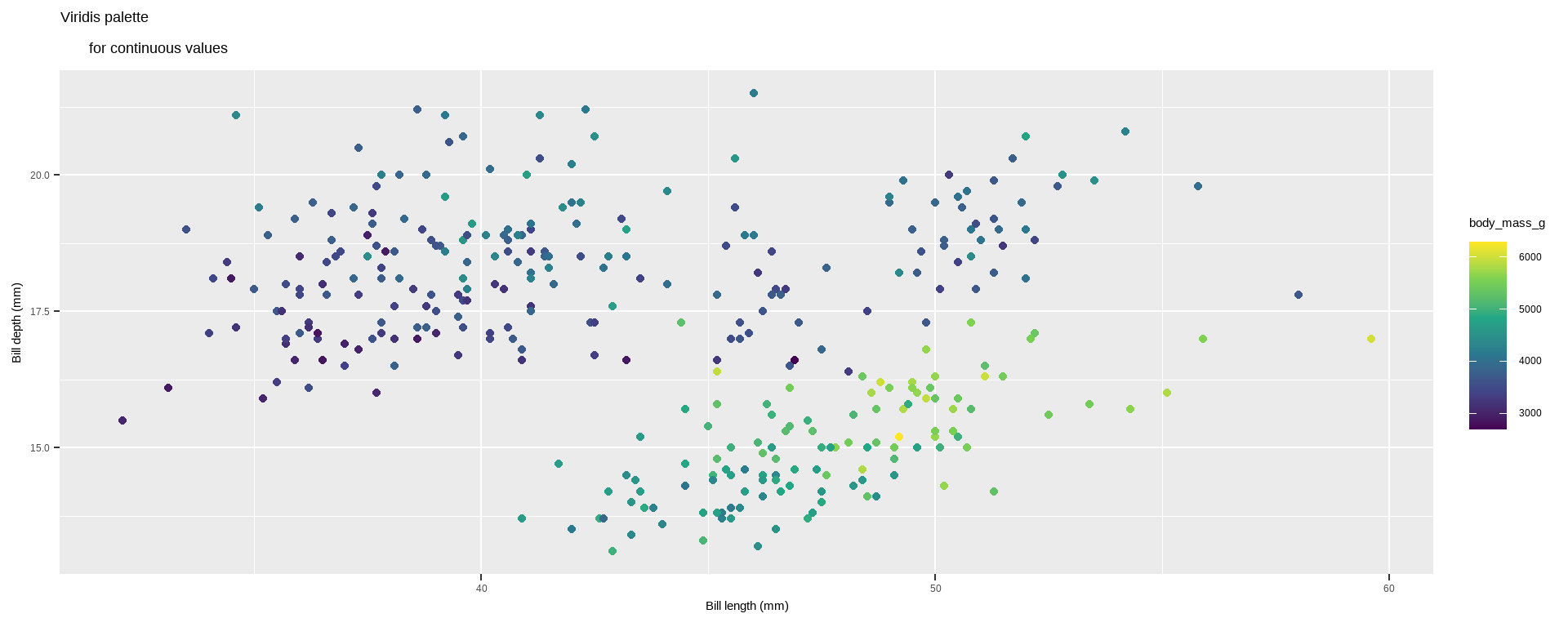
scale_color_viridis_c and scale_fill_viridis_c: Use the Viridis color palettes, which are perceptually uniform and suitable for colorblind viewers.
scale_color_viridis_c(option = "inferno")
Code
p2 +scale_color_viridis_c(option ="inferno")
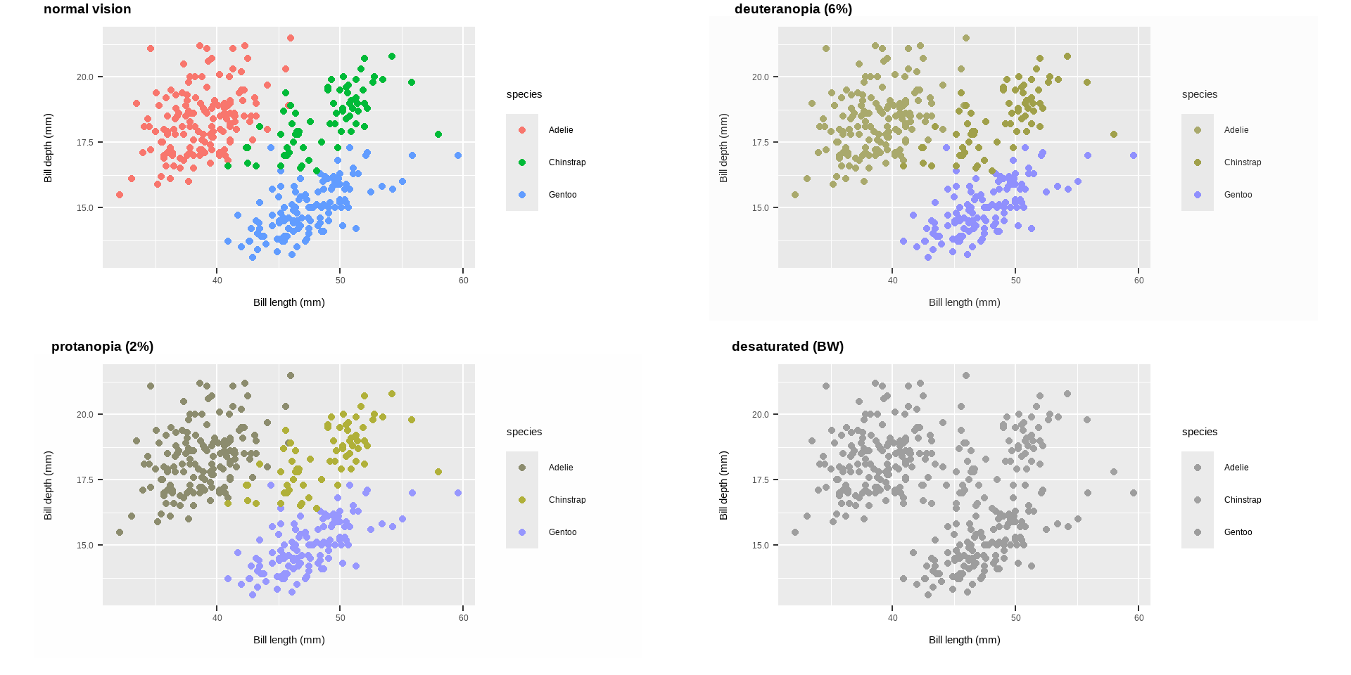
Additional Color Palettes from Extension Packages:
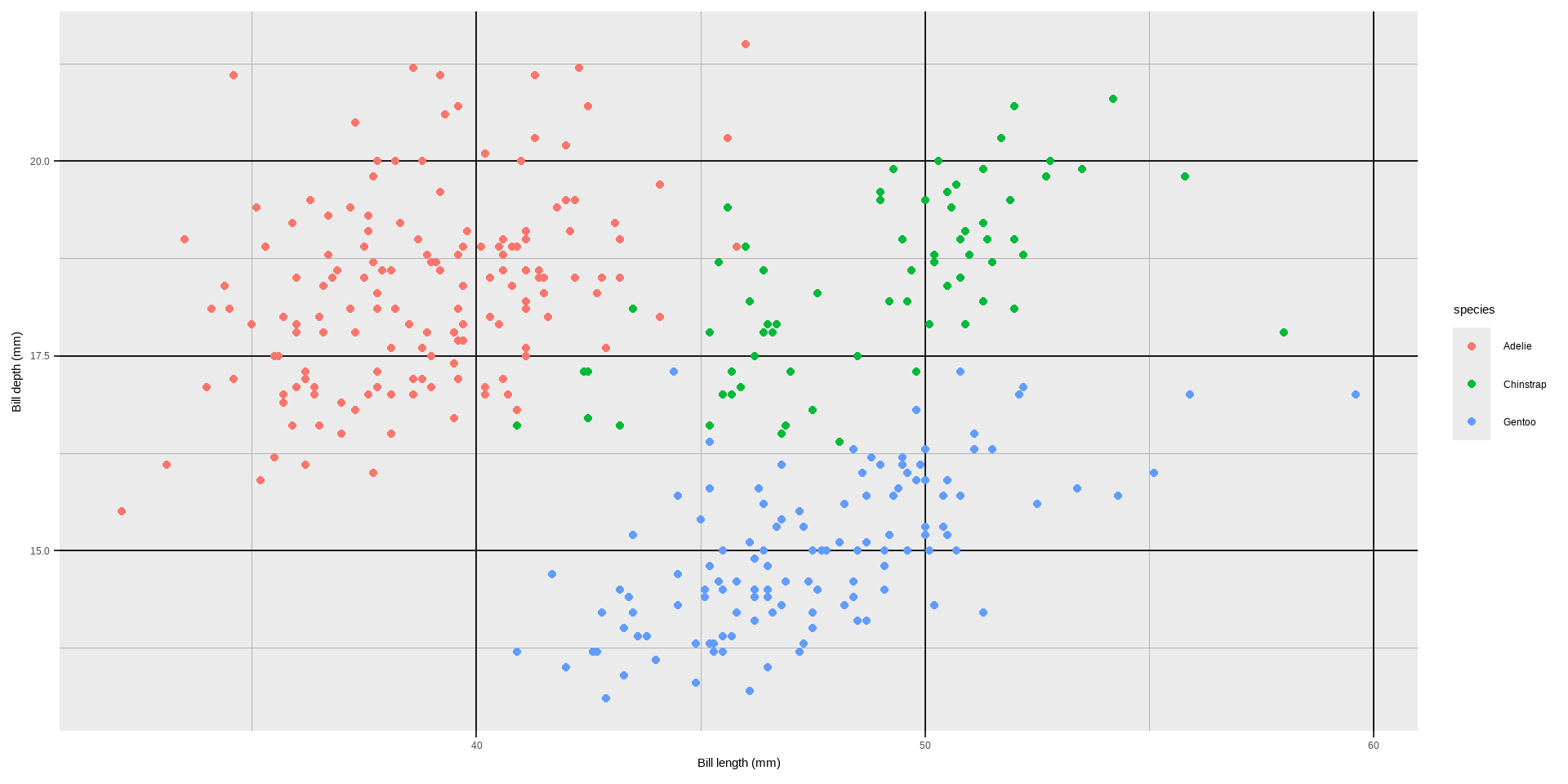
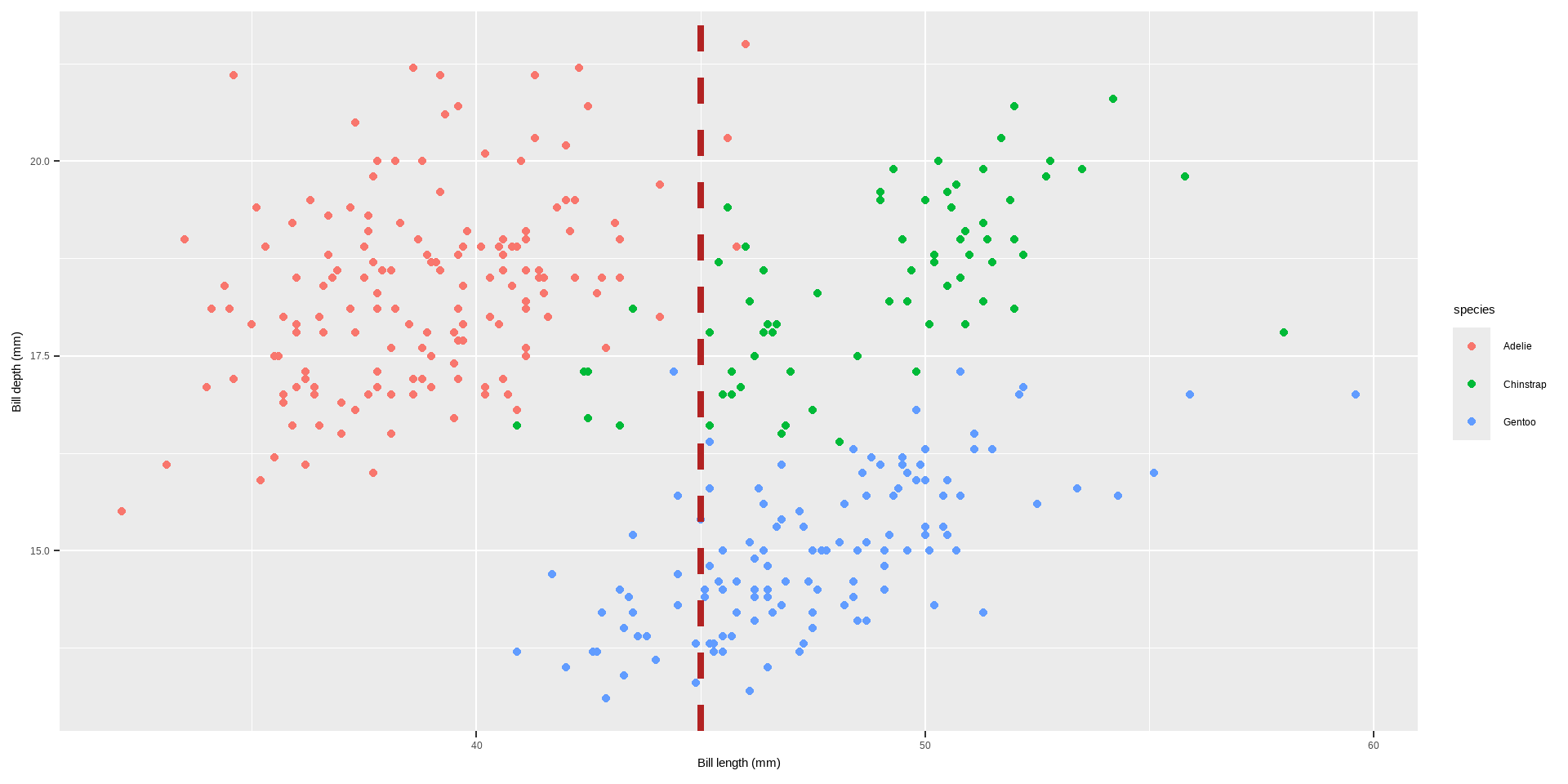
p +geom_vline(aes(xintercept =45), linewidth =1.5, color ="firebrick", linetype ="dashed")
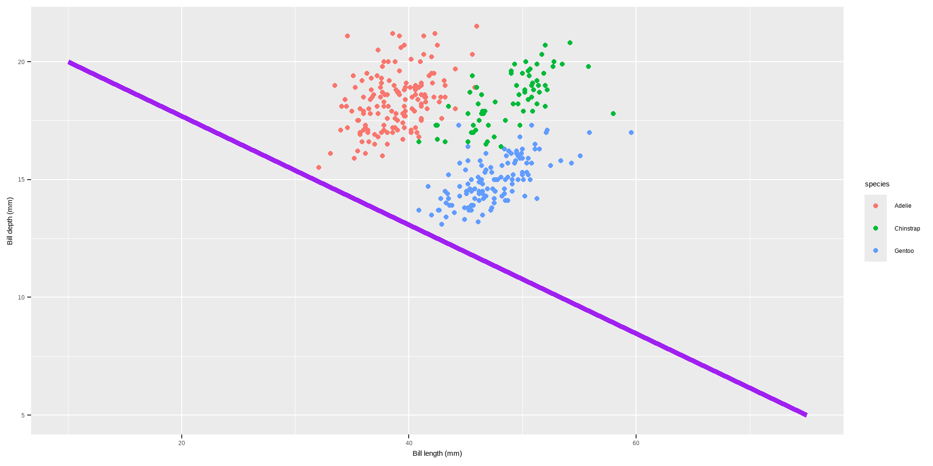
geom_abline(): Adds lines with a specified slope and intercept to a plot.
intercept: The intercept of the line.
slope: The slope of the line.
color, linewidth: Aesthetics for customizing the appearance of the line. geom_abline(intercept = coefficients(reg)[1], slope = coefficients(reg)[2], color = "darkorange2", linewidth = 1.5)
Lines
Code
reg <-lm(body_mass_g ~ bill_depth_mm, data = penguins) p +geom_abline(intercept =coefficients(reg)[1], slope =coefficients(reg)[2], color ="darkorange2", linewidth =1.5)
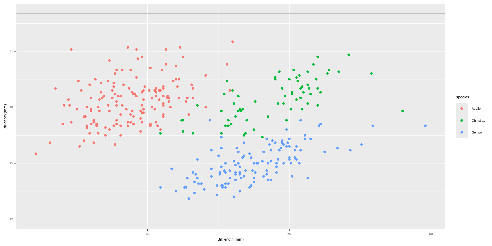
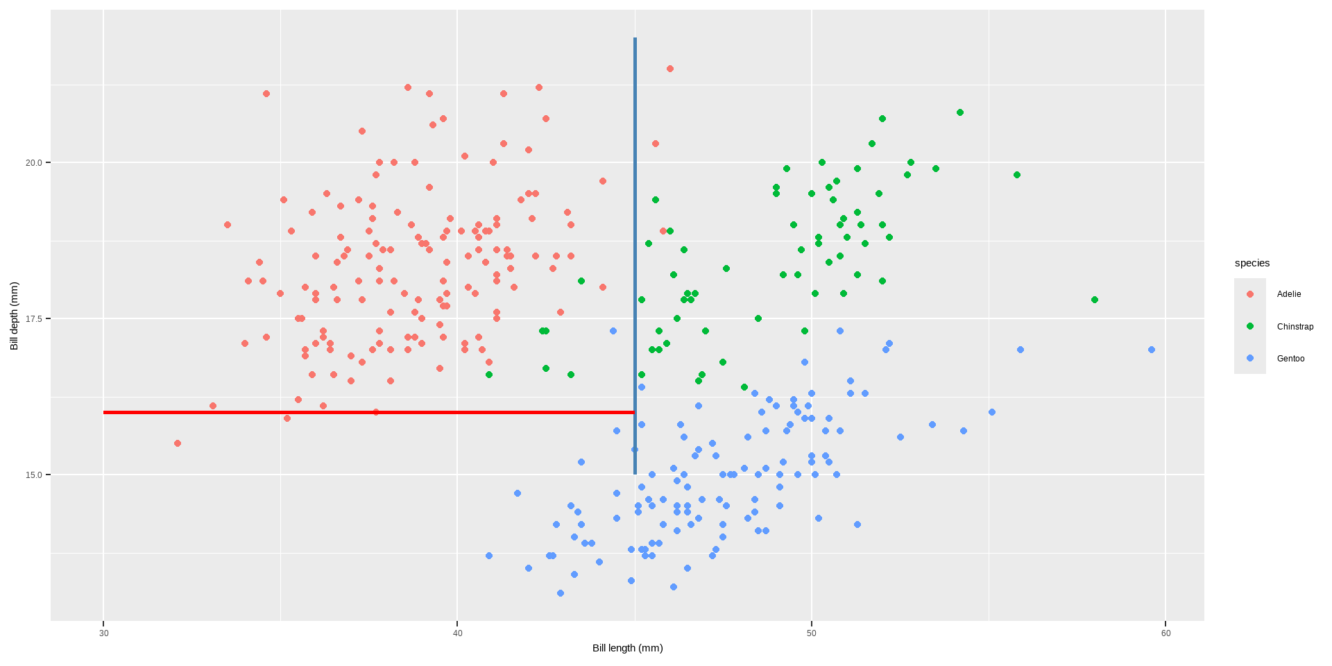
geom_linerange(): Adds line segments that do not span the entire plot range. Can be used for highlighting specific ranges.
x, y: Aesthetics for the starting and ending points of the line.
xmin, xmax, ymin, ymax: Coordinates for the start and end of the line segments.
color, linewidth: Aesthetics for customizing the appearance of the line.
Lines
Code
p+geom_linerange(aes(x =45, ymin =15, ymax =22), color ="steelblue", linewidth =1)+geom_linerange(aes(y =16, xmin =30, xmax =45), color ="red", linewidth =1)
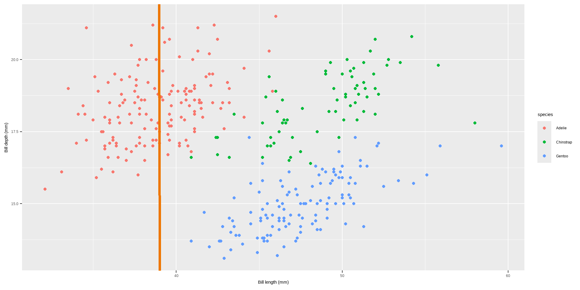
annotate(geom = "segment"): Adds line segments with specified start and end points. Useful for creating lines with arbitrary slopes.
x, xend, y, yend: Coordinates for the start and end of the line segments.
color, linewidth: Aesthetics for customizing the appearance of the line.
Lines
Code
p +annotate(geom ="segment", x =10, xend =75, y =20, yend =5, color ="purple", linewidth =2)
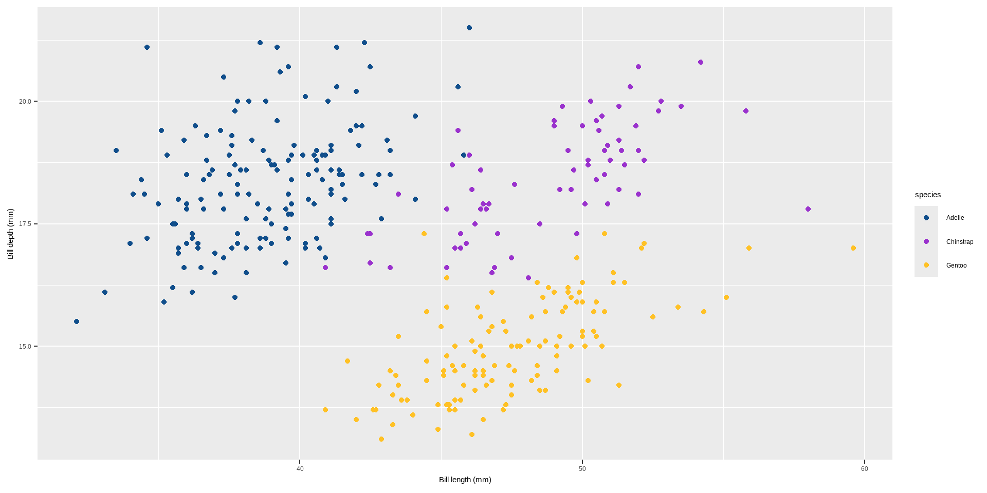
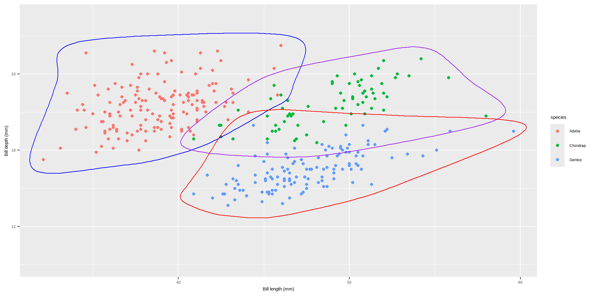
geom_encircle() in the ggalt package is used to automatically enclose points in a polygon, creating an encircling effect around specified groups of points in a ggplot2 plot. This can be useful for highlighting clusters or groups of points within your data visualization.
Lines
Code
library(ggalt)p +geom_encircle(data=subset(penguins, species =="Adelie"),colour="blue", spread=0.002) +geom_encircle(data=subset(penguins, species =="Chinstrap"), colour="purple", spread=0.002) +geom_encircle(data=subset(penguins, species =="Gentoo"), colour="red", spread=0.002) +ylim(10, 23)
Text
There are a range of functions and techniques to customize text and labels in ggplot2 plots. Let us seea a detailed explanation of each function mentioned, along with examples and their purposes:
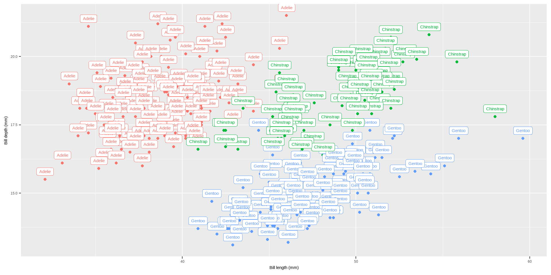
geom_label(): Adds labels to points on the plot with a rectangle around the text.
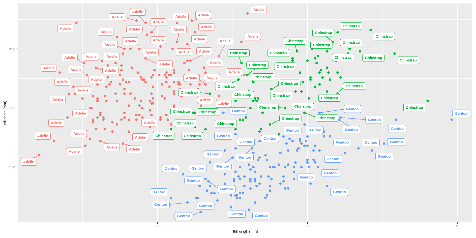
geom_label_repel() avoids overlapping by adjusting the position of labels.
annotate(): Adds annotations to a plot.
Code
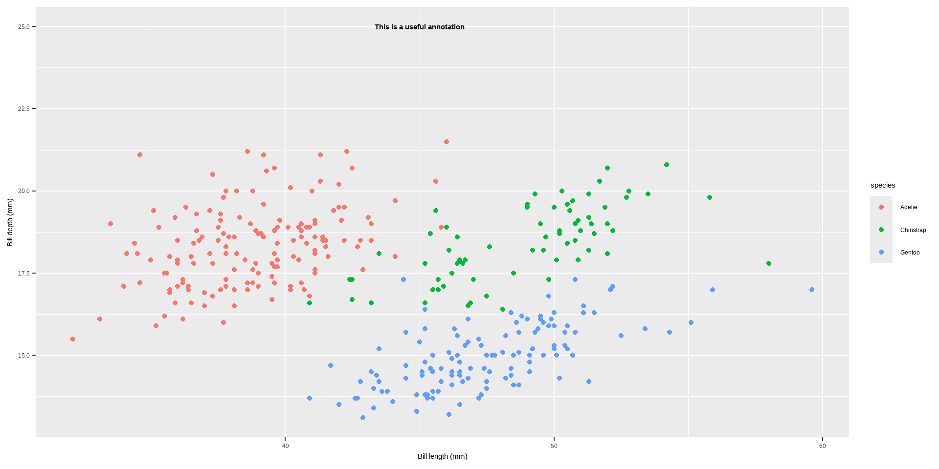
p +annotate(geom ="text", x =45, y =25, fontface ="bold", label ="This is a useful annotation")
Text
annotate() is used to add single text or label annotations at specified coordinates.
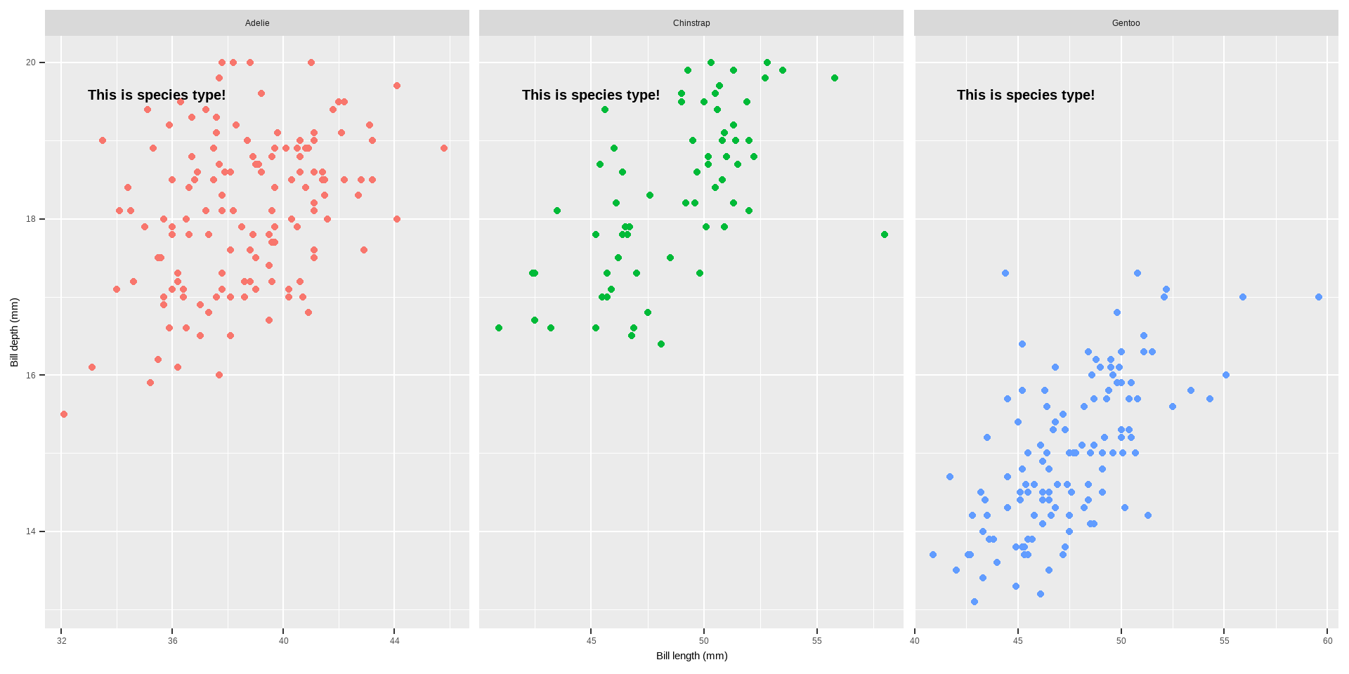
annotation_custom(): Adds custom annotations using grid graphical objects.
Code
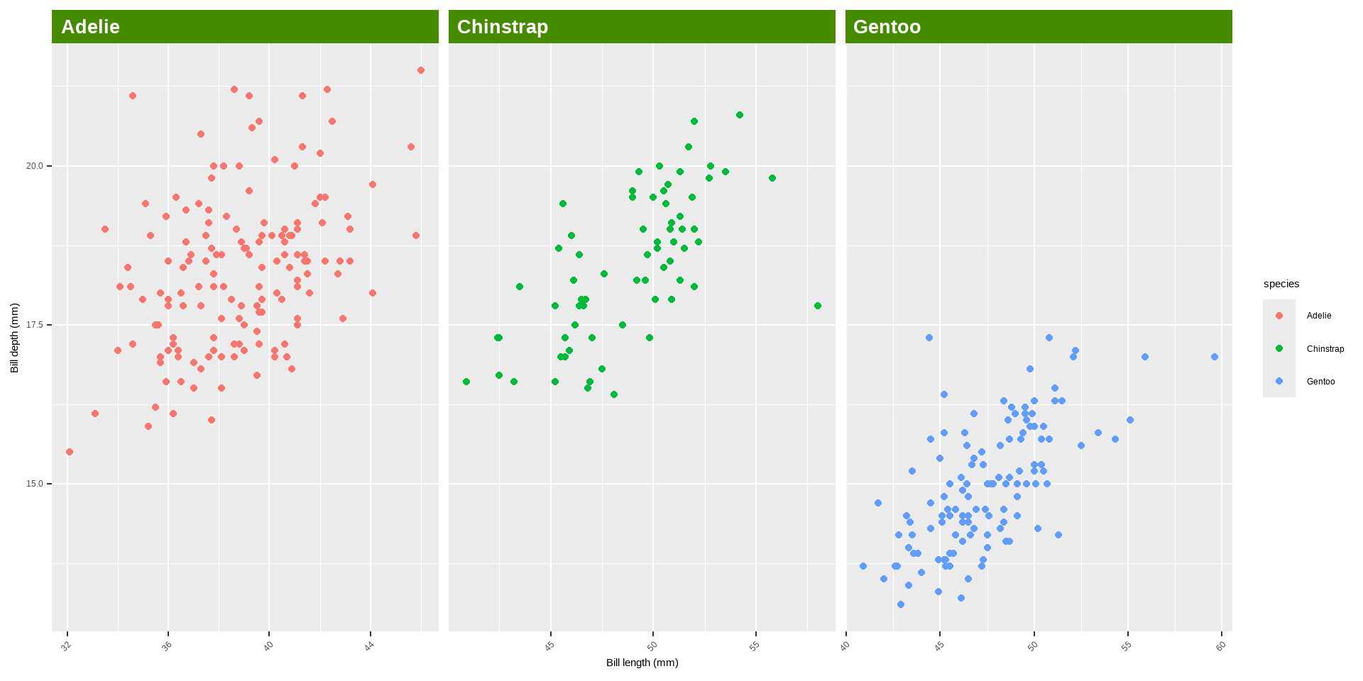
library(grid)my_grob <-grobTree(textGrob("This is species type!", x = .1, y = .9, hjust =0, gp =gpar(col ="black", fontsize =15, fontface ="bold"))) p +annotation_custom(my_grob) +facet_wrap(~species, scales ="free_x") +scale_y_continuous(limits =c(NA, 20)) +theme(legend.position ="none")
Text
ggtext Package: Enhances text rendering with support for markdown and HTML.
Functions:
geom_richtext(): Renders text as markdown or HTML.
geom_textbox(): Provides dynamic wrapping for longer text annotations.
Code
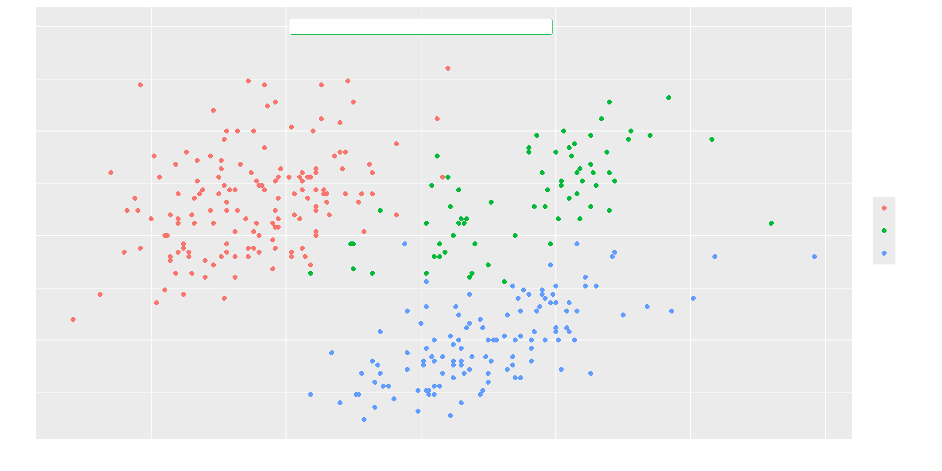
library(ggtext) lab_md <-"This plot shows **Bill lngth** in *°mm* versus **Bill depth** in *mm* across Species type"p +geom_richtext(aes(x =45, y =22.5, label = lab_md, stat ="unique"))
Text
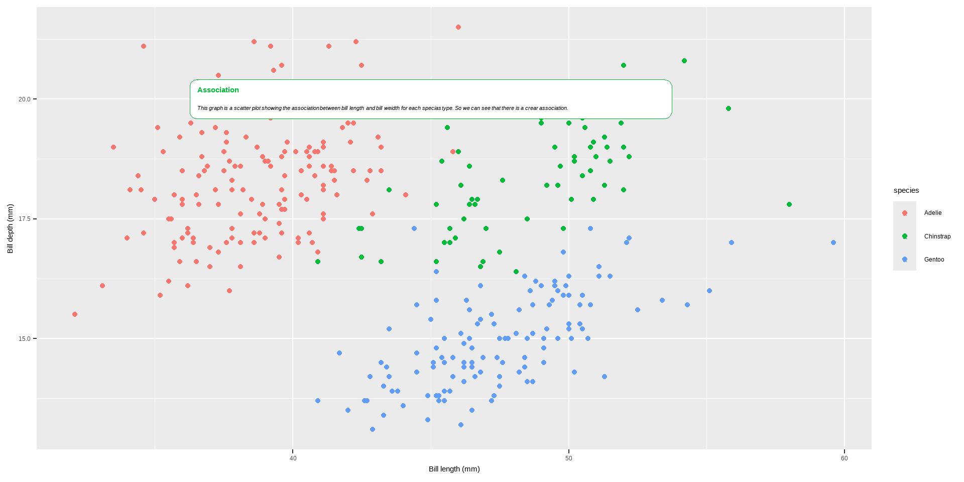
If we need to add long text to annotate our plot
Code
lab_long <-"**Association**<br><i style='font-size:8pt;color:black;'>This graph is a scatter plot showing the association between bill length and bill weidth for each specias type. So we can see that there is a crear association.</i>"p +geom_textbox(aes(x =45, y =20, label = lab_long),width =unit(25, "lines"), stat ="unique")
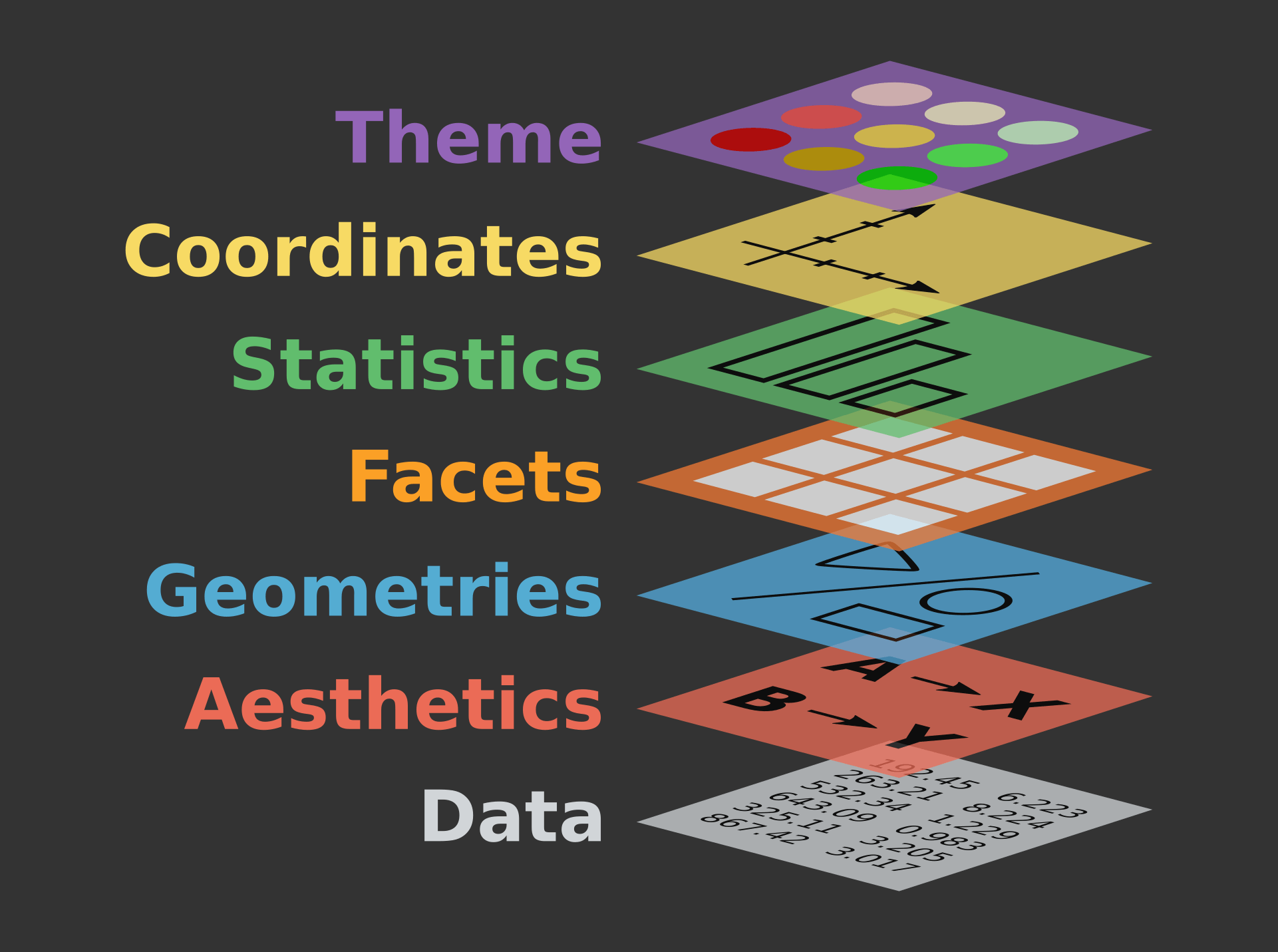
Coordinates
To customize plots in ggplot2, you can use a variety of functions that modify the coordinates, axes, scales, and themes of your plot. Here is a detailed explanation of the functions mentioned in your provided text, as well as some additional ones commonly used in ggplot2 for customization:
coord_flip(): Flips the x and y coordinates, making horizontal plots vertical and vice versa. This is particularly useful for bar charts and boxplots.
Code
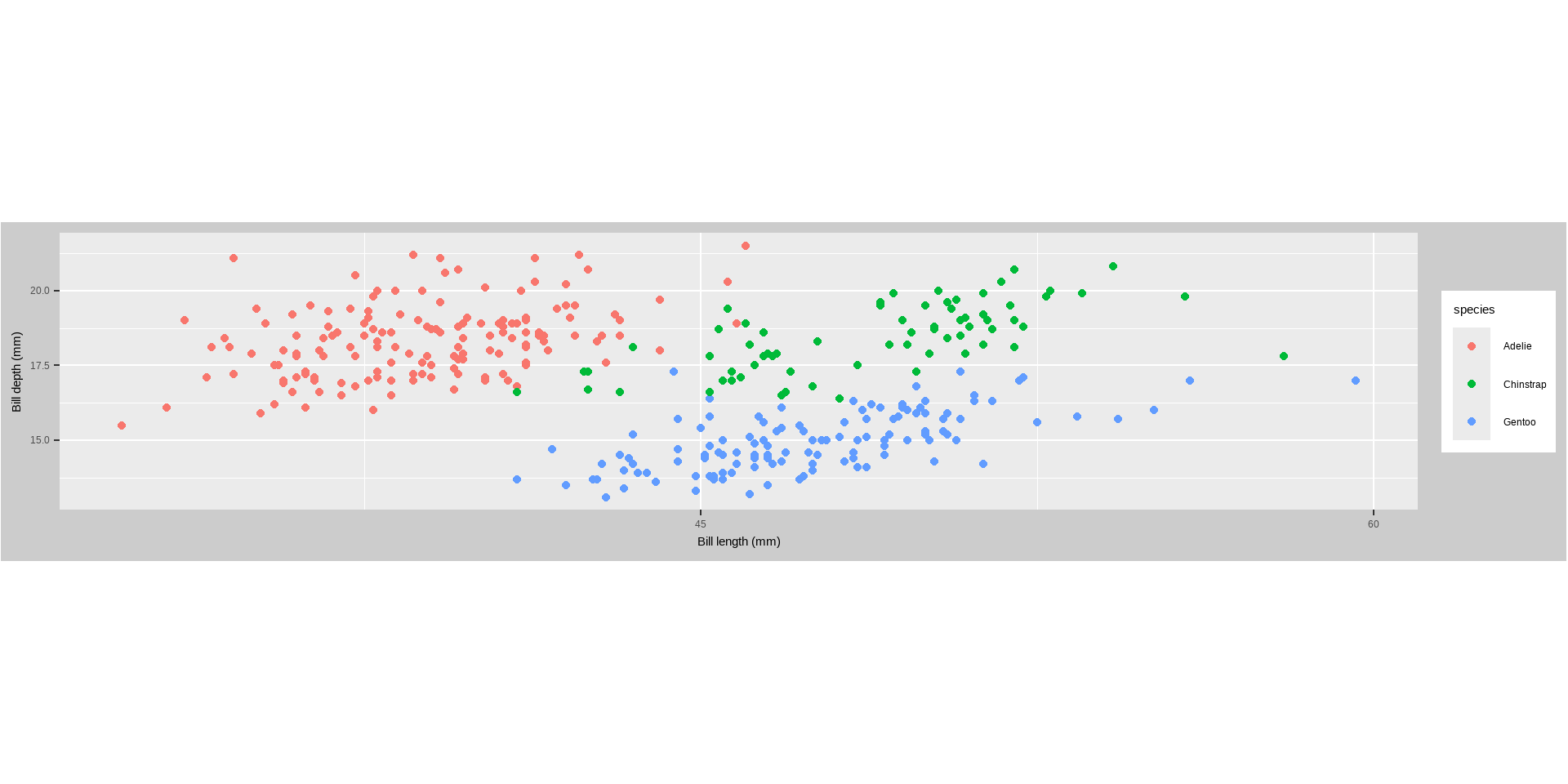
p +coord_flip()
Coordinates
coord_fixed(ratio = 1): Fixes the aspect ratio of the plot, ensuring a specific ratio of units on the x and y axes.
Code
p +scale_x_continuous(breaks =seq(0, 60, by =5)) +coord_fixed(ratio =1)
coord_fixed(ratio = 1/3): Sets a different aspect ratio, ensuring a 1:3 ratio of units on the x and y axes.
Coordinates
Code
p +scale_x_continuous(breaks =seq(0, 60, by =15)) +coord_fixed(ratio =2/3) +theme(plot.background =element_rect(fill ="grey80"))
Coordinates
coord_polar(): Converts the plot to polar coordinates, often used for circular bar charts and pie charts.
Code
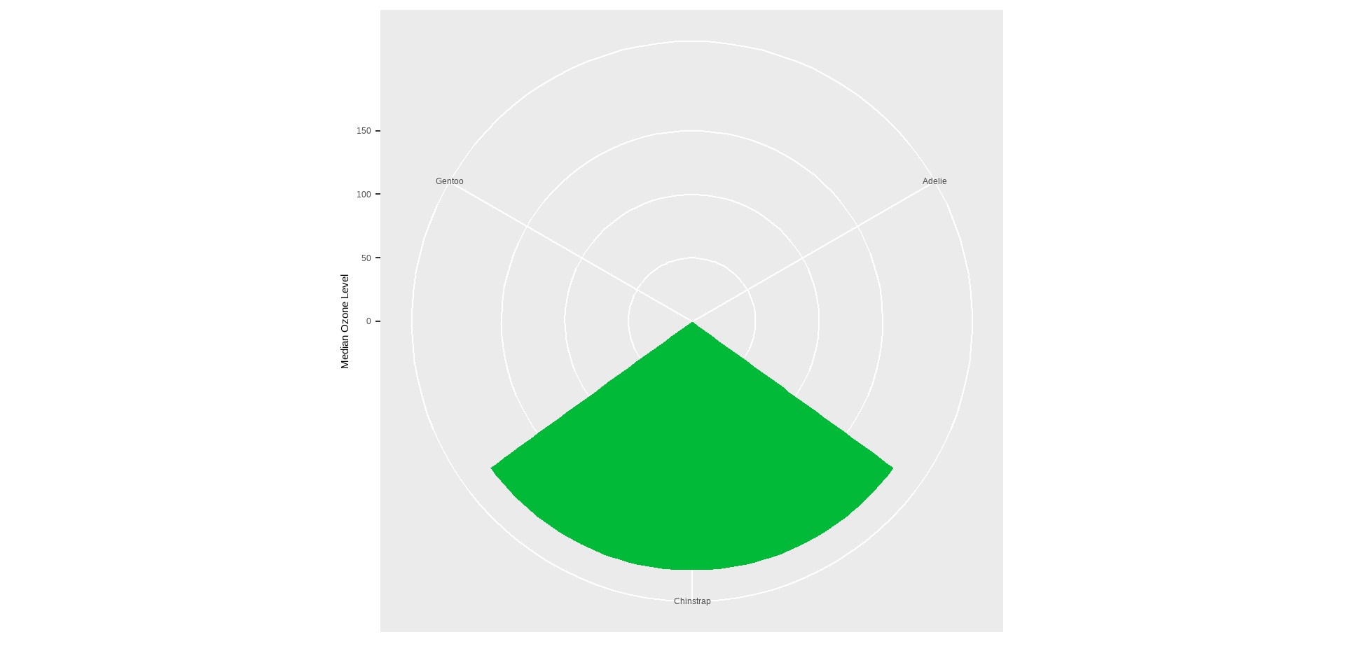
penguins %>% dplyr::group_by(species) %>% dplyr::summarize(bd =median(flipper_length_mm)) %>%ggplot(aes(x = species, y = bd)) +geom_col(aes(fill = species), color =NA) +labs(x ="", y ="Median Ozone Level") +coord_polar() +guides(fill ="none")
Coordinates
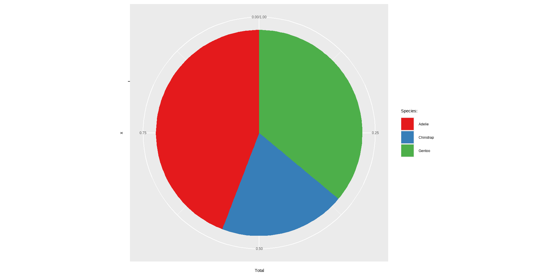
coord_polar(theta = "y"): Used for creating pie charts by specifying the theta parameter as “y”.
Code
library(dplyr)chic_sum <- penguins %>%mutate(n_all =n()) %>%group_by(species) %>% dplyr::summarize(Total =n() /unique(n_all)) ggplot(chic_sum, aes(x ="", y = Total)) +geom_col(aes(fill = species), width =1, color =NA) +coord_polar(theta ="y") +scale_fill_brewer(palette ="Set1", name ="Species:")
Axis Functions
scale_x_continuous() / scale_y_continuous(): Customize the breaks, labels, and limits of continuous scales.
Code
p +scale_x_continuous(breaks =seq(0, 60, by =10))
Axis Functions
scale_x_reverse() / scale_y_reverse(): Reverses the direction of the x or y axis, making higher values appear on the left or bottom.
Code
p +scale_y_reverse()
Axis Functions
scale_y_log10(): Transforms the y-axis to a logarithmic scale (base 10), useful for data with a wide range.
Code
p+scale_y_sqrt()
Smoothings
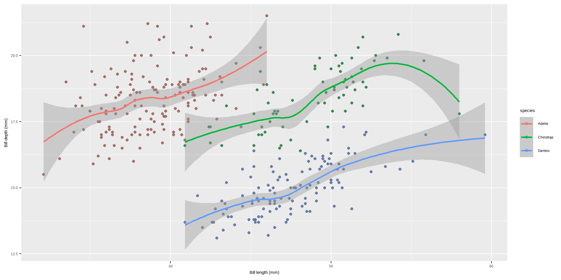
To make smoothing our plot, we can simply use stat_smooth().
This adds a LOESS (locally weighted scatter plot smoothing, method = "loess") if you have fewer than 1000 points or a GAM (generalized additive model, method = "gam") otherwise.
Code
p +geom_point(color ="gray40", alpha = .5) +stat_smooth()
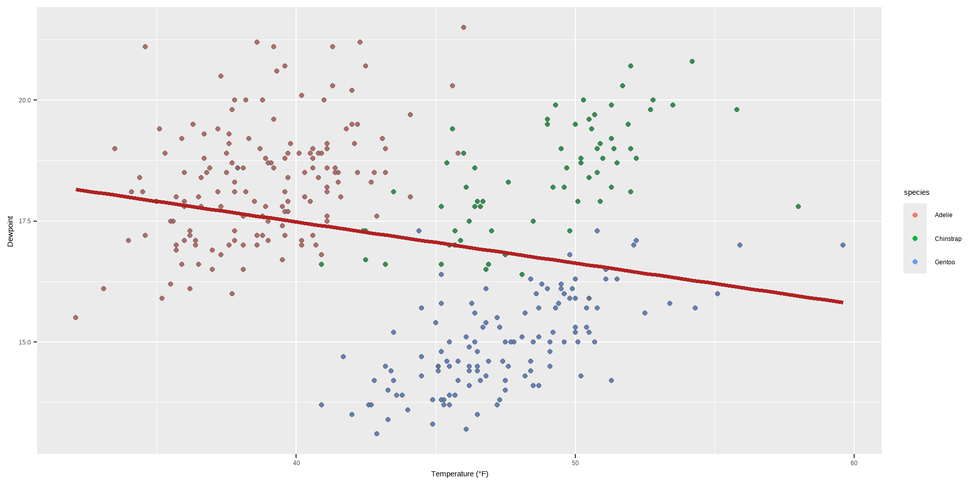
Adding a Linear Fit
Though the default is a LOESS or GAM smoothing, it is also easy to add a standard linear fit:
Code
p +geom_point(color ="gray40", alpha = .5) +stat_smooth(method ="lm", se =FALSE, color ="firebrick", linewidth =1.3)+labs(x ="Temperature (°F)", y ="Dewpoint")
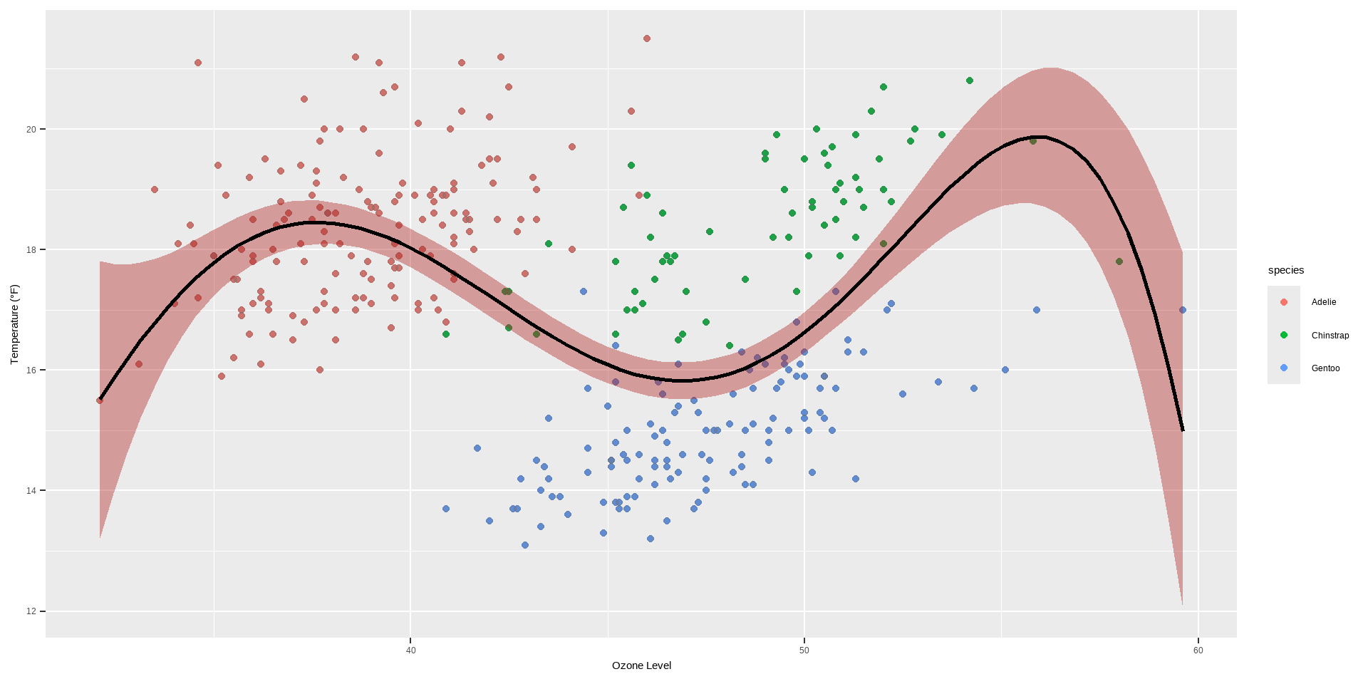
p +geom_point(color ="gray40", alpha = .3) +geom_smooth(method ="lm",formula = y ~ x +I(x^2) +I(x^3) +I(x^4) +I(x^5),color ="black", fill ="firebrick") +labs(x ="Ozone Level", y ="Temperature (°F)")
Interactive Plots
Interactive plots in R are a great way to enhance the user experience by providing dynamic and visually appealing graphics. Some libraries that can be used in combination with ggplot2 or on their own to create interactive visualizations:
There are different interactive Plot Libraries. The following are among the few
Plot.ly} is a tool for creating online, interactive graphics and web apps. The plotly package in R allows you to easily convert your ggplot2 plots into interactive plots.
Code
library(plotly)ggplotly(p)
Interactive Plots
This function ggplotly(p) converts the ggplot2 object p into an interactive plot.
ggiraph() is an R package that allows you to create dynamic ggplot2 graphs, adding tooltips, animations, and JavaScript actions.
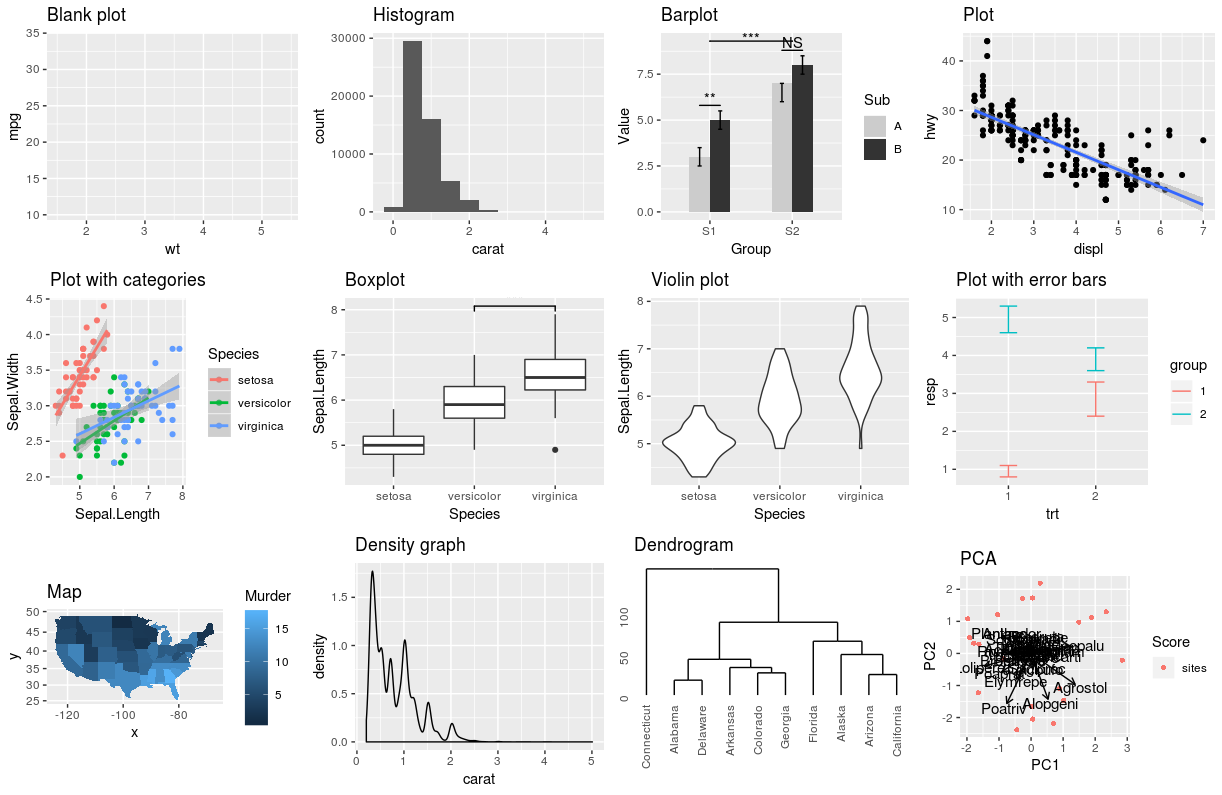
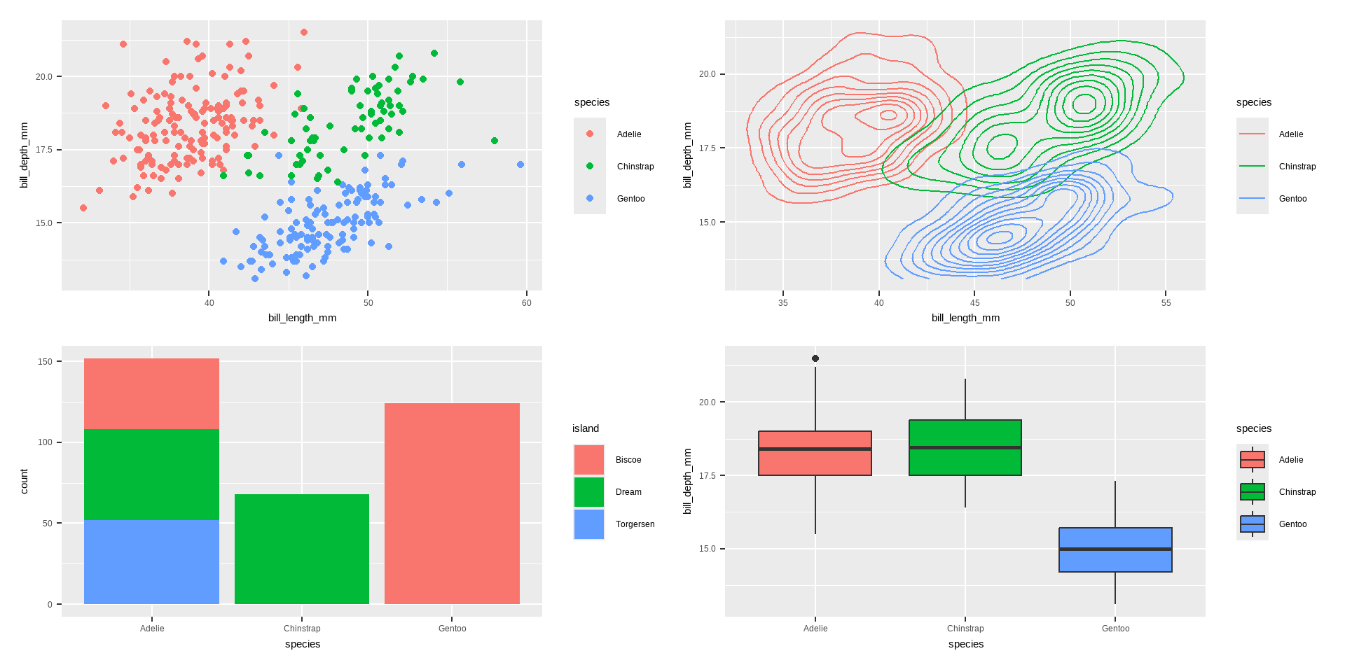
p1 <-ggplot(penguins, aes(x = bill_length_mm, y = bill_depth_mm, colour = species)) +geom_point()p2 <-ggplot(penguins, aes(x = bill_length_mm, y = bill_depth_mm, colour = species)) +geom_density2d()p3 <-ggplot(penguins, aes(x = species, fill = island)) +geom_bar()p4 <-ggplot(penguins, aes(x = species, y = bill_depth_mm, fill = species)) +geom_boxplot()library(patchwork)p1 + p2 + p3 + p4
Create different plots using geom_*()
This is a blank plot, before we add any geom_* to represent variables in the dataset.
Code
ggplot(penguins)
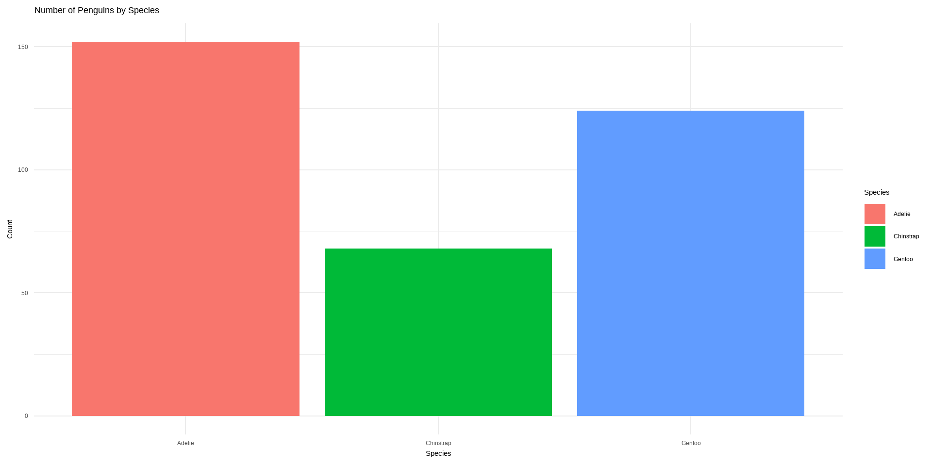
Bar plot using geom_bar()
Bar chart of number of penguins by species. I would like to know how many species we have in this dataset.
Code
ggplot(penguins, aes(x = species, fill = species)) +geom_bar() +labs(title ="Number of Penguins by Species",x ="Species", y ="Count", fill ="Species") +theme_minimal()
Bar plot using geom_bar()
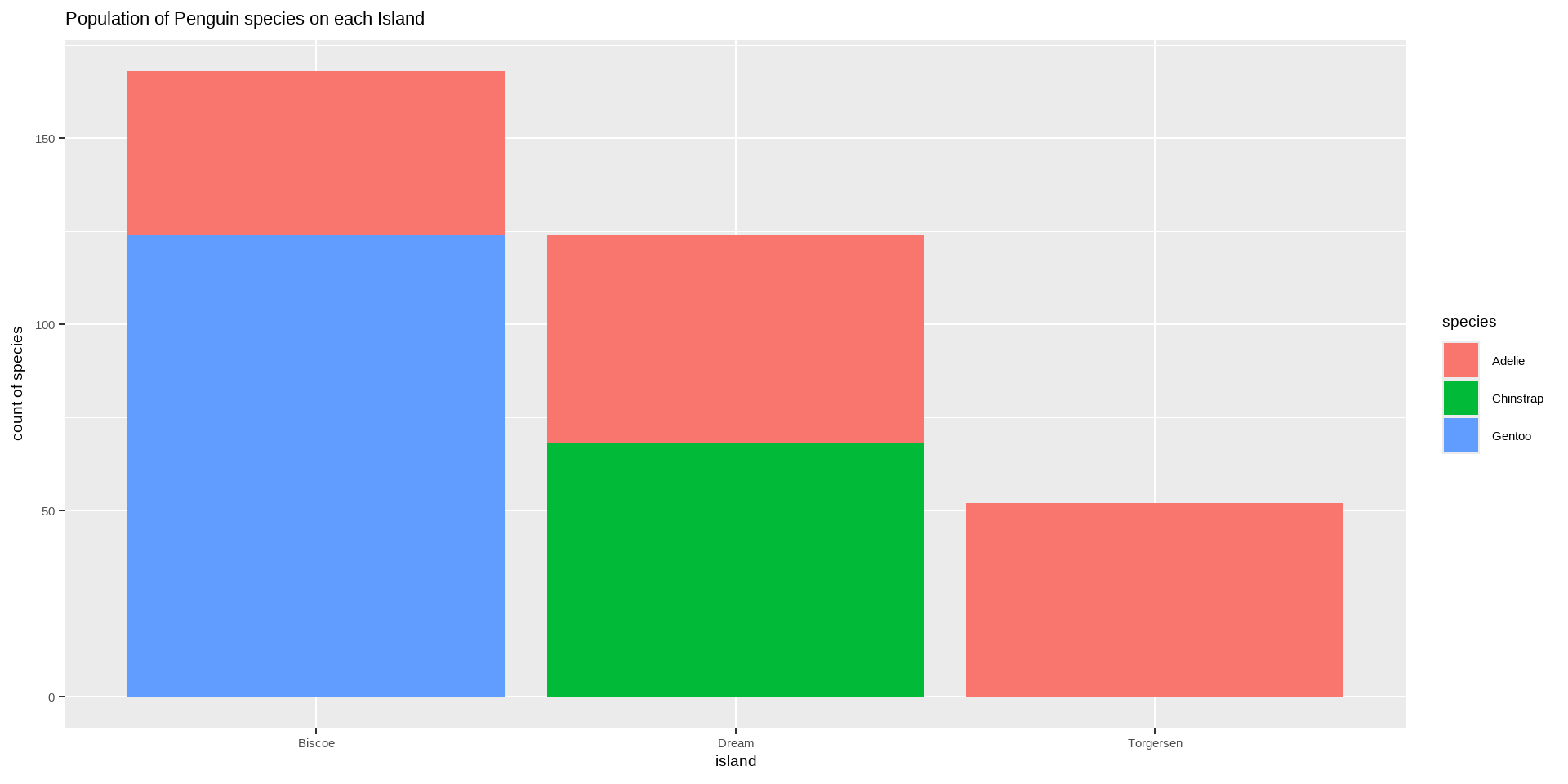
Number of Penguin species on each Island
Code
ggplot(data = penguins)+geom_bar(mapping=aes(x=island, fill=species))+labs(title="Population of Penguin species on each Island", y="count of species")+theme(text=element_text(size=14))
Bar plot using geom_bar()
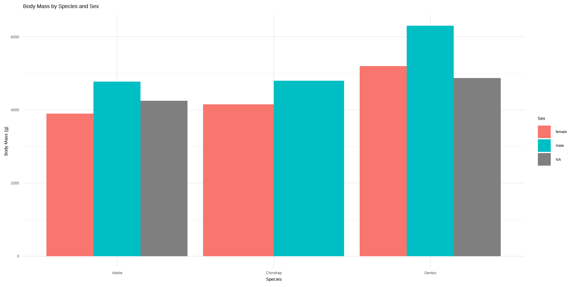
chart of body mass by species & sex.
Code
ggplot(penguins, aes(x = species, y = body_mass_g, fill = sex)) +geom_bar(stat ="identity", position ="dodge") +labs(title ="Body Mass by Species and Sex",x ="Species", y ="Body Mass (g)", fill ="Sex") +theme_minimal()
Labels
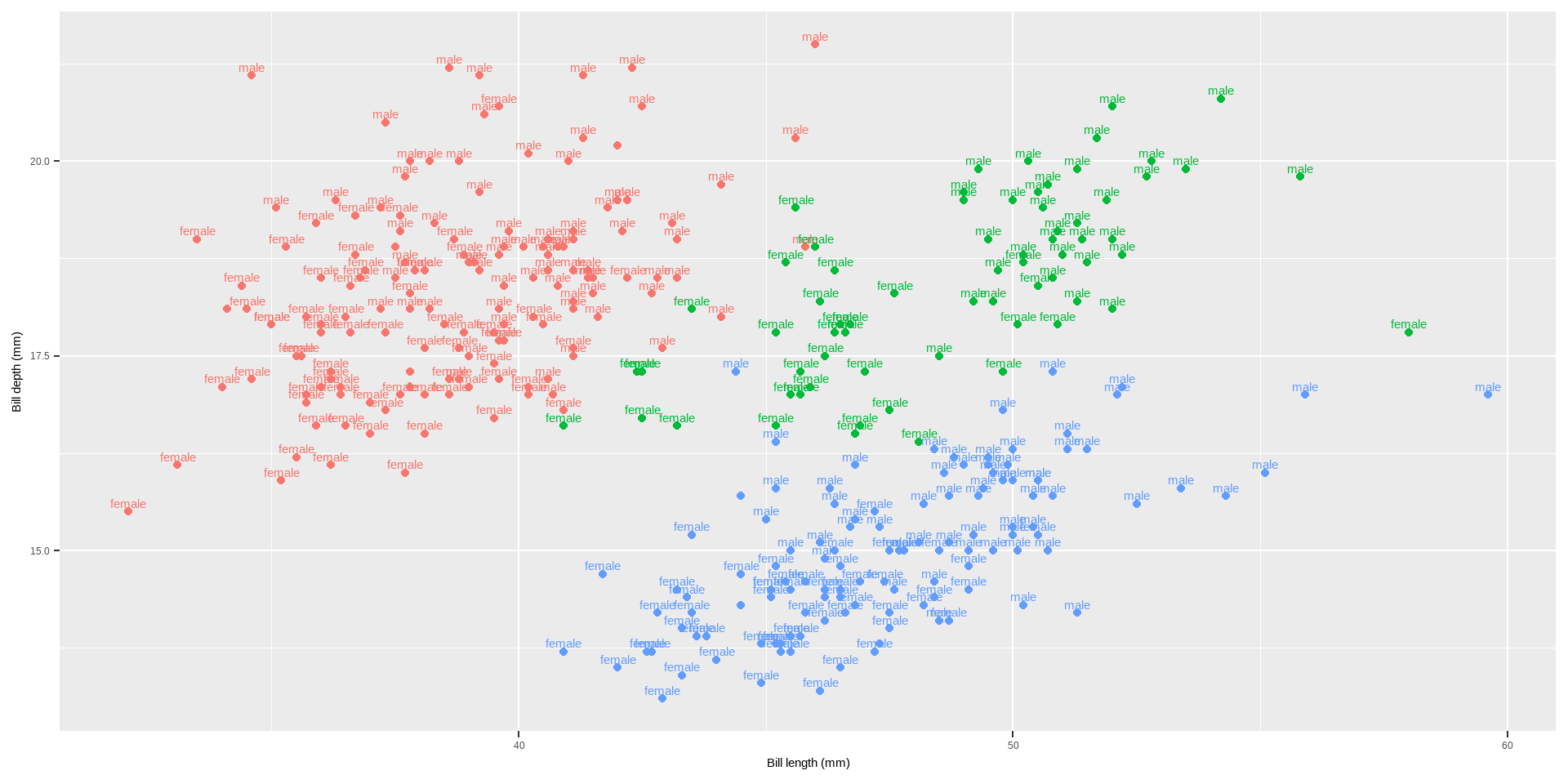
You can add labels with geom_label or geom_text. geom_text is just text and geom_label is text inside a rounded white box (this, of course, can be changed).
Histograms: geom_histogram()
A histogram is an accurate graphical representation of the distribution of numeric data. There is only one aesthetic required: the x variable.
Code
ggplot(penguins,aes(x = bill_length_mm)) +geom_histogram() +ggtitle("Histogram of penguin bill length ")
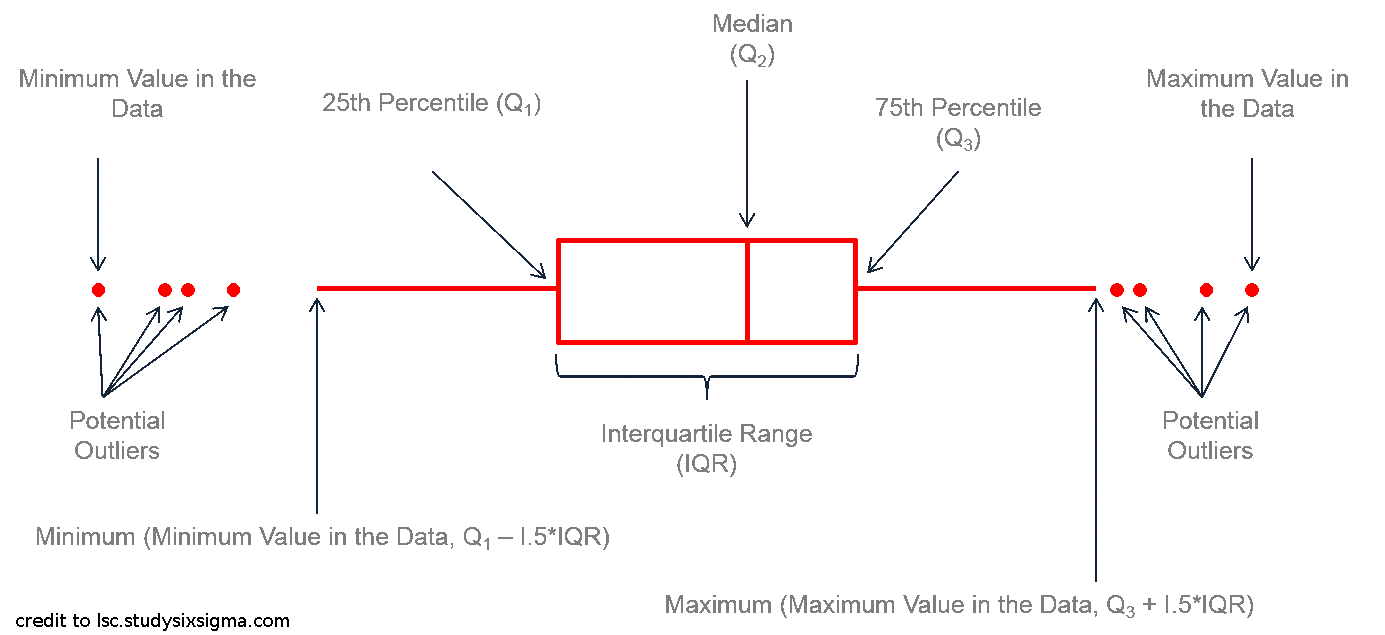
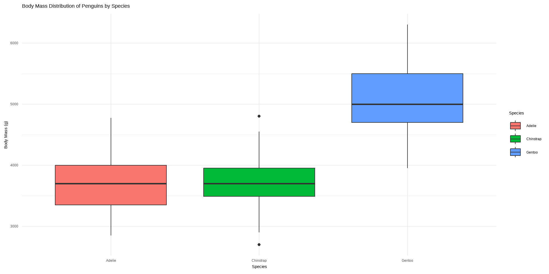
Boxplot: geom_boxplot()
Boxplot: geom_boxplot()
Boxplot of body mass distribution of penguins by species
Code
ggplot(penguins, aes(x = species, y = body_mass_g, fill = species)) +geom_boxplot() +labs(title ="Body Mass Distribution of Penguins by Species",x ="Species", y ="Body Mass (g)", fill ="Species") +theme_minimal()
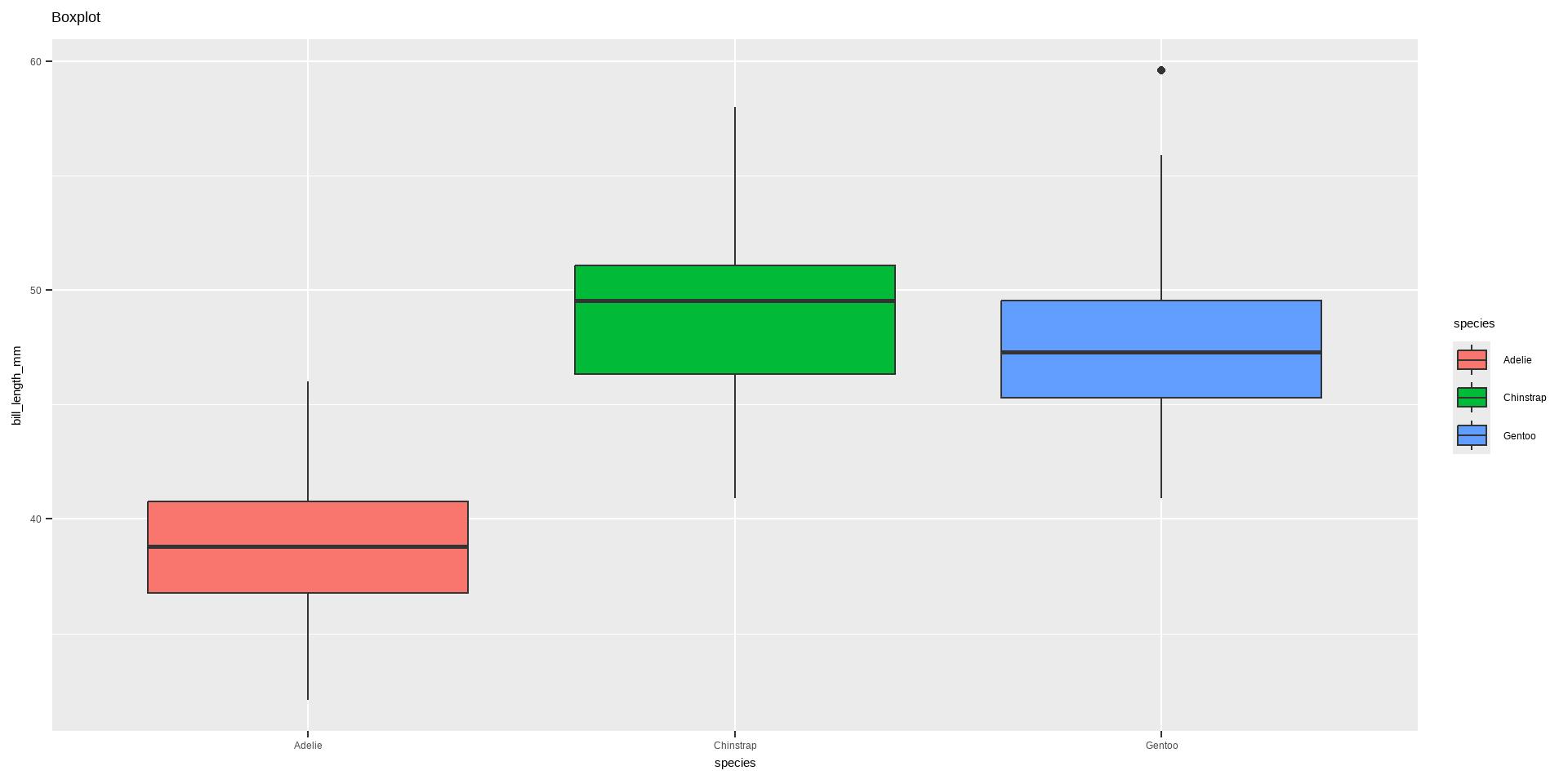
Boxplot: geom_boxplot()
Code
ggplot(data = penguins,aes(x = species, y = bill_length_mm, fill = species)) +geom_boxplot() +labs(title ="Boxplot")
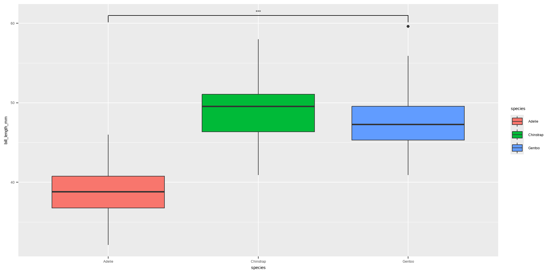
Boxplot: geom_boxplot()
Boxplot with annotations: geom_boxplot() and geom_signif()
Code
library(ggsignif)ggplot(data = penguins, aes(x = species, y= bill_length_mm, fill = species)) +geom_boxplot() +# specify the comparison we are interested ingeom_signif(comparisons =list(c("Adelie", "Gentoo")), map_signif_level=TRUE)
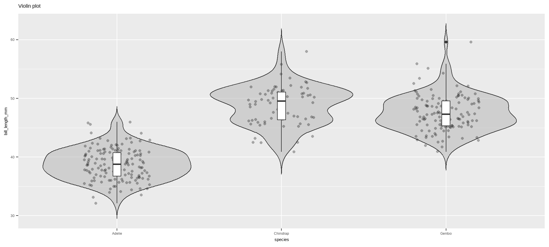
Violin plot: geom_violin()
Violin plot allows to visualize the distribution of a numeric variable for one or several groups. It is really close to a boxplot, but allows a deeper understanding of the distribution.
Violin plot: geom_violin()
Violin plot: geom_violin()
Code
violin <-ggplot(data = penguins, aes(x = species, y = bill_length_mm)) +geom_violin(trim =FALSE, fill ="grey70", alpha = .5) +labs(title ="Violin plot")violin
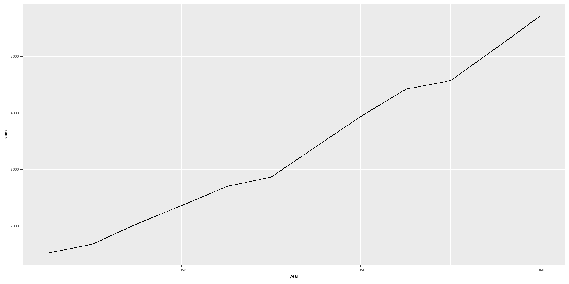
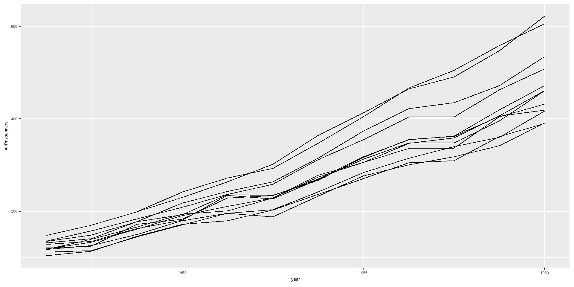
You can use geom_line() for line charts to display values over time. geom_line() requires an additional group= aesthetic. If there should be only 1 line because there is only 1 time variable, then use group=1. If you want to split the lines based on another variable, use group=variable_name.
We can add labels to the ends of the line using geom_label() (see Labels) but the lines are very close together, so we will use ggrepel() instead. This gives the labels space and connects them with their lines.