Basic data analysis in R
Using an Ethiopian Malaria Indicator Survey data
Ethiopian Public health Institute (EPHI)
2026-06-21
Today’s Agenda
- Understanding our data: load, inspect, audit missingness
-
Summarising variables: the
gtsummaryworkflow - Graphs & plots: distributions, comparisons, what to look for
- Choosing what to report: mean vs median · table vs graph
- Statistical tests: t-test, Wilcoxon, chi-square, regression
- Quarto for reporting: one source → HTML, PDF, Word
Tip
By the end of today you will produce one .qmd file that loads the malaria survey, makes a Table 1, runs a regression, and renders to an HTML report you can publish.
Part 1. Know Your Data: the Malaria Indicator Survey
Before you analyse anything, understand what you have
About the survey
- National survey of households across 8 Ethiopian regions
- Measures the core malaria indicators: testing, positivity, bednet use, indoor spraying, plus nutrition and anemia
- Modeled on the Malaria Indicator Survey (MIS) design
- Our dataset: ~26,000 individuals in ~5,000 households
- Real-world missingness:
bmi(children not measured) andmalaria_positive(only the tested)
Variables in our dataset
| Variable | Type | Example |
|---|---|---|
individual_id |
ID | HH-00001-01 |
region |
Categorical | Gambella / Amhara… |
sex |
Categorical | Female / Male |
wealth_quintile |
Ordinal | Lowest – Highest |
bednet_used |
Categorical | Yes / No |
hemoglobin |
Numeric | g/dL |
bmi |
Numeric | kg/m² |
malaria_positive |
Binary | Yes / No |
Note
This is a simulated, de-identified survey built for teaching. It has the real problems analysts face: missing values, skewed distributions, mixed variable types, and large enough n to run real tests.
The survey at a glance
5,000Households
26,264Individuals
8Regions
18.7%Tested for malaria
19%Positive (of tested)
13.2%Anemic (Hb < 11)
Note
These figures are computed live from the loaded data, so they always match the file you are practicing from.
Load packages, read the data
Why this order matters:
-
tidyversefirst - gives youread_csv(),mutate(),filter(), plus pipes -
gtsummarynext - for the descriptive table you’ll build later -
janitorlast - small helpers; loaded last so itstabyl()doesn’t get masked
Tip
Reproducibility rule: keep the data file next to your .qmd. Use relative paths ("data/malaria_survey_ethiopia.csv"), never absolute paths like "C:/Users/Me/Desktop/..." - they break the moment someone else opens your project.
Inspect the structure first
Rows: 26,264
Columns: 30
$ individual_id            <chr> "HH-00001-01", "HH-00001-02", "HH-00001-03", …
$ household_id             <chr> "HH-00001", "HH-00001", "HH-00001", "HH-00001…
$ region                   <fct> Amhara, Amhara, Amhara, Amhara, Amhara, Amhar…
$ zone                     <chr> "AMH-Z5", "AMH-Z5", "AMH-Z5", "AMH-Z5", "AMH-…
$ woreda                   <chr> "AMH-Z5-W2", "AMH-Z5-W2", "AMH-Z5-W2", "AMH-Z…
$ kebele                   <chr> "AMH-Z5-W2-K10", "AMH-Z5-W2-K10", "AMH-Z5-W2-…
$ household_size           <dbl> 8, 8, 8, 8, 8, 8, 8, 8, 7, 7, 7, 7, 7, 7, 7, …
$ wealth_quintile          <fct> Lowest, Lowest, Lowest, Lowest, Lowest, Lowes…
$ distance_health_facility <dbl> 5.6, 5.6, 5.6, 5.6, 5.6, 5.6, 5.6, 5.6, 5.5, …
$ altitude                 <dbl> 2723, 2723, 2723, 2723, 2723, 2723, 2723, 272…
$ rainfall_mm              <dbl> 529, 529, 529, 529, 529, 529, 529, 529, 291, …
$ irs_received             <chr> "No", "No", "No", "No", "No", "No", "No", "No…
$ age                      <dbl> 27, 25, 16, 9, 49, 9, 22, 25, 14, 20, 11, 12,…
$ sex                      <fct> Male, Female, Male, Male, Female, Female, Mal…
$ pregnancy_status         <chr> "Not applicable", "Not pregnant", "Not applic…
$ education_level          <chr> "Primary", "Secondary", "Higher", "None", "Se…
$ fever_last_2weeks        <chr> "No", "No", "No", "No", "No", "No", "No", "No…
$ malaria_tested           <chr> "No", "No", "No", "No", "No", "No", "No", "No…
$ rdt_result               <chr> "Not tested", "Not tested", "Not tested", "No…
$ malaria_positive         <chr> NA, NA, NA, NA, NA, NA, NA, NA, NA, NA, NA, N…
$ treatment_received       <chr> "No", "No", "No", "No", "No", "No", "No", "No…
$ bednet_owned             <chr> "Yes", "No", "No", "No", "No", "Yes", "Yes", …
$ bednet_used              <chr> "Yes", "No", "No", "No", "No", "No", "Yes", "…
$ bednet_condition         <chr> "Worn", "No net", "No net", "No net", "No net…
$ hemoglobin               <dbl> 13.4, 11.5, 11.4, 11.1, 12.4, 12.6, 14.4, 14.…
$ anemia_status            <fct> Not anemic, Mild, Moderate, Mild, Not anemic,…
$ bmi                      <dbl> 23.6, 19.9, NA, NA, 24.8, NA, 23.4, 23.2, NA,…
$ nutritional_status       <fct> Normal, Normal, Not applicable, Not applicabl…
$ anemic                   <fct> Not anemic, Not anemic, Not anemic, Not anemi…
$ bmi_missing              <lgl> FALSE, FALSE, TRUE, TRUE, FALSE, TRUE, FALSE,…
Why we always do this first:
glimpse() is the analyst’s first move on any new dataset. In one line you learn:
- How many rows and columns is this what you expected?
-
Variable names and types
<dbl>,<chr>,<fct>? - The first few values do they look sensible?
Catching a wrongly-typed variable here (e.g. wealth_quintile stored as text) saves hours of debugging later.
Audit missing data - never skip this
             sex              bmi malaria_positive
               0            14049            21350
What this tells you:
-
bmiis missing for every child under 18 (BMI is only computed for adults) - a structural gap, not a data error -
malaria_positiveis missing for everyone not tested (~80%) - it only exists for those who had an RDT -
region,sex,wealth_quintile,hemoglobinare complete - safe for descriptive tables
Variable types determine your analysis
# A tibble: 1 × 30
  individual_id household_id region zone      woreda    kebele    household_size
  <chr>         <chr>        <chr>  <chr>     <chr>     <chr>     <chr>
1 character     character    factor character character character numeric
# ℹ 23 more variables: wealth_quintile <chr>, distance_health_facility <chr>,
#   altitude <chr>, rainfall_mm <chr>, irs_received <chr>, age <chr>,
#   sex <chr>, pregnancy_status <chr>, education_level <chr>,
#   fever_last_2weeks <chr>, malaria_tested <chr>, rdt_result <chr>,
#   malaria_positive <chr>, treatment_received <chr>, bednet_owned <chr>,
#   bednet_used <chr>, bednet_condition <chr>, hemoglobin <chr>,
#   anemia_status <chr>, bmi <chr>, nutritional_status <chr>, anemic <chr>, …
The four R types you need to recognise:
| R type | Used for | Example variable |
|---|---|---|
dbl / int
|
Continuous / count |
hemoglobin, bmi, age
|
chr |
Text - recode to factor | raw rdt_result strings |
fct |
Categorical with levels |
wealth_quintile after factor()
|
lgl |
TRUE / FALSE | bmi_missing |
Why type matters: gtsummary, ggplot2, and every statistical test treat numeric and categorical variables differently. If wealth_quintile is stored as <chr> instead of an ordered <fct>, your tables sort alphabetically ("Fourth" before "Lowest") - wrong.
Descriptive Statistics: The four dimensions of any variable
Summarise every variable before you model anything
| Dimension | What it captures | Statistic |
|---|---|---|
| Centre | Typical value | Mean, median, mode |
| Spread | Variability | SD, IQR, range |
| Shape | Symmetry & tails | Skewness, kurtosis |
| Frequency | Category counts | n, %, cumulative % |
What to report by variable type
- Continuous, normal → Mean ± SD
- Continuous, skewed → Median (IQR)
- Categorical → n (%)
- Binary → n (%) of the positive class
Describe all variables before any modelling. A one-line summary per variable prevents major errors downstream.
For basic concepts, see the Descriptive Statistics Slides.
What gtsummary does for you
- Auto-detects variable types: continuous vs categorical
- Continuous → median (IQR) by default · Categorical → n (%)
-
add_p()automatically picks the correct statistical test -
add_overall()adds an all-participants column - Output-ready for HTML, Word, and PDF via
as_gt()oras_flex_table() - Bold or italicise labels in one pipe step
Tip
-
gtsummaryis the single most time-saving package in R for descriptive tables. - One pipe replaces ~30 lines of manual
summarise()+pivot_longer()+ formatting code.
Basic tbl_summary() code
What this does, line by line:
-
select(): pick the variables you want to describe -
tbl_summary(): auto-detect types and summarise each -
bold_labels(): make variable names stand out
The output is a publication-ready table. To save it for Word, pipe into as_flex_table() |> flextable::save_as_docx(path = "table1.docx").
Basic tbl_summary() output
| Characteristic | N = 26,2641 |
|---|---|
| sex | |
| Female | 13,228 (50%) |
| Male | 13,036 (50%) |
| wealth_quintile | |
| Lowest | 6,590 (25%) |
| Second | 5,919 (23%) |
| Middle | 5,115 (19%) |
| Fourth | 4,716 (18%) |
| Highest | 3,924 (15%) |
| hemoglobin | 12.90 (11.70, 13.90) |
| 1 n (%); Median (Q1, Q3) | |
Stratified tbl_summary() code
The by = argument is the magic. It splits the table into one column per group and - combined with add_p() - automatically chooses:
- Wilcoxon for skewed continuous
- Chi-square for categorical
- Fisher’s exact if any expected cell < 5
Stratified tbl_summary() output
| Characteristic |
Overall N = 26,2641 |
Female N = 13,2281 |
Male N = 13,0361 |
p-value2 |
|---|---|---|---|---|
| wealth_quintile | 0.089 | |||
| Lowest | 6,590 (25%) | 3,313 (25%) | 3,277 (25%) | |
| Second | 5,919 (23%) | 3,049 (23%) | 2,870 (22%) | |
| Middle | 5,115 (19%) | 2,517 (19%) | 2,598 (20%) | |
| Fourth | 4,716 (18%) | 2,408 (18%) | 2,308 (18%) | |
| Highest | 3,924 (15%) | 1,941 (15%) | 1,983 (15%) | |
| region | 0.2 | |||
| Afar | 3,209 (12%) | 1,624 (12%) | 1,585 (12%) | |
| Amhara | 4,994 (19%) | 2,484 (19%) | 2,510 (19%) | |
| Benishangul Gumuz | 2,042 (7.8%) | 1,004 (7.6%) | 1,038 (8.0%) | |
| Gambella | 1,680 (6.4%) | 847 (6.4%) | 833 (6.4%) | |
| Oromia | 6,326 (24%) | 3,208 (24%) | 3,118 (24%) | |
| Sidama | 2,049 (7.8%) | 1,087 (8.2%) | 962 (7.4%) | |
| Somali | 2,703 (10%) | 1,374 (10%) | 1,329 (10%) | |
| South Ethiopia | 3,261 (12%) | 1,600 (12%) | 1,661 (13%) | |
| hemoglobin | 12.90 (11.70, 13.90) | 12.80 (11.70, 13.90) | 12.90 (11.80, 14.00) | <0.001 |
| 1 n (%); Median (Q1, Q3) | ||||
| 2 Pearson’s Chi-squared test; Wilcoxon rank sum test | ||||
Customising labels and statistics
Code
malaria |>  select(sex, hemoglobin, bmi) |>
  tbl_summary( by = sex,
    statistic = list(
      all_continuous()  ~ "{median} ({p25}, {p75})",
      all_categorical() ~ "{n} ({p}%)"),
    digits = list(all_continuous() ~ 1),
    label  = list(
      hemoglobin ~ "Hemoglobin (g/dL)",
      bmi        ~ "Body Mass Index (kg/m²)"),
    missing = "ifany", missing_text = "Missing, n") |>
  add_p(test = list(all_continuous() ~ "wilcox.test")) |>
  add_overall() |>  bold_labels() |>
  modify_caption("**Table 1. Participant characteristics**")
Tip
The label argument relabels variables for publication - no need to rename your data frame. {p25} / {p75} show explicit percentiles; use {mean} / {sd} for normally-distributed variables.
How to read a gtsummary table
| Characteristic |
Overall N = 26,2641 |
Female N = 13,2281 |
Male N = 13,0361 |
p-value2 |
|---|---|---|---|---|
| Hemoglobin (g/dL) | 12.9 (11.7, 13.9) | 12.8 (11.7, 13.9) | 12.9 (11.8, 14.0) | <0.001 |
| Body Mass Index (kg/m²) | 21.5 (19.0, 23.9) | 21.5 (19.1, 23.9) | 21.5 (19.0, 23.9) | 0.7 |
| Missing, n | 14,049 | 7,073 | 6,976 | |
| 1 Median (Q1, Q3) | ||||
| 2 Wilcoxon rank sum test | ||||
Note
- IQR = interquartile range (25th-75th percentile) - the middle 50 % of the data
-
bmishows a Missing row because it is undefined for children - The Overall column is the unstratified total - useful for the abstract
Exploratory Data Analysis
-
Why we plot every variable first?
- Visualise before you conclude
“Exploratory data analysis can never be the whole story, but nothing else can serve as the foundation stone.” - John Tukey, 1977
Four EDA principles
| Principle | What to do |
|---|---|
| 📊 Look first | Plot before you model |
| 📈 Univariate first | One variable, then pairs |
| 📋 Plot AND tabulate | Numbers give magnitude; graphs give shape |
| 📝 Document decisions | If you drop an outlier, write down why |
EDA checklist
Hemoglobin distribution (histogram)
Code
med_hb <- median(malaria$hemoglobin, na.rm = TRUE)
ggplot(malaria, aes(x = hemoglobin)) +
  geom_histogram(binwidth = 0.5, fill = "#0D9488",
                 colour = "white") +
  geom_vline(xintercept = med_hb,
             colour = "#EF4444", linewidth = 1,
             linetype = "dashed") +
  annotate("text", x = med_hb + 0.4, y = 1500,
           label = paste("Median =",
                         round(med_hb, 1)),
           colour = "#EF4444", hjust = 0) +
  labs(title = "Distribution of hemoglobin",
       x = "Hemoglobin (g/dL)", y = "Count")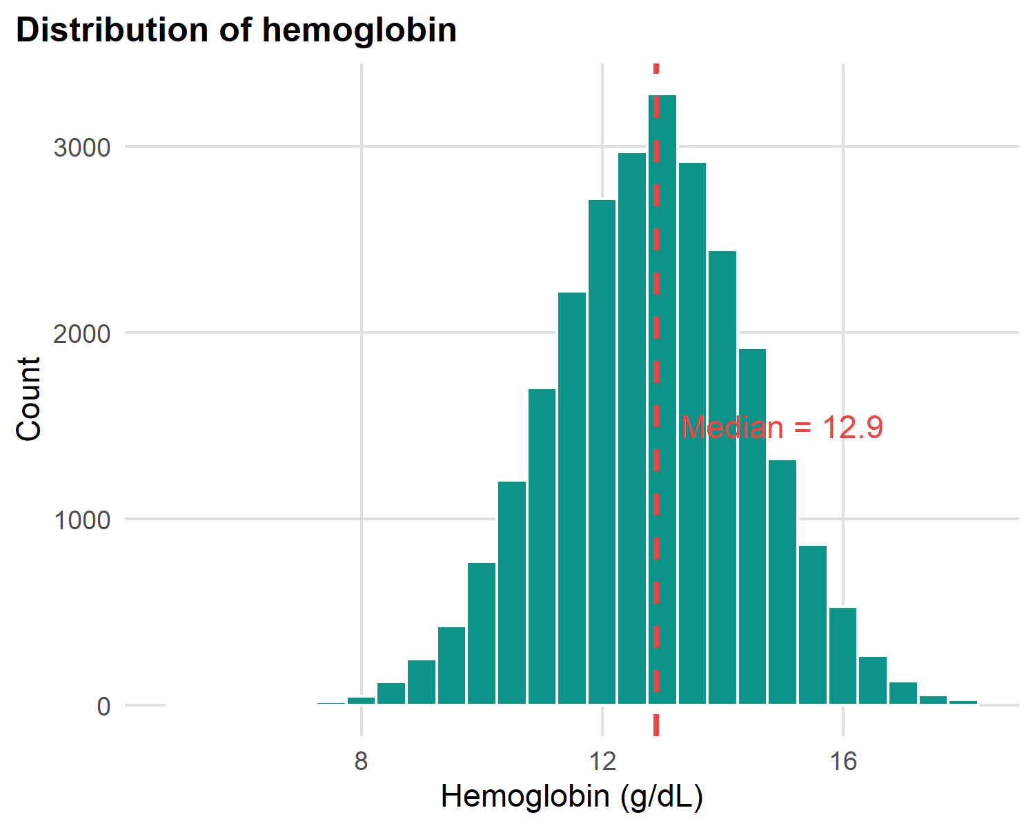
What to look for in any histogram:
- Centre: where is the bulk of the data?
- Spread: narrow peak or wide spread?
- Shape: symmetric (bell), skewed (long tail), or bimodal (two peaks)?
- Outliers: values far from the bulk that need investigation
Hemoglobin is roughly symmetric (bell-shaped) → mean and median nearly agree.
Hemoglobin density curves by sex
Code
ggplot(malaria |> filter(!is.na(sex)),
       aes(x = hemoglobin, fill = sex)) +
  geom_density(alpha = 0.45, colour = NA) +
  scale_fill_manual( values = c(Female = "#1B3A6B",
               Male   = "#F59E0B")) +
  labs(title = "Hemoglobin density by sex",
       x = "Hemoglobin (g/dL)", y = "Density", fill = NULL) +
  theme(legend.position = "top")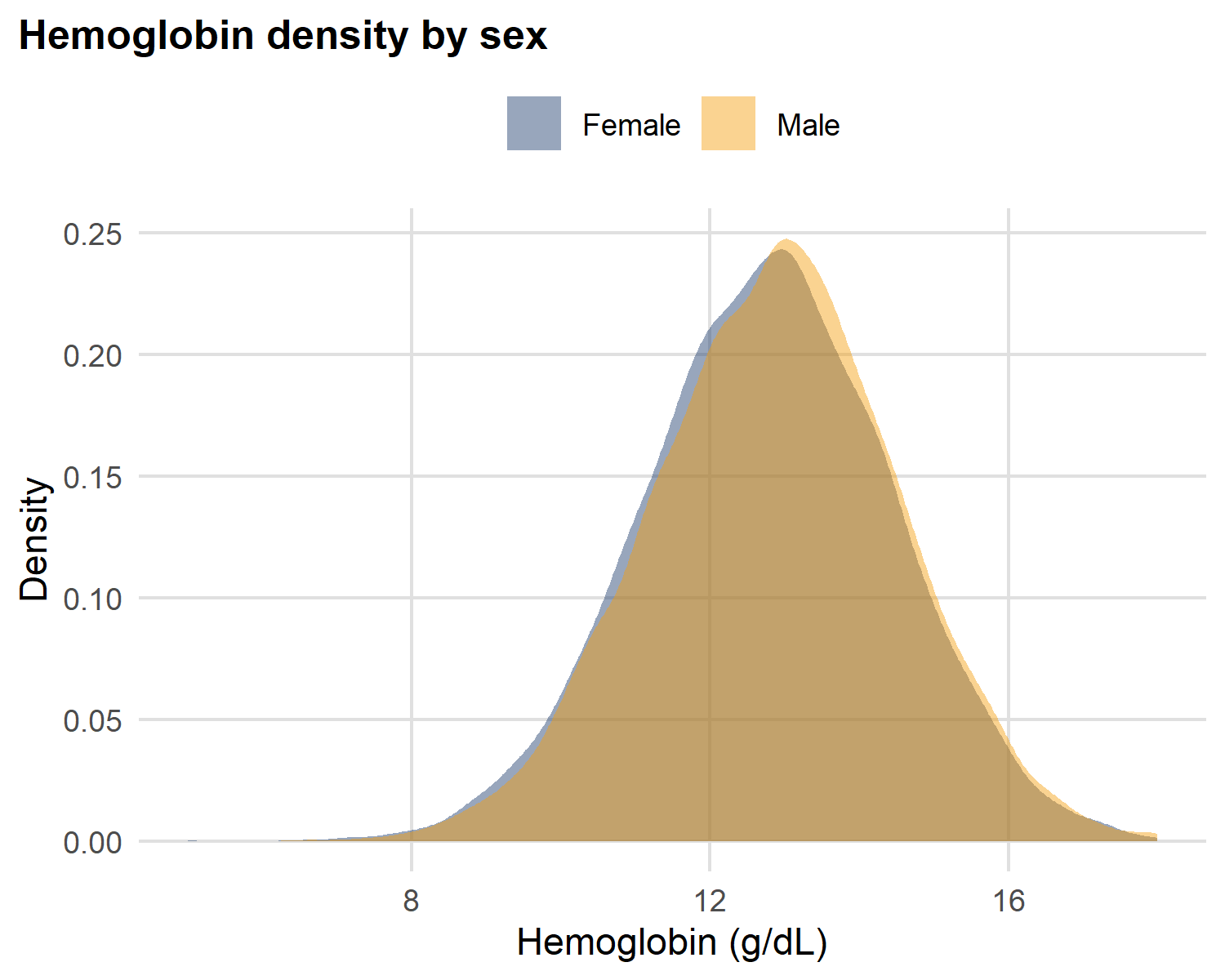
Reading two density curves side-by-side:
A density plot is a smoothed histogram - the area under each curve sums to 1. So you can compare two groups of different sizes on the same axes.
- Both curves are bell-shaped - same family of shape
- Where the peaks sit tells you which group is systematically higher
- Similar widths → similar IQRs (similar spread)
This is what a single number like “mean hemoglobin” would hide entirely.
Box plots: comparing groups
Code
ggplot(malaria |> filter(!is.na(wealth_quintile)),
       aes(x = wealth_quintile, y = hemoglobin, fill = wealth_quintile)) +
  geom_boxplot() +
  scale_fill_manual(values = c("#1B3A6B", "#0D9488",
                               "#F59E0B", "#EF4444", "#7C3AED")) +
  labs(title = "Hemoglobin by wealth quintile", x = NULL,
       y = "Hemoglobin (g/dL)") +
  theme(legend.position = "none",
        axis.text.x = element_text(angle = 20, hjust = 1))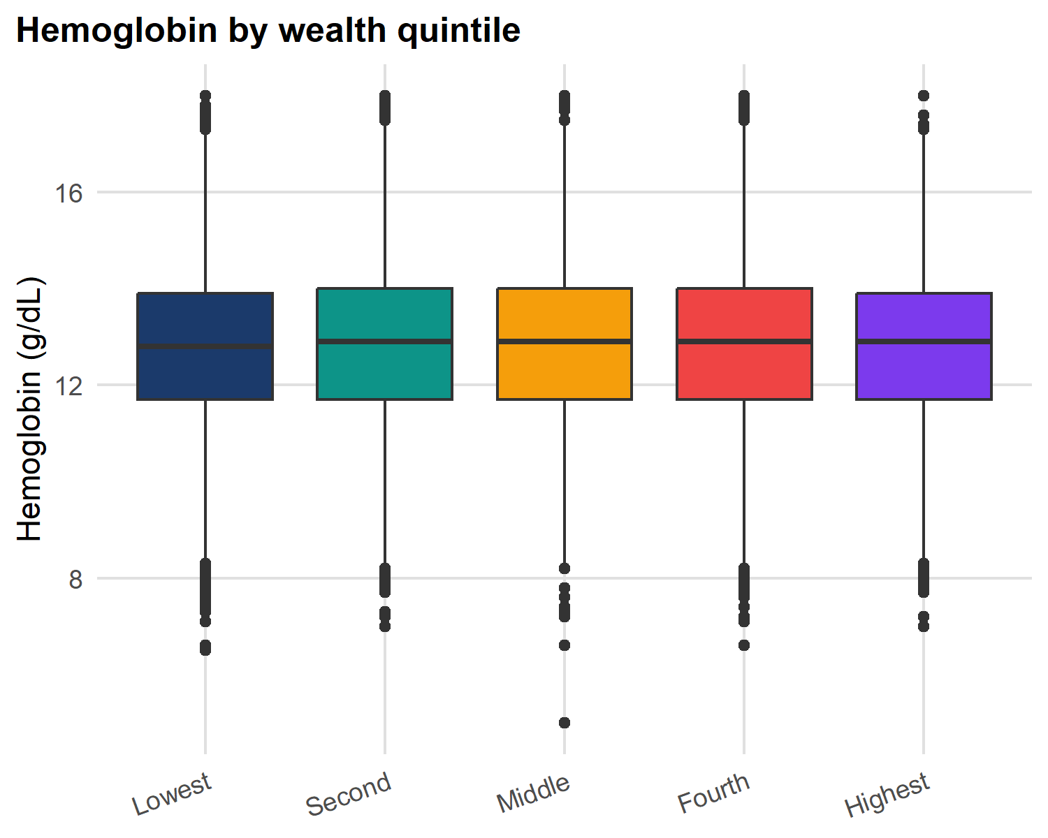
Anatomy of a box plot:
- Box = IQR (25th-75th percentile)
- Line in box = median
- Whiskers = 1.5 × IQR
- Points beyond whiskers = outlier candidates
Bar chart: categorical frequency
Code
malaria |>
  filter(!is.na(region)) |>
  count(region) |> mutate(pct = n / sum(n) * 100) |>
  ggplot(aes(y = reorder(region, n), x = pct)) +
  geom_col(fill = "#0D9488") +
  geom_text(aes(label = sprintf("%.1f%%", pct)),
    hjust = -0.1, size = 3.2) +
  scale_x_continuous(limits = c(0, 30)) +
  labs(title = "Sample distribution by region",
       x = "Percentage (%)", y = NULL)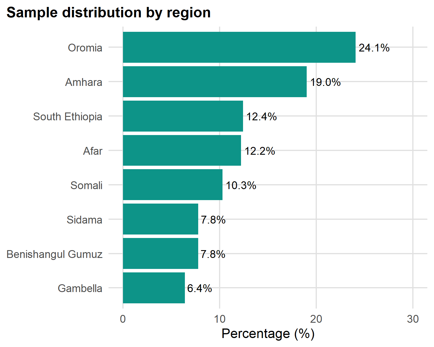
Three rules for good bar charts:
-
Sort by frequency with
reorder(): never alphabetical (unless ordinal like wealth quintile) - Use horizontal bars when category names are long - keeps labels readable
- Avoid 3-D and pie charts: humans can’t compare angles or volumes accurately
Add value labels with geom_text() so readers don’t have to estimate from the axis.
Stacked bars: composition within groups
Code
malaria |> filter(!is.na(wealth_quintile), !is.na(sex)) |>
  count(wealth_quintile, sex) |>
  group_by(wealth_quintile) |>
  mutate(pct = n / sum(n) * 100) |>
  ggplot(aes(x = wealth_quintile, y = pct, fill = sex)) +
  geom_col(position = "fill") +
  geom_text(aes(label = sprintf("%.0f%%", pct)),
    position = position_fill(vjust = 0.5),
    colour = "white", fontface = "bold", size = 3.5) +
  scale_fill_manual(values = c("#1B3A6B","#0D9488")) +
  scale_y_continuous(labels = scales::percent) +
  labs(title = "Sex distribution by wealth quintile",
       subtitle = "Each bar sums to 100%",
       x = "Wealth quintile", y = "Proportion", fill = "Sex") +
  theme(axis.text.x = element_text(angle = 20, hjust = 1))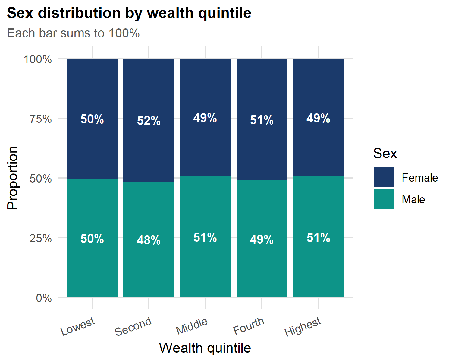
Stacked vs dodged: pick the right one:
-
Stacked (
position = "fill") - best for proportions within a group; each bar sums to 100%. -
Dodged (
position = "dodge") - best for absolute counts between groups; bars side-by-side.
Use stacked when relative composition matters. Use dodged when raw counts matter.
What to Report
Mean vs median
Use MEAN when
- Data is normally distributed (bell-shaped)
- No extreme outliers
- Continuous and symmetric: hemoglobin, height
- Parametric tests (t-test, ANOVA) will follow
Reporting: Mean ± SD Example: Hemoglobin: 12.6 ± 1.7 g/dL
Use MEDIAN when
- Data is skewed (distance to clinic, income, lab values)
- Outliers are present or expected
- Non-parametric tests will follow (Wilcoxon)
- distance to health facility → MEDIAN
Reporting: Median (IQR) Example: Distance: 5.6 (3.1-9.4) km
Important
Why mean fails with skewed data: a few households 40+ km from a clinic pull the mean distance upward but barely move the median. The median better represents the typical household.
Testing for normality
Code
p1 <- ggplot(malaria, aes(sample = hemoglobin)) +
  stat_qq(alpha = 0.2, size = 0.4, colour = "#0D9488") +
  stat_qq_line(colour = "#EF4444", linewidth = 0.7) +
  labs(title = "Hemoglobin (≈ normal)",
       x = "Theoretical", y = "Sample")

p2 <- ggplot(malaria, aes(sample = distance_health_facility)) +
  stat_qq(alpha = 0.2, size = 0.4, colour = "#1B3A6B") +
  stat_qq_line(colour = "#EF4444", linewidth = 0.7) +
  labs(title = "Distance (right-skewed)",
       x = "Theoretical", y = "Sample")
p1 + p2  # patchwork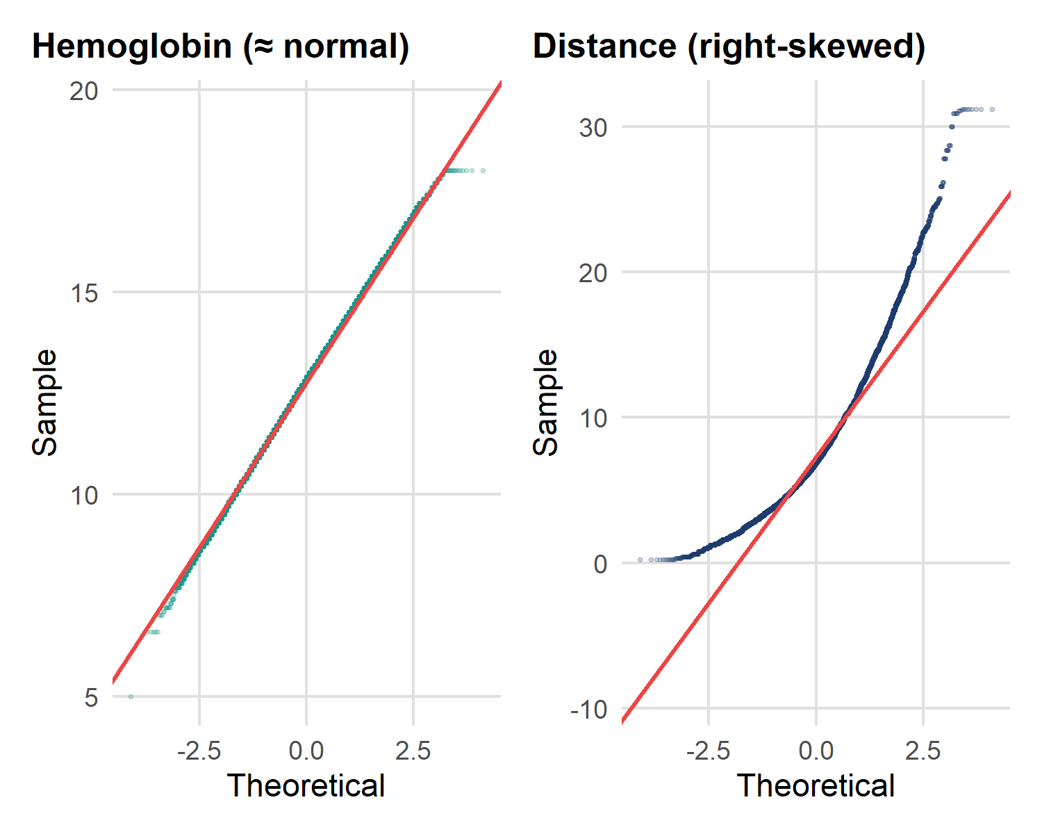
Read a Q–Q plot by the diagonal line:
- Points hug the line → approximately normal → Mean ± SD, parametric tests.
- Points curve away (especially up at the top-right) → right-skew → Median (IQR), non-parametric tests.
| Variable | Q–Q pattern | Decision |
|---|---|---|
| Hemoglobin | On the line | → Mean ± SD, t-test |
| Distance to clinic | Curves upward | → Median (IQR), Wilcoxon |
Table or graph: when to use which
| Goal | Table | Graph |
|---|---|---|
| Exact values matter | Lookup by readers | Loses precision |
| Trend over time | Hard to see | Line plot |
| Compare many groups | Rows are clear | Small multiples |
| Distribution shape | Numbers hide shape | ** Histogram / violin** |
| Two-variable relationship | Hard to parse | Scatter plot |
| Frequency / prevalence | n (%) | Bar chart (≤ 5 groups) |
| Public presentation | Audiences skip tables | ** Graphs are memorable** |
Note
Practical rule: use a table when readers need to look up specific numbers. Use a graph when they need to understand a pattern, trend, or shape.
Quick-reference reporting card
| Variable type | Example | Report as | Test | Best chart |
|---|---|---|---|---|
| Continuous, normal | Hemoglobin | Mean ± SD | t-test / ANOVA | Histogram, box |
| Continuous, skewed | Distance, rainfall | Median (IQR) | Wilcoxon / KW | Box, violin |
| Ordinal | Wealth quintile | Median (IQR) | Wilcoxon / Spearman | Bar, heatmap |
| Nominal / Binary | Sex, region, positive | n (%) | Chi-square / Fisher | Bar (sorted) |
| Count | Household size | Median (IQR) | Poisson / NB | Histogram |
| Time-to-event | Time to treatment | Median (95% CI) | Log-rank, Cox | Kaplan–Meier |
Statistical Tests - three questions
From describing the data to testing hypotheses
Before any test, ask in this order:
- What is the OUTCOME? Continuous or categorical?
- How many GROUPS are you comparing? 2, 3+, or paired?
- Is the data NORMAL (or large enough that the mean is stable)?
| Outcome | Groups | Distribution | Test | R function |
|---|---|---|---|---|
| Continuous | 2 indep. | Normal | t-test | t.test(hemoglobin ~ sex) |
| Continuous | 3+ groups | Normal | ANOVA | aov(hemoglobin ~ region) |
| Categorical | 2×2+ | - | Chi-square | chisq.test(table(...)) |
| Continuous | continuous predictor | - | Linear regression | lm(hemoglobin ~ age) |
| Binary outcome | any | - | Logistic regression | glm(..., family="binomial") |
Warning
The first question is the most important. Continuous outcome → t-test / regression world. Categorical outcome → chi-square / logistic world.
flowchart TD
    Start(["<b>START</b><br/>What is your OUTCOME?"])

    Start -->|Categorical| Cat["Categorical Outcome"]
    Start -->|Continuous| Cont["Continuous Outcome"]
    Start -->|Continuous predictor| Reg["<b>Linear Regression</b>"]

    Cat --> Chi["<b>Chi-square</b><br/>Expected counts ≥ 5"]
    Cat --> Fish["<b>Fisher's exact</b><br/>Expected counts < 5"]

    Cont --> Norm{"Data normally<br/>distributed?"}

    Norm -->|YES| Param["Parametric"]
    Norm -->|NO| NonParam["Non-parametric"]

    Param -->|2 groups| TTest["<b>Independent t-test</b>"]
    Param -->|3+ groups| ANOVA["<b>One-way ANOVA</b><br/>+ Tukey post-hoc"]

    NonParam -->|2 groups| Wilc["<b>Wilcoxon rank-sum</b>"]
    NonParam -->|3+ groups| Krus["<b>Kruskal–Wallis</b><br/>+ Dunn post-hoc"]

    classDef start fill:#FBF7EF,stroke:#1B3A6B,stroke-width:2px,color:#122849
    classDef test fill:#0D9488,stroke:#0a6b62,color:#FBF7EF
    classDef branch fill:#F4ECDC,stroke:#1B3A6B,color:#122849
    classDef decision fill:#F59E0B,stroke:#a76b06,color:#122849

    class Start start
    class Reg,Chi,Fish,TTest,ANOVA,Wilc,Krus test
    class Cat,Cont,Param,NonParam branch
    class Norm decision
Two quick tests in practice
    Welch Two Sample t-test

data:  hemoglobin by sex
t = -4.7058, df = 26260, p-value = 2.542e-06
alternative hypothesis: true difference in means between group Female and group Male is not equal to 0
95 percent confidence interval:
 -0.13711388 -0.05647871
sample estimates:
mean in group Female   mean in group Male
            12.77102             12.86782
    Pearson's Chi-squared test with Yates' continuity correction

data:  table(malaria$bednet_used, malaria$malaria_positive)
X-squared = 83.409, df = 1, p-value < 2.2e-16
How to read them:
- t-test compares mean hemoglobin between females and males; the p-value asks whether the observed gap is bigger than chance.
- Chi-square asks whether bednet use and test positivity are associated; a small p-value means the two are not independent.
For a skewed outcome (like distance), swap t.test() for wilcox.test().
Linear regression: hemoglobin predicted by age
Call:
lm(formula = hemoglobin ~ age, data = malaria)

Residuals:
    Min      1Q  Median      3Q     Max
-7.7831 -1.1139  0.0304  1.1304  5.2631

Coefficients:
             Estimate Std. Error t value Pr(>|t|)
(Intercept) 1.271e+01  1.813e-02 700.970  < 2e-16 ***
age         5.770e-03  7.764e-04   7.431 1.11e-13 ***
---
Signif. codes:  0 '***' 0.001 '**' 0.01 '*' 0.05 '.' 0.1 ' ' 1

Residual standard error: 1.666 on 26262 degrees of freedom
Multiple R-squared:  0.002098,  Adjusted R-squared:  0.00206
F-statistic: 55.22 on 1 and 26262 DF,  p-value: 1.108e-13
Tidy regression output with broom
# A tibble: 2 × 7
  term        estimate std.error statistic  p.value conf.low conf.high
  <chr>          <dbl>     <dbl>     <dbl>    <dbl>    <dbl>     <dbl>
1 (Intercept) 12.7      0.0181      701.   0        12.7      12.7
2 age 0.00577 0.000776 7.43 1.11e-13 0.00425 0.00729# A tibble: 1 × 12
r.squared adj.r.squared sigma statistic p.value df logLik AIC BIC
<dbl> <dbl> <dbl> <dbl> <dbl> <dbl> <dbl> <dbl> <dbl>
1 0.00210 0.00206 1.67 55.2 1.11e-13 1 -50668. 101342. 101367.
# ℹ 3 more variables: deviance <dbl>, df.residual <int>, nobs <int>broom turns model output into a tidy data frame easy to filter, format, and pass to gtsummary or ggplot2.
-
tidy()- one row per coefficient (estimate, SE, p-value, CI) -
glance()- one row per model (R², AIC, n) -
augment()- adds fitted values + residuals to your data
Multiple regression: adding sex and region
Call:
lm(formula = hemoglobin ~ age + sex + region, data = malaria)

Residuals:
    Min      1Q  Median      3Q     Max
-7.7436 -1.1136  0.0243  1.1250  5.5100

Coefficients:
                         Estimate Std. Error t value Pr(>|t|)
(Intercept)             12.635458   0.034419 367.112  < 2e-16 ***
age                      0.005770   0.000775   7.445 9.97e-14 ***
sexMale                  0.097715   0.020523   4.761 1.93e-06 ***
regionAmhara             0.086294   0.037616   2.294  0.02179 *
regionBenishangul Gumuz -0.122000   0.047065  -2.592  0.00954 **
regionGambella          -0.272034   0.050068  -5.433 5.58e-08 ***
regionOromia             0.059707   0.036032   1.657  0.09753 .
regionSidama             0.079939   0.047018   1.700  0.08910 .
regionSomali             0.033171   0.043405   0.764  0.44474
regionSouth Ethiopia     0.085132   0.041342   2.059  0.03948 *
---
Signif. codes:  0 '***' 0.001 '**' 0.01 '*' 0.05 '.' 0.1 ' ' 1

Residual standard error: 1.663 on 26254 degrees of freedom
Multiple R-squared:  0.006221,  Adjusted R-squared:  0.005881
F-statistic: 18.26 on 9 and 26254 DF,  p-value: < 2.2e-16
Publication table for the regression
Publication table for the regression
| Characteristic | Beta | 95% CI | p-value |
|---|---|---|---|
| Age (years) | 0.01 | 0.00, 0.01 | <0.001 |
| Sex | |||
| Female | — | — | |
| Male | 0.10 | 0.06, 0.14 | <0.001 |
| Region | |||
| Afar | — | — | |
| Amhara | 0.09 | 0.01, 0.16 | 0.022 |
| Benishangul Gumuz | -0.12 | -0.21, -0.03 | 0.010 |
| Gambella | -0.27 | -0.37, -0.17 | <0.001 |
| Oromia | 0.06 | -0.01, 0.13 | 0.10 |
| Sidama | 0.08 | -0.01, 0.17 | 0.089 |
| Somali | 0.03 | -0.05, 0.12 | 0.4 |
| South Ethiopia | 0.09 | 0.00, 0.17 | 0.039 |
| Abbreviation: CI = Confidence Interval | |||
| R² = 0.006; Adjusted R² = 0.006; AIC = 101,250; No. Obs. = 26,264 | |||
Tip
tbl_regression() automatically formats CIs, picks exponentiation for logistic models, and bolds significant p-values. One line replaces ~30 lines of manual table code.
Logistic regression: when the outcome is yes / no
So far our outcome (hemoglobin) has been continuous. But the central malaria question is about a binary outcome:
- Did the person test positive for malaria? (yes / no)
- Is the child anemic? (yes / no)
- Did the household use a bednet? (yes / no)
Why we can’t just use linear regression here:
- A linear model can predict probabilities below 0 or above 1 - meaningless
- The relationship between predictors and probability is S-shaped, not straight
- The variance of a 0/1 outcome isn’t constant - violates the equal-variance assumption.
The fix: transform the probability so the linear part of the model has no upper or lower bound. That transformation is called the logit.
The logit link - modelling probabilities
We don’t model the probability \(p\) directly. We model its log-odds:
\[\text{logit}(p) = \log\!\left(\frac{p}{1-p}\right) = \beta_0 + \beta_1 X_1 + \beta_2 X_2 + \dots\]
Why this works
-
p / (1 - p)converts probability into odds (ranges 0 to ∞) - Taking
log()makes it range from −∞ to +∞ - Now the right-hand side can take any value - no more impossible predictions
- Inverting the logit gives back a probability between 0 and 1
In R: glm(y ~ x, family = binomial) fits this model. The default link is logit. You almost never need to change it.
Odds and odds ratios - the interpretation key
Odds = probability of event / probability of no event.
| Probability | Odds | In words |
|---|---|---|
| 0.10 | 0.11 (1 : 9) | “Long shot” |
| 0.50 | 1.00 (1 : 1) | “Even money” |
| 0.80 | 4.00 (4 : 1) | “Strongly favoured” |
Odds ratio (OR) = odds in group A / odds in group B.
| OR | Meaning |
|---|---|
| = 1 | No association - both groups have the same odds |
| > 1 | Group A has higher odds (stronger if larger) |
| < 1 | Group A has lower odds (stronger if smaller) |
Important
Coefficients from glm() are on the log-odds scale. To interpret them as odds ratios, you must exponentiate: exp(coef). We never report log-odds in a paper - always ORs with 95 % CI.
Step 1 - Define the analysis population and outcome
Code
# Restrict to individuals who were actually tested, then set the outcome
tested <- malaria |>
  filter(malaria_tested == "Yes") |>
  mutate(malaria_positive = factor(malaria_positive,
                                   levels = c("No", "Yes")))   # explicit order
# Check prevalence
tested |> count(malaria_positive) |>
  mutate(pct = round(n / sum(n) * 100, 1))
# A tibble: 2 × 3
malaria_positive n pct
<fct> <int> <dbl>
1 No 3980 81
2 Yes 934 19Three things to notice:
-
filter(malaria_tested == "Yes")- positivity is only defined for the tested. Modelling the untested would be meaningless. -
levels = c("No", "Yes")makes “No” the reference category, so R models the probability of “Yes” (a positive test) - what we want.
Step 2 - Fit the model
Code
Call:
glm(formula = malaria_positive ~ age + sex + region + bednet_used,
    family = binomial, data = tested)

Coefficients:
                         Estimate Std. Error z value Pr(>|z|)
(Intercept)             -1.216757   0.113416 -10.728  < 2e-16 ***
age                      0.005997   0.003136   1.912   0.0558 .
sexMale                  0.130449   0.082650   1.578   0.1145
regionAmhara            -3.022170   0.346409  -8.724  < 2e-16 ***
regionBenishangul Gumuz  0.677653   0.118798   5.704 1.17e-08 ***
regionGambella           1.384132   0.115673  11.966  < 2e-16 ***
regionOromia            -2.254217   0.224312 -10.049  < 2e-16 ***
regionSidama            -2.753762   0.512016  -5.378 7.52e-08 ***
regionSomali            -0.222708   0.135684  -1.641   0.1007
regionSouth Ethiopia    -2.140772   0.294971  -7.258 3.94e-13 ***
bednet_usedYes          -0.826719   0.094793  -8.721  < 2e-16 ***
---
Signif. codes:  0 '***' 0.001 '**' 0.01 '*' 0.05 '.' 0.1 ' ' 1

(Dispersion parameter for binomial family taken to be 1)

    Null deviance: 4779.6  on 4913  degrees of freedom
Residual deviance: 3634.4  on 4903  degrees of freedom
AIC: 3656.4

Number of Fisher Scoring iterations: 6
Reading the raw summary() output
The output has four parts you should always check:
| Section | What it tells you |
|---|---|
| Call | Confirms the formula and family - sanity check |
| Coefficients | Estimate (log-odds), SE, z-value, p-value |
| Deviance | Null vs residual - drop in deviance = how much variance the model explains |
| AIC | Lower is better; used to compare models |
Warning
The Estimate column is in log-odds, not odds ratios. A coefficient of 0.45 means log-odds increase by 0.45 - which is exp(0.45) ≈ 1.57, an OR of 1.57. Always exponentiate before interpreting.
Tip
Reference categories (the level not shown) are the comparison group. By default it’s the first factor level - for bednet_used that’s “No”, so the bednet_usedYes row compares net users to non-users.
Step 3 - Get odds ratios with broom
broom::tidy() does the exponentiation, the CIs, and tidies everything into a data frame in one call:
# A tibble: 11 × 7
   term                  estimate std.error statistic p.value conf.low conf.high
   <chr>                    <dbl>     <dbl>     <dbl>   <dbl>    <dbl>     <dbl>
 1 (Intercept)              0.296     0.113    -10.7    0        0.237     0.369
 2 age                      1.01      0.003      1.91   0.056    1         1.01
 3 sexMale                  1.14      0.083      1.58   0.114    0.969     1.34
 4 regionAmhara             0.049     0.346     -8.72   0        0.023     0.091
 5 regionBenishangul Gu…    1.97      0.119      5.70   0        1.56      2.49
 6 regionGambella           3.99      0.116     12.0    0        3.19      5.01
 7 regionOromia             0.105     0.224    -10.0    0        0.066     0.16
 8 regionSidama             0.064     0.512     -5.38   0        0.019     0.153
 9 regionSomali             0.8       0.136     -1.64   0.101    0.612     1.04
10 regionSouth Ethiopia     0.118     0.295     -7.26   0        0.063     0.202
11 bednet_usedYes           0.437     0.095     -8.72   0        0.363     0.526
Now the estimate column is the OR, and conf.low / conf.high give the 95 % CI - ready to paste into a manuscript.
Step 4 - Publication table with gtsummary
Publication table with gtsummary
| Characteristic | OR | 95% CI | p-value |
|---|---|---|---|
| Age (years) | 1.01 | 1.00, 1.01 | 0.056 |
| Sex | |||
| Female | — | — | |
| Male | 1.14 | 0.97, 1.34 | 0.11 |
| Region | |||
| Afar | — | — | |
| Amhara | 0.05 | 0.02, 0.09 | <0.001 |
| Benishangul Gumuz | 1.97 | 1.56, 2.49 | <0.001 |
| Gambella | 3.99 | 3.19, 5.02 | <0.001 |
| Oromia | 0.10 | 0.07, 0.16 | <0.001 |
| Sidama | 0.06 | 0.02, 0.15 | <0.001 |
| Somali | 0.80 | 0.61, 1.04 | 0.10 |
| South Ethiopia | 0.12 | 0.06, 0.20 | <0.001 |
| Slept under a bednet | |||
| No | — | — | |
| Yes | 0.44 | 0.36, 0.53 | <0.001 |
| Abbreviations: CI = Confidence Interval, OR = Odds Ratio | |||
| No. Obs. = 4,914; AIC = 3,656 | |||
Interpreting your odds ratios
Pick one row at a time and translate it into a sentence. Template:
“Compared to [reference category], [predictor level] had OR-fold the odds of a positive malaria test (95 % CI: low-high; p = X.XX), holding all other variables constant.”
Worked example - bednet_usedYes (say OR = 0.55, 95 % CI 0.48-0.63):
People who slept under a bednet had 0.55 times (about 45% lower) the odds of testing positive compared to those who did not (95 % CI: 0.48-0.63; p < 0.001), adjusting for age, sex, and region.
Important
Three things every interpretation must include:
- The reference group (“compared to non-users”)
- The direction and magnitude (“0.55 times the odds”)
- The adjustment set (“holding age, sex, region constant”)
Without these, an OR is meaningless.
Warning
OR is not relative risk. When the outcome is common (>10 %), the OR exaggerates the relative risk. With ~19 % positivity among the tested, interpret an OR with care in plain-language summaries.