# install CRAN packages
install.packages(
  c("ggplot2", "tibble", "tidyr", "forcats", "purrr", "prismatic",
    "corrr", "cowplot", "ggforce", "ggrepel", "ggridges", "ggsci",
    "ggtext", "ggthemes", "grid", "gridExtra", "patchwork", "rcartocolor",
"scico", "showtext", "shiny", "plotly", "highcharter", "echarts4r"))Data Visualization
What is data visualization?
- Data visualization is the presentation of data in a pictorial or graphical format, and
- A data visualization tool is the software that generates this presentation.
- Effective data visualization provides users with intuitive means to
- interactively explore and analyze data,
- enabling them to effectively identify interesting patterns,
- infer correlations and causalities, and
- supports sense-making activities.
- Good visual presentations tend to enhance the message of the visualization.
What is data visualization?
What are the key principles, methods, and concepts required to visualize data for publications, reports, or presentations?
The effectiveness of data visualization depends on several factors
What would you like to communicate?
Who is your audience? Researchers? Journalists? General public? Grant reviewers?
What is the best way to represent your data and your message?
- Is it through a box plot?
- Should you use blue or red?
- What scale should you use?
- Should you add or should you remove information?
Impoerant packages to create figures
A few packages to create figures in R are
ggplot2grammer of graphicscowplotfor composing ggplotsggforcevisual data investigationsggrepelfor nice text labelingggridgesfor ridge plotsggscifor nice color palettesggtextfor advanced text renderingggthemesfor additional themesgridfor creating graphical objectsgridExtraadditional functionsgrid
patchworkfor multi-panel plotsprismaticfor manipulating colorsrcartocolorfor great color palettesscicoperceptional uniform palettesshowtextfor custom fontscharterinteractive visualizationsecharts4rinteractive visualizationsggiraphinteractive visualizationshighcharterinteractive visualizationsplotlyinteractive visualizations
install packages to create figures
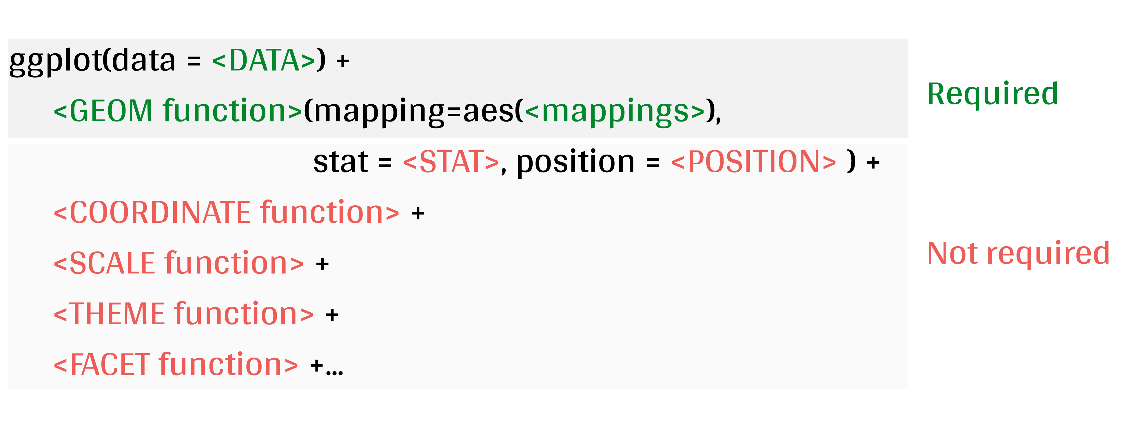
The basic components of plot using ggplot2 Package
ggplot2is a system for declaratively creating graphics, based on the Grammar of Graphics.You provide the data, tell
ggplot2how to map variables to aesthetics, what graphical primitives to use, and it takes care of the details.
Why ggplot2?
- A grammar of graphics is a grammar used to describe and create a wide range of statistical graphics.
- The promise of a grammar for graphics.
- Easy to manage, save, etc.
- Graphs are composed of layers.
- Easy to add stuff to existing graphs.
- ggplot2 graphics take less work to make beautiful and eye-catching graphics.
- Enables the creation of reproducible visualization patterns.
- Publication quality & beyond
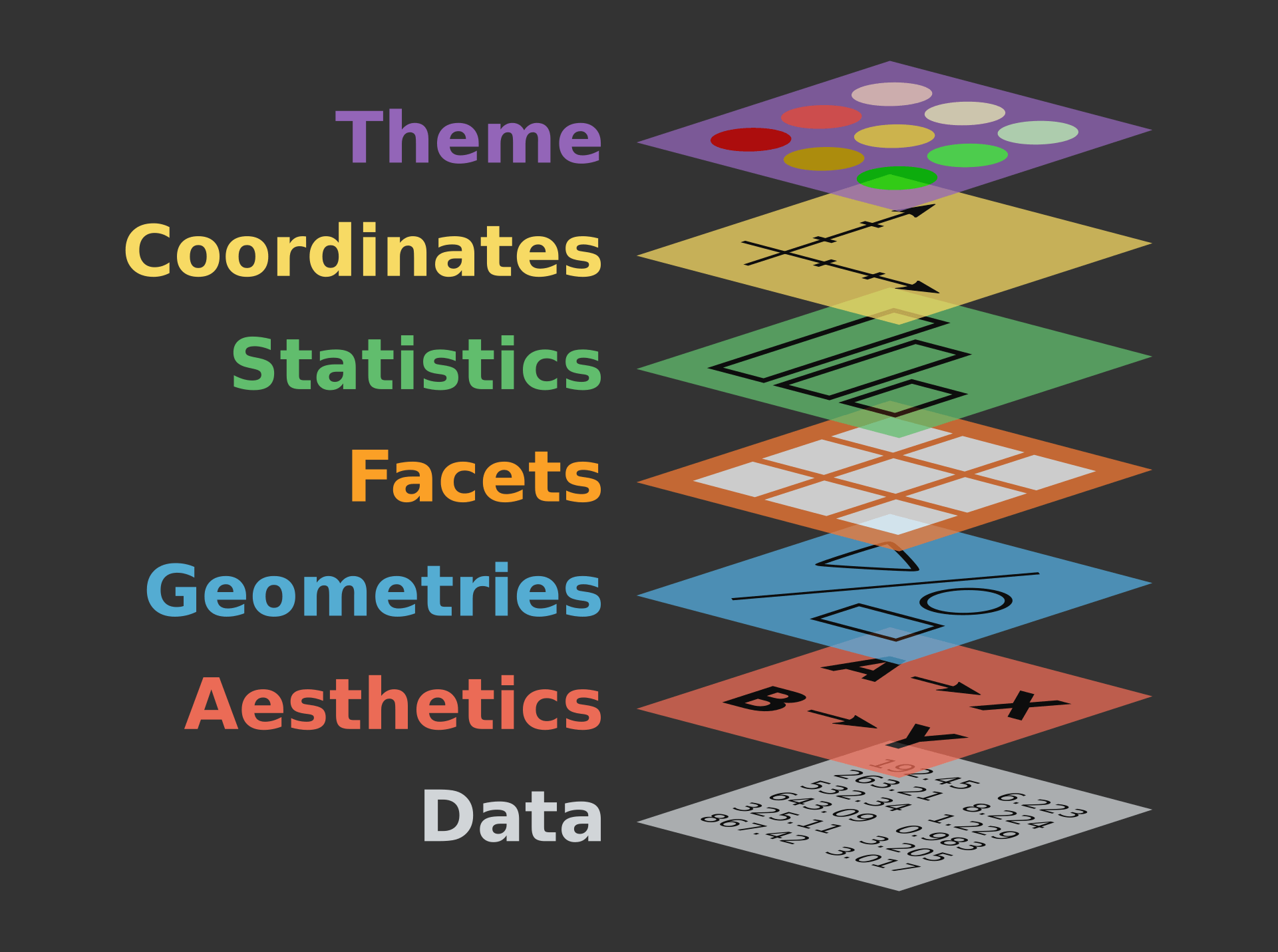
ggplot2 mechanics: the basics
A ggplot is built up from a few basic elements:
- Data: The raw data that you want to plot.
- Geometries
geom_: The geometric shapes that will represent the data. - Aesthetics
aes(): Aesthetics of the geometric and statistical objects, such as position, color, size, shape, and transparency - Scales
scale_: Maps between the data and the aesthetic dimensions, such as data range to plot width or factor values to colors. - Statistical transformations
stat_: Statistical summaries of the data, such as quantiles, fitted curves, and sums. - Coordinate system
coord_: The transformation used for mapping data coordinates into the plane of the data rectangle. - Facets
facet_: The arrangement of the data into a grid of plots. - Visual themes
theme(): The overall visual defaults of a plot, such as background, grids, axes, default typeface, sizes and colors.
Components of the layered grammar
- Layer
- Data
- Mapping
- Statistical transformation (stat)
- Geometric object (geom)
- Position adjustment (position)
- Scale
- Coordinate system (coord)
- Faceting (facet)
Data
- Data defines the source of the information to be visualized.
- Must be a data.frame
- Gets pulled into the ggplot() object
Aesthetics (aes()) (a.k.a. mapping)
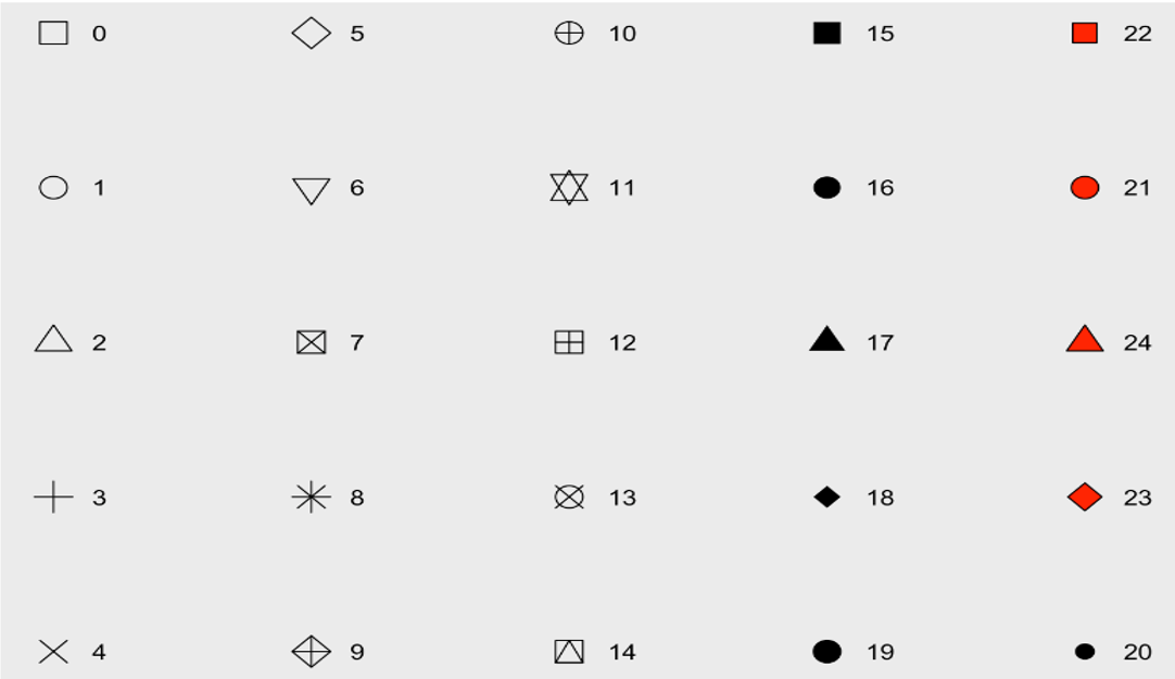
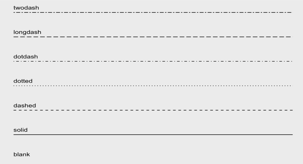
x,y: variablescolour: colours the lines of geometriesfill: fill geometries or fill colorgroup: groups based on the datashape: shape of point, an integer value 0 to 24, or NAlinetype: type of line, a integer value 0 to 6 or a stringsize: sizes of elements, a non-negative numeric valuealpha: changes the transparency,a numeric value 0 to 1
Data
# data and aesthetics
ggplot(data, mapping = aes(x, y, ...))- shape values
- line type value
Geometries (geom_*()) function
The general syntax is:
ggplot(data = data, mapping = aes(mapings))+ geom_function()Geom Components
Geom Description Input geom_histogram Histograms Continous x geom_barBar plot with frequncies Discrete x geom_pointPoints/scattorplots Discrete/continuous x and y geom_boxplotBox plot Disc. x and cont. y geom_smoothfunction line based on data geom_lineLine plots Discrete/continuous x and y geom_ablineReference line intercept and slope value geom_hlinegeom_vline Reference lines xintercept or yintercept
geom_*() functions
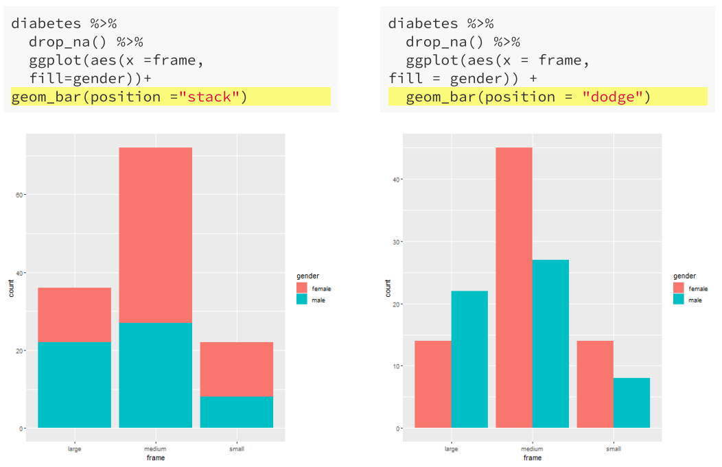
Positions
geom_bar(position = "<position >")- When we have aesthetics mapped, how are they positioned?
- bar: dodge, fill, stacked (default)
- point: jitter
Facets
facet_grid vs facet_wrap
facet_grid()facets the plot with a variable in a single direction (horizontal or vertical)facet_wrap()simply places the facets next to each other and wraps them accoridng to the provided number of columns and/or rows.
The following table describes how facet formulas work in facet_grid() and facet_wrap():
| Type | Formula | Description |
|---|---|---|
| Grid | facet_grid(. ~ x) | Facet horizontally across x values |
Grid |
facet_grid(y ~ .) | Facet vertically across y values |
Grid |
facet_grid(y ~ x) | Facet 2-dimensionally |
Wrap |
facet_wrap(~ x) | Facet across x values |
Wrap |
facet_wrap(~ x + y) | Facet across x and y values |
Facets
- Statistics (
stat_*()) computed on the data.stat_*()-like functions perform computations such as means, counts, linear models, and other statistical summaries of data.
- Coordinates (
coord_*()) establish representation rules to print the datacoord_cartesian()for the Cartesian plane;coord_polar()for circular plots;coord_map()for different map projections.
Themes
plot + theme_gray(base_size = 11, base_family = "")- Theme is what controls the overall appearance of the ggplot visualiation.
- ggplot2 offers several predefined themes that can be quickly applied to the ggplot object. see the details in section Themes
Practice with ggplot2
- Create a simple plot object:
plot.object <- ggplot() - Add geometric layers:
plot.object <- plot.object + geom_*() - Add appearance layers:
plot.object <- plot.object + coord_*() + theme() - Repeat steps 2 and 3 until satisfied, then print:
plot.objectorprint(plot.object)
Practice with ggplot2
- dataset to practice:
palmerpenguins
We will use the palmerpenguins data set:
This data set contains size measurements for three penguin species observed on three islands in the Palmer Archipelago, Antarctica.
- This dataset is often used to replace the iris dataset, which has some problems for teaching data science, including its ties to eugenics.
Let us take a look at the variables in the penguins data set:
library(palmerpenguins)
Attaching package: 'palmerpenguins'The following objects are masked from 'package:datasets':
penguins, penguins_rawdata(penguins)
#str(penguins)Practice with ggplot2
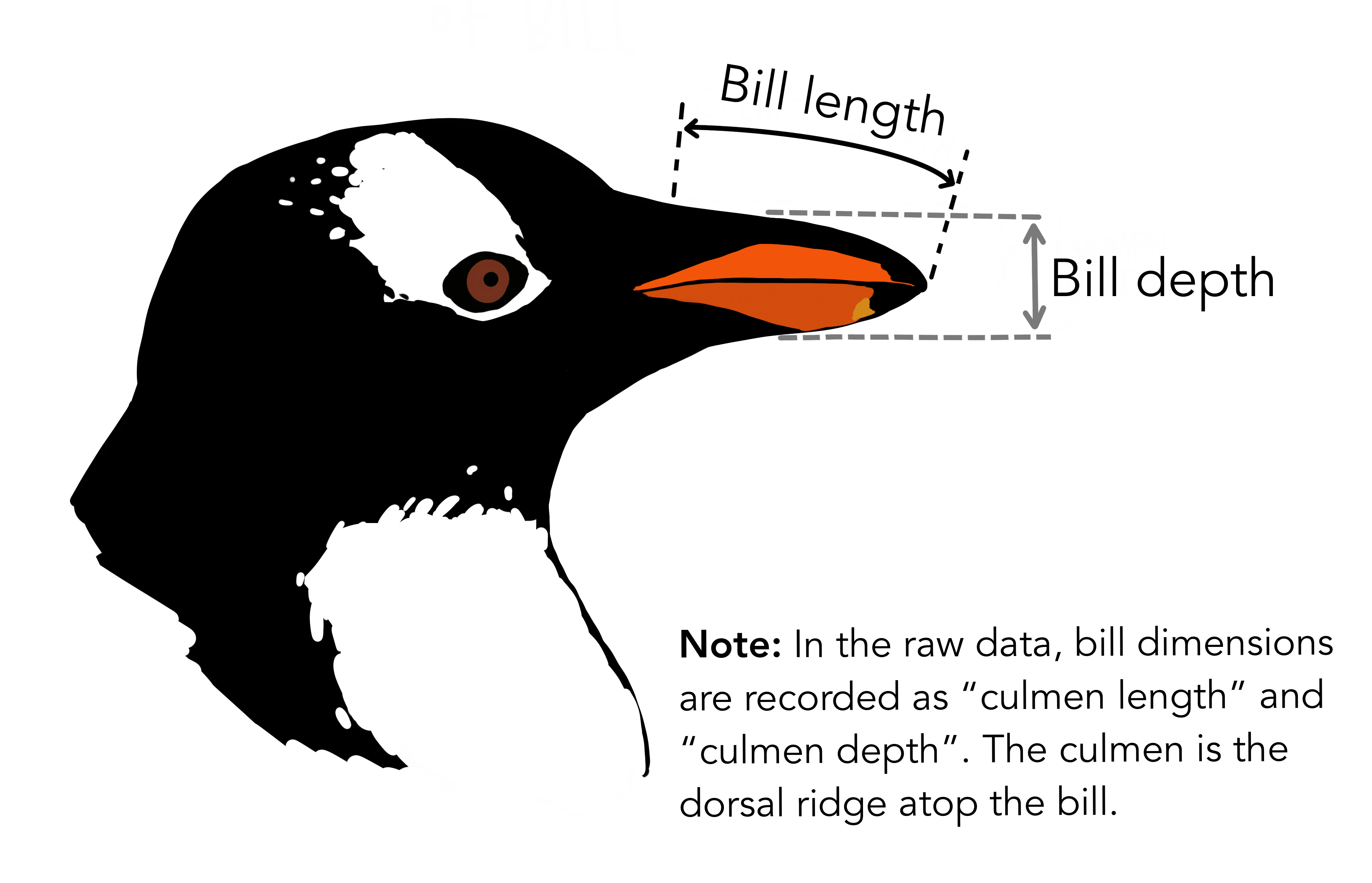
- species, island, and sex are factor variables,
- bill measurements depicted in the image are numeric variables,
- two integer variables (flipper length and body mass).
- Prepare data for
ggplot2 ggplot2requires you to prepare the data as an object of classdata.frameortibble(common in thetidyverse).
library(tibble)
class(penguins) # all set!
[1] "tbl_df" "tbl" "data.frame"peng <- as_tibble(penguins) # acceptable
class(peng)[1] "tbl_df" "tbl" "data.frame"Practice with ggplot2
More complex plots in ggplot2 require the long data frame format.
- Scientific questions about penguins
Scientific questions
Is there a relationship between the length & the depth of bills?
Does the size of the bill & flipper vary together ?
How are these measures distributed among the 3 penguin species ?
How can we graphically address these questions with ggplot2?
ggplot() layers
library(ggplot2)
ggplot(data = penguins)
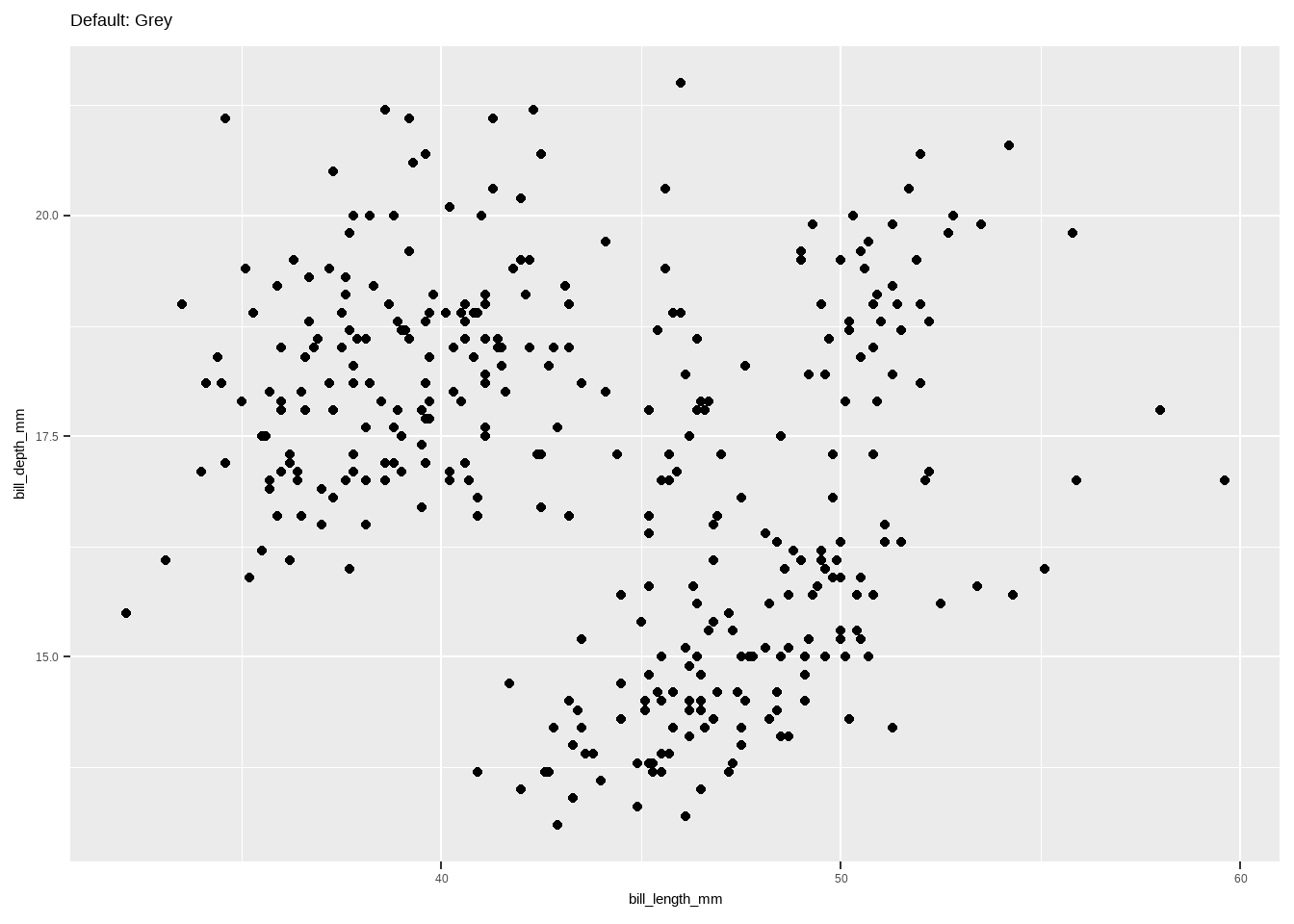
ggplot(data = penguins, aes(x = bill_length_mm, y = bill_depth_mm))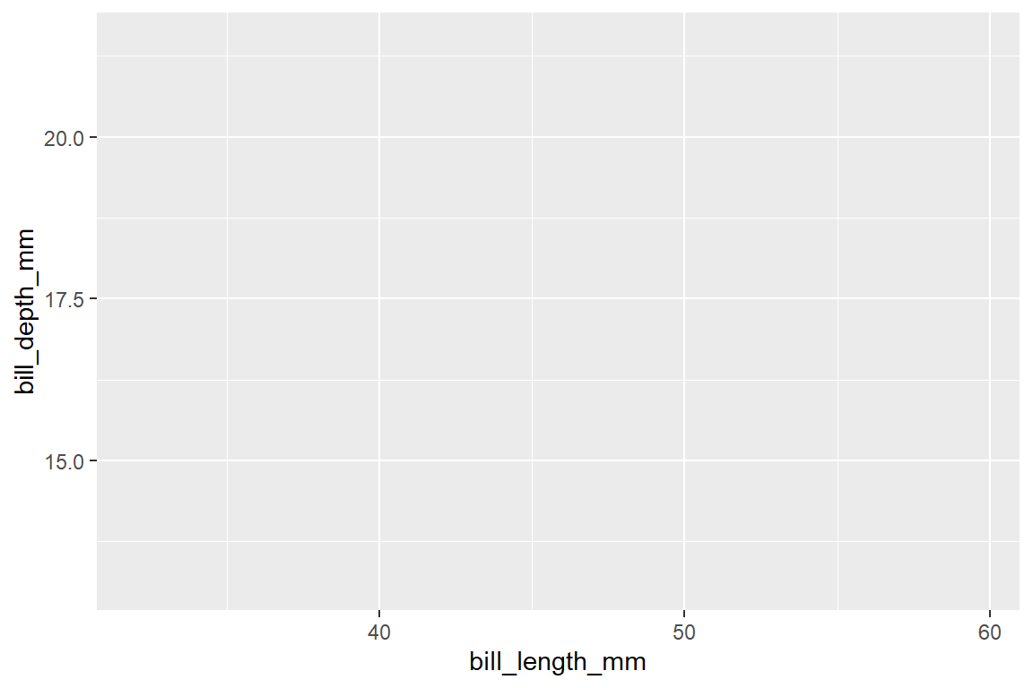
ggplot(data = penguins,
       aes(x = bill_length_mm, y = bill_depth_mm)) +
  geom_point()
Warning: Removed 2 rows containing missing values or values outside the scale range
(`geom_point()`).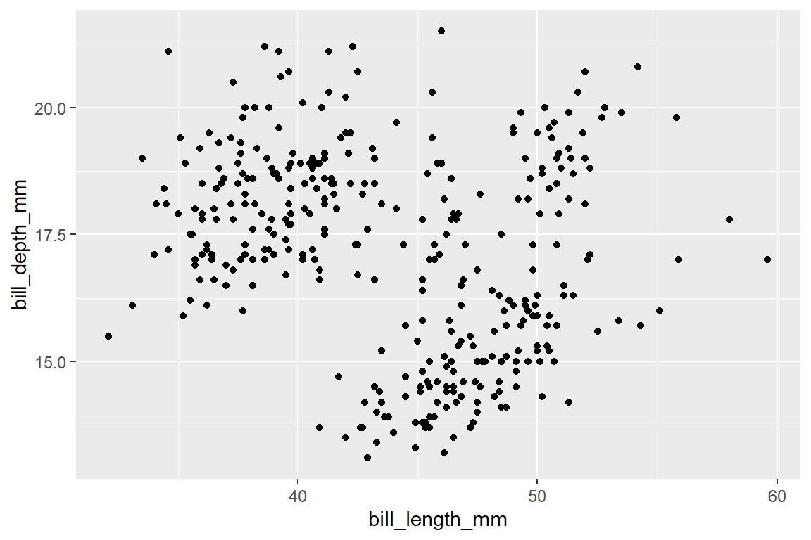
ggplot(data = penguins,
       aes(x = bill_length_mm, y = bill_depth_mm)) +
  geom_point() +  facet_wrap(~species) +
  coord_trans(x = "log10", y = "log10")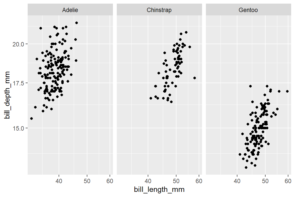
Let us explore how some of this data is structured by species:
ggplot(data = penguins,               # Data
       aes(x = bill_length_mm,        # Your X-value
           y = bill_depth_mm,         # Your Y-value
           col = species)) +          # Aesthetics
  geom_point(size = 5, alpha = 0.8) + # Point
  geom_smooth(method = "lm")         # Linear regression
`geom_smooth()` using formula = 'y ~ x'Warning: Removed 2 rows containing non-finite outside the scale range
(`stat_smooth()`).Warning: Removed 2 rows containing missing values or values outside the scale range
(`geom_point()`).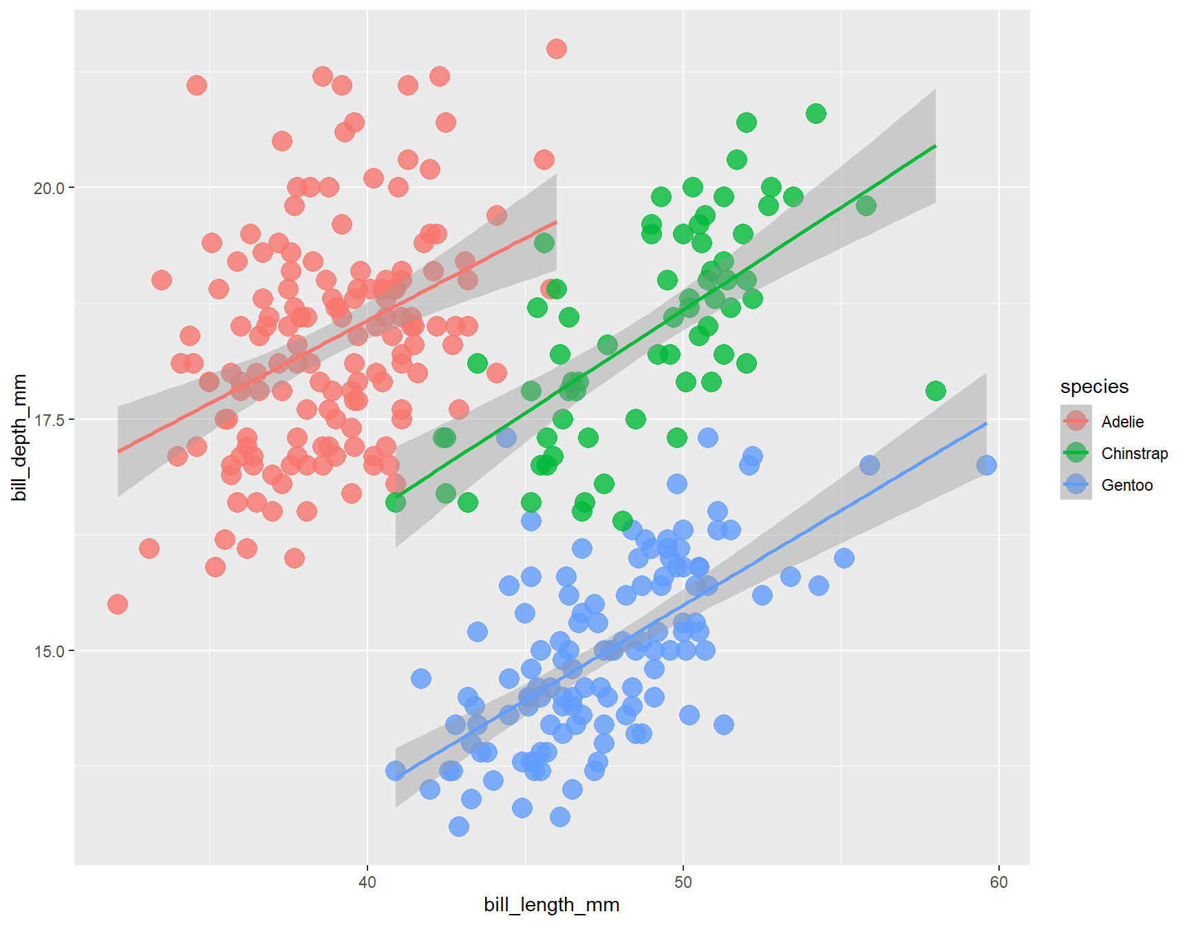
Customize Our Plot
- Here are some key aspects you can customize:
Axes, Titles and Legends
Title and axes components: changing size, colour and face
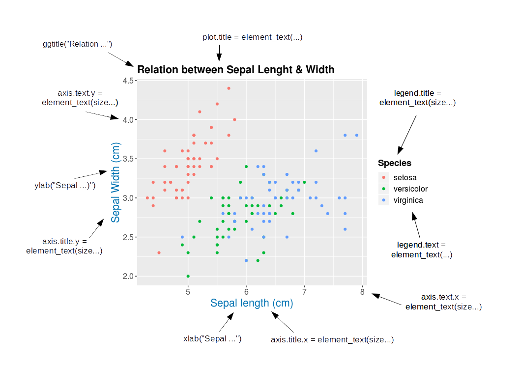
Change Axis Titles: Axes, Titles and Legends
- Customizing Axis Labels with
labs()- used to modify plot labels, including x-axis, y-axis, and plot title.
ggplot(data = penguins) +
  geom_point(aes(x = bill_length_mm, y= bill_depth_mm, color= species)) +
      labs(x = "Bill length (mm)", y = "Bill depth (mm)")
Warning: Removed 2 rows containing missing values or values outside the scale range
(`geom_point()`).
Axes, Titles and Legends
xlab()andylab(): These functions specifically set the x-axis and y-axis labels, respectively.
ggplot(data = penguins) +
  geom_point(aes(x = bill_length_mm, y= bill_depth_mm, color=species)) +
  xlab("Bill length (mm)")+ ylab("Bill depth (mm)")
Warning: Removed 2 rows containing missing values or values outside the scale range
(`geom_point()`).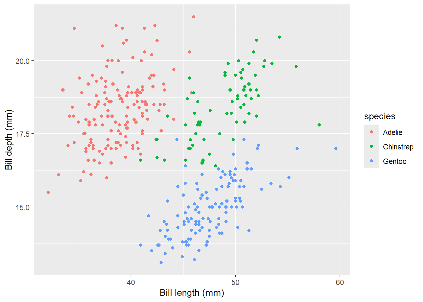
Axes, Titles and Legends
expression(): This function allows you to include mathematical expressions, special characters, and symbols in axis labels, such as Greek letters, superscripts, and subscripts.
ggplot(data = penguins) +
  geom_point(aes(x = bill_length_mm, y = bill_depth_mm, color= species)) +
      labs(x=expression(paste("X Axis Label with ", mu^2," and ",sigma)))
Warning: Removed 2 rows containing missing values or values outside the scale range
(`geom_point()`).
Axes, Titles and Legends
Increasing Space Between Axis and Axis Titles
element_text(): While primarily used intheme()for overall theme customization,element_text()can be used to specify text properties such as size, color, and font face for axis labels.
ggplot(data = penguins) +
  geom_point(aes(x = bill_length_mm, y= bill_depth_mm, color= species)) +
      labs(x = "Bill length (mm)", y = "Bill depth (mm)")+
      theme(axis.title = element_text(size = 15, face= "italic"))
Warning: Removed 2 rows containing missing values or values outside the scale range
(`geom_point()`).
Axes, Titles and Legends
- To change vertical alignment using
vjustwhich controls the vertical alignment, typically ranging between 0 and 1, but can extend beyond this range.
ggplot(data = penguins) +
  geom_point(aes(x = bill_length_mm, y= bill_depth_mm, color= species)) +
      labs(x = "Bill length (mm)", y = "Bill depth (mm)")+
  theme(axis.title.x = element_text(vjust = 0, size = 15),
        axis.title.y = element_text(vjust = 2, size = 15))
Warning: Removed 2 rows containing missing values or values outside the scale range
(`geom_point()`).
Axes, Titles and Legends
- To change the distance, you can specify the
margin()function’s with parameters t and r which refer to top and right, respectively.
ggplot(data = penguins) +
  geom_point(aes(x = bill_length_mm, y= bill_depth_mm, color= species)) +
      labs(x = "Bill length (mm)", y = "Bill depth (mm)")+
  theme(axis.title.x = element_text(margin = margin(t = 10), size = 15),
        axis.title.y = element_text(margin = margin(r = 10), size = 15))
Warning: Removed 2 rows containing missing values or values outside the scale range
(`geom_point()`).
Axes, Titles and Legends
- To adjust the space on the y-axis, change the right margin, not the bottom margin.
- The
faceargument can be set to bold, italic, or bold.italic:
ggplot(data = penguins) +
  geom_point(aes(x = bill_length_mm, y= bill_depth_mm, color= species)) +
      labs(x = "Bill length (mm)", y = "Bill depth (mm)")+
  theme(axis.title= element_text(color= "sienna", size= 15, face= "bold"),
        axis.title.y = element_text(face = "bold.italic"))
Warning: Removed 2 rows containing missing values or values outside the scale range
(`geom_point()`).
Axes, Titles and Legends
axis.textcan modify the appearance of axis text (numbers) and its sub-elementsaxis.text.xand axis.text.y:
ggplot(data = penguins) +
  geom_point(aes(x = bill_length_mm, y= bill_depth_mm, color= species)) +
      labs(x = "Bill length (mm)", y = "Bill depth (mm)")+
  theme(axis.text = element_text(color = "dodgerblue", size = 12),
        axis.text.x = element_text(face = "italic"))
Warning: Removed 2 rows containing missing values or values outside the scale range
(`geom_point()`).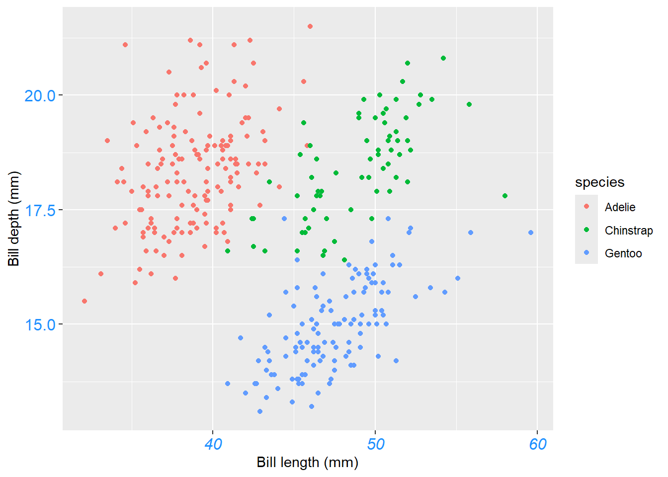
Axes, Titles and Legends
angle,hjustandvjustcan rotate any text element.hjustandvjustused to adjust the position horizontally (0 = left, 1 = right) and vertically (0 = top, 1 = bottom):
ggplot(data = penguins) +
  geom_point(aes(x = bill_length_mm, y= bill_depth_mm, color= species)) +
      labs(x = "Bill length (mm)", y = "Bill depth (mm)")+
theme(axis.text.x = element_text(angle =50, vjust= 1, hjust =1, size= 12))
Warning: Removed 2 rows containing missing values or values outside the scale range
(`geom_point()`).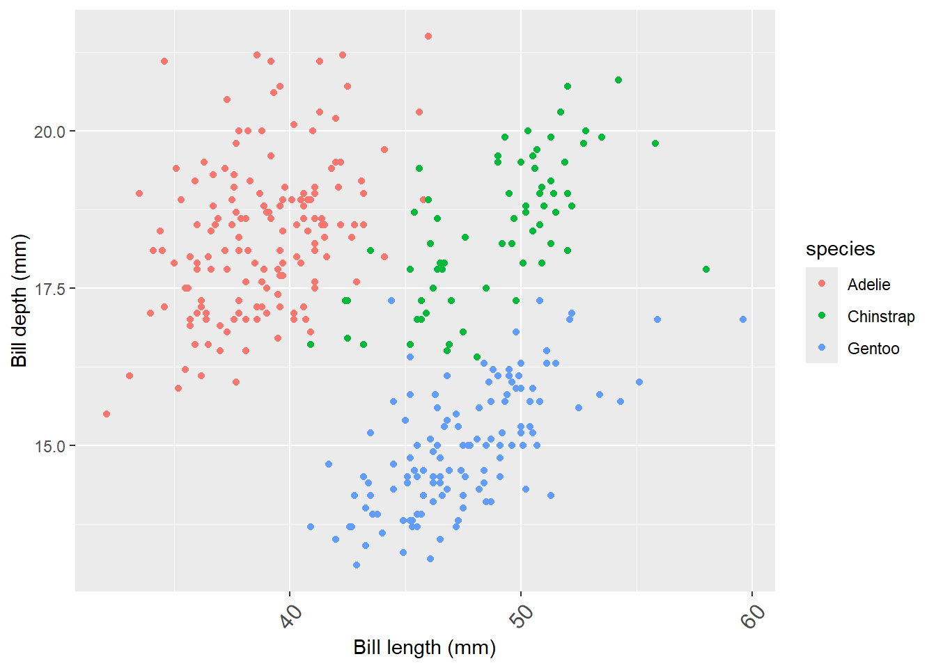
Axes, Titles and Legends
element_blank()used to remove axis text and ticks,
ggplot(data = penguins) +
  geom_point(aes(x = bill_length_mm, y = bill_depth_mm, color= species)) +
      labs(x = "Bill length (mm)", y = "Bill depth (mm)")+
  theme(axis.ticks.y = element_blank(), axis.text.y = element_blank())
Warning: Removed 2 rows containing missing values or values outside the scale range
(`geom_point()`).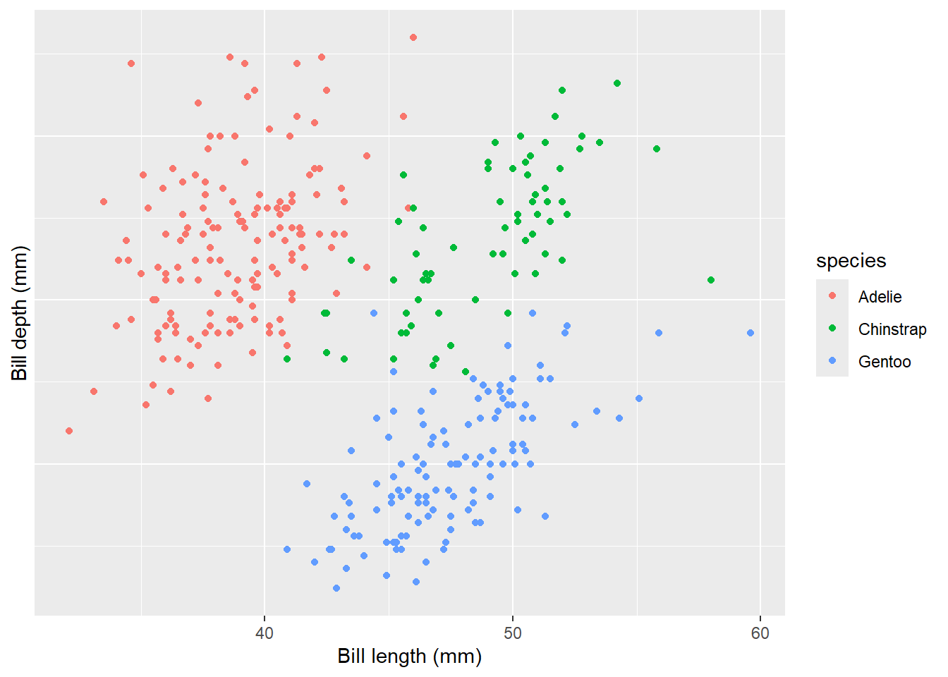
Axes, Titles and Legends
- The element_blank() function is used to remove an element entirely but to remove axis titles by setting them to NULL or empty quotes
" "in thelabs()function:
ggplot(data = penguins) +
  geom_point(aes(x = bill_length_mm, y= bill_depth_mm, color= species)) +
      labs(x = "Bill length (mm)", y = "Bill depth (mm)")+
 labs(x = NULL, y = "")
Warning: Removed 2 rows containing missing values or values outside the scale range
(`geom_point()`).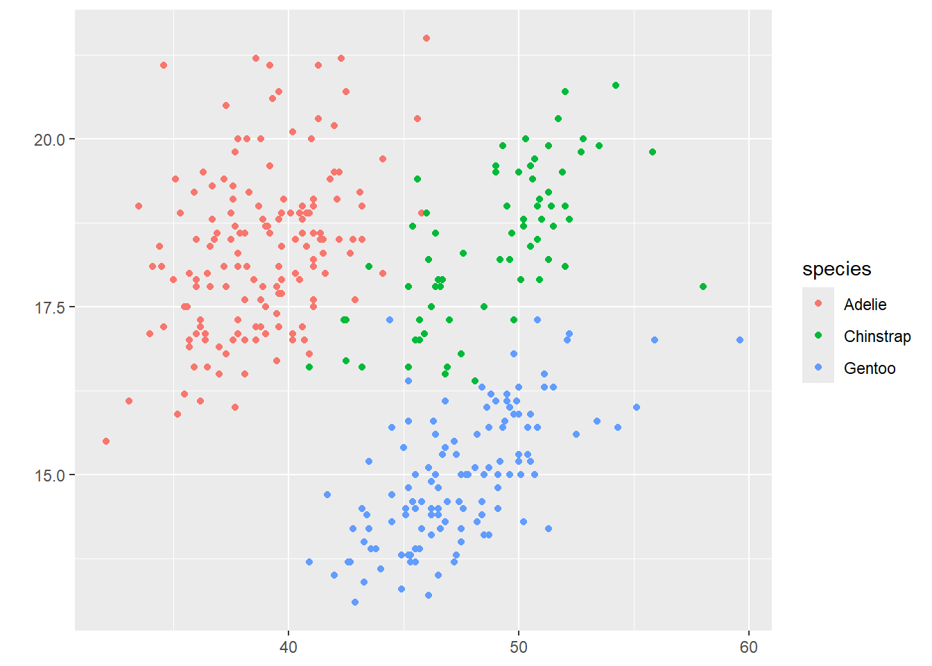
💡 Using NULL removes the element, while empty quotes ” ” keep the space for the axis title but print nothing.
Axes, Titles and Legends
ylim()andxlim()functions are used to limiting axis range
ggplot(data = penguins) +
  geom_point(aes(x = bill_length_mm, y= bill_depth_mm, color= species)) +
      labs(x = "Bill length (mm)", y= "Bill depth (mm)")+ ylim(c(0, 20))
Warning: Removed 19 rows containing missing values or values outside the scale range
(`geom_point()`).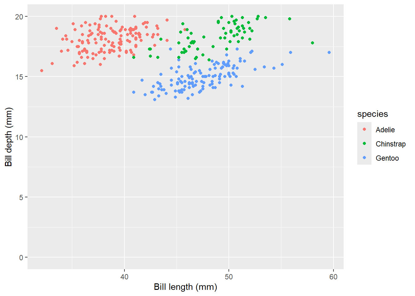
- Alternatively, use scale_y_continuous(limits = c(0, 20)) or coord_cartesian(ylim = c(0, 20)). The former removes data points outside the range, while the latter adjusts the visible area without removing data points.
Axes, Titles and Legends
scale_x_continuous()andscale_y_continuous(): While primarily for scaling continuous axes, these functions can also adjust axis labels usingname.
ggplot(data = penguins) +
  geom_point(aes(x = bill_length_mm, y= bill_depth_mm, color= species)) +
      scale_x_continuous(name = "New X Axis Label") +
    scale_y_continuous(name = "New Y Axis Label")
Warning: Removed 2 rows containing missing values or values outside the scale range
(`geom_point()`).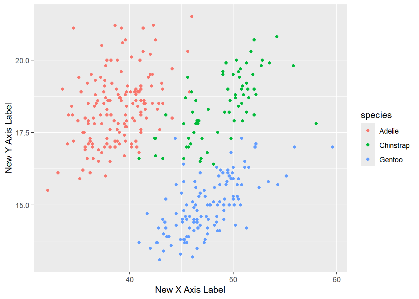
Adding Title
- To customize titles in ggplot2, you can use a combination of
ggtitle(),labs(), andtheme()functions. Below is a list of the main functions and their key arguments for title customization:
Main Functions and Arguments
ggtitle(): used tolabelthe text for the main title.- Example:
ggtitle("Main Title")
- Example:
labs():title: The text for the main title.subtitle: The text for the subtitle.caption: The text for the caption.tag: The text for a tag.- Example:
labs(title = "Main Title", subtitle = "Subtitle", caption = "Caption", tag = "Fig. 1")
Adding Title
theme(): Customize the appearance of the text elements.plot.title: Customize the main title text, subtitle, caption and tag text. Example:theme(plot.title = element_text(face = "bold", size = 14, hjust = 0.5))theme(plot.subtitle = element_text(size = 12, hjust = 0.5))theme(plot.caption = element_text(size = 10, hjust = 0))theme(plot.tag = element_text(size = 8, hjust = 1))element_text(face, size, family, hjust, vjust, margin, lineheight): Control the font face, size, family, alignment, margin, and line height.
Adding Title
ggplot(data = penguins) +
  geom_point(aes(x = bill_length_mm, y= bill_depth_mm, color = species)) +
      labs(x = "Bill length (mm)", y = "Bill depth (mm)",
           title = "Relationship between bill length and depth",
           subtitle = "for different penguin species",
           caption = "scatter plot", tag = "Fig. 1")
Warning: Removed 2 rows containing missing values or values outside the scale range
(`geom_point()`).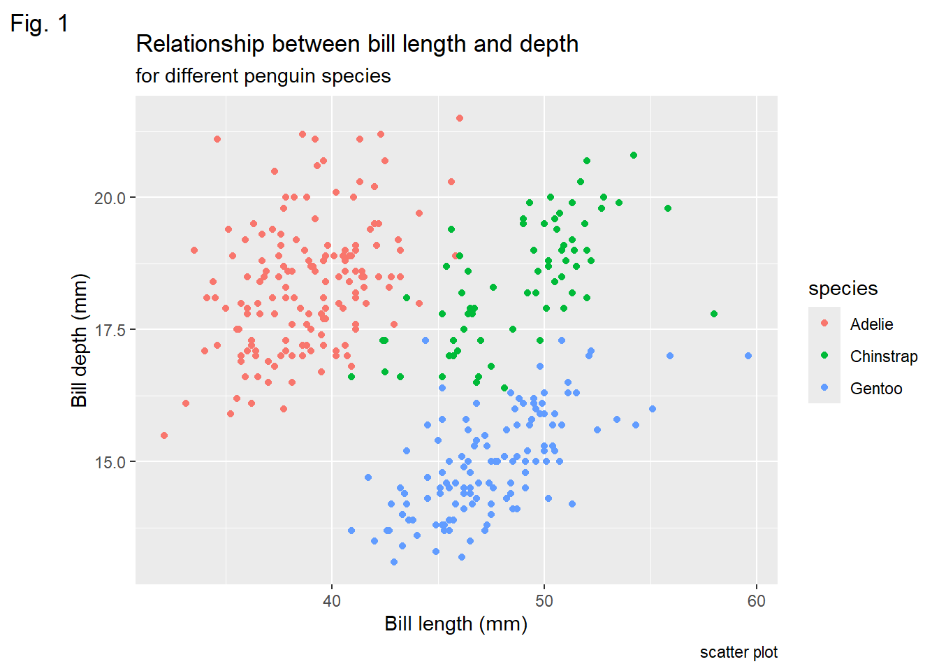
Bold Title and Margin
ggplot(data = penguins) +
  geom_point(aes( x = bill_length_mm, y= bill_depth_mm, color= species)) +
      labs(x = "Bill length (mm)", y = "Bill depth (mm)",
           title = "Relationship between bill length and depth")+
  theme(plot.title = element_text(face = "bold",
                                  margin =margin(10,0,10,0), size= 14))
Warning: Removed 2 rows containing missing values or values outside the scale range
(`geom_point()`).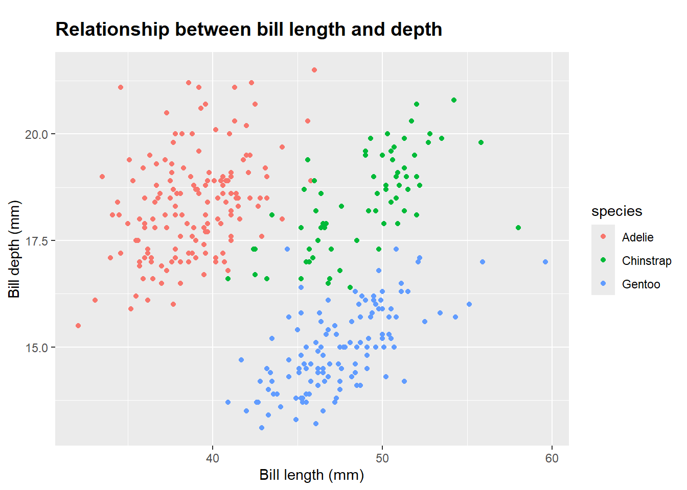
Using Non-Traditional Fonts
library(showtext) Loading required package: sysfontsLoading required package: showtextdbfont_add_google("Playfair Display", "Playfair")
font_add_google("Bangers", "Bangers")
showtext_auto()
ggplot(data = penguins) +
geom_point(aes(x = bill_length_mm, y= bill_depth_mm, color= species)) +
labs(x = "Bill length (mm)", y = "Bill depth (mm)",
title = "Relationship between bill length and depth") +
theme(plot.title = element_text(family= "Bangers", hjust= 0.5,size= 25),
plot.subtitle = element_text(
family = "Playfair", hjust = 0.5, size = 15)) Warning: Removed 2 rows containing missing values or values outside the scale range
(`geom_point()`).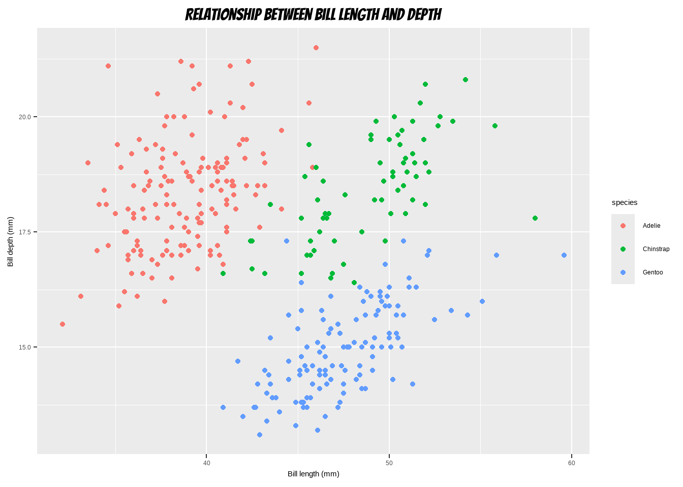
Changing Line Height in Multi-Line Text
ggplot(data = penguins) +
  geom_point(aes(x = bill_length_mm, y= bill_depth_mm, color= species)) +
      labs(x = "Bill length (mm)", y = "Bill depth (mm)")+
  ggtitle("Relationship between bill length and depth acrrossdifferent \n
          species using scatter plot") +
  theme(plot.title = element_text(lineheight = 0.8, size = 16))
Warning: Removed 2 rows containing missing values or values outside the scale range
(`geom_point()`).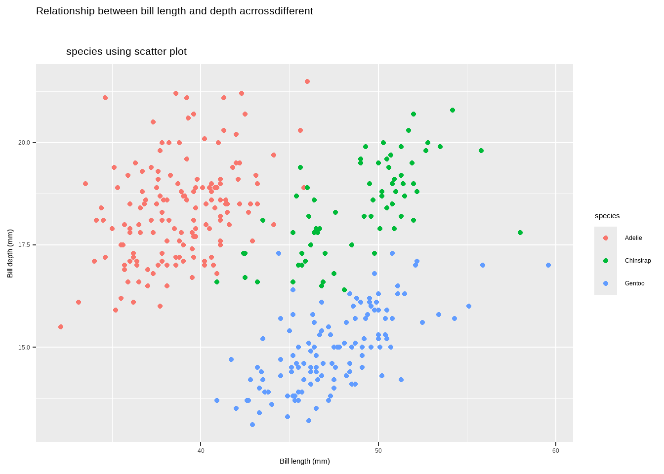
Legends
- One nice thing about
ggplot2is that it adds a legend by default when mapping a variable to an aesthetic. You can see that by default the legend title is what we specified in the color argument:
ggplot(data = penguins) +
  geom_point(aes(x = bill_length_mm, y = bill_depth_mm, color= species)) +
      labs(x = "Bill length (mm)", y = "Bill depth (mm)")
Warning: Removed 2 rows containing missing values or values outside the scale range
(`geom_point()`).
Legends
The main functions and methods to customize legends in ggplot2:
To Turn Off the Legend: we can use the following code
theme(legend.position = "none")guides(color = "none")scale_color_discrete(guide = "none")
ggplot(data = penguins) +
  geom_point(aes(x = bill_length_mm, y= bill_depth_mm, color= species)) +
      labs(x = "Bill length (mm)", y = "Bill depth (mm)")+
 theme(legend.position = "none")
Warning: Removed 2 rows containing missing values or values outside the scale range
(`geom_point()`).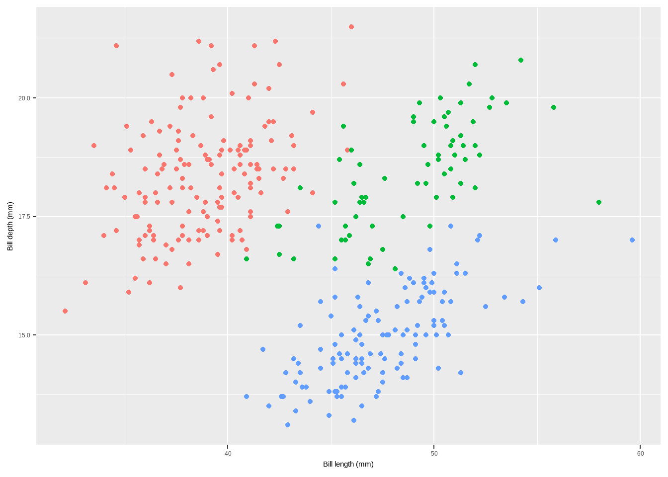
Legends
ggplot(data = penguins) +
  geom_point(aes(x = bill_length_mm, y= bill_depth_mm, color= species)) +
      labs(x = "Bill length (mm)", y = "Bill depth (mm)")+
  guides(color = "none")
Warning: Removed 2 rows containing missing values or values outside the scale range
(`geom_point()`).
To Remove Legend Titles
theme(legend.title = element_blank())scale_color_discrete(name = NULL)labs(color = NULL
ggplot(data = penguins) +
  geom_point(aes(x = bill_length_mm, y= bill_depth_mm, color= species)) +
      labs(x = "Bill length (mm)", y = "Bill depth (mm)")+
theme(legend.title = element_blank())
Warning: Removed 2 rows containing missing values or values outside the scale range
(`geom_point()`).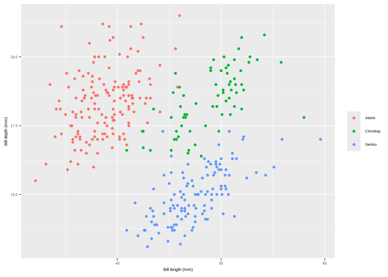
To Remove Legend Titles
💁 You can achieve the same by setting the legend name to NULL, either via scale_color_discrete(name = NULL) or labs(color = NULL). Expand to see examples.
Change Legend Position
theme(legend.position = "top")theme(legend.position = c(x, y), legend.background = element_rect(fill = "transparent"))to add legend inside the plot
ggplot(data = penguins) +
  geom_point(aes(x = bill_length_mm, y= bill_depth_mm, color= species)) +
      labs(x = "Bill length (mm)", y = "Bill depth (mm)")+
theme(legend.position = "top")
Warning: Removed 2 rows containing missing values or values outside the scale range
(`geom_point()`).
To Remove Legend Titles
ggplot(data = penguins) +
  geom_point(aes(x = bill_length_mm, y= bill_depth_mm, color = species)) +
      labs(x = "Bill length (mm)", y = "Bill depth (mm)")+
theme(legend.position = c(.15, .15),
      legend.background = element_rect(fill = "transparent"))
Warning: Removed 2 rows containing missing values or values outside the scale range
(`geom_point()`).
To Remove Legend Titles
- Change Legend Direction
guides(color = guide_legend(direction = "horizontal"))
- Change Style of the Legend Title
theme(legend.title = element_text(family, color, size, face))
ggplot(data = penguins) +
  geom_point(aes(x = bill_length_mm, y = bill_depth_mm, color= species)) +
      labs(x = "Bill length (mm)", y = "Bill depth (mm)")+
theme(legend.title = element_text(family = "Playfair",
                                  color="chocolate", size=14, face="bold"))
Warning: Removed 2 rows containing missing values or values outside the scale range
(`geom_point()`).
Change Legend Title
labs(color = "new title")scale_color_discrete(name = "new title")guides(color = guide_legend("new title"))
ggplot(data = penguins) +
  geom_point(aes(x = bill_length_mm, y = bill_depth_mm, color= species)) +
      labs(x = "Bill length (mm)", y = "Bill depth (mm)",
           color = "species\nindicated\nby colors:") +
  theme(legend.title = element_text(family = "Playfair",
                                    color= "blue", size=14, face="bold"))
Warning: Removed 2 rows containing missing values or values outside the scale range
(`geom_point()`).
Change Order of Legend Keys
- `factor(penguins$species, levels = c("Chinstrap", "Gentoo", "Adelie"))`library(dplyr)
Attaching package: 'dplyr'The following objects are masked from 'package:stats':
filter, lagThe following objects are masked from 'package:base':
intersect, setdiff, setequal, unionpenguins1 <- penguins %>%
mutate(species=factor(species, levels=c("Chinstrap", "Gentoo","Adelie")))
ggplot(data = penguins1) +
geom_point(aes(x = bill_length_mm, y= bill_depth_mm, color= species)) +
labs(x = "Bill length (mm)", y = "Bill depth (mm)")Warning: Removed 2 rows containing missing values or values outside the scale range
(`geom_point()`).
Change Legend Labels
scale_color_discrete(name = "species:", labels = c("Adelie type", "Chinstrap type", "Gentoo typ"))
ggplot(data = penguins) +
  geom_point(aes(x = bill_length_mm, y = bill_depth_mm, color= species)) +
      labs(x = "Bill length (mm)", y = "Bill depth (mm)")+
scale_color_discrete(name = "species:",
                     labels=c("Adelie type","Chinstrap type","Gentoo typ"))+
  theme(legend.title = element_text(
    family = "Playfair", color = "chocolate", size = 14, face = 2))
Warning: Removed 2 rows containing missing values or values outside the scale range
(`geom_point()`).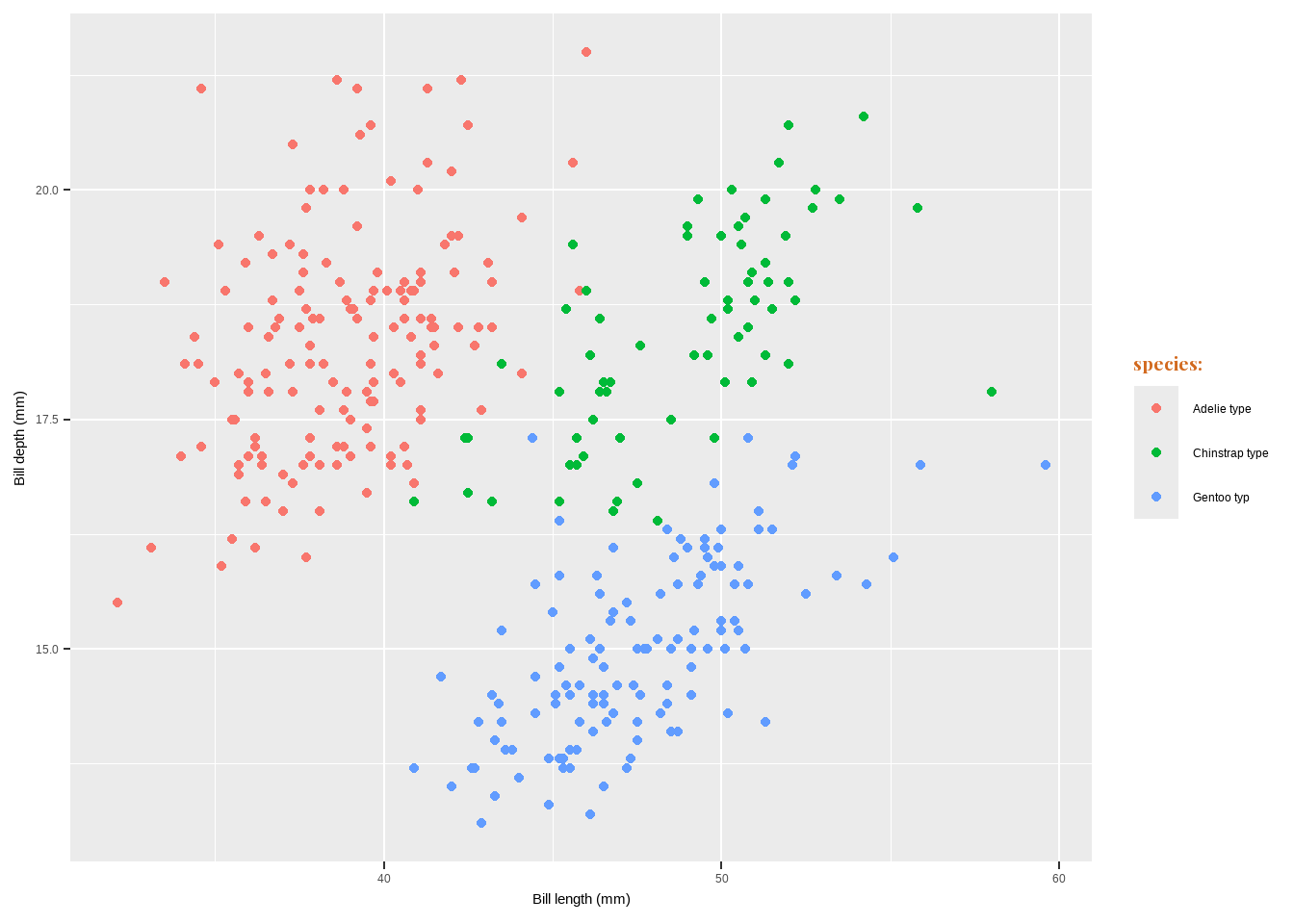
Change Legend Labels
- Change Background Boxes in the Legend
theme(legend.key = element_rect(fill = "color"))
- Change Size of Legend Symbols
guides(color = guide_legend(override.aes = list(size = size)))
ggplot(data = penguins) +
  geom_point(aes(x = bill_length_mm, y= bill_depth_mm, color= species)) +
      labs(x = "Bill length (mm)", y = "Bill depth (mm)")+
theme(legend.key = element_rect(fill = NA),
      legend.title = element_text(color= "chocolate", size= 14, face= 2)) +
  scale_color_discrete("species:") +
  guides(color = guide_legend(override.aes = list(size = 6)))
Warning: Removed 2 rows containing missing values or values outside the scale range
(`geom_point()`).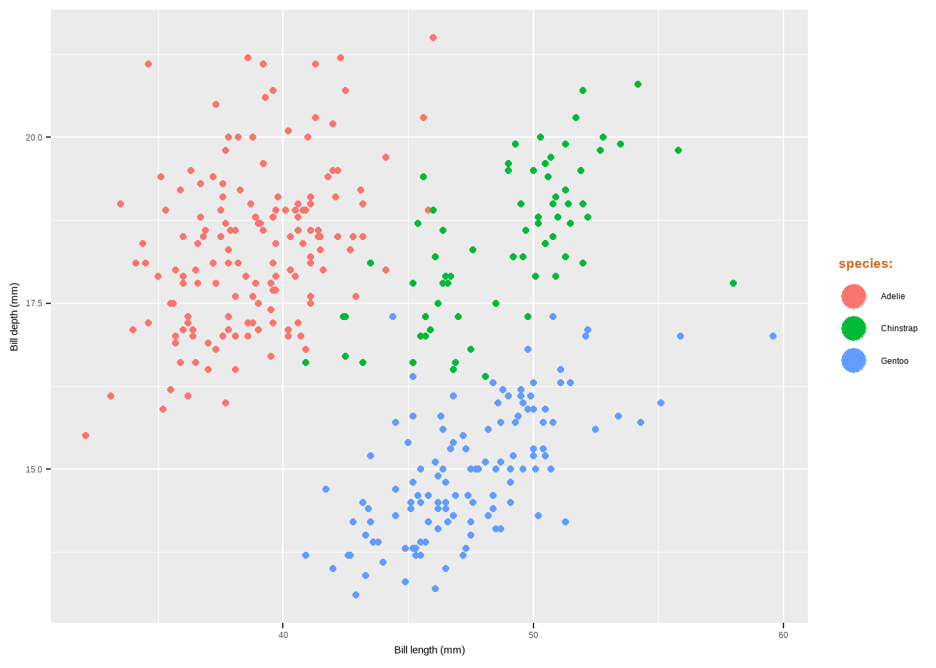
Change Legend Labels
- Use Other Legend Styles
guides(color = guide_legend())guides(color = guide_bins()
ggplot(data = penguins) +
  geom_point(aes(x= bill_length_mm, y= bill_depth_mm, color= body_mass_g)) +
      labs(x = "Bill length (mm)", y = "Bill depth (mm)")+
guides(color = guide_legend())
Warning: Removed 2 rows containing missing values or values outside the scale range
(`geom_point()`).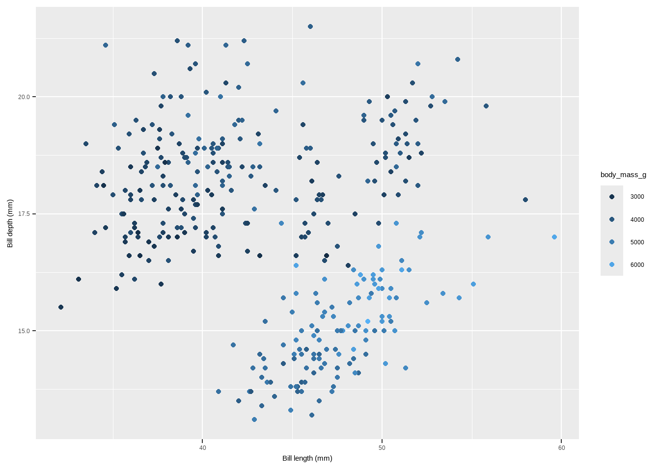
Change Legend Labels
ggplot(data = penguins) +
  geom_point(aes(x = bill_length_mm, y= bill_depth_mm, color=body_mass_g)) +
      labs(x = "Bill length (mm)", y = "Bill depth (mm)")+
  guides(color = guide_bins())
Warning: Removed 2 rows containing missing values or values outside the scale range
(`geom_point()`).
theme
theme()
- Elements of a theme by (Isabella Benabaye).
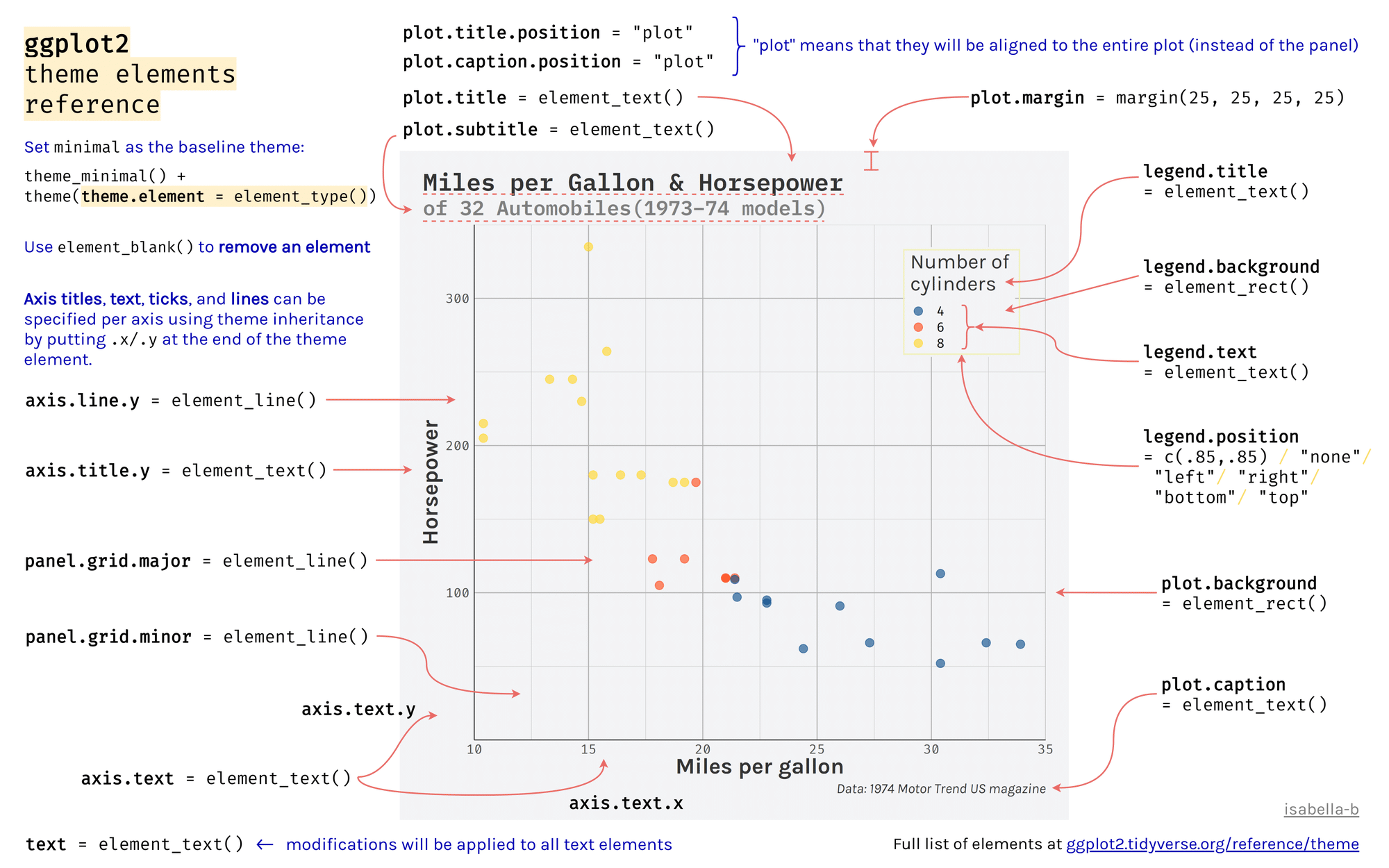
theme
Default theme: The default theme is theme_gray().
theme
- The predefined theme takes two arguments for the base font size (base_size) and font family (
base_family). - base_size input is a number, and base_family is a string (e.g. “serif”, “sans”, “mono”).
- In addition, ggthemes pacakge offers additional predefined themes.
- We will start with 8 predefined themes provided by ggplot2:
plot+theme_gray()plot+theme_bw()plot+theme_linedraw()plot+theme_light()
plot + theme_dark()plot + theme_minimal()plot + theme_classic()plot + theme_void()
theme
theme()has many arguments to control and modify individual components of a plot theme, including:- all line, rectangular, text and title elements
- aspect ratio of the panel
- axis title, text, ticks, and lines
- legend background, margin, text, title, position, and more
- panel aspect ratio, border, and grid lines
Backgrounds & Grid Lines
The main functions to customize the background of the plot in the provided code and explanation involve modifying elements of the theme function in ggplot2. Here are the key functions and elements used:
- Changing the Panel Background Color
The panel background refers to the area where the data is plotted.
panel.background: Adjusts the background color and outline of the panel area.theme(panel.background = element_rect(fill = "#64D2AA", color = "#64D2AA", linewidth = 2))
ggplot(data = penguins) +
  geom_point(aes(x= bill_length_mm, y= bill_depth_mm, color= body_mass_g)) +
      labs(x = "Bill length (mm)", y = "Bill depth (mm)")+
  theme(panel.background = element_rect(
    fill = "#64D2AA", color = "#64D2AA", linewidth = 2))
Warning: Removed 2 rows containing missing values or values outside the scale range
(`geom_point()`).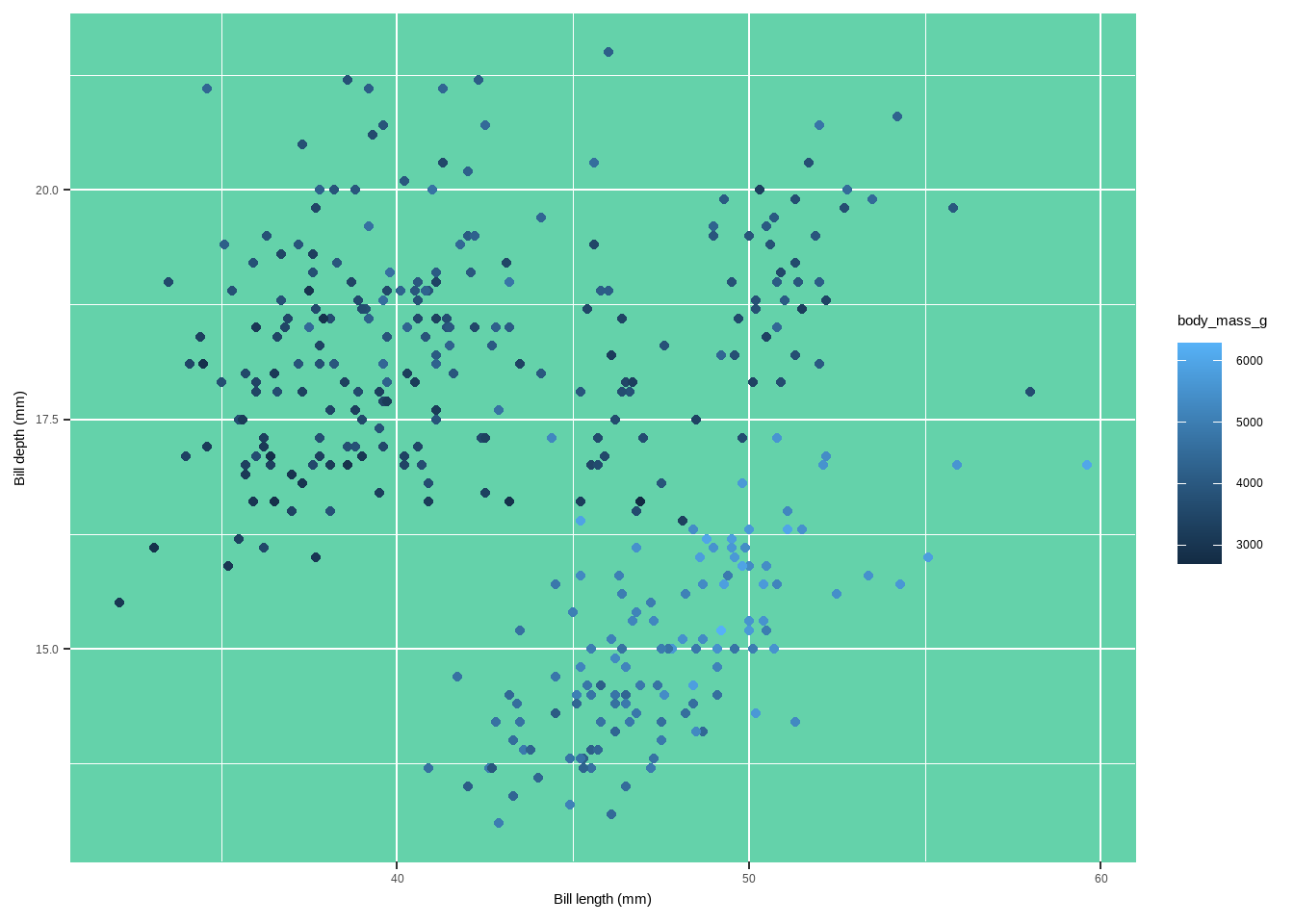
Changing the Panel Border Color
The panel border is an overlay on top of the panel.background which outlines the panel.
panel.border: Sets the border properties of the panel.theme(panel.border = element_rect(fill = "#64D2AA99", color = "#64D2AA", linewidth = 2))
ggplot(data = penguins) +
    geom_point(aes(x= bill_length_mm, y=bill_depth_mm, color=body_mass_g)) +
          labs(x = "Bill length (mm)", y = "Bill depth (mm)")+
      theme(panel.border = element_rect(
        fill = "#64D2AA99", color = "#64D2AA",linewidth = 2))
Warning: Removed 2 rows containing missing values or values outside the scale range
(`geom_point()`).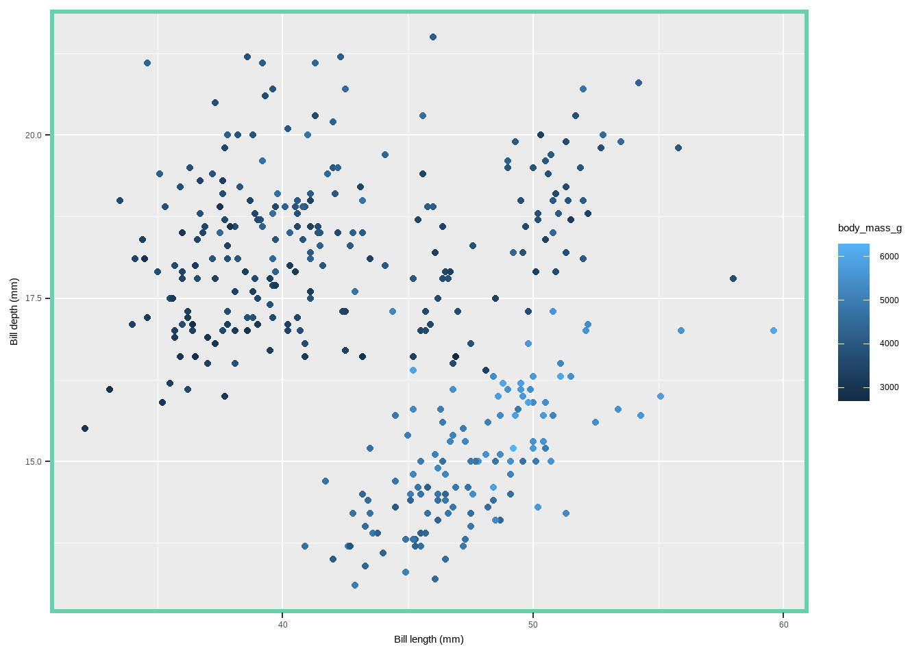
Changing Grid Lines
Grid lines help in referencing the data points against the axes.
panel.grid: Changes properties for all grid lines.panel.grid.major: Changes properties for major grid lines.panel.grid.minor: Changes properties for minor grid lines.panel.grid.major.xandpanel.grid.major.y: Change properties for major grid lines on the x and y axes separately.panel.grid.minor.xandpanel.grid.minor.y: Change properties for minor grid lines on the x and y axes separately.
ggplot(data = penguins) +
  geom_point(aes(x = bill_length_mm, y= bill_depth_mm, color= species)) +
      labs(x = "Bill length (mm)", y = "Bill depth (mm)")+
  theme(panel.grid.major = element_line(color = "gray10",linewidth = .5),
        panel.grid.minor = element_line(color = "gray70", linewidth = .25))
Warning: Removed 2 rows containing missing values or values outside the scale range
(`geom_point()`).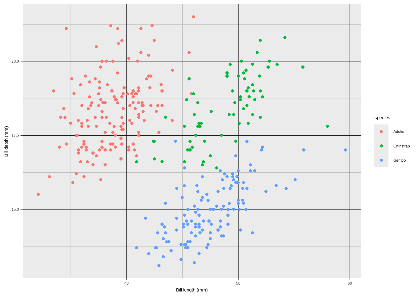
Changing Grid Lines
ggplot(data = penguins) +
  geom_point(aes(x= bill_length_mm, y= bill_depth_mm, color= body_mass_g)) +
      labs(x = "Bill length (mm)", y = "Bill depth (mm)")+
  theme(panel.grid.major = element_line(linewidth = .5, linetype= "dashed"),
        panel.grid.minor = element_line(linewidth = .25, linetype= "dotted"),
        panel.grid.major.x = element_line(color = "red1"),
        panel.grid.major.y = element_line(color = "blue1"),
        panel.grid.minor.x = element_line(color = "red4"),
        panel.grid.minor.y = element_line(color = "blue4"))
Warning: Removed 2 rows containing missing values or values outside the scale range
(`geom_point()`).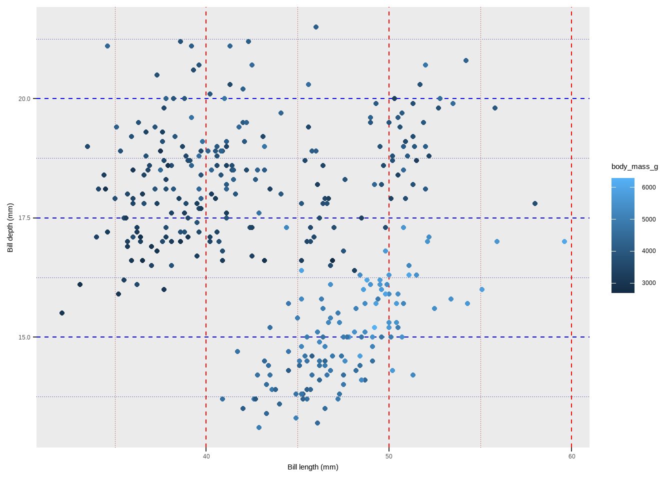
Removing Grid Lines
Grid lines can be selectively removed.
element_blank(): Used to remove specific theme elements.theme(panel.grid.minor = element_blank())theme(panel.grid = element_blank())
ggplot(data = penguins) +
  geom_point(aes(x = bill_length_mm, y= bill_depth_mm, color = species)) +
  labs(x = "Bill length (mm)", y = "Bill depth (mm)")+
  theme(panel.grid = element_blank())
Warning: Removed 2 rows containing missing values or values outside the scale range
(`geom_point()`).
Changing the Spacing of Gridlines
You can specify the spacing of grid lines using scale_*_continuous functions.
scale_y_continuous(): Defines the breaks for the y-axis.scale_y_continuous(breaks = seq(0, 100, 10), minor_breaks = seq(0, 100, 2.5))
ggplot(data = penguins) +
  geom_point(aes( x= bill_length_mm, y= bill_depth_mm, color= species)) +
      labs(x = "Bill length (mm)", y = "Bill depth (mm)")+
  scale_y_continuous(breaks = seq(0, 30, 5), minor_breaks= seq(0, 60, 2.5))
Warning: Removed 2 rows containing missing values or values outside the scale range
(`geom_point()`).
Changing the Plot Background Color
The plot background refers to the entire area of the plot, including the panel and surrounding space.
plot.background: Adjusts the background color and outline of the entire plot area.theme(plot.background = element_rect(fill = "gray60", color = "gray30", linewidth = 2))
ggplot(data = penguins) +
  geom_point(aes(x= bill_length_mm, y= bill_depth_mm, color= body_mass_g)) +
      labs(x = "Bill length (mm)", y = "Bill depth (mm)")+
  theme(plot.background = element_rect(
    fill = "gray60",  color = "gray30", linewidth = 2))
Warning: Removed 2 rows containing missing values or values outside the scale range
(`geom_point()`).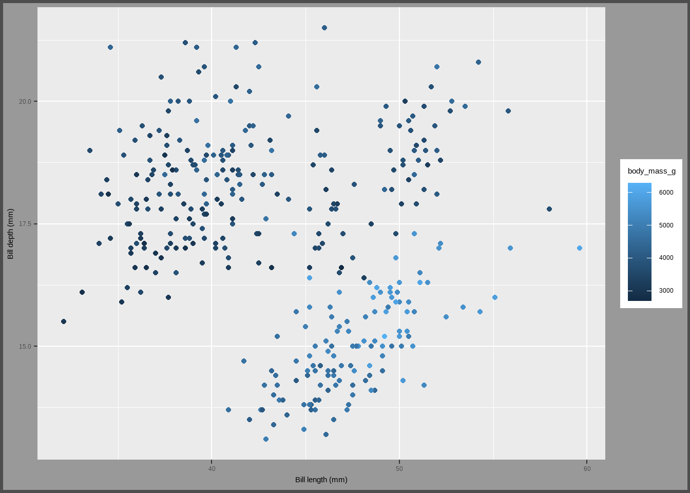
Customizing multi-panel plots
When creating multi-panel plots in ggplot2, there are several functions and themes available to customize their appearance. Here’s a breakdown of the main functions and customization options based on the provided code:
Creating Facets with facet_grid and facet_wrap
facet_wrap(variable ~ .):- Creates a ribbon of panels based on a single variable.
ggplot(data = penguins) +
  geom_point(mapping = aes(x = bill_length_mm, y = bill_depth_mm,
                           colour = species)) +
  facet_grid(~ species, scales = "free")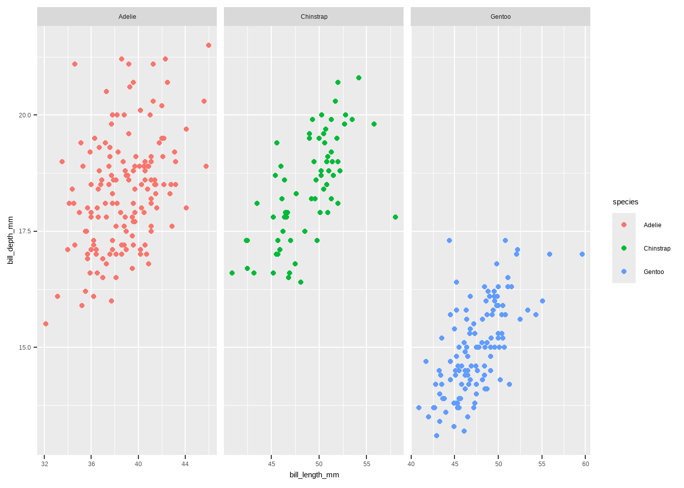
facet_grid(rows ~ columns):
- Creates a grid of panels based on two variables.
ggplot(data = penguins) +
  geom_point(mapping = aes(x = bill_length_mm, y = bill_depth_mm,
                           colour = species)) +
  facet_grid(year ~ species, scales = "free")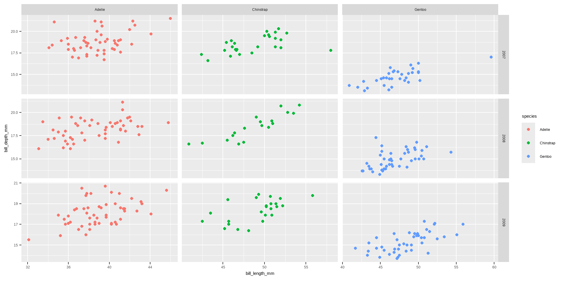
- Customizing Layout of Facets
ncolandnrow:- Control the number of columns and rows in
facet_wrap.
- Control the number of columns and rows in
facet_wrap
ggplot(data = penguins) +
  geom_point(aes(x = bill_length_mm, y= bill_depth_mm, color= species)) +
          labs(x = "Bill length (mm)", y = "Bill depth (mm)")+
      theme(axis.text.x = element_text(angle = 45, vjust = 1, hjust= 1)) +
  facet_wrap( ~ species+sex, ncol = 3)
Warning: Removed 2 rows containing missing values or values outside the scale range
(`geom_point()`).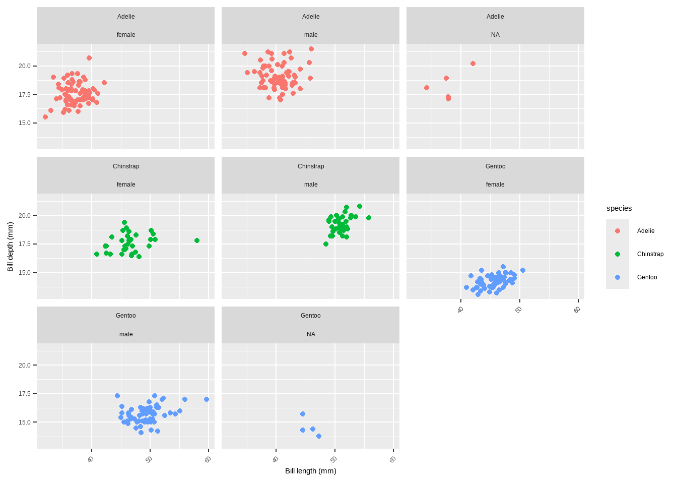
scales:- Allows axes to have free scales with
scales = "free"or control specific axis withscales = "free_x"orscales = "free_y".
scales
ggplot(data = penguins) +
  geom_point(aes(x = bill_length_mm, y = bill_depth_mm, color= species)) +
      labs(x = "Bill length (mm)", y = "Bill depth (mm)")+
  theme(axis.text.x = element_text(angle= 45, vjust = 1, hjust = 1)) +
  facet_wrap( ~ species, ncol = 3, scales = "free")
Warning: Removed 2 rows containing missing values or values outside the scale range
(`geom_point()`).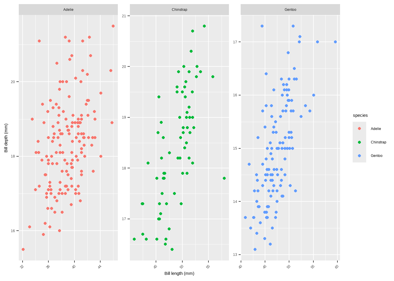
- Styling Facet Labels
- Modifying strip text and background:
- Use
themeto customize the appearance of facet labels.
ggplot(data = penguins) +
  geom_point(aes(x = bill_length_mm, y= bill_depth_mm, color= species)) +
      labs(x = "Bill length (mm)", y = "Bill depth (mm)")+
  theme(axis.text.x = element_text(angle = 45, vjust = 1, hjust = 1)) +
  facet_wrap(~ species, ncol = 3, scales = "free_x") +
  theme(strip.text = element_text(
    face = "bold", color = "white", hjust = 0, size = 20),
        strip.background = element_rect(
          fill = "chartreuse4", linetype = "dotted"))
Warning: Removed 2 rows containing missing values or values outside the scale range
(`geom_point()`).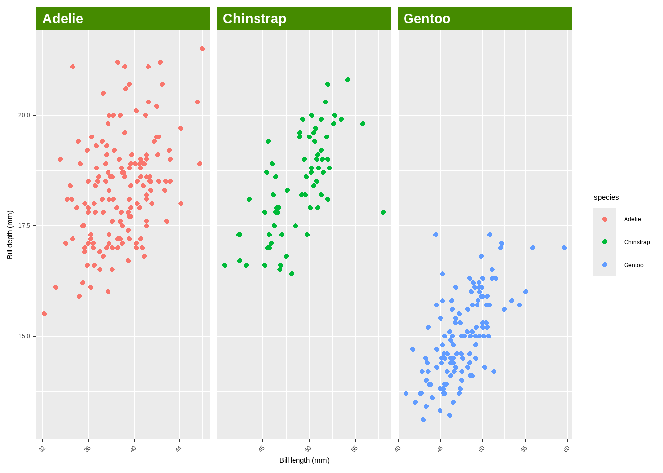
- Highlight specific labels using
element_textbox_highlight:
library(ggtext)
library(purrr)  # for %||%
ggplot(data = penguins) +
  geom_point(aes(x = bill_length_mm, y= bill_depth_mm, color = species)) +
      labs(x = "Bill length (mm)", y = "Bill depth (mm)")+
  theme(axis.text.x = element_text(angle = 45, vjust = 1, hjust = 1)) +
  facet_wrap(~ species, ncol = 3, scales = "free_x") +
  theme(strip.background = element_blank(),
        strip.text = element_textbox_highlight(
          family = "Playfair", size = 12, face = "bold", fill = "white",
          box.color = "chartreuse4", color = "chartreuse4", halign = .5,
          linetype = 1,  r = unit(5, "pt"), width = unit(1, "npc"),
          padding = margin(5, 0, 3, 0),  margin = margin(0, 1, 3, 1),
          hi.labels = c("1997", "1998","1999", "2000"),
          hi.fill = "chartreuse4", hi.box.col = "black",hi.col= "white"))
Combining Different Plots
{patchwork}package:- Combine multiple plots with simple syntax.
p1 + p2 p1 / p2 (g + p2) / p1
{cowplot}package:Another package for combining multiple plots.
library(cowplot)
# plot_grid(plot_grid(g, p1), p2, ncol = 1)
Combining Different Plots
{gridExtra}package:- Provides functions to arrange multiple plots.
library(gridExtra)
# grid.arrange(g, p1, p2, layout_matrix = rbind(c(1, 2), c(3, 3)))`- Custom layout with
{patchwork}:- Define complex layouts using a design matrix.
# layout <- "AABBBB#   AACCDDE   ##CCDD#   ##CC### "
# p2 + p1 + p1 + g + p2 + plot_layout(design = layout)
Colors
Several functions and techniques are highlighted for customizing colors in ggplot2 plots.
colorandfillArguments: Define the outline color (color) and the filling color (fill) of plot elements.geom_point(color = "steelblue", size = 2)geom_point(shape = 21, size = 2, stroke = 1, color = "#3cc08f", fill = "#c08f3c")
# default
p <- ggplot(penguins, aes( x = bill_length_mm, y = bill_depth_mm, colour= species)) +
  geom_point() + labs(x = "Bill length (mm)", y = "Bill depth (mm)")
Colors
p +
  geom_point(shape= 21, size=2, stroke=1, color= "#3cc08f", fill="#c08f3c")
Warning: Removed 2 rows containing missing values or values outside the scale range
(`geom_point()`).
Removed 2 rows containing missing values or values outside the scale range
(`geom_point()`).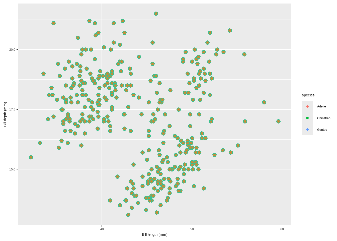
scale_color_*andscale_fill_*Functions: Modify colors when they are mapped to variables. - These functions differ based on whether the variable is categorical (qualitative) or continuous (quantitative).
Qualitative Variables:
**`scale_color_manual` and `scale_fill_manual`**: Manually specify colors for categorical variables. `scale_color_manual(values = c("dodgerblue4", "darkolivegreen4", "darkorchid3", "goldenrod1"))`p + scale_color_manual(values=c("dodgerblue4", "darkorchid3", "goldenrod1"))Warning: Removed 2 rows containing missing values or values outside the scale range
(`geom_point()`).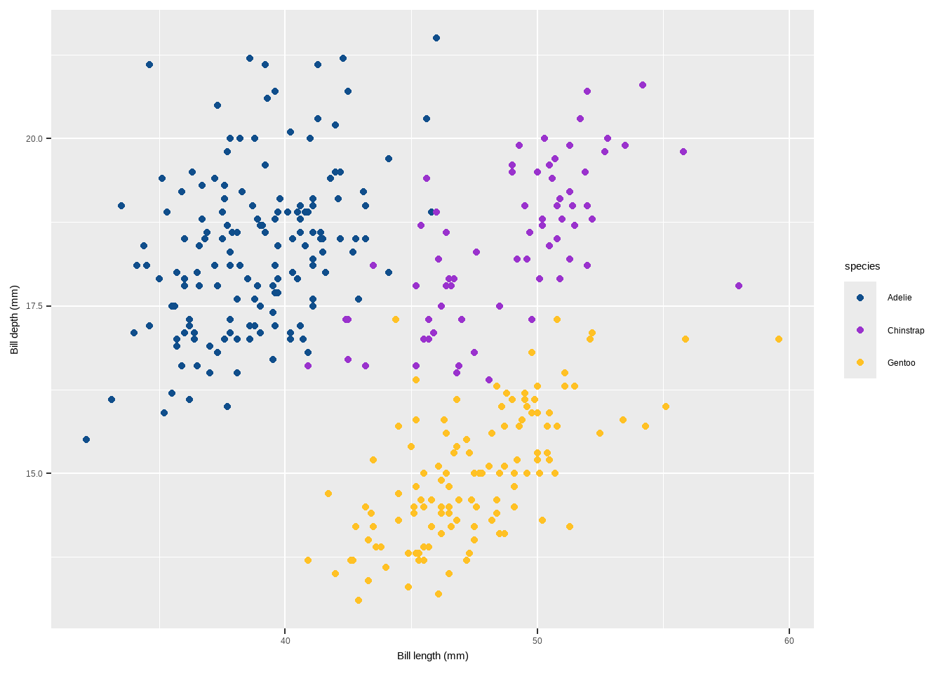
scale_color_brewerandscale_fill_brewer: Use predefined color palettes from ColorBrewer.
scale_color_brewer(palette = “Set1”)
p+ scale_color_brewer(palette = "Set1")Warning: Removed 2 rows containing missing values or values outside the scale range
(`geom_point()`).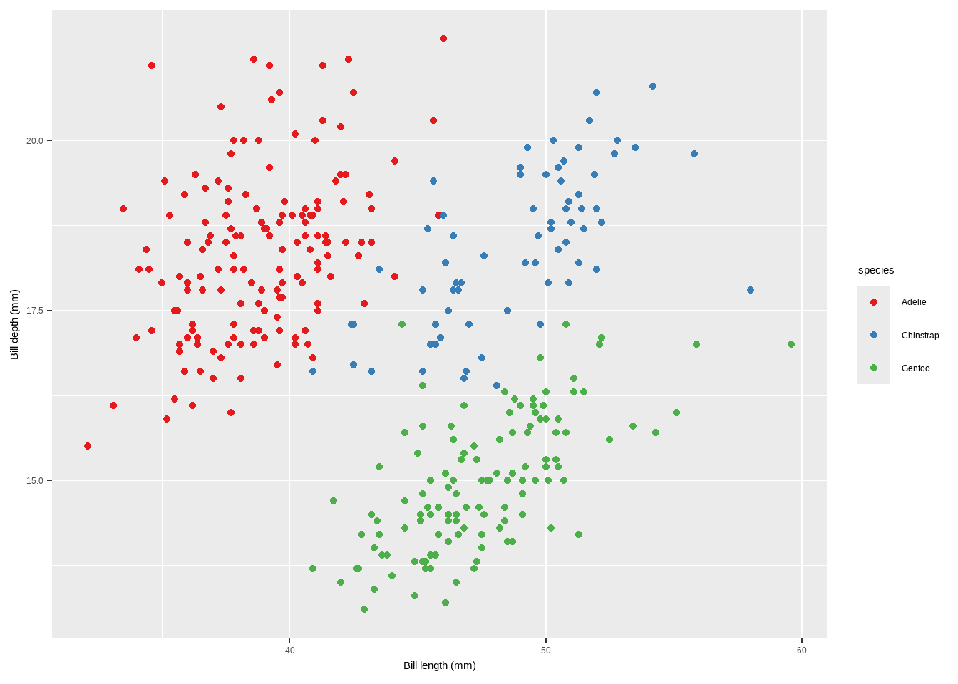
Quantitative Variables:
scale_color_gradientandscale_fill_gradient: Apply a sequential gradient color scheme for continuous variables.scale_color_gradient(low = "darkkhaki", high = "darkgreen")
p2 <- ggplot(penguins, aes( x = bill_length_mm, y = bill_depth_mm,
                            colour = body_mass_g)) + geom_point()+
  labs(x = "Bill length (mm)", y = "Bill depth (mm)")
    p2 + scale_color_gradient(low = "darkkhaki", high = "darkgreen")
Warning: Removed 2 rows containing missing values or values outside the scale range
(`geom_point()`).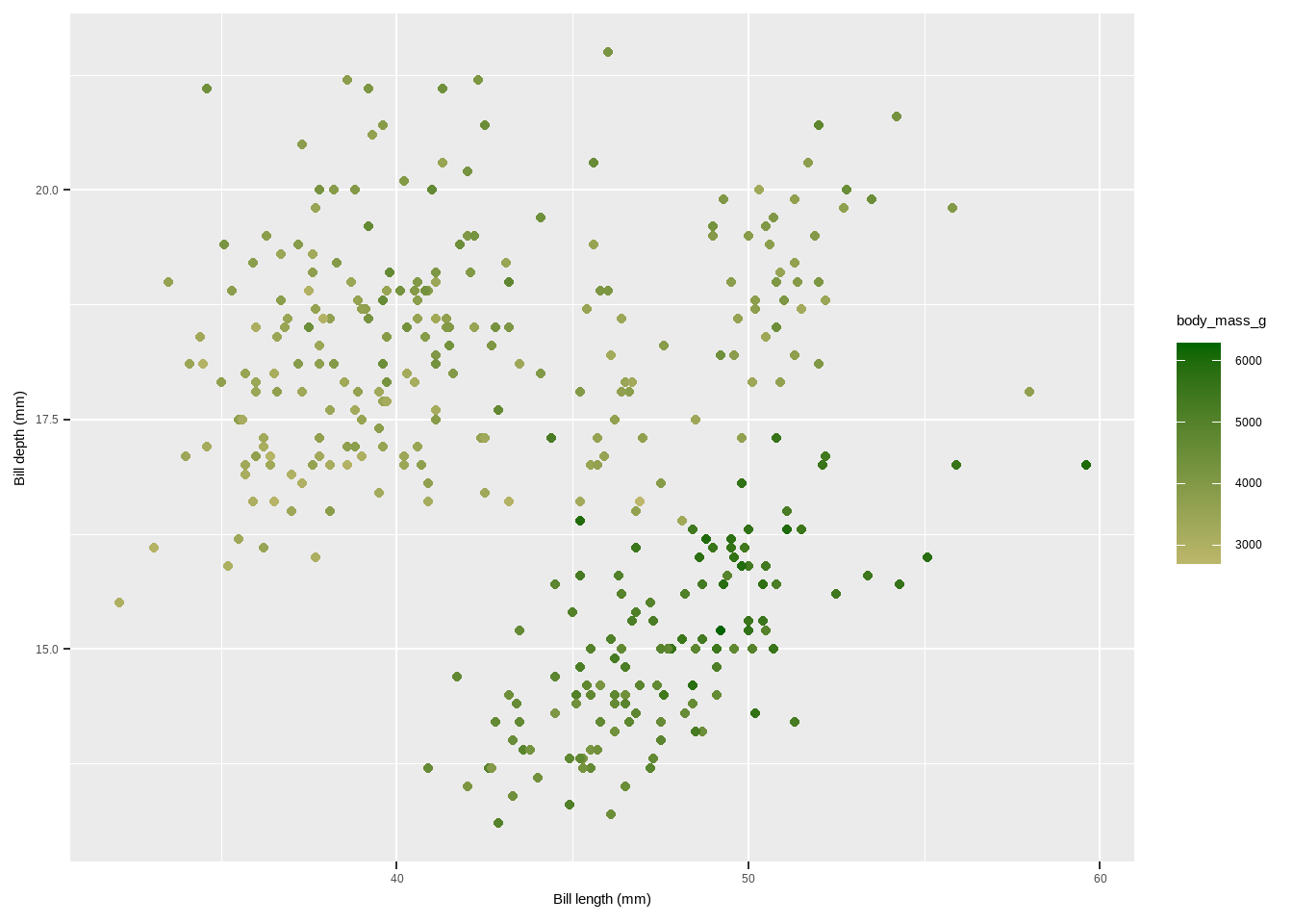
Quantitative Variables:
scale_color_viridis_candscale_fill_viridis_c: Use the Viridis color palettes, which are perceptually uniform and suitable for colorblind viewers.
scale_color_viridis_c(option = "inferno")
p2 + scale_color_viridis_c(option = "inferno")Warning: Removed 2 rows containing missing values or values outside the scale range
(`geom_point()`).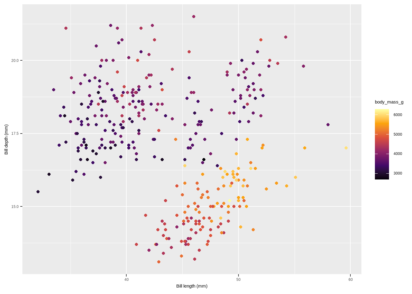
Additional Color Palettes from Extension Packages:
The {ggthemes} package for example lets R users access the Tableau colors. Tableau is a famous visualiztion software with a well-known color palette.
scale_color_tableauandscale_fill_tableau(from{ggthemes}): Use Tableau color palettes.
scale_color_tableau()
library(ggthemes)
Attaching package: 'ggthemes'The following object is masked from 'package:cowplot':
theme_mapp + scale_color_tableau()Warning: Removed 2 rows containing missing values or values outside the scale range
(`geom_point()`).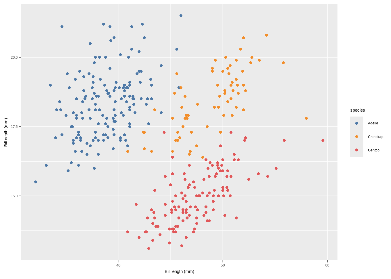
The {ggsci} package provides scientific journal and sci-fi themed color palettes with colors that look like being published in Science or Nature.
scale_color_tableau()
scale_color_aaas,scale_color_npg(from{ggsci}): Use scientific journal and sci-fi themed color palettes.scale_color_aaas()scale_color_npg()
library(ggsci)
p + scale_color_aaas()
Warning: Removed 2 rows containing missing values or values outside the scale range
(`geom_point()`).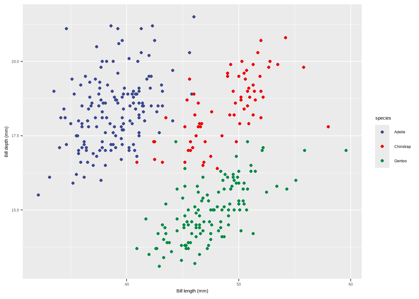
p+ scale_color_npg()Warning: Removed 2 rows containing missing values or values outside the scale range
(`geom_point()`).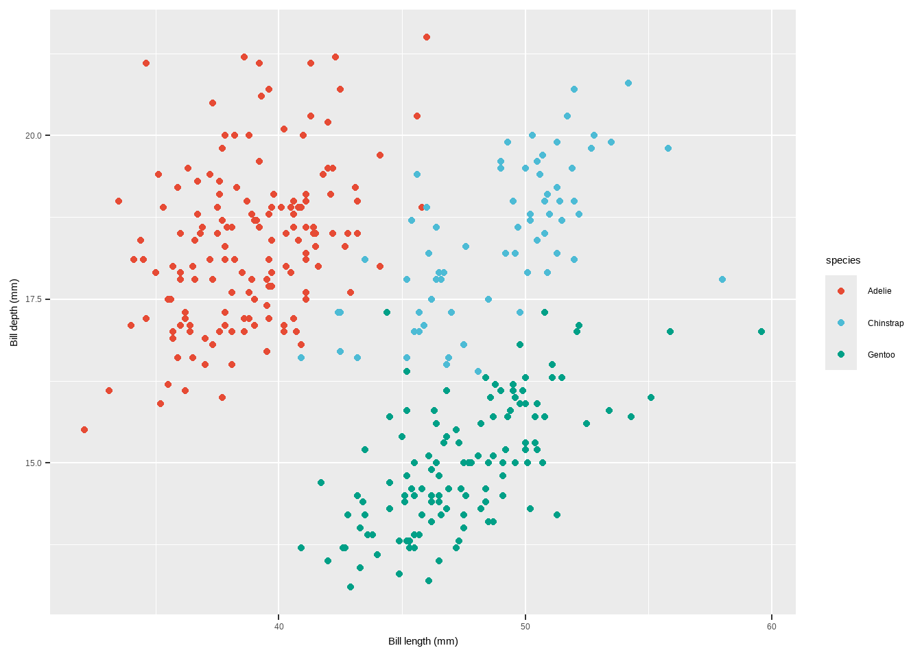
scale_color_carto_candscale_fill_carto_c(from{rcartocolor}): Use CARTO color palettes.scale_color_carto_c(palette = "BurgYl")
scale_color_tableau()
library(rcartocolor)
p2 + scale_color_carto_c(palette = "BurgYl")
Warning: Removed 2 rows containing missing values or values outside the scale range
(`geom_point()`).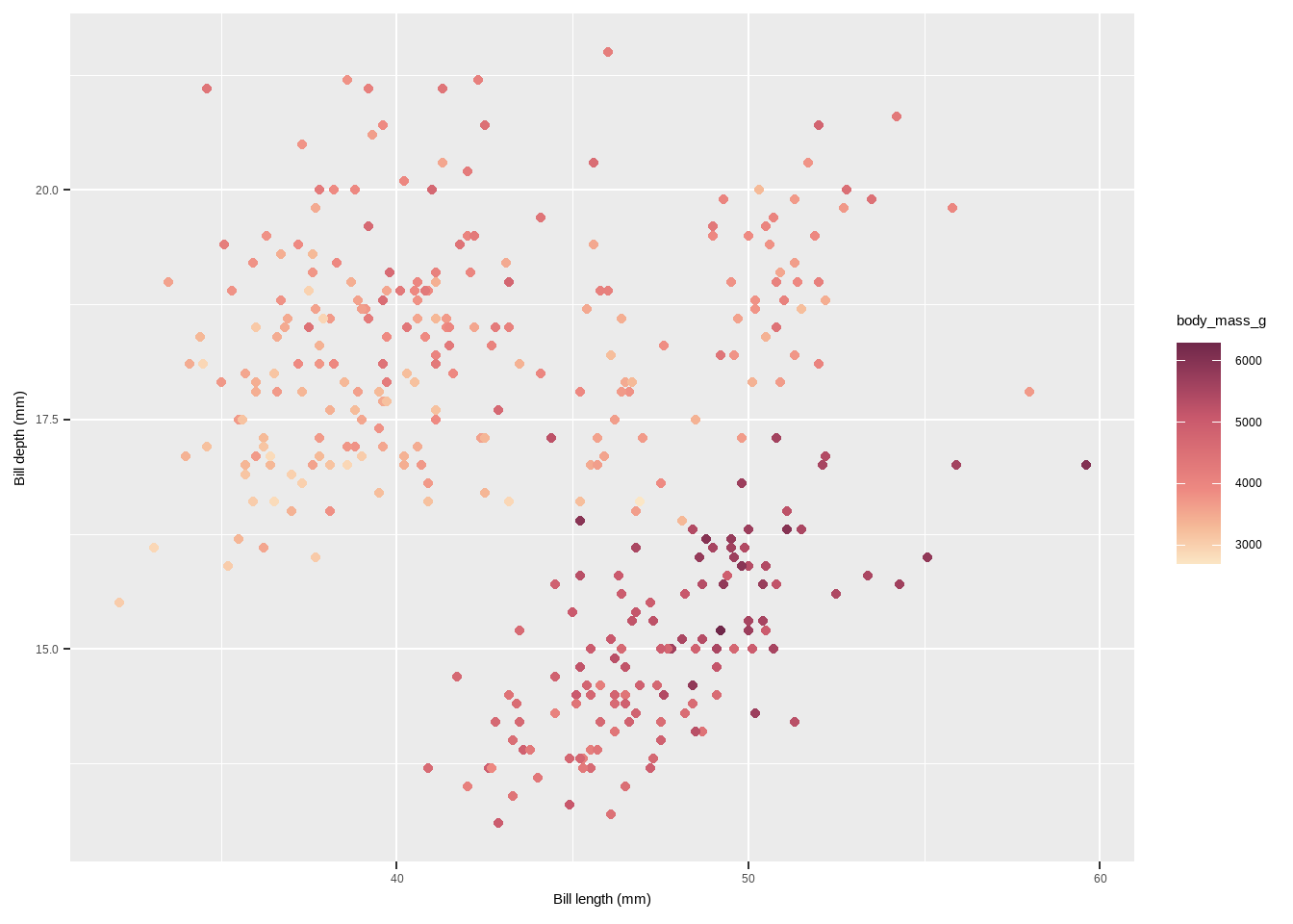
scale_color_scicoandscale_fill_scico(from{scico}): Use perceptually uniform color palettes from the Scico package.- The
{scico}package provides access to the color palettes developed by Fabio Crameri. scale_color_scico(palette = "berlin")
library(scico)
p2 + scale_color_scico(palette = "berlin")
Warning: Removed 2 rows containing missing values or values outside the scale range
(`geom_point()`).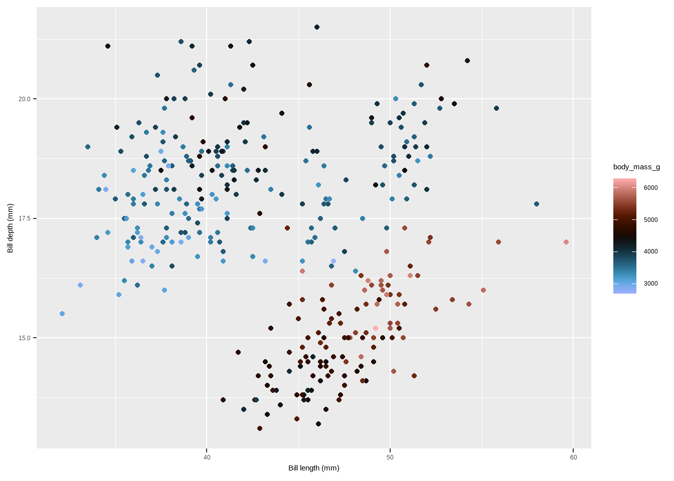
scale_color_tableau()
# Manual
p + scale_colour_manual(values = c("grey55", "orange",  "skyblue")) +
  labs(title = "Manual")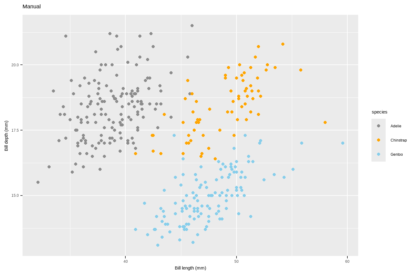
- Use a predefined colour palette
#install.packages("RColorBrewer")
require(RColorBrewer)
Loading required package: RColorBrewerdisplay.brewer.all()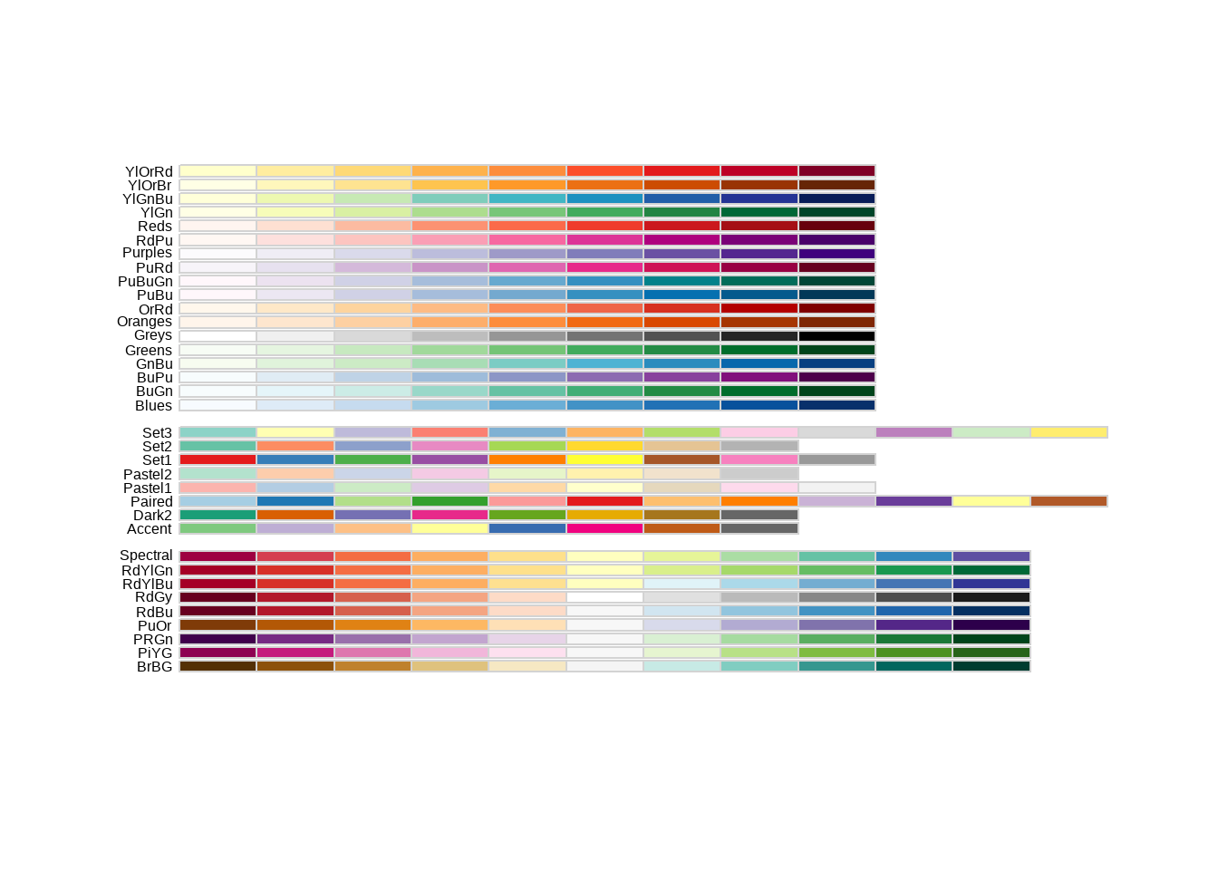
library(RColorBrewer)
p+scale_colour_brewer(palette = "Dark2") +
  labs(title = "Palette for groups")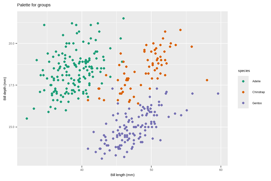
- Use a predefined colour palette
# Palette for continuous values
p2 + scale_colour_viridis_c()+
  labs(title= "Palette for continuous values")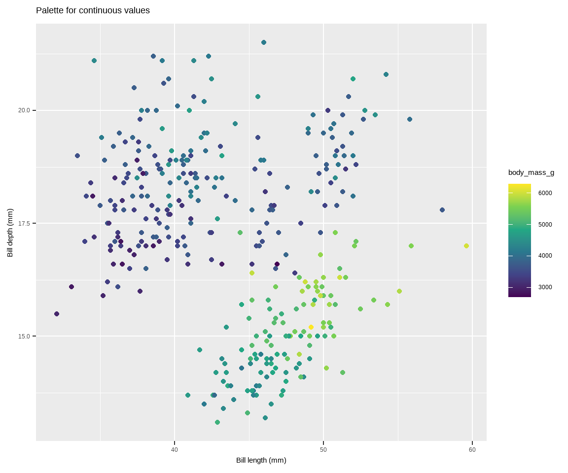
Use colourblind-friendly palettes
Have you ever considered how your figure might appear under various forms of colourblindness? We can use the package colorBlindness to consider this.
library(colorBlindness)
cvdPlot(p)
Warning: Removed 2 rows containing missing values or values outside the scale range
(`geom_point()`).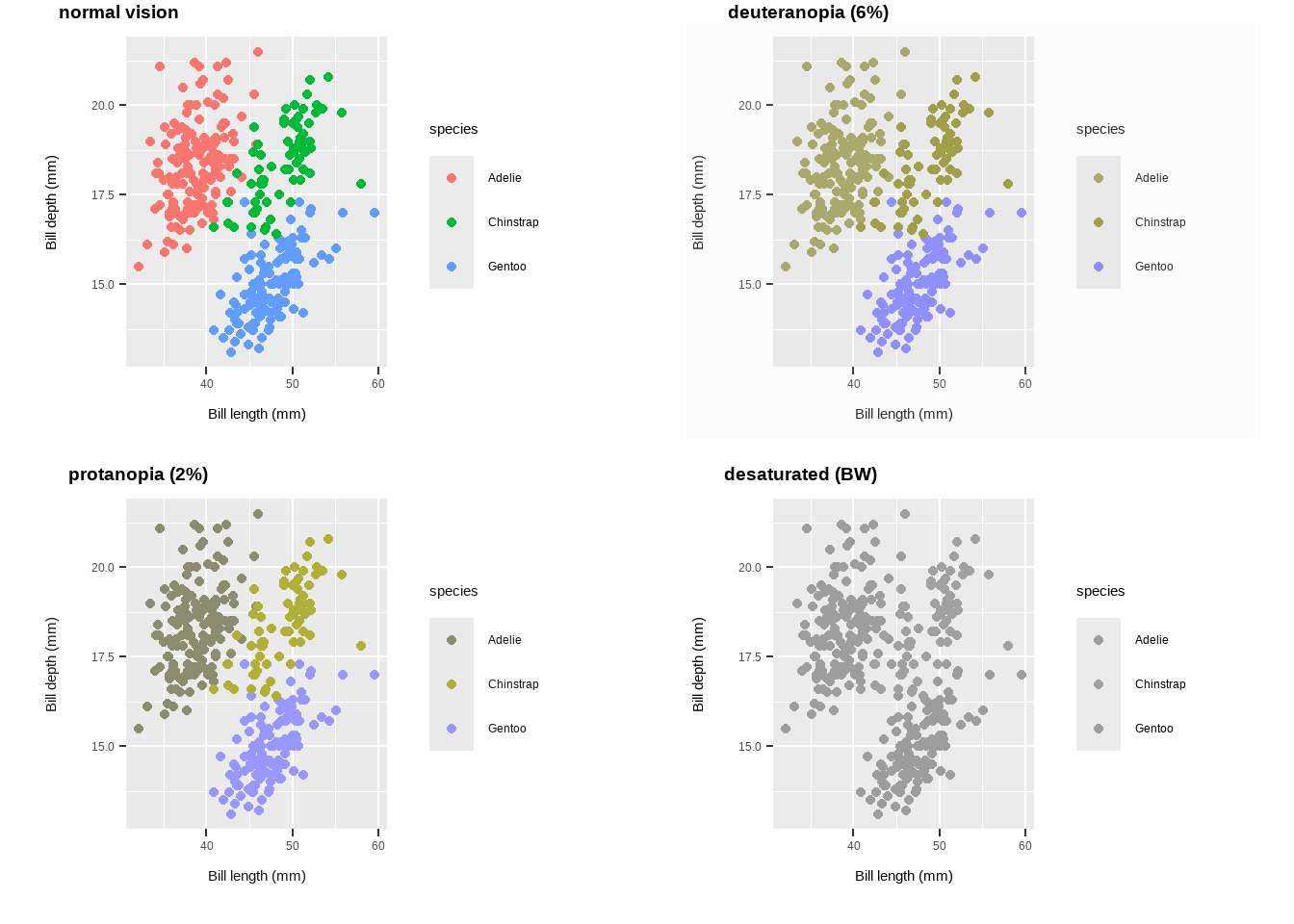
Use colourblind-friendly palettes
# Palette for groups
p +
  scale_colour_viridis_d() +
  labs(title ="Viridis palette for groups")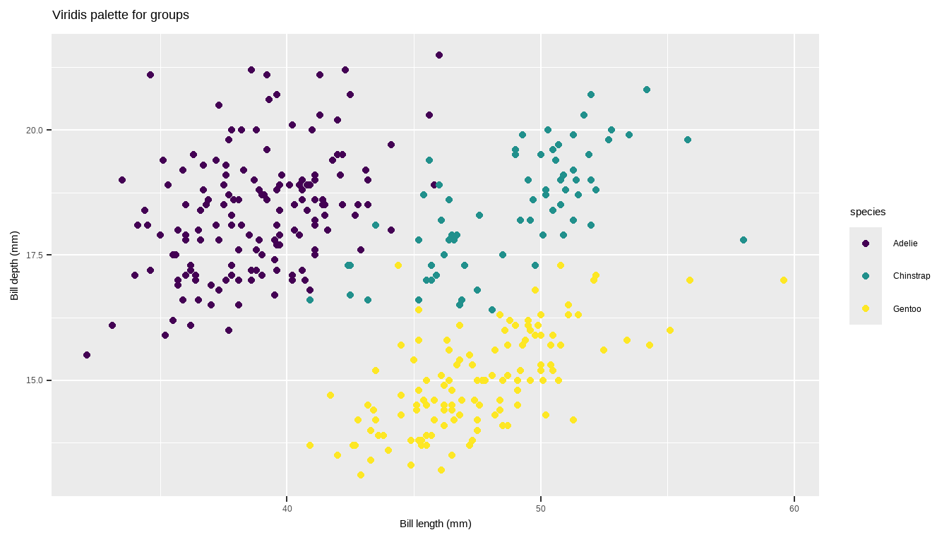
# Palette for continuous values
p2 +
  scale_colour_viridis_c() +
  labs(title = "Viridis palette
       for continuous values")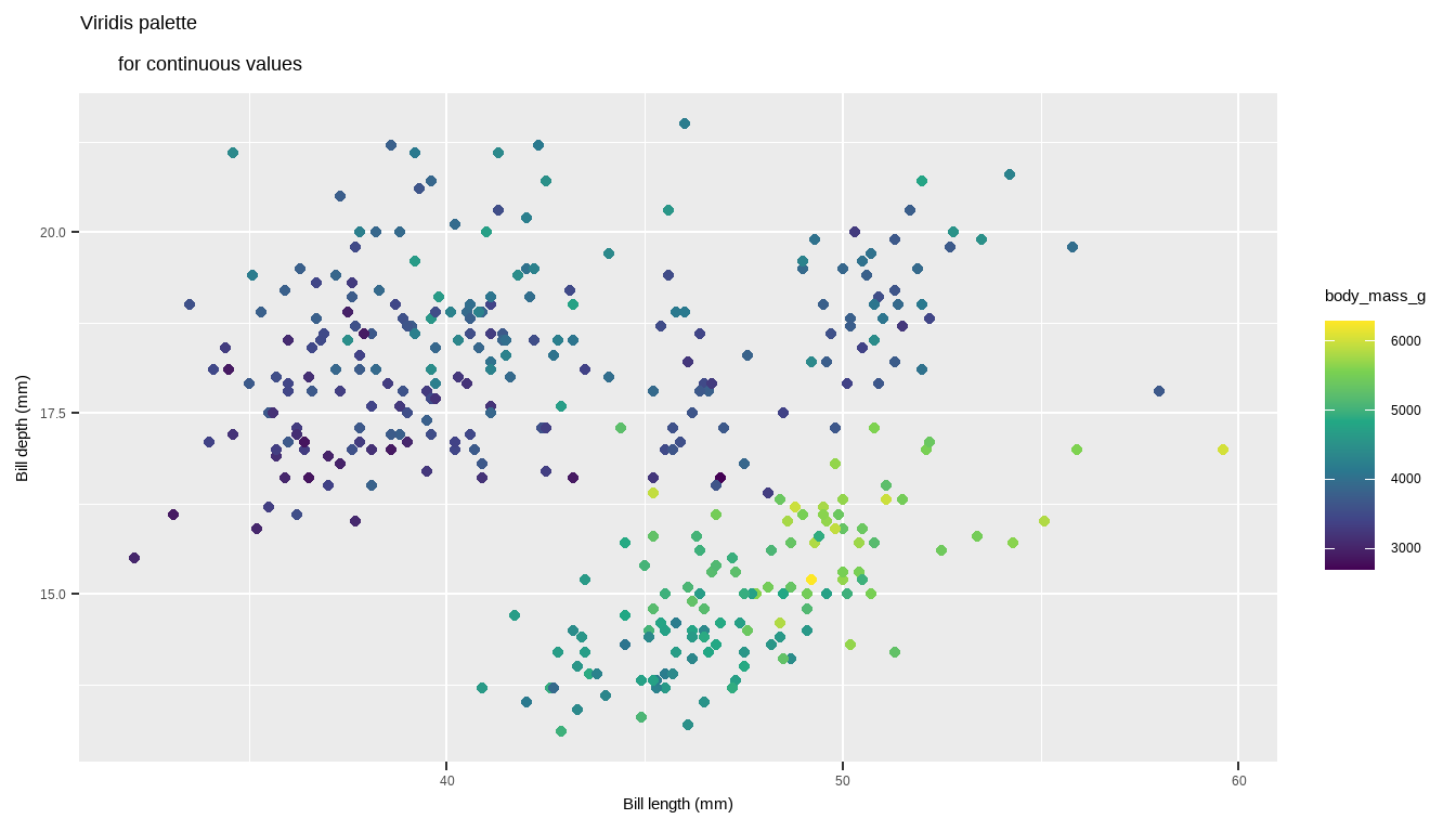
Lines
geom_hline(): Adds horizontal lines to a plot at specified y-axis values.yintercept: A numeric vector indicating where to draw the horizontal lines.geom_hline(yintercept = c(12, 23))
p + geom_hline(yintercept = c(12, 23))Warning: Removed 2 rows containing missing values or values outside the scale range
(`geom_point()`).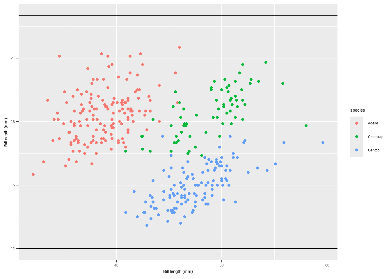
geom_vline(): Adds vertical lines to a plot at specified x-axis values.xintercept: A numeric vector or aesthetic mapping for x-axis intercepts.color,linewidth,linetype: Aesthetics for customizing the appearance of the line.
Lines
geom_vline(aes(xintercept = 45), linewidth = 1.5, color = "firebrick", linetype = "dashed")
p + geom_vline(aes(xintercept = 45), linewidth = 1.5,
               color = "firebrick", linetype = "dashed")
Warning: Removed 2 rows containing missing values or values outside the scale range
(`geom_point()`).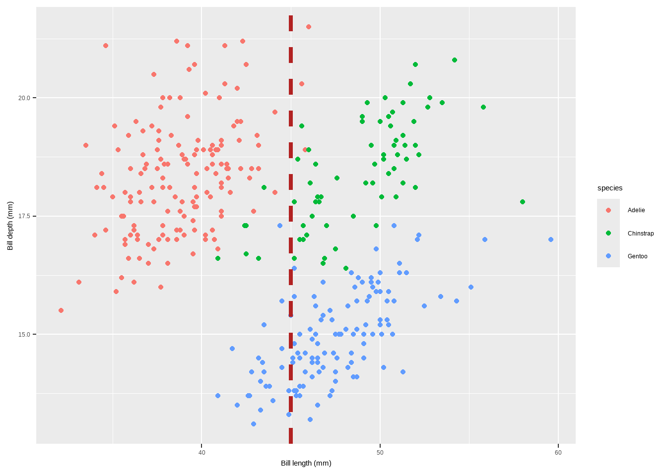
geom_abline(): Adds lines with a specified slope and intercept to a plot.intercept: The intercept of the line.slope: The slope of the line.color,linewidth: Aesthetics for customizing the appearance of the line.geom_abline(intercept = coefficients(reg)[1], slope = coefficients(reg)[2], color = "darkorange2", linewidth = 1.5)
Lines
reg <- lm(body_mass_g ~ bill_depth_mm, data = penguins)
p + geom_abline(intercept = coefficients(reg)[1],
                slope = coefficients(reg)[2], color = "darkorange2",
                linewidth = 1.5)
Warning: Removed 2 rows containing missing values or values outside the scale range
(`geom_point()`).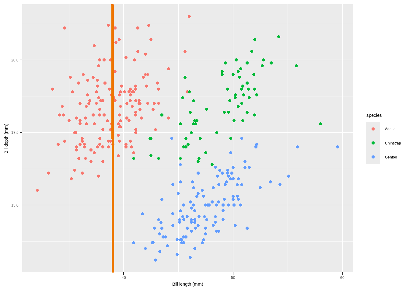
geom_linerange(): Adds line segments that do not span the entire plot range. Can be used for highlighting specific ranges.x,y: Aesthetics for the starting and ending points of the line.xmin,xmax,ymin,ymax: Coordinates for the start and end of the line segments.color,linewidth: Aesthetics for customizing the appearance of the line.
Lines
p+geom_linerange(aes(x = 45, ymin = 15, ymax = 22),
                 color = "steelblue", linewidth = 1)+
  geom_linerange(aes(y = 16, xmin = 30, xmax = 45),
                 color = "red", linewidth = 1)
Warning: Removed 2 rows containing missing values or values outside the scale range
(`geom_point()`).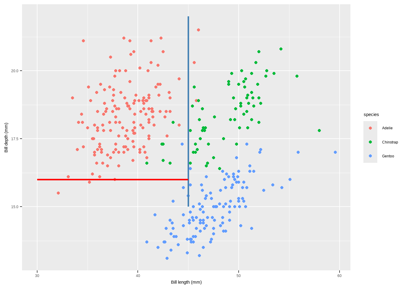
annotate(geom = "segment"): Adds line segments with specified start and end points. Useful for creating lines with arbitrary slopes.x,xend,y,yend: Coordinates for the start and end of the line segments.color,linewidth: Aesthetics for customizing the appearance of the line.
Lines
p + annotate(geom = "segment", x = 10, xend = 75, y = 20, yend = 5,
             color = "purple", linewidth = 2)
Warning: Removed 2 rows containing missing values or values outside the scale range
(`geom_point()`).
<<<<<<< HEAD
geom_encircle()in theggaltpackage is used to automatically enclose points in a polygon, creating an encircling effect around specified groups of points in a ggplot2 plot. This can be useful for highlighting clusters or groups of points within your data visualization.
Lines
library(ggalt)Registered S3 methods overwritten by 'ggalt':
method from
grobHeight.absoluteGrob ggplot2
grobWidth.absoluteGrob ggplot2
grobX.absoluteGrob ggplot2
grobY.absoluteGrob ggplot2p + geom_encircle(data=subset(penguins, species =="Adelie"),
colour="blue", spread=0.002) +
geom_encircle(data=subset(penguins, species =="Chinstrap"),
colour="purple", spread=0.002) +
geom_encircle(data=subset(penguins, species =="Gentoo"),
colour="red", spread=0.002) + ylim(10, 23)Warning: Removed 2 rows containing missing values or values outside the scale range
(`geom_point()`).Warning: Removed 1 row containing missing values or values outside the scale range
(`geom_encircle()`).
Removed 1 row containing missing values or values outside the scale range
(`geom_encircle()`).
8ddf821530bc5f0597a692a84963f534daaeee29
Text
There are a range of functions and techniques to customize text and labels in ggplot2 plots. Let us seea a detailed explanation of each function mentioned, along with examples and their purposes:
geom_label(): Adds labels to points on the plot with a rectangle around the text.
p + geom_label(aes(label = species), hjust = .5, vjust = -.5) +
  theme(legend.position = "none")
Warning: Removed 2 rows containing missing values or values outside the scale range
(`geom_point()`).Warning: Removed 2 rows containing missing values or values outside the scale range
(`geom_label()`).
Text
hjustandvjustcontrol the horizontal and vertical justification of the labels.geom_text(): Similar togeom_label(), but without the rectangle around the text.
p + geom_text(aes(label = sex), hjust = .5, vjust = -.5)+
  theme(legend.position = "none")
Warning: Removed 2 rows containing missing values or values outside the scale range
(`geom_point()`).Warning: Removed 11 rows containing missing values or values outside the scale range
(`geom_text()`).
Text
{ggrepel}Package: Provides functions to repel overlapping text labels.geom_text_repel(): Repels text labels to avoid overlap.geom_label_repel(): Repels text labels with a rectangle around them.
library(ggrepel)
p + geom_label_repel(aes(label = species), fontface = "bold")+
  theme(legend.position = "none")
Warning: Removed 2 rows containing missing values or values outside the scale range
(`geom_point()`).Warning: Removed 2 rows containing missing values or values outside the scale range
(`geom_label_repel()`).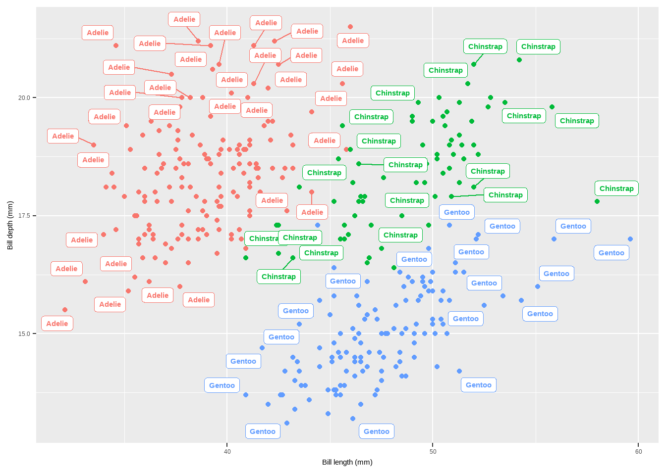
Text
geom_label_repel()avoids overlapping by adjusting the position of labels.annotate(): Adds annotations to a plot.
p + annotate(geom = "text", x = 45, y = 25, fontface = "bold",
             label = "This is a useful annotation")
Warning: Removed 2 rows containing missing values or values outside the scale range
(`geom_point()`).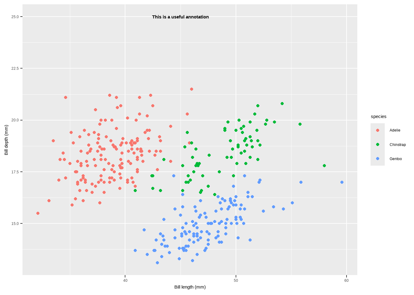
Text
annotate()is used to add single text or label annotations at specified coordinates.annotation_custom(): Adds custom annotations using grid graphical objects.
library(grid)
my_grob <- grobTree(textGrob("This is species type!", x = .1, y = .9,
                             hjust = 0, gp = gpar(col = "black", fontsize = 15,
                                                  fontface = "bold")))
p + annotation_custom(my_grob) + facet_wrap(~species, scales = "free_x") + scale_y_continuous(limits = c(NA, 20)) + theme(legend.position = "none")
Warning: Removed 19 rows containing missing values or values outside the scale range
(`geom_point()`).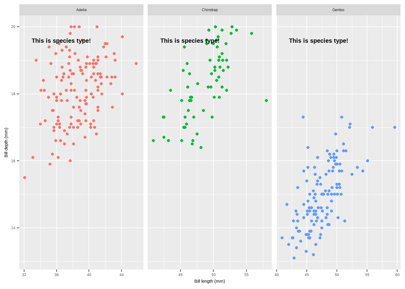
Text
{ggtext}Package: Enhances text rendering with support for markdown and HTML.- Functions:
geom_richtext(): Renders text as markdown or HTML.geom_textbox(): Provides dynamic wrapping for longer text annotations.
library(ggtext)
lab_md <- "This plot shows **Bill lngth** in *°mm* versus **Bill depth** in *mm* across Species type"
p + geom_richtext(aes(x = 45, y = 22.5, label = lab_md, stat = "unique"))
Warning in geom_richtext(aes(x = 45, y = 22.5, label = lab_md, stat =
"unique")): Ignoring unknown aesthetics: statWarning: Removed 2 rows containing missing values or values outside the scale range
(`geom_point()`).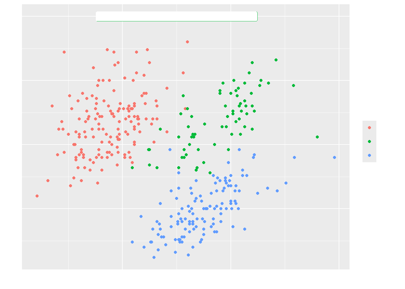
Text
- If we need to add long text to annotate our plot
lab_long <- "**Association**<br><i style='font-size:8pt;color:black;'>This graph is a scatter plot showing the association between bill length and bill weidth for each specias type. So we can see that there is a crear association.</i>"

p + geom_textbox(aes(x = 45, y = 20, label = lab_long),
                 width = unit(25, "lines"), stat = "unique")
Warning: Removed 2 rows containing missing values or values outside the scale range
(`geom_point()`).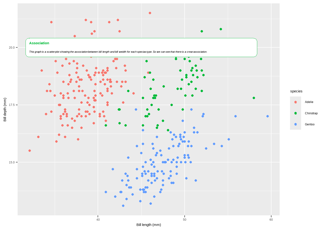
Coordinates
To customize plots in ggplot2, you can use a variety of functions that modify the coordinates, axes, scales, and themes of your plot. Here is a detailed explanation of the functions mentioned in your provided text, as well as some additional ones commonly used in ggplot2 for customization:
coord_flip(): Flips the x and y coordinates, making horizontal plots vertical and vice versa. This is particularly useful for bar charts and boxplots.
p + coord_flip()Warning: Removed 2 rows containing missing values or values outside the scale range
(`geom_point()`).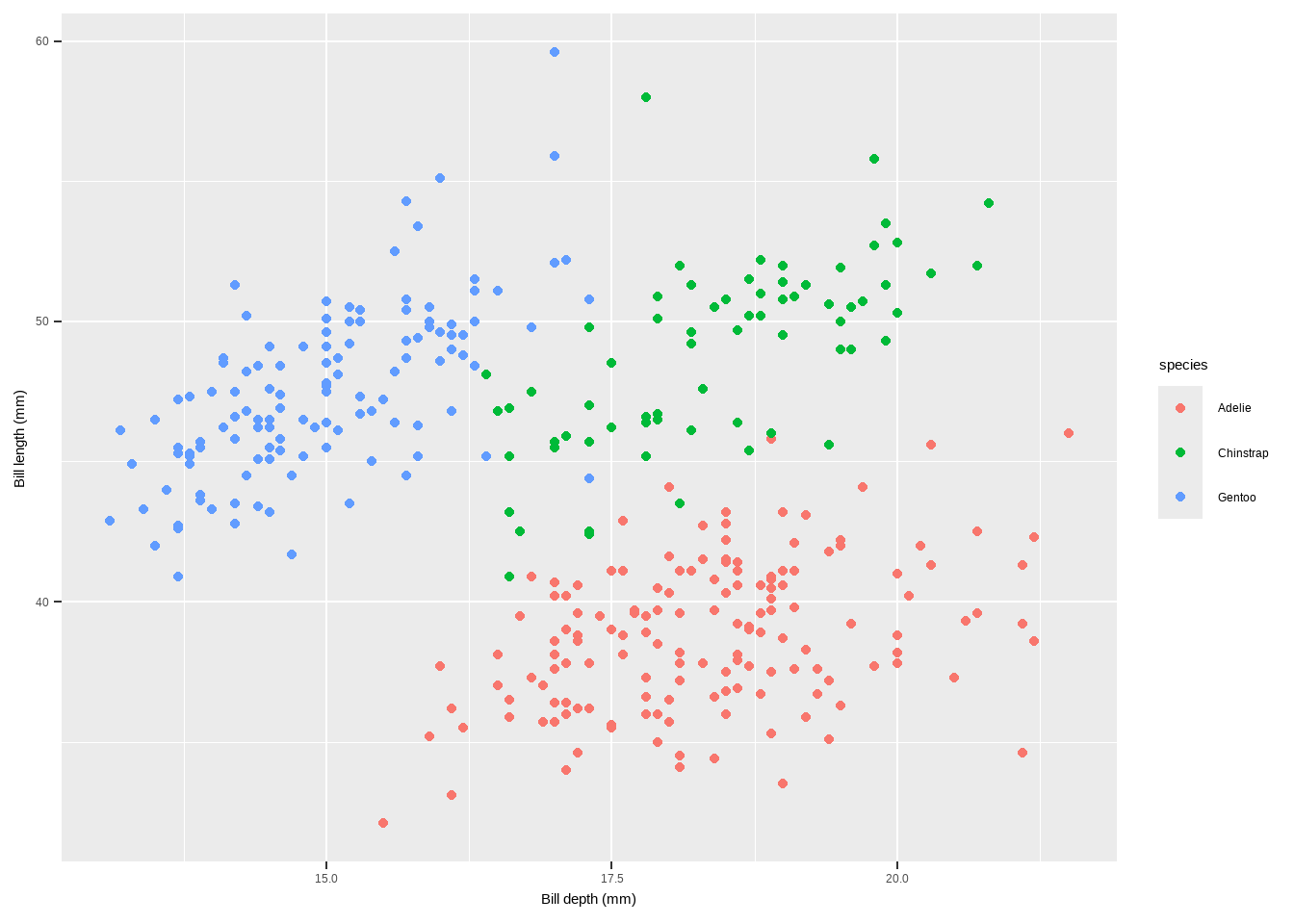
Coordinates
coord_fixed(ratio = 1): Fixes the aspect ratio of the plot, ensuring a specific ratio of units on the x and y axes.
p + scale_x_continuous(breaks = seq(0, 60, by = 5)) +
  coord_fixed(ratio = 1)
Warning: Removed 2 rows containing missing values or values outside the scale range
(`geom_point()`).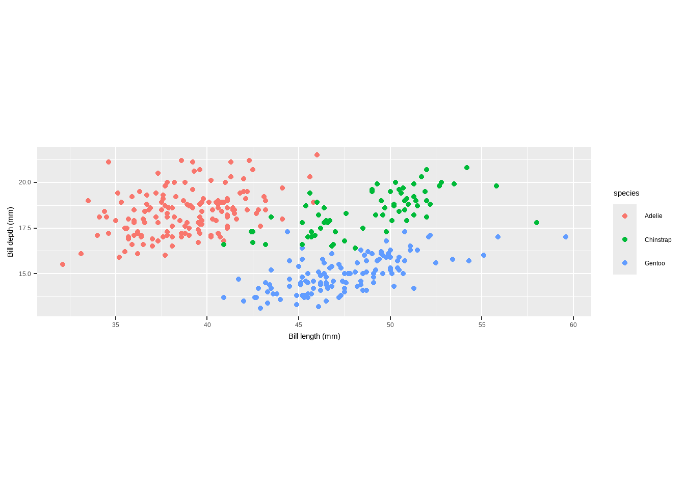
coord_fixed(ratio = 1/3): Sets a different aspect ratio, ensuring a 1:3 ratio of units on the x and y axes.
Coordinates
p + scale_x_continuous(breaks = seq(0, 60, by = 15)) +
  coord_fixed(ratio = 2/3) +
  theme(plot.background = element_rect(fill = "grey80"))
Warning: Removed 2 rows containing missing values or values outside the scale range
(`geom_point()`).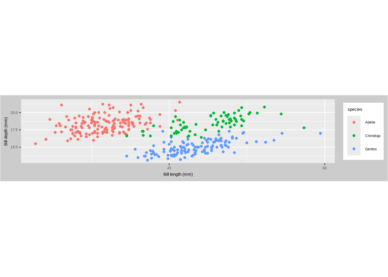
Coordinates
coord_polar(): Converts the plot to polar coordinates, often used for circular bar charts and pie charts.
penguins %>%   dplyr::group_by(species) %>%   dplyr::summarize(bd = median(flipper_length_mm)) %>%   ggplot(aes(x = species, y = bd)) +
  geom_col(aes(fill = species), color = NA) +
  labs(x = "", y = "Median Ozone Level") +   coord_polar() +
  guides(fill = "none")
Warning: Removed 2 rows containing missing values or values outside the scale range
(`geom_col()`).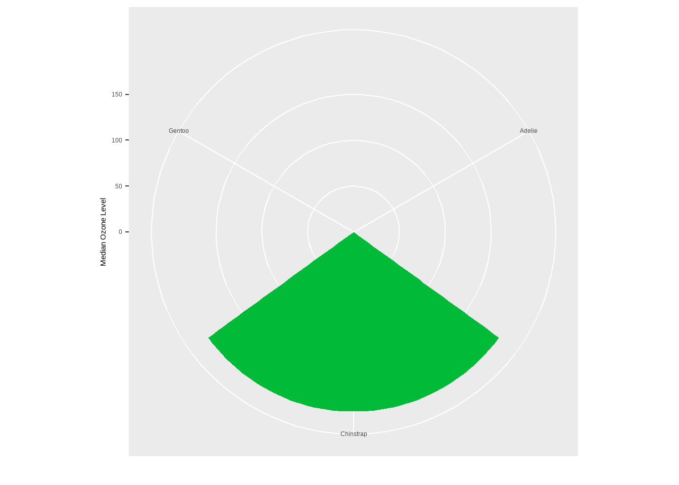
Coordinates
coord_polar(theta = "y"): Used for creating pie charts by specifying thethetaparameter as “y”.
library(dplyr)
chic_sum <- penguins %>%  mutate(n_all = n()) %>% group_by(species) %>% dplyr::summarize(Total = n() / unique(n_all))
ggplot(chic_sum, aes(x = "", y = Total)) +
  geom_col(aes(fill = species), width = 1, color = NA) +
  coord_polar(theta = "y") +
scale_fill_brewer(palette = "Set1", name = "Species:") 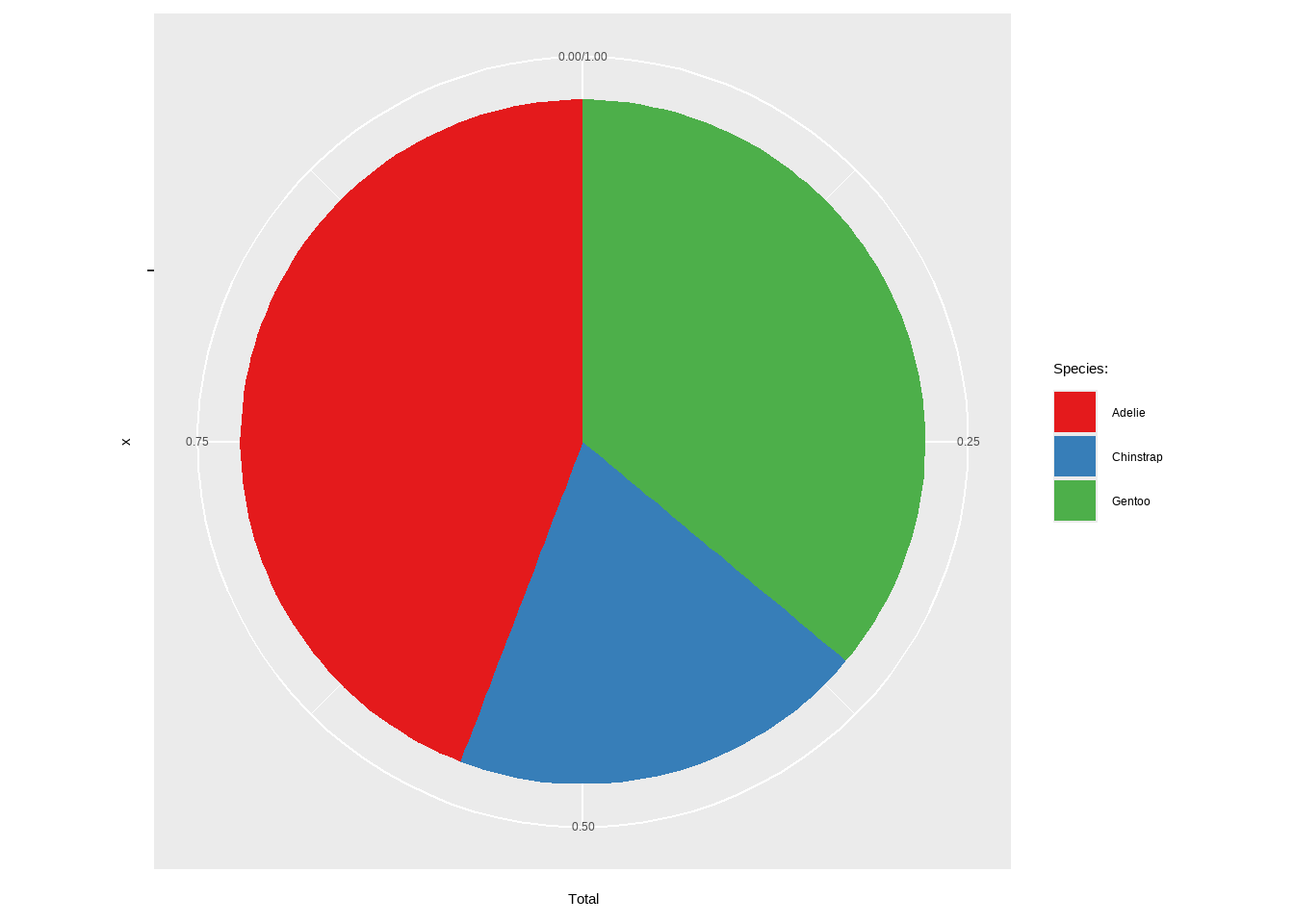
Axis Functions
scale_x_continuous()/scale_y_continuous(): Customize the breaks, labels, and limits of continuous scales.
p + scale_x_continuous(breaks = seq(0, 60, by = 10))Warning: Removed 2 rows containing missing values or values outside the scale range
(`geom_point()`).
Axis Functions
scale_x_reverse()/scale_y_reverse(): Reverses the direction of the x or y axis, making higher values appear on the left or bottom.
p + scale_y_reverse()Warning: Removed 2 rows containing missing values or values outside the scale range
(`geom_point()`).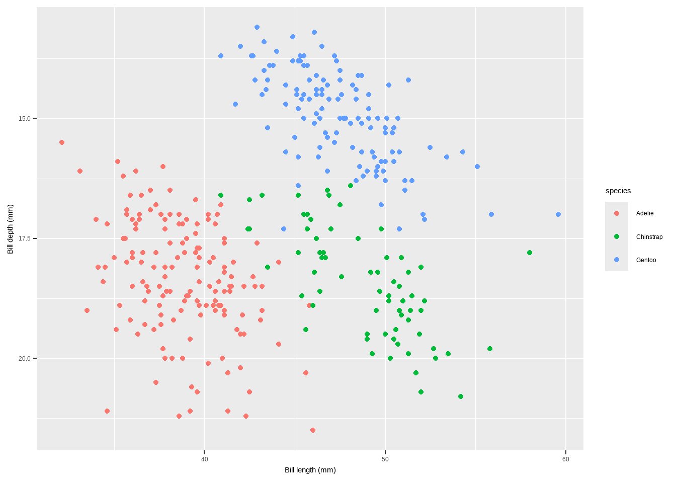
Axis Functions
scale_y_log10(): Transforms the y-axis to a logarithmic scale (base 10), useful for data with a wide range.
p+scale_y_sqrt()Warning: Removed 2 rows containing missing values or values outside the scale range
(`geom_point()`).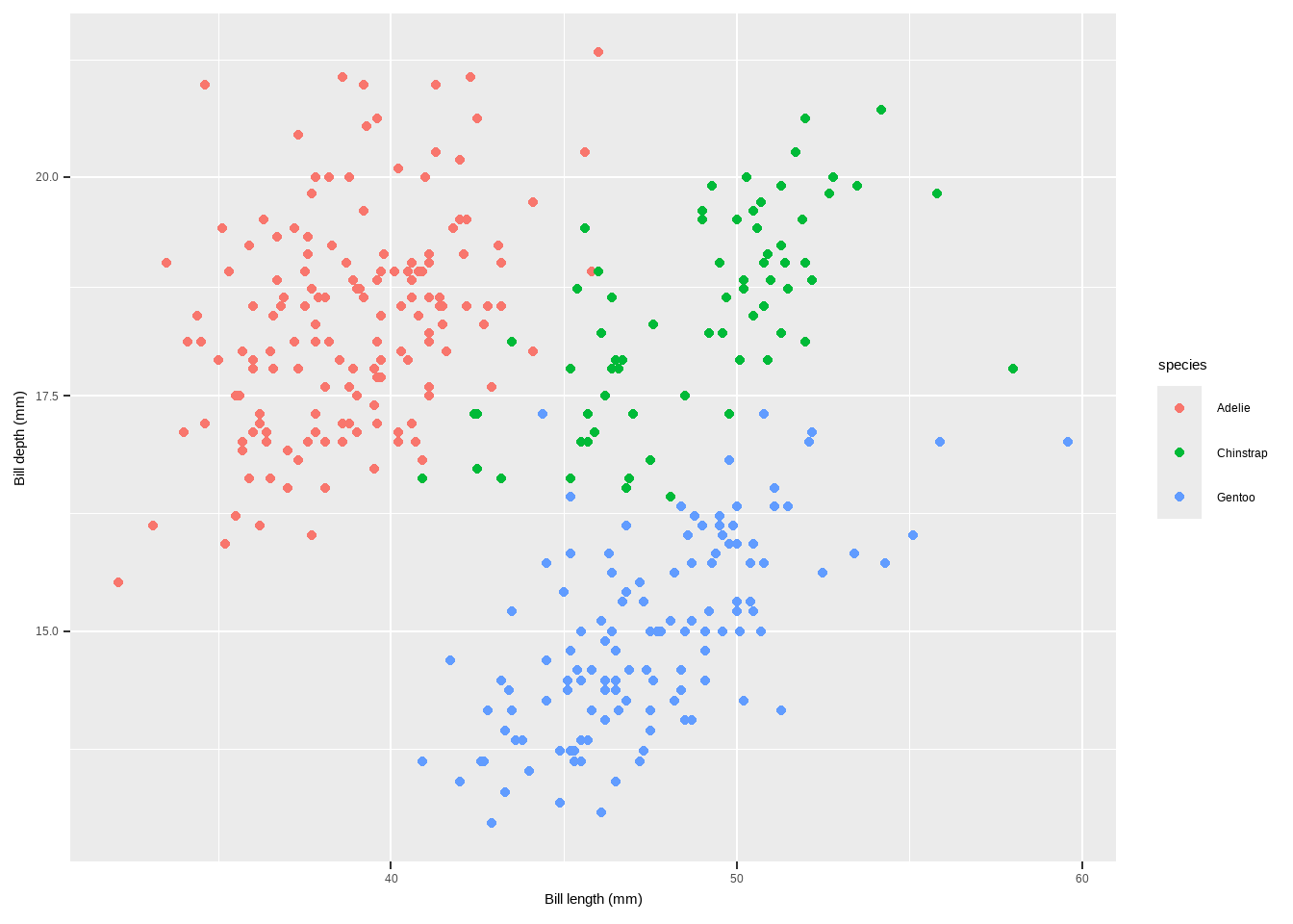
Smoothings
To make smoothing our plot, we can simply use stat_smooth().
- This adds a LOESS (locally weighted scatter plot smoothing,
method = "loess") if you have fewer than 1000 points or a GAM (generalized additive model,method = "gam") otherwise.
p + geom_point(color = "gray40", alpha = .5) + stat_smooth()`geom_smooth()` using method = 'loess' and formula = 'y ~ x'Warning: Removed 2 rows containing non-finite outside the scale range
(`stat_smooth()`).Warning: Removed 2 rows containing missing values or values outside the scale range
(`geom_point()`).
Removed 2 rows containing missing values or values outside the scale range
(`geom_point()`).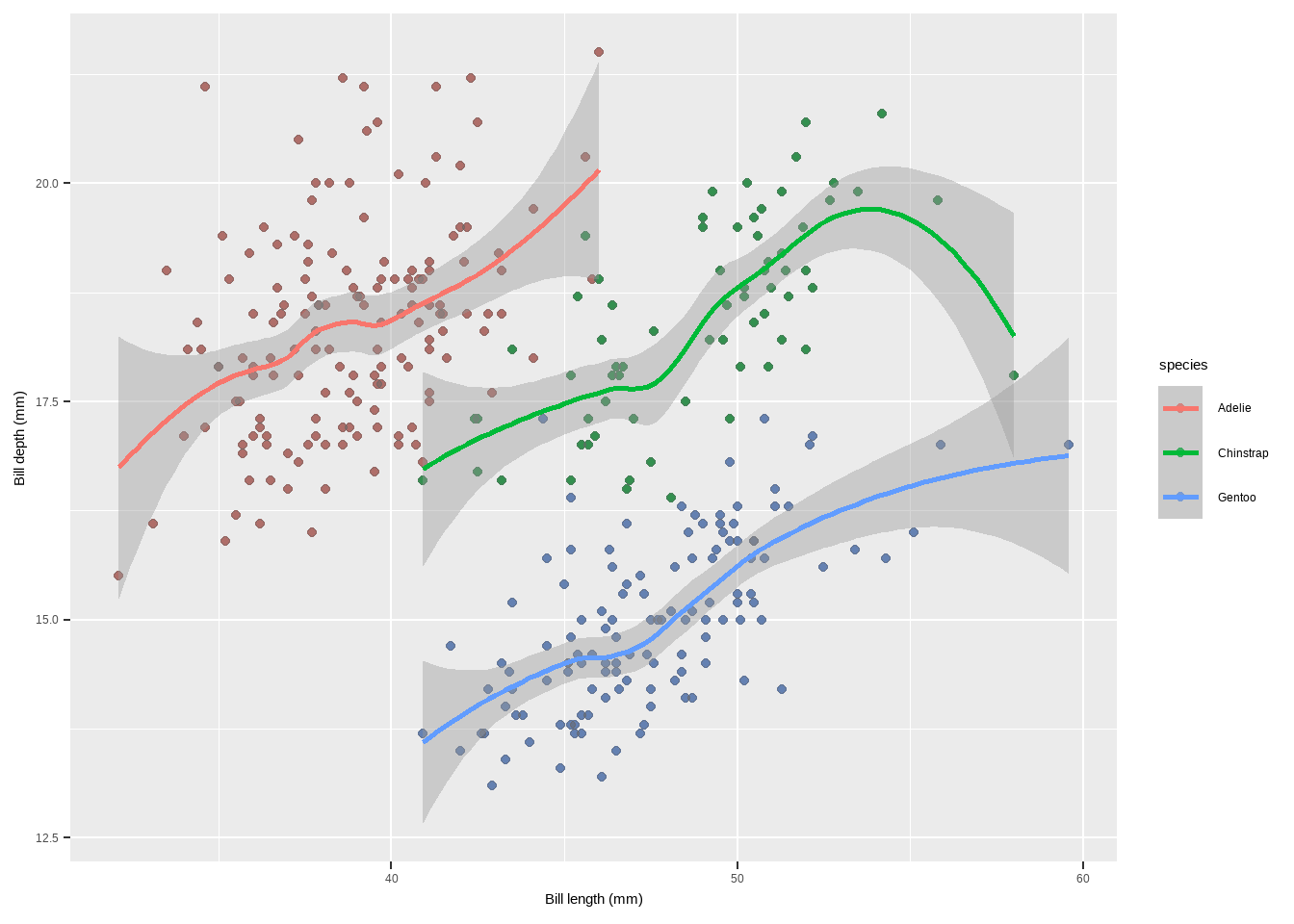
Adding a Linear Fit
Though the default is a LOESS or GAM smoothing, it is also easy to add a standard linear fit:
p + geom_point(color = "gray40", alpha = .5) +
  stat_smooth(method = "lm", se = FALSE, color = "firebrick", linewidth = 1.3)+
  labs(x = "Temperature (°F)", y = "Dewpoint")
`geom_smooth()` using formula = 'y ~ x'Warning: Removed 2 rows containing non-finite outside the scale range
(`stat_smooth()`).Warning: Removed 2 rows containing missing values or values outside the scale range
(`geom_point()`).
Removed 2 rows containing missing values or values outside the scale range
(`geom_point()`).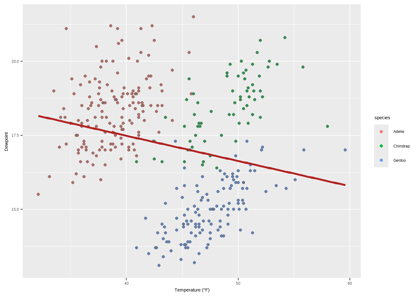
Specifying the Formula for Smoothing
{ggplot2} allows you to specify the model you want it to use. Maybe you want to use a polynomial regression?
p + geom_point(color = "gray40", alpha = .3) +
  geom_smooth(method = "lm",
              formula = y ~ x + I(x^2) + I(x^3) + I(x^4) + I(x^5),
              color = "black", fill = "firebrick") +
  labs(x = "Ozone Level", y = "Temperature (°F)")
Warning: Removed 2 rows containing non-finite outside the scale range
(`stat_smooth()`).Warning: Removed 2 rows containing missing values or values outside the scale range
(`geom_point()`).
Removed 2 rows containing missing values or values outside the scale range
(`geom_point()`).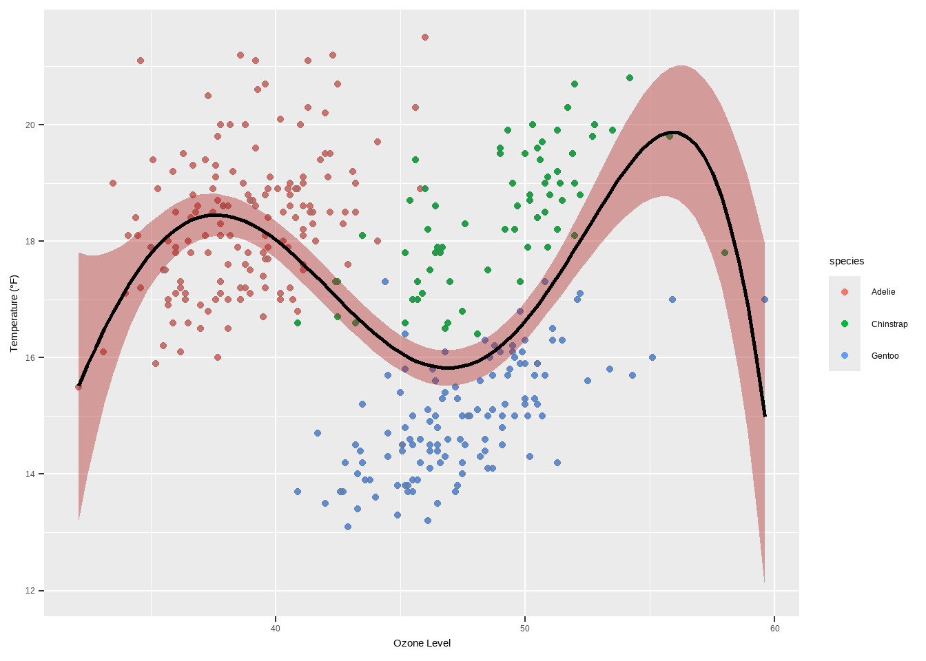
Interactive Plots
- Interactive plots in R are a great way to enhance the user experience by providing dynamic and visually appealing graphics. Some libraries that can be used in combination with
ggplot2or on their own to create interactive visualizations:
There are different interactive Plot Libraries. The following are among the few
Plot.ly} is a tool for creating online, interactive graphics and web apps. The plotly package in R allows you to easily convert your ggplot2 plots into interactive plots.
library(plotly)
Attaching package: 'plotly'The following object is masked from 'package:ggplot2':
last_plotThe following object is masked from 'package:stats':
filterThe following object is masked from 'package:graphics':
layoutggplotly(p)Interactive Plots
This function ggplotly(p) converts the ggplot2 object p into an interactive plot.
ggiraph()is an R package that allows you to create dynamicggplot2graphs, adding tooltips, animations, and JavaScript actions.
library(ggiraph)
p3 <- p+   geom_line(color = "grey") +
  geom_point_interactive(aes(color = species, tooltip = species, data_id = species)) +
  scale_color_brewer(palette = "Dark2", guide = "none")
girafe(ggobj = p3)
Warning: Removed 2 rows containing missing values or values outside the scale range
(`geom_point()`).Warning: Removed 2 rows containing missing values or values outside the scale range
(`geom_line()`).Warning: Removed 2 rows containing missing values or values outside the scale range
(`geom_interactive_point()`).Interactive Plots
The function girafe(ggobj = p3) creates an interactive plot with tooltips.
- highcharter() is a software library for interactive charting. The
{highcharter}package brings this functionality to R.
library(highcharter) Registered S3 method overwritten by 'quantmod':
method from
as.zoo.data.frame zoo hchart(penguins, "scatter", hcaes(x = bill_length_mm, y = bill_depth_mm,
group = species))Interactive Plots
The
hchartfunction generates a scatter plot using theHighchartslibrary.echarts4r is a free, powerful charting and visualization library. The
{echarts4r}package provides an interface to use this library in R.
library(echarts4r)
penguins %>%   e_charts(bill_length_mm) %>%
  e_scatter(body_mass_g, symbol_size = 7) %>%
  e_visual_map(body_mass_g) %>%   e_y_axis(name = "Bill length") %>%
  e_legend(FALSE)
<<<<<<< HEAD
Interactive Plots
Create different plots using geom_*()
Create different plots using geom_*()
p1 <- ggplot(penguins, aes(x = bill_length_mm, y = bill_depth_mm, colour = species)) +
  geom_point()
p2 <- ggplot(penguins, aes(x = bill_length_mm, y = bill_depth_mm, colour = species)) +
  geom_density2d()
p3 <- ggplot(penguins, aes(x = species, fill = island)) +
  geom_bar()
p4 <- ggplot(penguins, aes(x = species, y = bill_depth_mm, fill = species)) +
  geom_boxplot()

library(patchwork)
Attaching package: 'patchwork'The following object is masked from 'package:cowplot':
align_plotsp1 + p2 + p3 + p4Warning: Removed 2 rows containing missing values or values outside the scale range
(`geom_point()`).Warning: Removed 2 rows containing non-finite outside the scale range
(`stat_density2d()`).Warning: Removed 2 rows containing non-finite outside the scale range
(`stat_boxplot()`).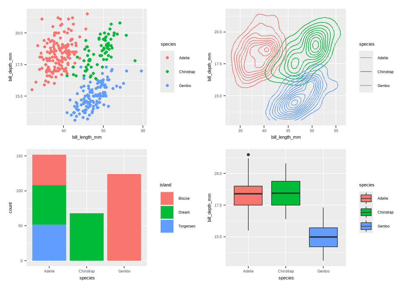
Create different plots using geom_*()
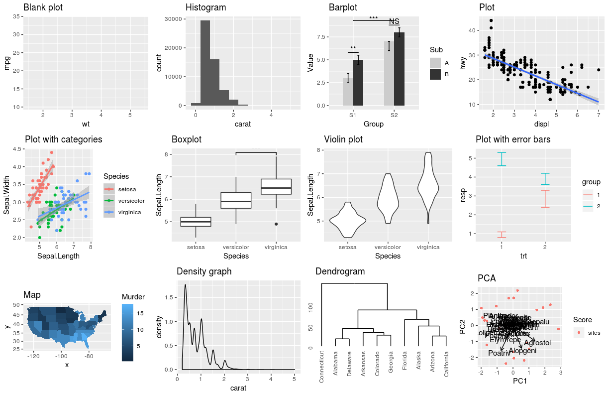
This is a blank plot, before we add any geom_* to represent variables in the dataset.
ggplot(penguins)
Bar plot using geom_bar()
- Bar chart of number of penguins by species. I would like to know how many species we have in this dataset.
ggplot(penguins, aes(x = species, fill = species)) +
  geom_bar() + labs(title = "Number of Penguins by Species",
       x = "Species",  y = "Count", fill = "Species") + theme_minimal()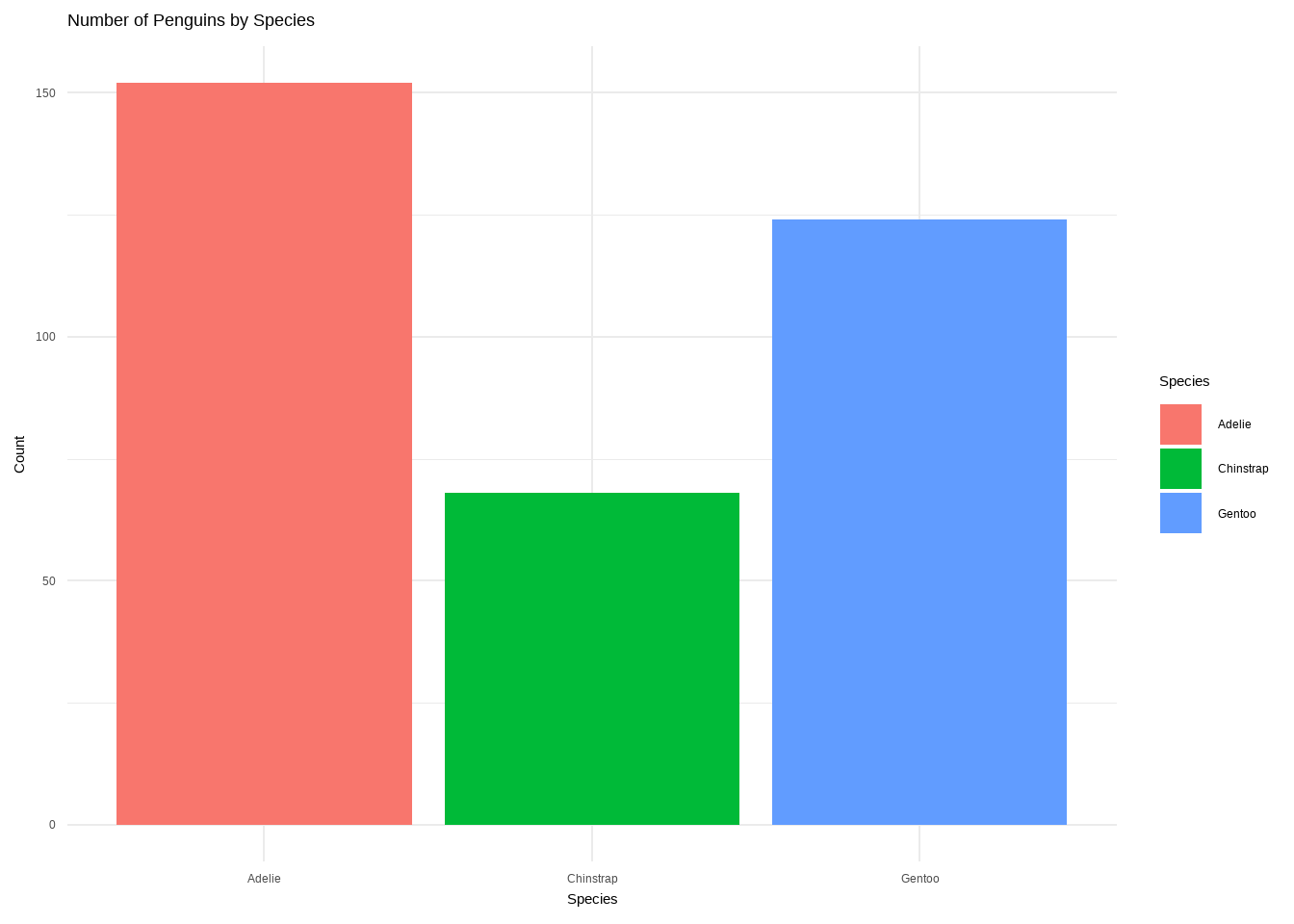
Bar plot using geom_bar()
- Number of Penguin species on each Island
ggplot(data = penguins)+ geom_bar(mapping=aes(x=island, fill=species))+
  labs(title="Population of Penguin species on each Island", y="count of species")+
theme(text=element_text(size=14))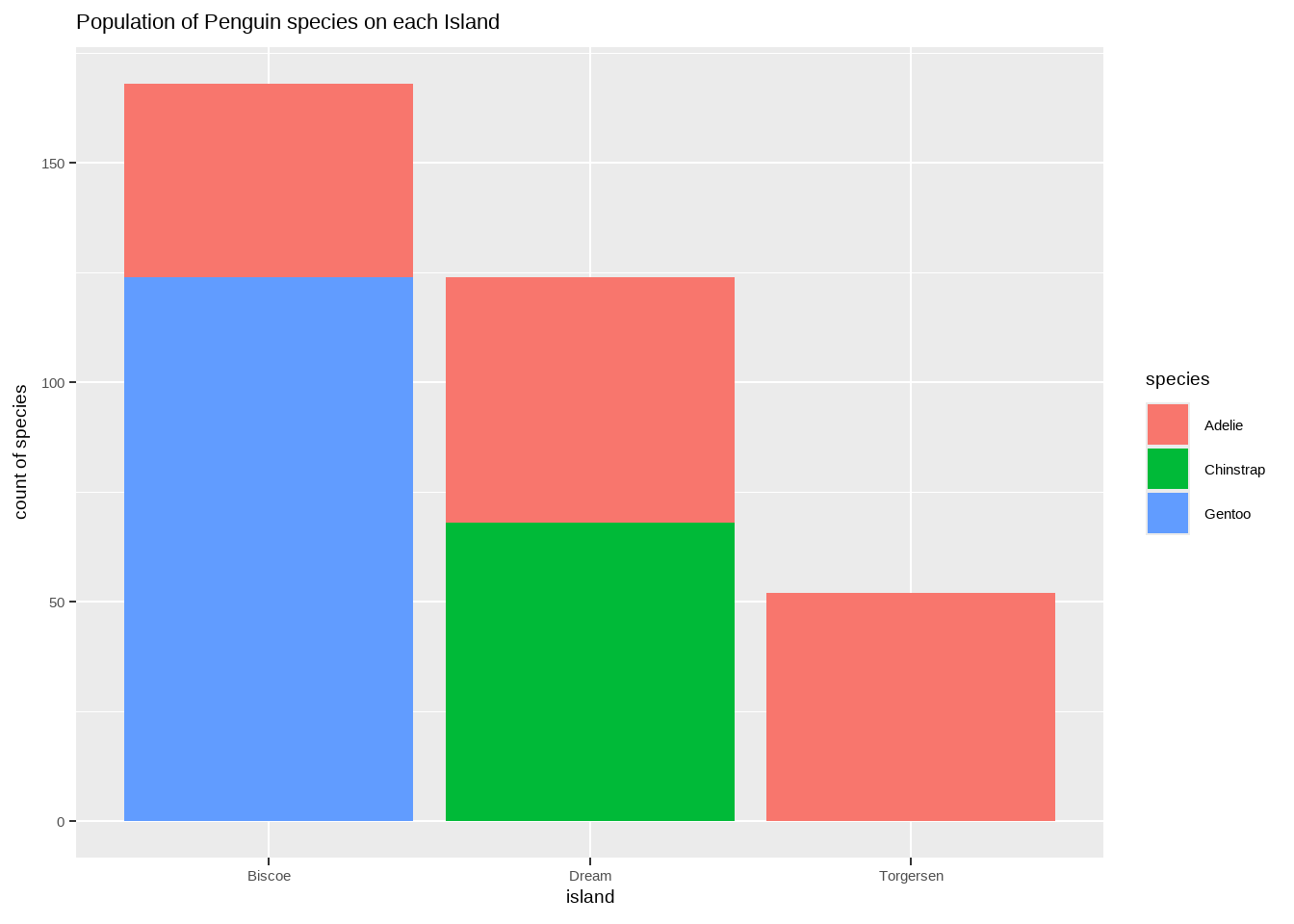
Bar plot using geom_bar()
- chart of body mass by species & sex.
ggplot(penguins, aes(x = species, y = body_mass_g, fill = sex)) +
  geom_bar(stat = "identity", position = "dodge") +
  labs(title = "Body Mass by Species and Sex",
       x = "Species", y = "Body Mass (g)", fill = "Sex") +
  theme_minimal()
Warning: Removed 2 rows containing missing values or values outside the scale range
(`geom_bar()`).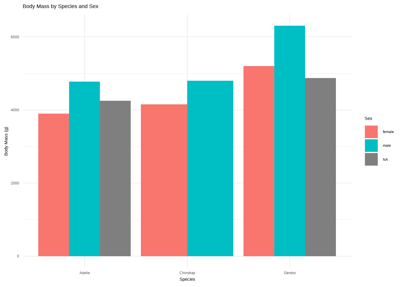
Labels
You can add labels with geom_label or geom_text. geom_text is just text and geom_label is text inside a rounded white box (this, of course, can be changed).
Histograms: geom_histogram()
A histogram is an accurate graphical representation of the distribution of numeric data. There is only one aesthetic required: the x variable.
ggplot(penguins,
       aes(x = bill_length_mm)) + geom_histogram() +
  ggtitle("Histogram of penguin bill length ")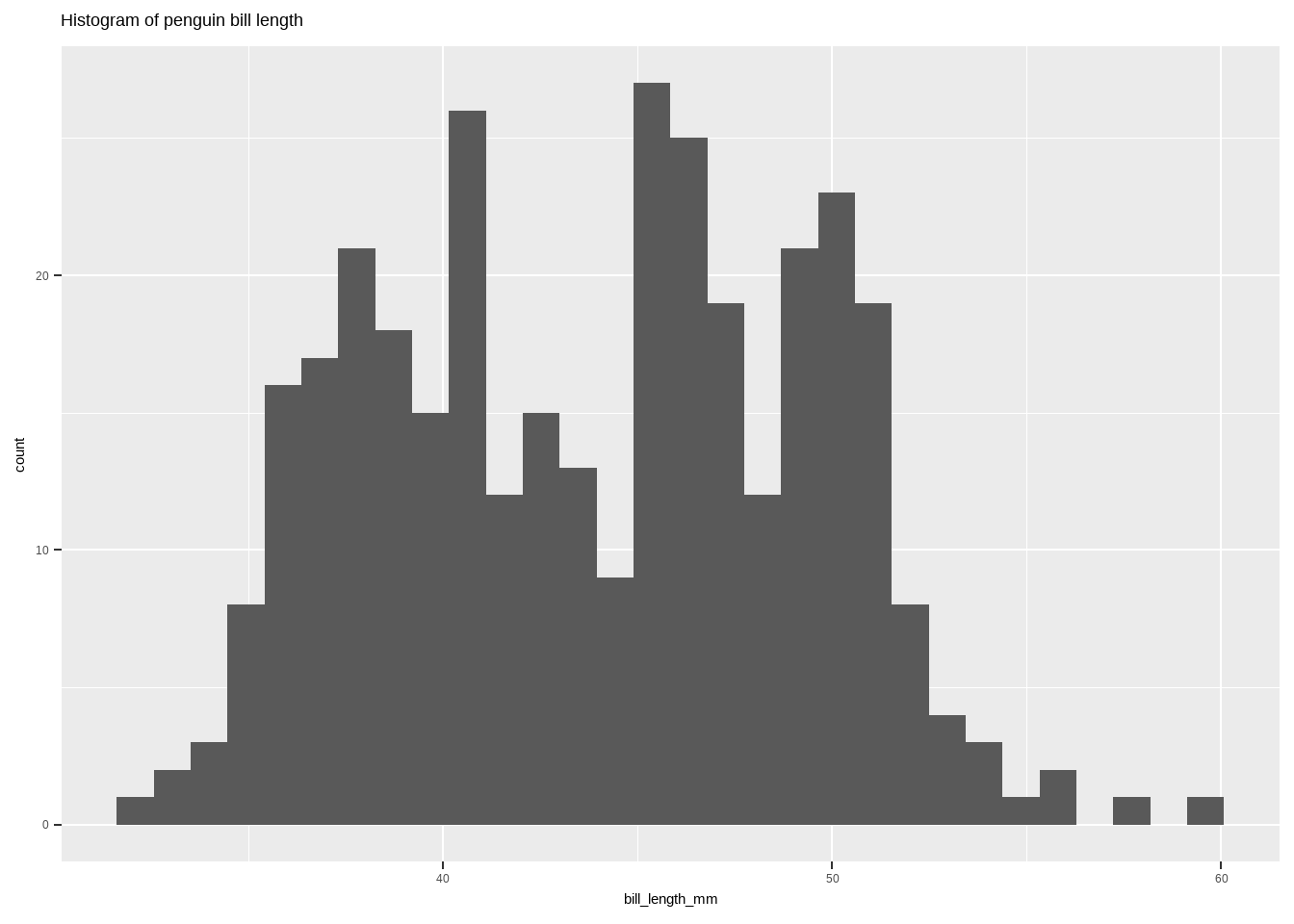
Boxplot: geom_boxplot()
Boxplot: geom_boxplot()
- Boxplot of body mass distribution of penguins by species
ggplot(penguins, aes(x = species, y = body_mass_g, fill = species)) +
  geom_boxplot() +
  labs(title = "Body Mass Distribution of Penguins by Species",
       x = "Species",   y = "Body Mass (g)", fill = "Species") +
  theme_minimal()
Warning: Removed 2 rows containing non-finite outside the scale range
(`stat_boxplot()`).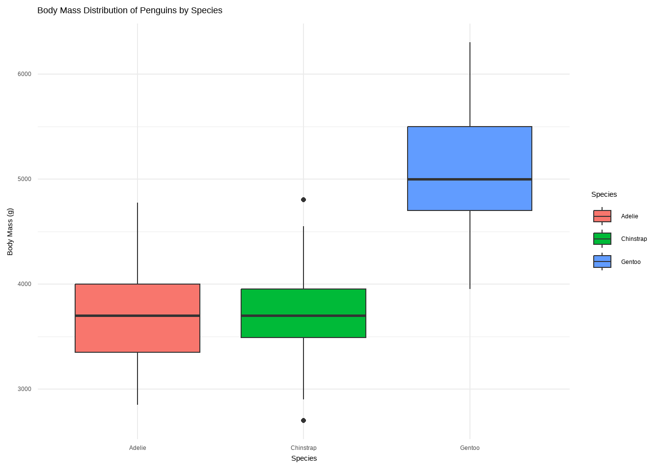
Boxplot: geom_boxplot()
ggplot(data = penguins,
       aes(x = species, y = bill_length_mm, fill = species)) +
  geom_boxplot() + labs(title = "Boxplot")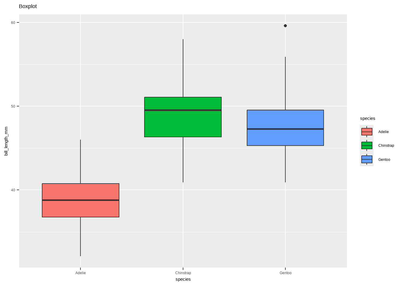
Boxplot: geom_boxplot()
- Boxplot with annotations:
geom_boxplot()andgeom_signif()
library(ggsignif)
ggplot(data = penguins, aes(x = species, y= bill_length_mm, fill = species)) +
  geom_boxplot() +
  # specify the comparison we are interested in
  geom_signif(comparisons = list(c("Adelie", "Gentoo")), map_signif_level=TRUE)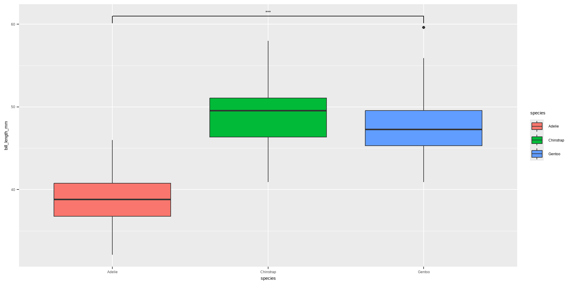
Violin plot: geom_violin()
Violin plot allows to visualize the distribution of a numeric variable for one or several groups. It is really close to a boxplot, but allows a deeper understanding of the distribution.
Violin plot: geom_violin()
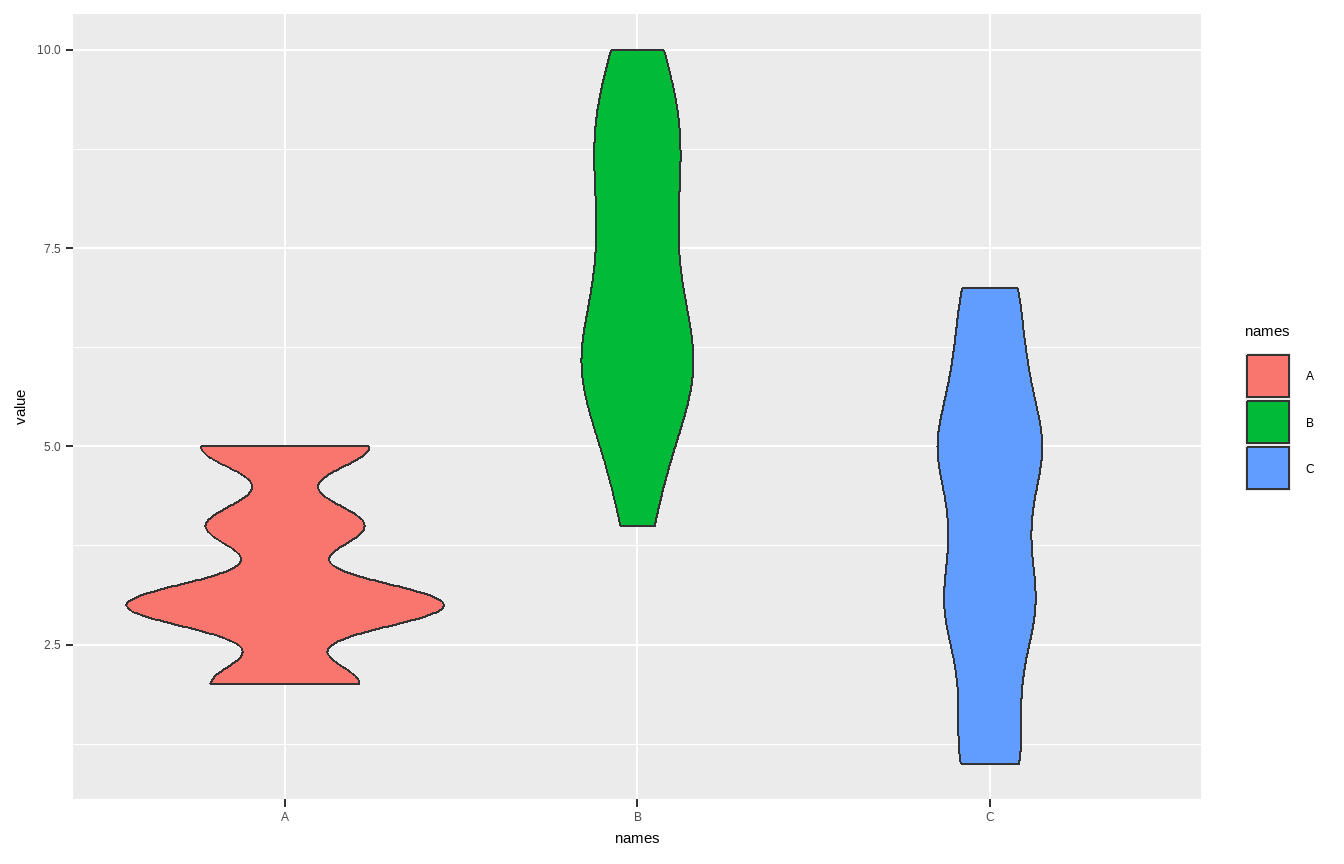
Violin plot: geom_violin()
violin <- ggplot(data = penguins, aes(x = species, y = bill_length_mm)) +
geom_violin(trim = FALSE, fill = "grey70", alpha = .5) +
labs(title = "Violin plot")
violin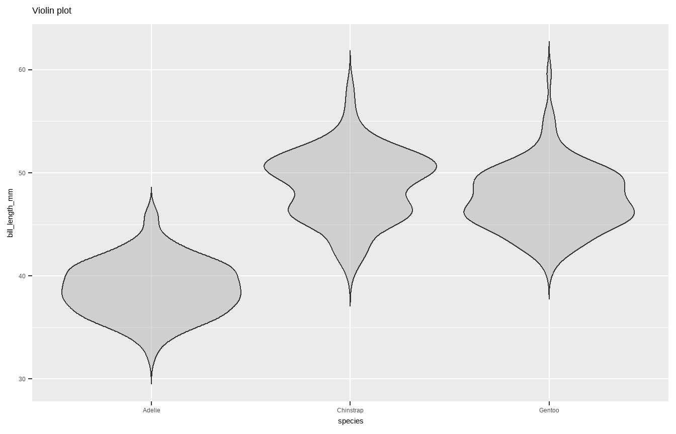
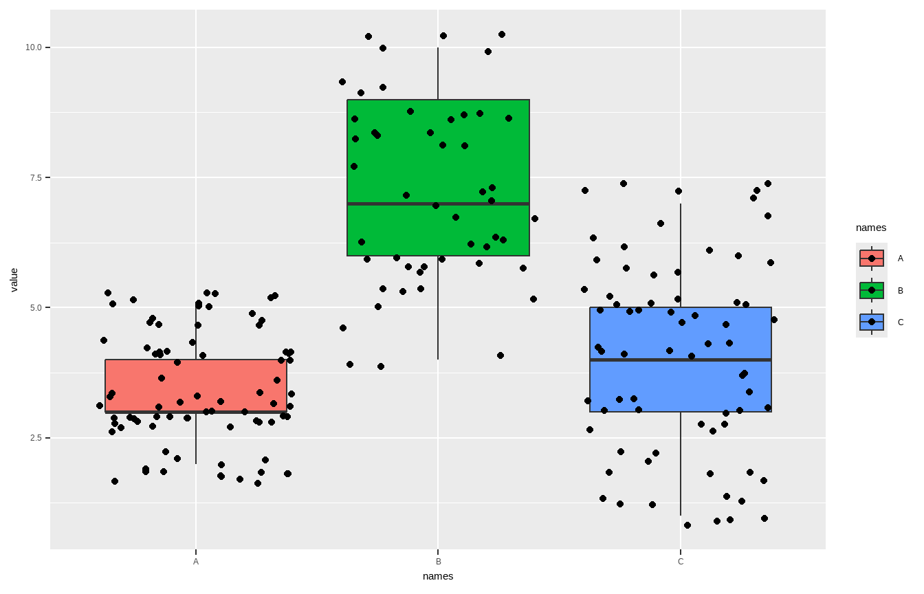
Violin plot: geom_violin() + _boxplot() + _jitter()
violin + geom_jitter(shape = 16, position = position_jitter(0.2),
alpha = .3) + geom_boxplot(width = .05)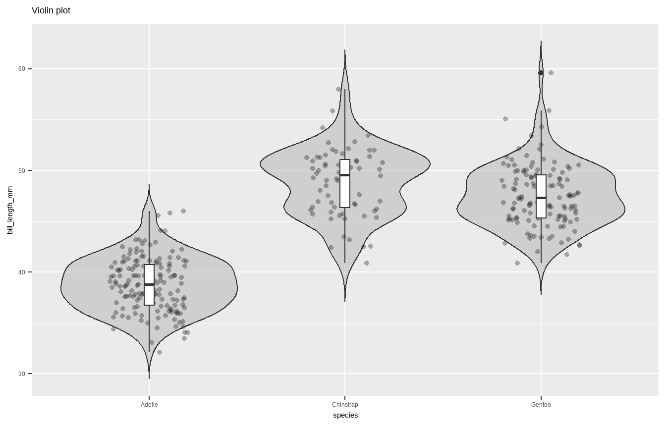
Pie chart
Summarise y values: stat_summary()
ggplot(mtcars, aes(cyl, mpg)) + geom_point() +
stat_summary(fun.y = "median", geom = "point",
colour = "red",size = 6) + labs(title = "Medians")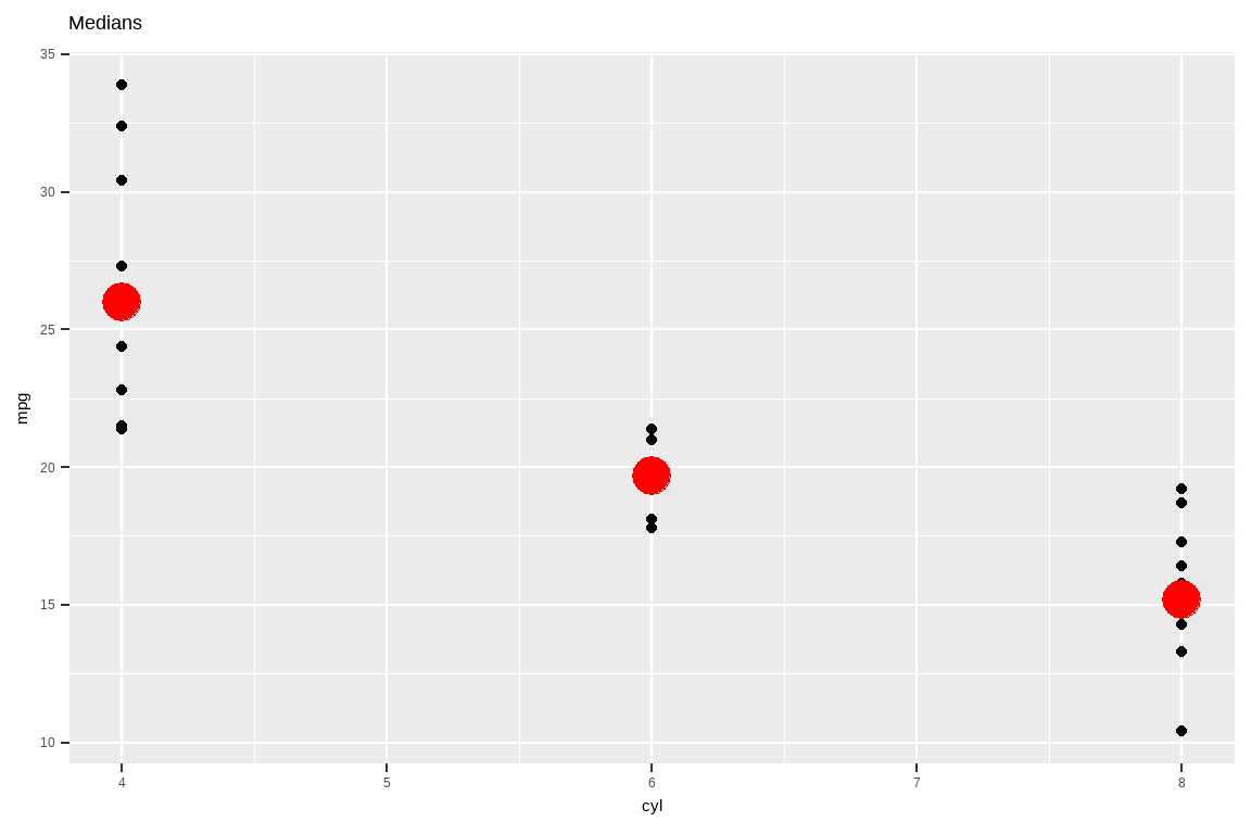
Pie chart
ggplot(mtcars, aes(cyl, mpg)) + geom_point() +
stat_summary(fun.data = "mean_cl_boot", colour = "red", size = 1.6) +
labs(title = "Means and CIs")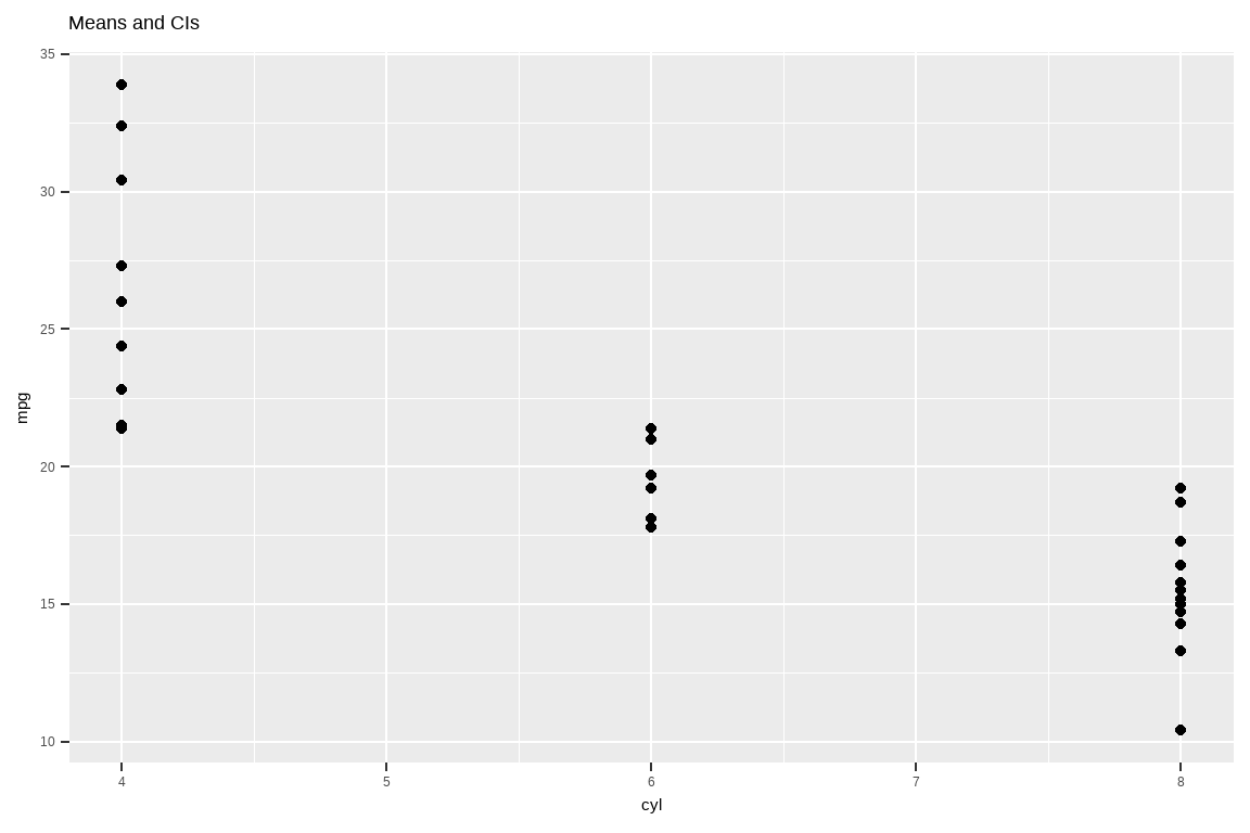
Line Charts
You can use geom_line() for line charts to display values over time. geom_line() requires an additional group= aesthetic. If there should be only 1 line because there is only 1 time variable, then use group=1. If you want to split the lines based on another variable, use group=variable_name.
A line graph displaying a single line for year
data(AirPassengers)
airpassengers <- data.frame(AirPassengers, year = trunc(time(AirPassengers)),
month = month.abb[cycle(AirPassengers)])
airpassengers %>% group_by(year) %>% summarize(sum =sum(AirPassengers, na.rm=T)) %>%
ggplot()+ geom_line(aes(x=year, y=sum, group=1))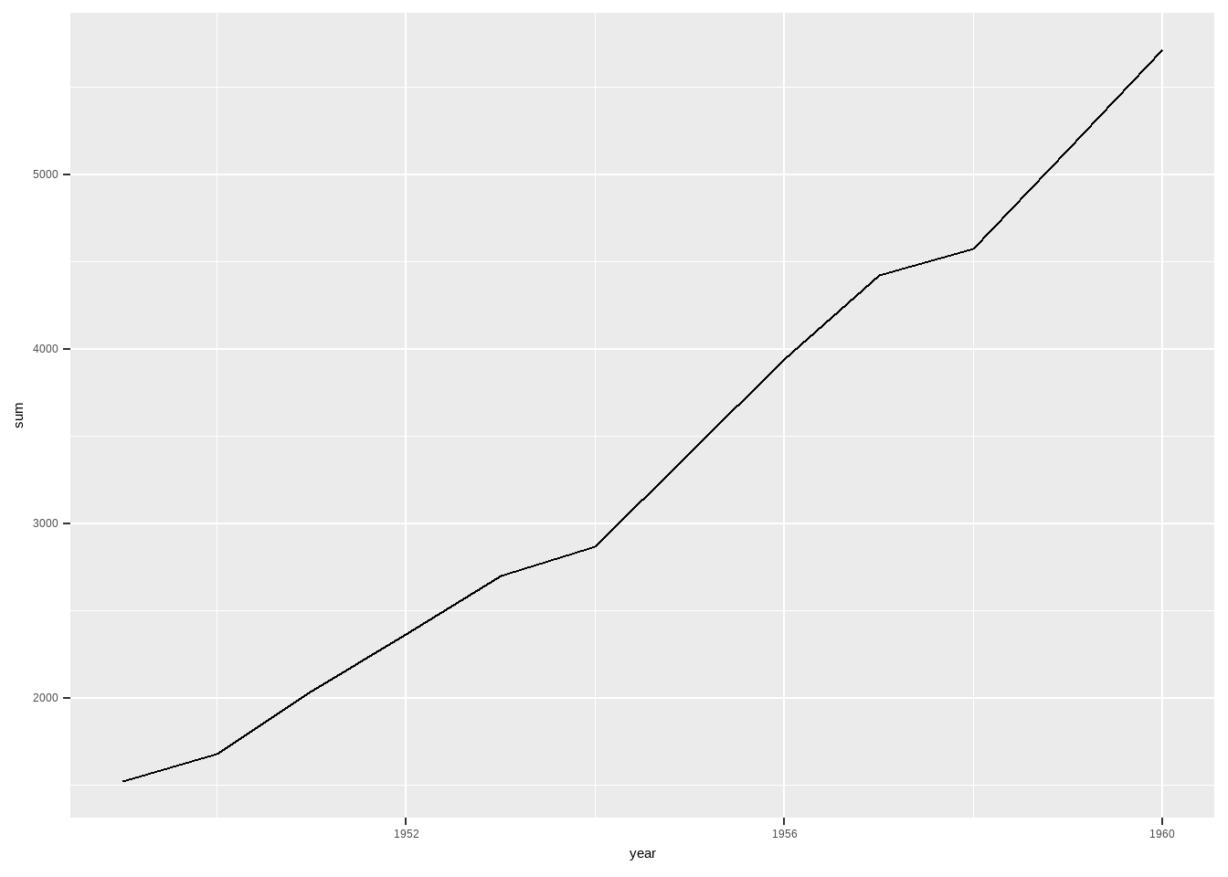
Line Charts
A line graph displaying 1 line per month
ggplot(airpassengers)+ geom_line(aes(x=year, y=AirPassengers, group=month))Don't know how to automatically pick scale for object of type <ts>. Defaulting
to continuous.
Don't know how to automatically pick scale for object of type <ts>. Defaulting
to continuous.
We can add labels to the ends of the line using geom_label() (see Labels) but the lines are very close together, so we will use ggrepel() instead. This gives the labels space and connects them with their lines.
Line Charts
library(ggrepel)
ggplot(airpassengers)+ geom_line(aes(x=year, y=AirPassengers, group=month))+
geom_label_repel(data=airpassengers %>% filter(year == max(year)),
aes(x=year, y=AirPassengers, label=month))Don't know how to automatically pick scale for object of type <ts>. Defaulting
to continuous.
Don't know how to automatically pick scale for object of type <ts>. Defaulting
to continuous.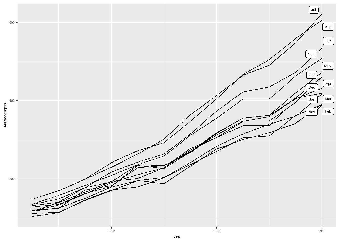
Refer more one
The Ultimate Guide to Get Started With ggplot2: Albert Rapp
Visualization